Hey there, fellow website owners and digital enthusiasts! Are you looking to enhance your website’s navigation to provide a seamless user experience? Look no further! In this article, we’ll explore the power of heatmap analysis and how it can transform the way you optimize your website for improved navigation. We won’t be discussing the concept and types of heatmaps, but rather focus on actionable insights and practical application possibilities using Capturly’s free heatmap tool. So, let’s dive right in and uncover the secrets to exceptional website navigation!
Wait a minute, do you even know what options Capturly offers when it comes to heatmap types? No? Let’s see!
Table of Contents
Types Of Capturly’s Heatmap In Brief
Capturly offers a diverse range of heatmap options that cater to every aspect of your website’s performance. Let’s take a creative journey through the various types and explore the unique benefits and experiences each one brings.
Click Heatmap: Unveiling User Interaction
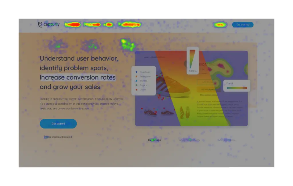
Capturly’s click heatmap paints a vibrant picture of user interactions by showcasing the areas of your website that receive the most clicks. With this insight, you can identify which elements are captivating your audience, allowing you to optimize important features and boost user engagement. Experience the thrill of discovering the hotspots where your visitors can’t resist clicking, guiding you to create a compelling and user-friendly website.
Scroll Heatmap: Journey of User Attention
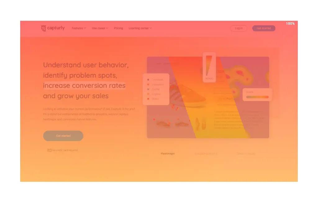
The scroll heatmap takes you on an adventurous journey, illustrating how far users scroll down your pages. This animated map reveals how your content captivates visitors and where they might lose interest. By understanding where the drop-off points occur, you can strategically position vital information and captivating visuals, keeping your audience engaged throughout their scrolling experience.
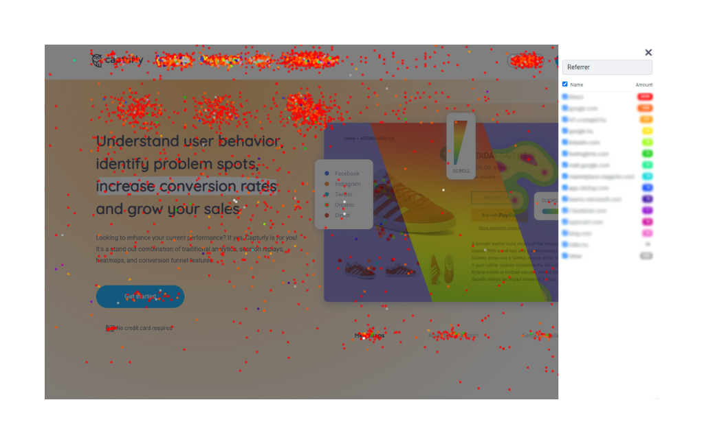
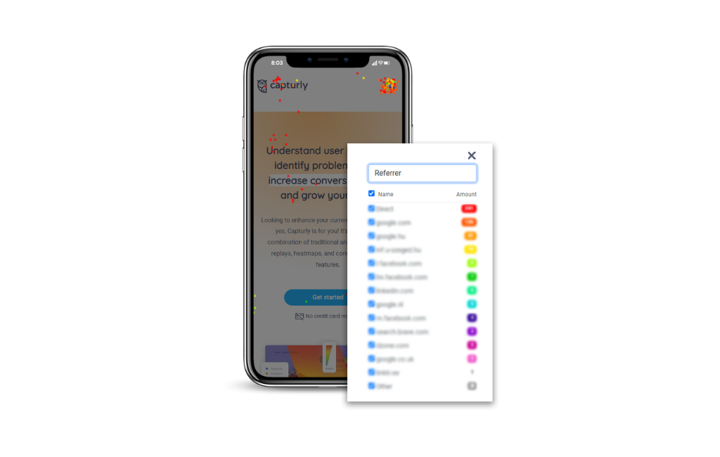
Segment Heatmap: Unraveling User Groups
Prepare to be amazed by the segment heatmap, a feature that allows you to analyze user behavior based on segments. Discover how new and returning users, customers from different countries, or visitors from various traffic sources interact with your website differently. This powerful insight empowers you to create personalized experiences for different user groups, ultimately enhancing user satisfaction and driving higher conversions.
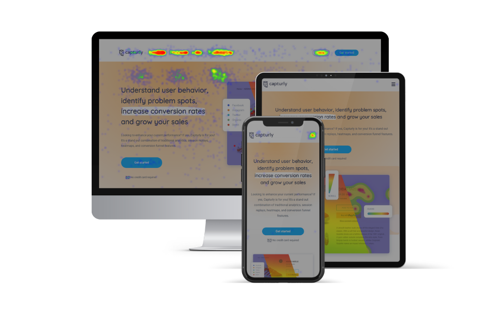
Mobile View: Unveiling Navigation Insights for Mobile Users
In today’s mobile-centric world, ensuring an exceptional mobile user experience is paramount for any website owner. As you may already know, in almost all cases, websites transform their navigation menu bar into a hamburger menu (yes, that’s the technical term for it) in mobile view. But what if you could dive deeper into mobile user behavior to optimize your website’s navigation effectively?
Enter Capturly’s Heatmap Analysis with Mobile View!
Unlock the Power of Mobile View
With Capturly, you can turn on mobile view separately in heatmap analysis, offering you a unique window into how your website performs on mobile devices. Here, you get to see your website precisely as mobile users do, and every click, scroll, and segment is visible in the heatmap view.
Analyze Desktop and Mobile Visits Separately
One of the most significant advantages of this feature is the ability to analyze desktop and mobile visits separately. By segregating data for both platforms, you gain a comprehensive understanding of how users interact with your website based on their devices. This unlocks invaluable insights that can transform your website’s navigation strategy.
The Benefits of Analyzing Desktop and Mobile Visits Separately
- Tailor-Made Navigation Strategies: By analyzing desktop and mobile visits separately, you can tailor your navigation strategy to cater specifically to each platform. What works on a desktop may not necessarily work on mobile and vice versa. Capturly’s mobile view allows you to optimize navigation for both worlds.
- Seamless Mobile User Experience: Understanding how mobile users navigate your website empowers you to create a seamless and user-friendly mobile experience. This insight is priceless in today’s mobile-dominated landscape.
- Optimized Conversion Funnel: By focusing on mobile-specific navigation data, you can identify potential friction points in the conversion funnel for mobile users. This enables you to optimize the flow and boost mobile conversions significantly.
Key Takeaways
- Activate Capturly’s mobile view in heatmap analysis to explore your website from a mobile user’s perspective.
- Analyze desktop and mobile visits separately to tailor navigation strategies and enhance user experience on both platforms.
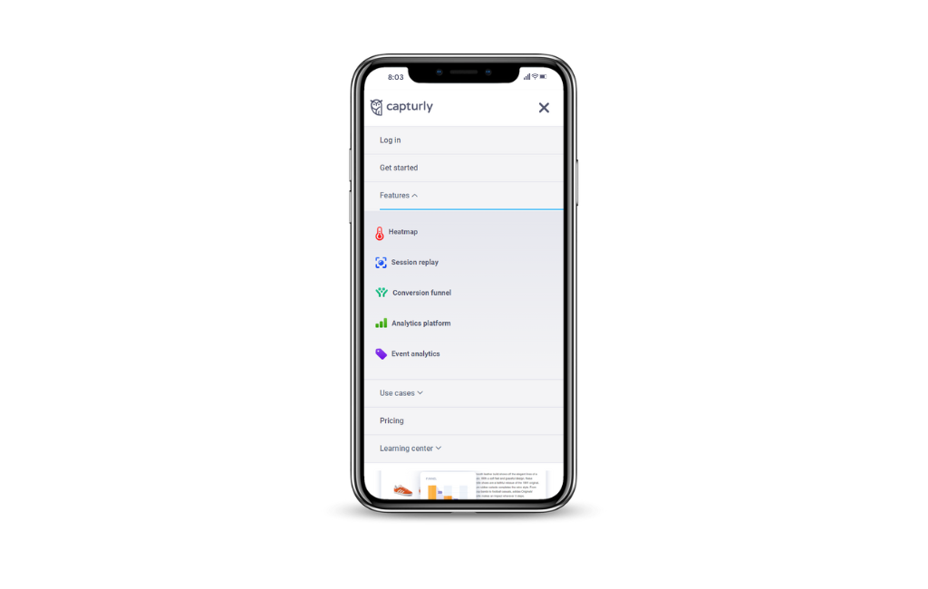
Optimizing Menu Items: Unveiling Marketing Psychology Insights
The order in which menu items are displayed in the navigation bar can significantly impact user behavior and navigation on your website. With Capturly’s heatmap analysis, you have the power to explore this aspect.
The Power of Menu Item Order
- Strategic Information Hierarchy: The arrangement of menu items can create a visual hierarchy that guides users through your website. Marketing psychology suggests that placing essential and frequently accessed pages first can encourage users to explore more deeply.
- Behavioral Triggers: The order of the website menu items can act as behavioral triggers for users. Placing high-priority items first may entice visitors to take specific actions, such as making a purchase, signing up for a newsletter, or contacting your team.
- Content Segmentation: Grouping related navigation menu items enhances user understanding and makes navigation more intuitive. Capturly’s heatmap analysis can help you evaluate the effectiveness of your current content segmentation strategy.
Have you heard this one?
Marketing psychology indicates that humans tend to focus on the first and last items in a list more than those in the middle. This phenomenon, known as the serial position effect (Ebbinghaus, 1913; Murdock, 1962; Glanzer & Cunitz, 1966), can influence user clicks and interactions on your website. Utilizing heatmap analysis, you can determine if this effect is present in your website menu bar and make informed decisions about your navigation menu item order.
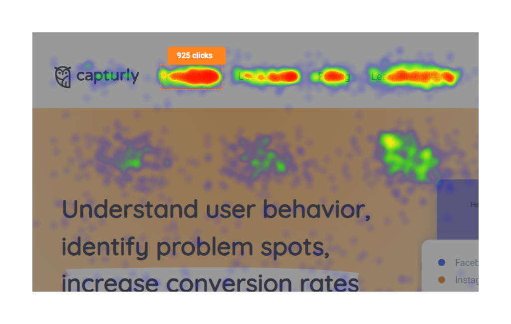
Plot Clicks on Website Elements
Capturly’s heatmap analysis takes optimization one step further by allowing you to plot the number of clicks on each website element, including menu items. With this feature, you gain a clear visual representation of user engagement with your navigation bar.
Benefits of Click Plotting
- Identify Top-Performing Menu Items: By plotting clicks on each menu item, you can quickly spot which ones receive the most attention from your users. This knowledge allows you to prioritize high-impact items and ensure they stand out.
- Optimize Page Relevance: The heatmap data can reveal if certain menu items are receiving unexpected or excessive clicks on specific pages. This insight helps you fine-tune the relevance of menu items to different pages on your website.
- Refine User Navigation: Armed with click plotting data, you can refine your menu bar’s structure and content, creating a smoother and more efficient user navigation experience.
Key Takeaways
- Leverage marketing psychology insights to strategically order your navigation menu items for enhanced user behavior.
- Use click plotting in heatmap analysis to identify top-performing menu items and refine user navigation.
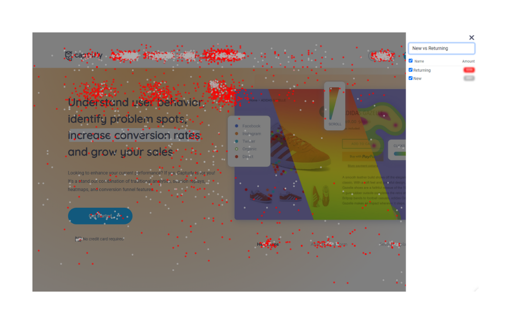
New vs. Returning Users: Unraveling User Behavior Differences
New and returning users bring distinct behaviors and intentions to your website. Understanding these differences can be the key to optimizing user experience and boosting engagement. Capturly’s segment heatmap is here to shed light on how these two user groups interact with your website’s menu bar differently. Every segment is color-coded on the segment heatmaps to easier distinguish the differences.
The Intriguing World of User Behavior
- Returning Users: These users are already familiar with your website and have likely explored it before. They might be returning to find specific information, make a purchase, or engage with your content further.
- New Users: On the other hand, new users are experiencing your website for the first time. They are exploring, trying to understand what you offer, and seeking to accomplish their specific goals.
The Benefits of Analyzing New and Returning User Behavior
- Personalized User Experience: Armed with segment heatmap data, you can create a more personalized user experience for both new and returning users. By understanding their unique needs, you can guide them to the most relevant sections of your website efficiently.
- Optimize for Different Intentions: New and returning users often have different intentions when visiting your site. With segment heatmap analysis, you can ensure your navigation bar caters to their varied goals, increasing user satisfaction and engagement.
- Identify Opportunities and Pain Points: Analyzing user behavior separately can uncover specific opportunities and pain points for each group. These insights are instrumental in refining your website’s navigation and content placement.
And Beyond: Discovering Other Navigation Elements
While the menu bar plays a crucial role in website navigation, it’s not the only tool at your disposal. Let’s explore other navigation elements and how heatmap analysis can optimize them.
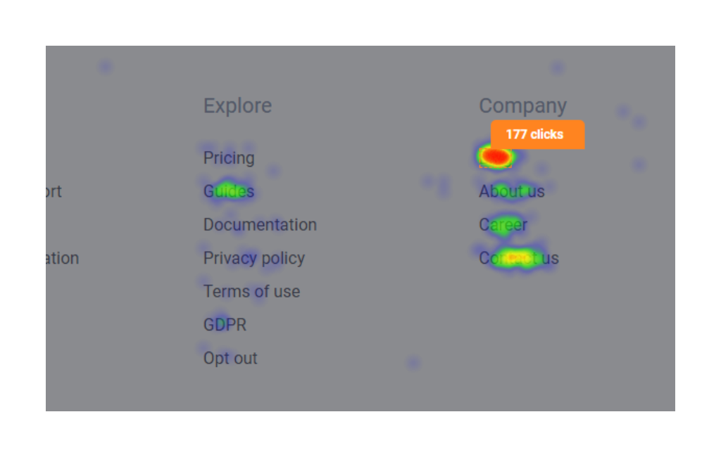
CTAs and Footers: Enhancing Navigation for Action
Calls-to-Action (CTAs) and footers are crucial elements that guide users through your website and encourage specific actions. By analyzing heatmap data, you gain valuable insights into their effectiveness and optimize navigation for better user engagement.
Leveraging heatmap data to examine user interactions with CTAs and footers reveals valuable insights for optimization.
Benefits of Analyzing CTAs and Footers
- Identifying High-Performing CTAs: Discover which CTAs attract the most clicks and prioritize them for maximum conversions.
- Optimizing CTA Placement: Strategically place CTAs based on visual heatmap data to guide users effectively.
- Understanding Footer Engagement: Gauge user interest in footer links and organize content for improved navigation.
- Maximizing CTA Impact: A/B testing different CTA variations led to significantly increased click-through rates and conversions.
- Enhancing Footer Usability: Adding a quick contact form to the footer streamline communication and improve user experience.
- Streamlining Checkout Process: Prominently displaying the “Proceed to Checkout” link reduce cart abandonment rates and expedite the checkout flow.
Checkout Page Navigation: Optimizing the E-Commerce Experience
For e-commerce websites, the checkout process is a critical juncture, where every step matters. Utilizing heatmap analysis on checkout pages can reveal insights to optimize the flow and reduce cart abandonment rates.
The Power of Heatmap Analysis for Checkout Pages
- Identify Friction Points: Heatmaps uncover areas where users encounter difficulties during checkout, such as form fields or payment steps that require optimization.
- Streamline the Checkout Flow: Heatmap insights enable you to streamline the checkout process by eliminating unnecessary steps and creating a smoother experience.
- Enhance User Experience: Understanding user navigation during checkout allows you to tailor the experience, increasing satisfaction and encouraging completion.
- Clearing Form Confusion: Addressing confusion around form fields reduces cart abandonment rates.
- Simplifying Shipping Options: Placing shipping details higher on the page improved visibility and informed decisions.
- Recovering Abandoned Carts: Implementing a one-click payment option significantly reduces cart abandonment rates.
Form Optimization: Boost Conversions with Heatmap Analysis
Heatmap analysis is a powerful tool for optimizing forms on your website, be it sign-up forms, contact forms, or surveys. By pinpointing usability issues, you can create a more user-friendly experience, leading to increased conversions.
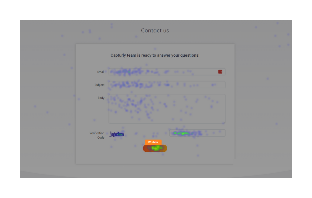
The Power of Heatmap Analysis for Form Optimization
- Identify Pain Points: Heatmaps reveal which form fields users struggle with the most, allowing you to streamline the form and reduce user frustration.
- Optimize Field Placement: Heatmaps guide you in placing essential fields strategically for a smoother form completion process.
- Increase Conversions: By optimizing forms based on heatmap insights, you create a more user-friendly experience, leading to higher completion rates and increased conversions.
- Boosting Newsletter Subscriptions: Simplified subscription process led to a significant increase in newsletter sign-ups.
- Enhancing Contact Form Usability: Reducing optional fields improve user engagement and increased inquiries.
- Improving Survey Response Rates: Breaking the survey into shorter sections dramatically increase completion rates.
Fun Questions: Are You Maximizing Navigation Awesomeness?
Time for some fun questions! Are you ready to take your website navigation to the next level?
Let’s see:
- Is your mobile view on point? Can you look at desktop and mobile visits separately?
- Do you know the top-performing menu items on your website? Heatmap analytics can unveil this hidden treasure!
- Are returning and new users treated differently on your site? Discover the power of segment heatmap analysis for personalized navigation.
- Have you explored navigation beyond the navigation bar? Don’t forget about CTAs, footers, and checkout pages—they play a crucial role too!
Stop for a moment and think about the above!
Take a moment to reflect on these questions and consider how heatmap analysis can elevate your website navigation. Try Capturly’s free heatmap tool now and unlock navigation awesomeness!
Conclusion
Congratulations! You’ve just unlocked the secrets to exceptional website navigation using heatmap analysis. By leveraging Capturly’s free heatmap tool and exploring mobile view insights, segment heatmap analysis, and navigation beyond the menu bar, you’re well-equipped to optimize your website for a superior user experience. Remember, the journey doesn’t end here—continue exploring heatmap analysis to discover even more opportunities for website enhancement!