
Heatmaps in analytics are powerful tools. They can help you find and analyze patterns and errors, understand customer behavior, and identify the busiest parts of your website. Now you might think that nothing will go wrong during continuous heatmap analysis.
Well, we’re here to tell you that’s not true. Although companies that offer online analytics tools often offer tips and guides for using their heatmap services, let’s be honest: you probably haven’t read them yet.
In this case, this article is for you and we get why you don’t read these instructions. These guides are often very long and difficult to follow, especially if you are new to data analysis. Don’t worry, this article is different. We will give you a short and effective description. Since we’re focusing on scroll heatmaps, let’s briefly introduce this type of heatmap.
Table of Contents
Types of website heatmaps
Let’s start from the beginning: A heatmap is a tool to represent data visually, making it easier to understand. Think of it as a pie chart rather than looking at the values one by one. Your brain is better able to recognize important information when it’s presented visually, especially when you see it for the first time.
Why are there so many different heat maps?
- New ways to collect data: Experts have realized that we can get useful information from almost any kind of data.
- Understanding user behavior: Websites can track and store more visitor data than ever before, but only if the visitor agrees to it.
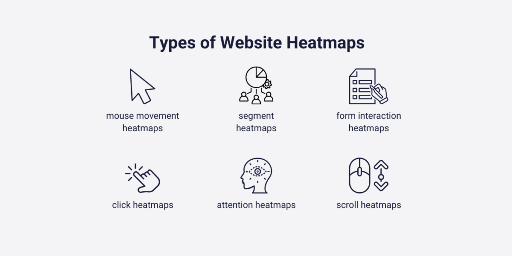
Different types of heatmaps
- click heatmaps,
- mouse movement heatmaps,
- attention heatmaps,
- segment heatmaps,
- form interaction heatmaps,
- and scroll heatmaps.
What is a scroll heatmap?
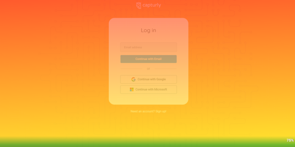
In this article, we will focus on scroll heatmaps. These heatmaps are categorized easily by their names and use warm and cool colors to show how far a visitor has scrolled down the homepage or subpage. It is trivial that every customer, who clicks on one of your CTA-s or goes further on your designated conversion paths will appear at the top of your loaded page. That’s also true with your landing page.
Let’s see an example:
As visitors scroll down and their enthusiasm decreases, they may exit your page. However, not all visitors exit at the same point. Some may withdraw after reading 30%, and some may exit after reading 50%.
Chartbeat conducted research to clarify this question. Imagine a blog post that has 100 visitors reading it at once. The research found that every ⅓ of the visitors spend only 15 seconds on the page before moving forward. By the end of the article, around 20% of the visitors will stay. This is a positive example; articles that don’t meet visitors’ expectations may fare worse.
These numbers worry not only bloggers but everyone. It’s frustrating when a page about your site’s best features loses visitors’ interest after a couple of paragraphs. Most of the time, it’s not the visitor’s fault; your content, graphics, or structure may not be eye-catching.
A scroll heatmap will help you reach this conclusion faster. By quickly identifying if your page’s user experience needs improvement, you can come up with solutions promptly. This is what scroll heatmaps, as well as other types of heatmaps, provide in the first place. But how can you go wrong with this simple yet amazing data visualization tool? The next chapter covers these mistakes and offers tips on how to avoid them!
5 mistakes to avoid when using scroll heatmaps
As we already explained, and some research showed, scroll heatmaps are efficient for tracking visitor engagement and your content’s quality. That’s not a question. However, sometimes it is not as efficient as you hoped it would be. There’s a bunch of questions in your head about what you do wrong, but you don’t find a single word about these mistakes on the internet. In this chapter, we will cover the most common mistakes of using scroll heatmaps, and give you some advice on how you can get back on track.
- Overlooking different device types
- Ignoring regular updates and their effects
- Misinterpreting fast scrolling
- Using scroll heatmaps without other analytics tools
- Ignoring the difference between page and content types
Let’s see them all!
1. Overlooking different device types
In this decade, it is not evident that your users are using a desktop when they browse your site. According to Similarweb’s research in 2023 December, the mobile market share was 66.02%, the desktop was 32.54%, and the tablet was 1.44%.
Although it always depends on the actual industry that you are participating in, mobile users are always a factor. However, this brings us to another crucial problem.
Desktop
When we think of a desktop, we can be more sure about the visitors’ screen displays. HD screen resolution is the most common, so website developers place their most important CTA’s, general instructions, or the most convincing elements inside this area.
Do not forget that most of your visitors won’t scroll a centimeter down, so you better steal the stars at the top of your screen.
Mobile
However, in terms of mobile, deciding the most used screen resolution is not that easy. 360×800, 390×884, 414×896, and 412×915 are the four most common screen resolution types in mobile screens, although we only covered half of the mobile users. There are still a lot of other screen resolutions that have significant usage.
Take care of your responsive design
That’s why even if your site has a responsive design, most of your customers see your website a little differently. This difference is not as big as you think, with a little more sharper pictures, or a little more above-the-fold content.
But, this can influence scrolling statistics, and bring you in wrong ways. So generally more scrolls and better-scrolling percentages don’t always mean that your site is better-optimized than others, or your customers are more excited about your content than they were ever before.
It may mean that from your above-the-fold content, most of your customers can not navigate themselves to other crucial parts of your website, due to the diversity of their screen displays. So it is better to use segment heatmaps simultaneously with scrolling heatmaps to discover these nuances.
2. Ignoring regular updates and their effects
We need to look at this issue from two perspectives because both can lead to incorrect assumptions, which isn’t good in this situation.
Keep updated on your analytics tool
Sometimes your analytics tools become outdated. This could mean that the data you store is no longer accurate, or that your analytics tools are lacking in a specific area. While these issues may seem less damaging than the second one, any mistake in your critical analysis could lead you to legal trouble and GDPR complaints.
Make sure you stay up to date with the latest regulations, and features and update your analytics tools regularly. On the other hand, if the information in your analytics tool is outdated, you risk focusing your resources in the wrong direction. These mistakes can prevent you from prioritizing problems and lead to inaccurate decisions.
Keep your website up-to-date
Scrolling heatmaps may not provide information about visitor engagement or user experience if your site looks awful. Outdated buttons, broken URLs, and unreadable fonts can all be to blame.
To address these issues, consider collecting feedback from your site visitors at least once a month through surveys or one-on-one interviews. They look at your website from a different perspective and reveal aspects that you might not always notice. This feedback can help you identify areas for improvement.
3. Misinterpreting fast scrolling
When you hear “fast scrolling,” you might think these people aren’t interested in your content – many of you would say that. But does it always mean that? Are there no other possible explanations for this activity? Yes, there are.
You might know how much time it takes to read a page full of letters and sentences, but do all your pages look the same? We’re specifically talking about written content. On a page, you usually display both visual and written content. If your visitors scroll down a bit, they may encounter more visual content.
However, if they scroll down further, they’ll find more written content. But these do not always appear in the same mix. One of your pages contains more pics, and one contains more letters. So, fast scrolling could be caused by more visual content, not necessarily disinterest or lack of engagement.
What is a quick scanning?
Fast scrolling may happen for other less-known reasons. One of these is called “quick scanning.” This means your visitors don’t read your whole written text but filter the most important facts and then scroll down. This can occur when you highlight key sentences in your written content, and your visitors realize they only need to read those for a proper understanding.
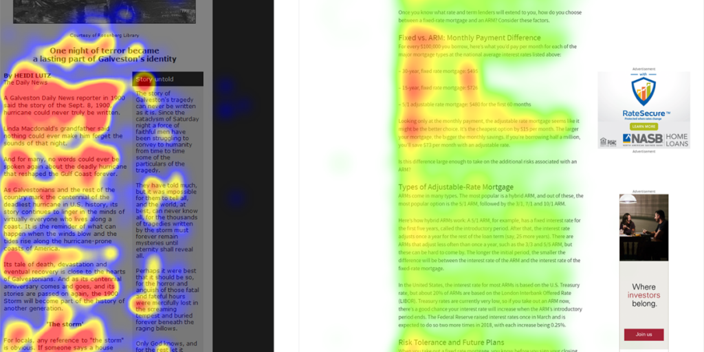
Results of an eye-tracking study on quick scanning (Source)
Is it a problem? Could it lead to a worse user experience? Maybe, but sometimes it can also have the opposite effect. You need to test it first to figure out whether fast scrolling is a good or bad sign. It’s a false claim that fast scrolling goes against what you want to achieve, so you don’t need to solve it immediately on every occasion.
4. Using scroll heatmaps without other analytics tools
While a scroll heatmap is a very effective tool, relying on it alone without incorporating other heatmap techniques or analyzing users’ individual sessions can lead to incorrect assumptions.
Just noticing that most of your customers don’t reach the end of the pages doesn’t automatically mean you need to make changes. Furthermore, even if you’re certain that some of your changes are necessary, analyzing scroll heatmaps alone often doesn’t provide the “why.”
Choose a website analytics tool
Heatmaps and session recordings are like Batman and Robin – they are strongest when used together. But how to combine these two tools? Do you need to purchase two different analytics tools?
No, that’s not the case. Website analytics companies typically offer at least four different tools in one package. While these comprehensive services are not entirely free, they provide free plans so you can determine if you truly need the service or if your site lacks visitors to justify the cost.
These four tools include heatmap options:
- Heatmaps
- Session recordings
- Conversion funnel analysis
- Survey function
Our recommended tool is Capturly
Despite having the industrial standards, our tool, Capturly Analytics, goes a step further. It offers unique heatmap options, detailed session error indicators through session recordings, and an analytics platform to gather all crucial information. The best thing is that these are all included in Capturly’s plans, even in our free plan. So, don’t hesitate to try one of the most versatile analytics tools in the industry.

5. Ignoring the difference between page and content types
All your pages serve different purposes. One might provide important context for your products or services, so it’s crucial not to lose your visitors before they can read most of the information. Another page might be something where generating more scrolls is not the main goal.
Landing pages
To illustrate this, let’s look at landing pages. A landing page is where visitors “land” after clicking a call-to-action in social media ads, emails, or pay-per-click ads. The main focus of a landing page is to convince potential buyers to click another call-to-action leading to the actual website. Is there a logical reason to track scrolls on this page? Not really, as it’s not the main purpose.
Different pages and content types
How can you align different pages and content types with the corresponding scrolls? First, you need to determine each page’s goals. What do you want to achieve with a specific page? If your goal is to attract attention, place everything above the fold and avoid unnecessary scrolling, as these actions may lose crucial visitors.
If you want to inform visitors about a specific topic to convince them about your products or services, set clear objectives for each page. Analyze visitor scrolls and evaluate them while keeping your expectations in mind. Create high-quality content, ensure clear navigation, and gather feedback. Also, introduce scroll heatmaps to assess your performance.
Conclusion
We can only advise you, in conclusion, to remember that scrolling heatmaps are your friend, but don’t forget their limitations and usability issues. In this article, we discussed many of them, including misinterpretations, relying solely on it, and neglecting proven facts.
Scroll heatmaps, when used with other heatmap tools, are excellent for finding bugs, identifying negative user experiences, and uncovering poorly constructed customer journeys and website pages. Using this tool effectively enhances your customers’ user experience, leading to more loyalty and, ultimately, increased revenue for your business.