
CTAs, or Call-to-Actions, are practically everywhere these days. Whether browsing through newsletters, scrolling through social media, reading blogs, or watching videos, you can’t escape the presence of these powerful prompts.
Unfortunately, almost 70% of businesses do not have a CTA. And even among those with a CTA, many need help figuring out how to make the most of it. It’s a missed opportunity that could be costing you big time!
So, on a scale from 1 to 10, how compelling are your calls to action? If your number is less than 10, you should probably keep reading.
The call to action (CTA) can be seen as the bridge between marketing and sales. All the effort you’ve put into branding and engagement has one ultimate goal: to turn potential prospects into paying customers.
Businesses use it as a tool to guide the consumer into the sales funnel. Sounds like a piece of cake, isn’t it?
Well, there’s only one tiny hitch. Making a captivating call to action is part art and part science, much like writing content. If your call to action (CTA) is weak, all of your marketing efforts will be for nothing, no matter how great your startup idea is.
With so much riding on them, determining the ideal type that will truly captivate your audience can be quite a challenge.
Let’s explore how exactly these CTAs impact conversion rates.
Table of Contents
1. Understanding the Significance of CTAs
Your efforts to track website visitors and improve the website’s visibility in search engines (SEO) have paid off, as seen by a recent uptick in visitor numbers. However, you’ve only just begun your journey. The next step is to increase the percentage of visitors who become leads or, even better, paying customers.
CTAs (or “calls to action”) play a crucial role in this context. Data enrichment can help you tailor your CTAs to specific customer segments, increasing their effectiveness.
Encouraging users to act while designing a website or web page is especially important for no-code web developers. Whether you’re trying to increase email subscriptions or phone calls, a call to action (CTA) is essential.
Internet users seek content that will inform, inspire, and amuse them. When they’ve accomplished their mission, they’ll go immediately unless you encourage them to continue. Strategically incorporating CTAs on your marketing website design helps guide users along a predetermined path.
CTAs are helpful in a variety of contexts:
- Boosting the percentage of people who click on a link or button
- Increasing the size of your email list
- Increasing the number of views for a video,
- Boosting the downloads of Ebooks and guides
- Increasing Inquiries Via sales calls or automated surveys
- Expansion of a company’s product or service
However, this is only effective if you know how to craft and strategically position your calls to action. Let’s look at what works best to increase click-through rates (CTR) on calls to action.

2. Types of CTAs and Their Applications
Different forms of CTAs have varying effects on clickthrough rates. The following are examples of popular call-to-actions:
Button CTAs
These are the colorful buttons with phrases like “Buy Now” and “Sign Up” that entice site visitors to take some sort of action. In e-commerce and lead generation, button calls to action are frequently utilized and can considerably affect conversion rates.
Text CTAs
These links are in text format and are designed to encourage visitors to take specific actions, such as “Learn More” or “Download Now”.
Text CTAs are commonly utilized in scenarios where there is a lot of content, such as blog posts or landing pages. These text CTAs have proven to be very effective in encouraging conversions.
Form CTAs
These are fields where site visitors can voluntarily provide you with contact details like email addresses and phone numbers. In lead generation scenarios, form CTAs are frequently employed and can substantially affect conversion rates.
Different calls to action (CTAs) may affect conversion rates differently based on the context and objectives of a given website.
For instance: In situations with high stakes, such as on e-commerce checkout pages, using a call-to-action button is more effective than text. Conversely, in situations where the stakes are low, such as in blog articles, using text may prove to be more effective.
3. Crafting Compelling CTAs
The call-to-action copy you use must appeal specifically to your ideal clients. Make them want to click on the CTA by addressing their problems and worries in the preceding text.
Let’s understand with an example.
Suppose you’re trying to sell a bookkeeping service to independent consultants or freelancers. You might mention the money your clients save each year thanks to your services rather than doing their own bookkeeping.
Then, employ a CTA that is more compelling than just “Buy now.” Use more action-oriented language such as “Stop Wasting Money” or “Begin Reducing Your Tax Liability Immediately.”
According to data compiled by HubSpot, conversion rates for customized CTAs were 202% higher than those for generic ones. Therefore, tailor your language to your readers’ interests and circumstances (e.g., occupation, difficulties, aspirations).
3.1 Writing Engaging CTA Copy
A compelling call to action (CTA) requires careful consideration of several factors.
- Always be Direct and Unambiguous
First, you need to have a clear and concise call to action. Avoid using jargon and other complicated terminology that could confuse your visitors and lead to low conversion rates.
- Make it Actionable
If you use the right words determined as per customer journey, your readers will be excited about your strategy and motivated to take action. Use phrases like “Sign up now,” “Learn more,” and “Get started” to encourage quick action on the part of the reader.
- Use Powerful Verbs
Use powerful, action-oriented verbs in your call-to-action. Making it more alluring with words like “Join,” “Download,” “Start,” or “Get” is a good idea.
3.2 Designing Eye-Catching CTA Graphics
Your call to action button’s color needs to jump off the page. Don’t be afraid to go for vibrant, eye-catching hues like red, yellow, green, blue, orange, or purple. These are attention-getters that will entice readers to click.
You can also emphasize by experimenting with font family, size, bold, italics, or other typographical features. Which one you pick will be determined by the website’s overall typeface.
If you’re using the same font for all your text, you may choose a different font for the CTA or make it bigger. Don’t go overboard, though; doing so would be tacky. The site’s font size and design should be complementary to one another.
The point is to make it obvious where to click. In addition, you should check its readability across a range of devices and display settings.
4. Optimizing CTAs for Maximum Effectiveness
For maximum efficiency, it is very important to optimize CTAs. Here are some tips on how to optimize your call to action.
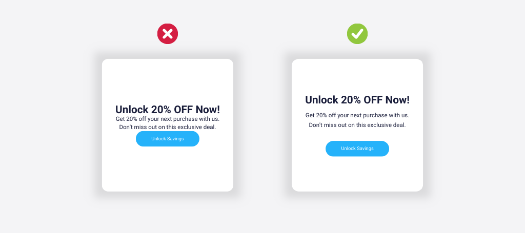
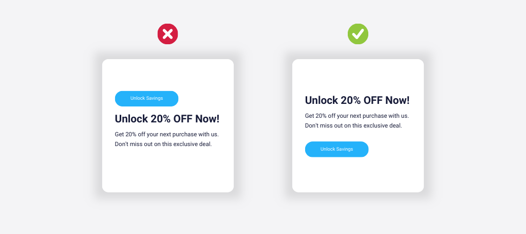
4.1. Placement and Visibility of CTAs
Your CTA needs to be the center of attention, like a spotlight on Broadway. Put it where it will immediately draw the attention of your site visitors.
If your call to action (CTA) is too subtle, readers may not see it. Because most users won’t read a complete web page, making your CTA stand out through factors like its location, color, and size is essential. Make sure it sticks out and screams to be noticed, whether it’s above the fold or at the end of interesting content.
Some people make the fatal error of placing the CTA somewhere in the midst of the text, where it will be less likely to be noticed. Instead, place calls to action at the page’s beginning and finish, where readers’ eyes are more likely to wander.
Ensure to add some breathing room around your CTAs so they aren’t buried in walls of text.
In addition, consider using heatmaps to gain insights into how visitors navigate your site. Heatmaps can help you track website visitors’ movement patterns and behavior, allowing you to identify the best spots for your buttons.
4.2. A/B Testing and Iterative Refinement
You’ve successfully implemented these CTA best practices, which is a significant step in the right direction. However, your work isn’t complete just yet. Now, it’s crucial to measure the impact of these changes to understand how they are influencing your audience’s behavior.
What kind of results do you get from your CTAs? Is there room for improvement? To find out for sure, split-test several versions of your calls to action.
You can alter the CTA’s appearance by changing one of its constituent parts, such as its color, the copy, its positioning, or the preceding text. See which of the two versions (original and modified) is more successful. Try this out with a few different iterations to find the optimal tweaks.
💡 Pro tip: Use website heatmap for A/B testing >>>
The outcomes of your A/B tests require in-depth analysis. Look for commonalities and insights that can help you improve your calls to action (CTAs) and bring in more customers. You’ll be amazed at how many angles a single report package may cover.
So, incorporate regular A/B testing into your marketing plan to boost the effectiveness of your calls to action.
5. Implementing Advanced CTA Strategies
Want to improve your CTA strategy? Read more about how you can improve your call to action to maximize its potential.
5.1. Personalization and Targeted CTAs
Communicating with your audience on their level is essential. An excellent example of this is Unbounce, whose conversion rate skyrocketed by an impressive 90% when they made a simple yet impactful shift from using “you” to “me” in their call to action.
The essence of this transformation lies in making your readers feel like the offer is crafted exclusively for them.
To put this into context, notice how swapping the generic “Learn More” CTA with “Show Me What To Do.” creates a powerful impact.
By using “me,” you invite your audience to participate and be a part of your business journey actively. It fosters a sense of personal connection, compelling the visitors to take action.
You can even utilize clients’ real names if you employ email marketing. This will show that you put thought into the email and care about the recipient.
You must personalize the call to action (CTA) for your target market. Consider an online store that specializes in wedding attire. Bridal attire may be associated with style, but the focus is not solely on fashion trends, as emotions play a significant role in the decision-making process for weddings.
When creating your call-to-action (CTA), it is crucial to consider this specific element. Your purpose is not only to showcase fashionable dresses but also to emphasize how your business or services can enhance the bride’s special day. To effectively engage your audiences, it is important to establish an emotional connection with them.

5.2. Urgency and Scarcity Techniques
In your call-to-action copy, instill a sense of scarcity and timelessness. Make your target audience feel like you’ve come bearing an irresistible offer they can’t refuse.
This excitement can be generated on your site by providing users with exclusive promotions that are only available for a short period of time.
You must have seen some version of the following call-to-action phrases on a variety of different eCommerce sites. The idea behind this strategy is to make the target worried that they will miss out if they don’t immediately take action. People are more motivated to change when they fear losing out, a phenomenon known as loss aversion or fear of missing out (FOMO).
Examples of urgent calls to action include as follows:
- Hurry! Savings of 50% this week only
- For Today Only, Every Item is 25% Off.
- Deals for the Season
- Special Offer Only
- Fast Checkout: 10% Off Your Order
- Get It Now
Conclusion: Mastering CTAs for Optimal Conversions
The difference between a visitor leaving your website unsatisfied and completing the intended action is in your call to action (CTA) quality. Even small changes to things like color, orientation, or typography can have a big effect.
The gains keep coming as you make progress. As your customer acquisition expenses decrease and your customer lifetime value rises, you will have more capital available to put toward attracting new customers. Each unique visitor gives you a better chance of making a sale. It’s a positive feedback loop that reinforces itself.
💡 Pro tip: Use Capturly’s brand-new email survey for deep insights. >>>
Absorb the wealth of CTA best practices showcased in this piece as a wellspring of inspiration. Then, embark on a journey of relentless testing and optimization. Your CTA evolution will chart a course toward unparalleled success.
————————
Author
Yash Chawlani is a B2B SaaS Marketing Consultant and Founder of Merlin, a result-oriented online marketing agency. He specializes in SEO and Content Marketing and helps various B2B & SaaS companies with his top-notch marketing strategies. You can get in touch with him via LinkedIn.
3 Comments
dordle
2024-01-17 at 05:00This article was very interesting and informative to me. Thank you for taking the time to share your special thoughts with us. This is something I will definitely share with my friends.
Quordle
2024-03-06 at 11:15We are able to make use of all of the data that you provided on your blog. You have provided some very helpful advice in this post.
Skribbl io
2025-03-26 at 10:13As I conducted an online search for information, I encountered your paper.