
The goal of every online entrepreneur is to tailor the website as optimized and user-friendly as possible. And what does user-friendly mean? It means that the elements of the site are composed in such a way, that users find what they are looking for without any hesitation. Needless to say, you can achieve this by using certain tools that provide us with information about user behavior.
You can “interview” your visitors using surveys or you can fire up a heatmap tool. Heatmaps are an important tool in a marketer’s shed. They provide the right information to arrange the website to become more user-friendly. The core of the statistics about the website and the bounce rates of particular sites are acquired through Google Analytics, and there is another feature called session replay which showcases the exact mouse movement of each individual user that has visited the website. Using polls on sites to find out the users’ opinions about the site is another useful resource for a UX designer. But Google Analytics, session replays, and on-page feedback are most of the time not enough to firmly establish where the website is lacking. So what are heatmaps and what do they bring to the table?
Table of Contents
What Are Heatmaps?
The term heatmap is something that UX designers are already familiar with. It is a data visualization technique that tracks the user’s mouse movement on the screen and highlights potential “hot-spots”. Heatmaps not only track clicks that happen anywhere on the site but also visualize the scrolling distance.
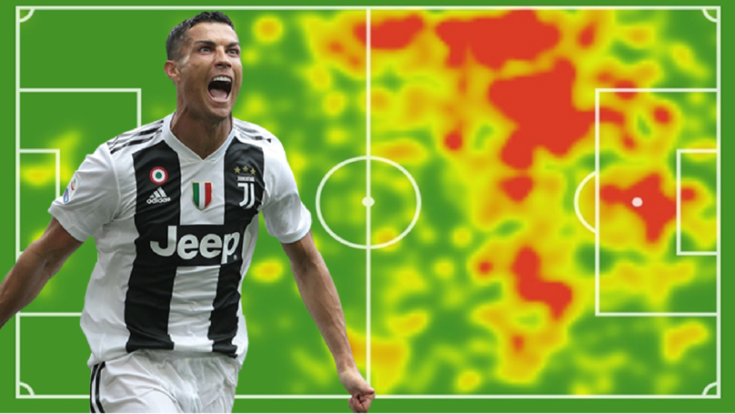
The visualization of a website heatmap is very similar to how other heatmaps look; for example, you often see heatmaps in sports, especially in football, where the movement of certain players is tracked and then graphically represented through heatmaps. The most basic distinction between the most populated parts of the site and the least populated is split by color. Usually, the most populated parts are displayed by the red color, while the least populated, “colder” parts are indicated by green or blue.
Through this feedback of heatmaps, the website owner, the marketer, the designer can analyze and discover the weak areas of the website and upon this information can make improvements. Heatmaps are relatively easy to use and also provide us with information that Google Analytics does not. They provide the “why” of the statistics of traditional analytics. For example, Google Analytics might tell you that the bounce rate from a certain page within the website is high, but we do not exactly know why. This is where heatmaps come into play, as they provide us with the information that explains why the users behave differently there.
Website heatmaps help to answer the following questions:
- Why do users leave without spending a single dollar on your site?
- Do visitors from given sources behave differently? If so, why?
- Why do visitors ignore certain parts of the website, or do the opposite?
Types of Heatmaps
There are all kinds of heatmaps:
- Click heatmaps
- Segment heatmaps
- Scroll heatmaps
- Move heatmaps
Click Heatmaps
The poster boy of heatmaps. Click maps show where exactly the users click on the page. They are the most specific type among heatmaps. They show exactly where the most clicks are concentrated, unlike the move maps, which only show where the user’s mouse is hovering. Clicking is a powerful representation of interest because the user’s attention is usually where the mouse cursor is when the click happens. For example, they can reveal potential parts where the users keep clicking on a broken link or on an element that does not lead anywhere.
Not only that, but click heatmaps also show if the elements that you wanted to be important, are actually clicked by users, and if they are not, it means that you have to make changes.
Segment Heatmaps
If you’re an entrepreneur who’s into marketing, then you are familiar with the term ‘Market Segmentation‘. In marketing, this means the distribution of the target market to smaller, descriptive portions. Segmentation provides you an option to filter the traffic from various sources.
Segment heatmaps allow you to compare the behavior of:
- visitors arriving from organic versus direct sources,
- new versus returning visitors,
- visitors arriving from certain operating systems and browsers,
- visitors arriving from certain devices.
With this information in your hands, you can spot correlations by separating different sources from each other.
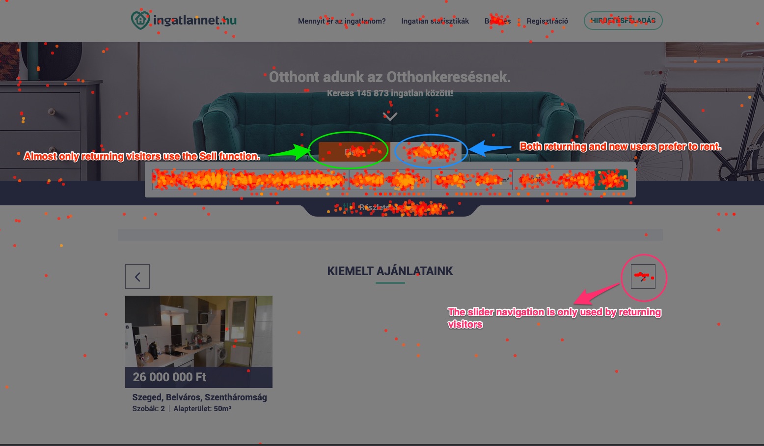
In the example, you can see Capturly’s segment heatmap feature in action on a real estate portal. The behavior of new versus returning visitors are compared, and thanks to the segmentation feature, we already have three clues:
- only returning visitors use the navigation on the slider (pink circle)
- only returning visitors click on the Sell tab (green circle)
- returning and new visitors are equally interested in renting (blue circle)
Scroll Heatmaps
These maps horizontally visualize the usage of the page, in other words, how far visitors scroll. The usage of the scroll heatmaps is represented by horizontal bands in colors; the warmer the color of the horizontal band, the more this part of the site is used. The further down the page we go, the colder the colors of the horizontal bands are. And that is even more evident when the pages are very long, as some users may never reach the bottom of the page. It is not unusual to see that pattern even with the most popular and the best-optimized websites on the internet. The difference between a decent website and a poorly optimized webpage is, in fact, the correct arrangement of the elements and the content of the site. An expert will look at a scroll heatmap and determine where the most important and relevant content of the site should be.
Compared to move maps or click heatmaps, this type is less specific but they are still very useful. Scroll heatmaps present you with instant feedback on the whole webpage based on the scrolling behavior of the visitors. Your goal is simple, pull down the red and yellow bars as far as you can. Obviously, the above-the-fold area will take most of the credit for the “hot-zone”, however, with some creative design elements you can keep a good amount of the attention as they scroll down towards the footer section.
Example for Scroll Heatmap
For example, if the most important content and interactive elements of the site are at the top of the page, where the users are still very active, then it would be a good idea to spread that quality content throughout the whole page. That way, the drop-off rates of the users would be much lower as it would be worth it for them to stay on the page because some important information is on the bottom of the page. That is where scroll maps are useful.
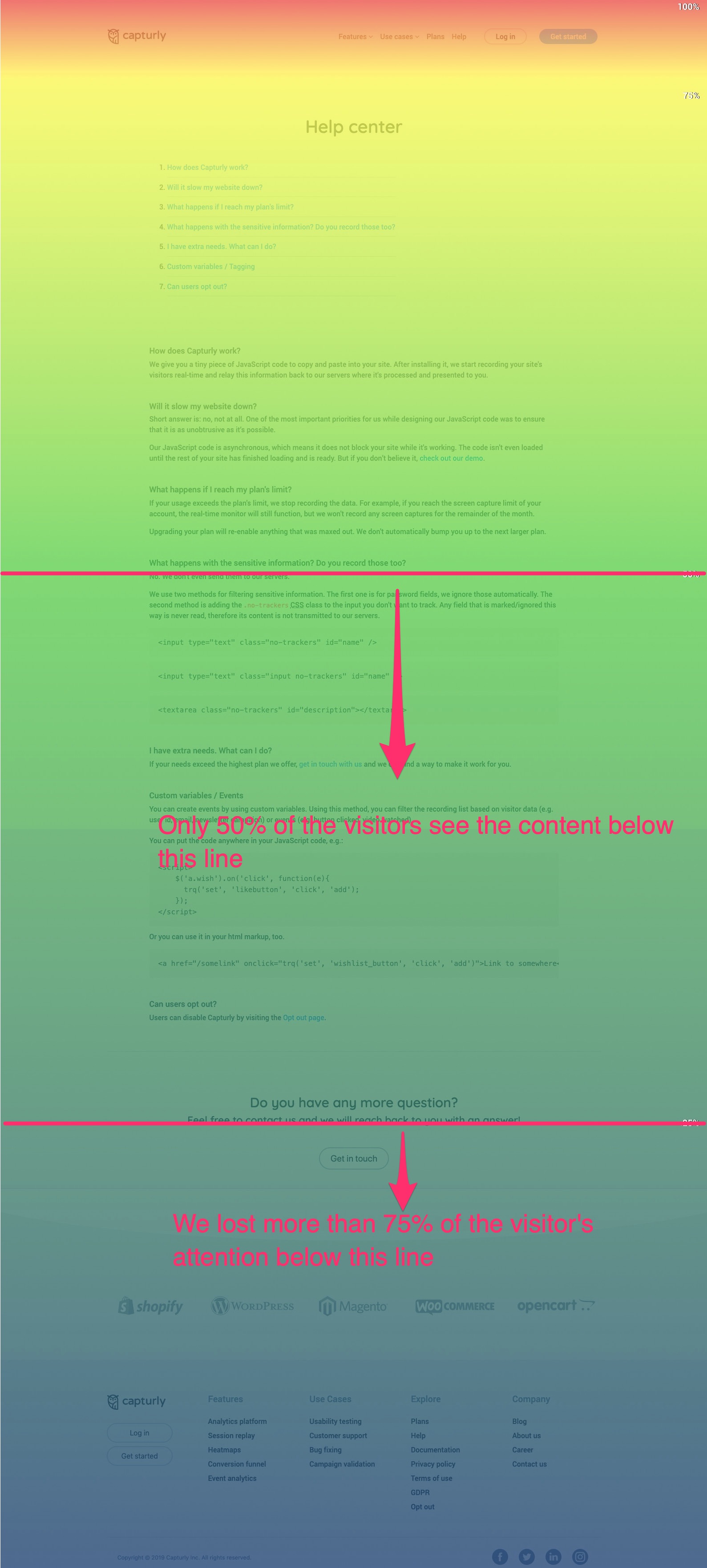
As you can see from the example above, we lost more than 75% of the visitors’ attention as they proceeded towards the footer section.
Move Heatmaps
Move heatmaps or hover maps are commonly mistaken for click heatmaps. This type of map shows over which parts of the site the user’s mouse hovers most. This represents only the hovering movement of the mouse, without clicking. This type of map is useful to show us which parts are the most appealing for the visitors of the site and which parts need improvement to become more appealing for the user.
It is a good representation because the user’s attention is usually where the mouse cursor is, and that is where the most attention will be. Move maps are slightly more accurate than scroll heatmaps but at the same time much less accurate than click maps. The visual representation of move maps most closely resembles the heatmaps used in other fields, like the before-mentioned sports heatmaps.
How to Use Heatmaps
You can set up a heatmap for your website relatively quickly. First, you need to implement a tracking code on your website. Then set it up to start tracking your website. Once that’s out of the way, all you have to do is wait until your first heatmap is ready. This can mean several minutes up until a few hours based on your traffic. The more visitors you have, the more relevant and representative the results of heatmaps are.
After the tracking period, it is time for data analysis. From there, you can view the various heatmaps (scroll maps, move maps, click maps, segment maps) and compare the results with the statistics of the webpage. Analyzing heatmaps together with traditional quantitative metrics such as average session duration, bounce rate, makes it easier to understand which parts of your website you should improve.
Wrapping up
What is a heatmap? How to use heatmaps? Well if these are still unanswered questions, here is a short wrap-up.
While heatmaps alone are not enough to provide a user-friendly webpage, they are certainly an important tool that every marketer should use.
- Heatmaps help to learn how far down the site users scroll – achieved this with scroll maps, it helps determine where your webpage is weak and how you should arrange your site elements to keep users scrolling down the page for longer.
- Heatmaps determine how good the interactive design of your page is – click maps provide us with this information. If users keep clicking on an element of your page that is not responsive or includes a broken link, it might be an indication that you should change the element to make it responsive or include a link on the element. It also tells you which elements are more popular. They can track the statistics of clicks, too.
- Heatmaps tell us how users interact with the page – through move maps, the designer can get specific information on which parts of the site are the most popular and give the designer an idea, which parts of the page are lacking in content.
- Heatmaps help improve the optimization of the site for both desktop and mobile – heatmaps can also track the user behavior on mobile devices as well as, of course on the desktop page. This way, they can help us improve the mobile version of the website.
2 Comments