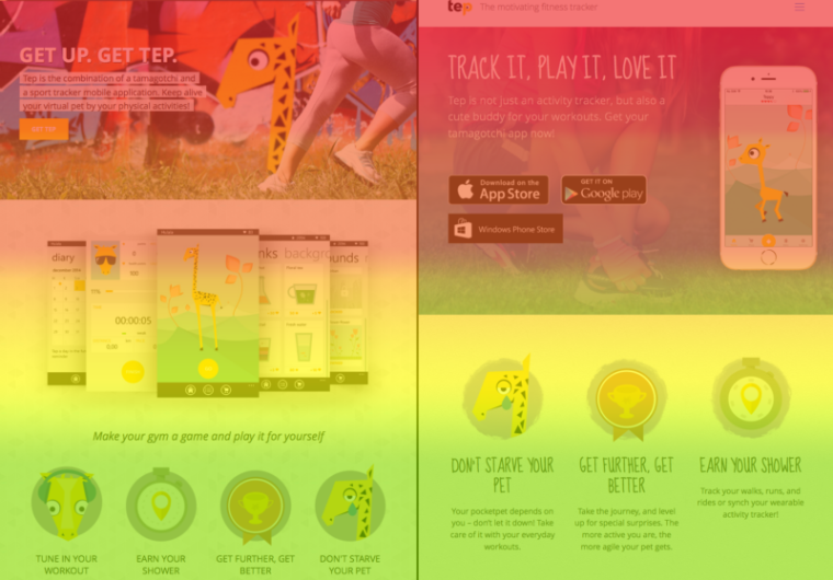
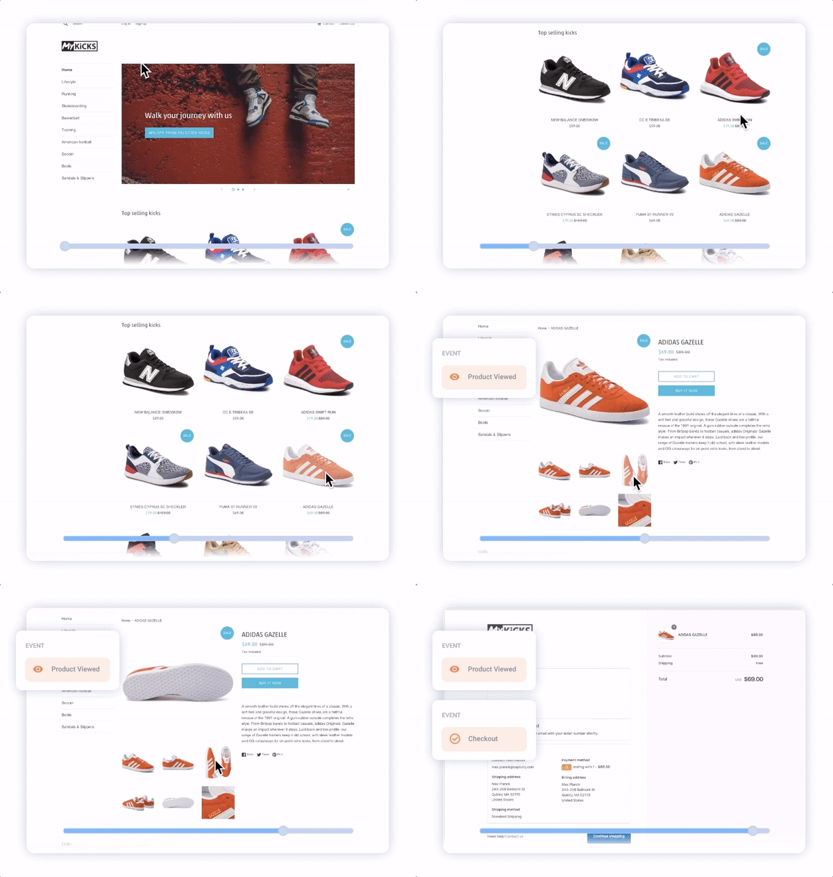
Visual analytics to the rescue!
More and more website owners realize the importance of session recording and heatmap services nowadays. They realized that by using such services, they can increase and optimize their website’s conversion rates. Those who wish to ensure the growth of their revenues from their sites are encouraged to consider adding these simple but effective analytic tools to their toolbox.

Session recording are video recordings of visitors interacting with your site and it allows you to see everything they do. Heatmaps show you which parts of your site are interesting and engaging to visitors. Together they are a powerful visual analytics combo. By means of them, you can gather valuable information about your visitors and potential customers. With a little adjustment, you can satisfy their needs and increase your conversion rates successfully.
The first and most important question to ask yourself is ‘What problems on my website could possibly drive my visitors away?’. However, you cannot find the answers until you use these in-depth analytics. The conclusion is simple: you can not solve a problem without realizing the cause of it. For a better understanding, we gathered…
5 of The Most Common Mistakes Website Owners Make
#1 Bad CTA placement
Call to Actions are the most important elements of your website, their function is to make visitors take immediate action. They are the bread and butter of your conversion funnel.
The most common mistakes are the following: bad positioning, confusing, or just simply dull wording and unattractive design, which doesn’t stand out and cannot catch the attention of the visitors.
Even the smallest fix to a CTA can generate a conversion lift of 304%, so you have to take very good care of them.
How can you identify whether there is a problem with your CTAs or not?

It’s actually quite simple with the right tools. Is your CTA above the fold? If not, the scroll heatmap will tell. It will allow you to see how many of your visitors are actually scrolling down to the part of the page where your CTA is. Keep in mind that the visuals look different on different screens, thus the exact place of “the fold” can differ, too. For instance, it will be located elsewhere on an HD or a 4K screen than on a mobile device.
Check a couple of session videos to see whether your visitors can find the CTA easily or not. In case you still have doubts, check out the click heatmap to get to know on which part of the site visitors are focusing on and where they’re clicking the most frequently. Place the CTA to the hot spot! Usability tests show that visitors tend to pay more attention to the left side of a page and are reading content in an F-shaped pattern.
#2 CTA not attractive enough:

Ok, so far so good. You placed your CTA above the fold, put it on the most actively viewed and frequently clicked part of your site, but the click heatmap and session recording still show that people are just not clicking on that damned thing. This suggests that the CTA does not attract enough attention and you either need to change the wording or come up with a better design to make it more eye-catching or both. HubSpot ran a test and found that
red buttons perform better than the green ones by an average of 21%.
And here’s another hint. Why not review your entire website and reposition your Google ads or any other paid banners? Locate them right in the middle of the traffic hotspots to increase your ad revenues. Of course, you have to be careful not to hurt your CTA engagement as that should be your top priority.
#3 Dead ends and drop off areas on your site

A well-designed customer journey induces visitor interaction at each and every step of the funnel. It should be crystal clear on all parts of your website design what elements are clickable and actionable. Sadly, ever so often this is not the case.
There could be plenty of titles, images, graphic designs on your site that immediately catch the visitors’ attention, but are not clickable. It’s more than natural for modern-day internet users to click on these in the hope of getting to know more about the website. However, they come to a dead end.
In a survey, 95% of people said that a good user experience just makes sense.
This might as well be one of the main reasons why people leave without converting but you end up clueless. To solve the mystery, you can just simply check the heatmap of the page to see that there are a large number of clicks on non-linking elements. Why not make those linking? And presto, you have just fixed one of your conversion optimization problems. You can always check session playback videos to find out how and in what order do people try to interact with your content.
#4 Distractions that hijack visitors
A page is full of information and design elements. Some are more important than others. With the help of an analytics platform, you can get to know the average time people spend on a specific page, which is great! But, what you won’t be able to tell is whether they are spending enough time on the important page parts or they get distracted by other page elements and information.
By looking at the session replays, you will be able to determine how and where exactly visitors spend their time on that specific page.
With a little rearrangement and maybe the removal of some distracting elements, you can easily keep visitors on the right track. Meanwhile, do not forget to keep your goal with that specific page in mind!

#5 Navigation menu too confusing
You have your menu bar all set up shiny and clean, but the magic just doesn’t happen. Have you asked yourself:
‘Are my visitors finding the content they need to find?’.
Maybe not – this occurs more frequently than you might think. Simply run a click heatmap and analyze to see which menu options your visitors are clicking on or ignoring in the navigation bar. If you find that they avoid some of the most important labels and links, maybe it’s time to:
- rephrase the terms you use
- or rearrange the menu options to draw more attention to those.
In case you find the opposite, namely, the heatmap showing visitors paying too much attention to the not-so-important ones, you should consider hiding those in a submenu or a drop-down menu. Examining the menu closely can also help us to make a simpler interface. To give you a piece of advice, combine two rarely, or unused sections into one and make navigation on the page easier and more focused on what’s really important.

Run A/B tests with segment heatmaps
Of course, there are more problems to list beyond these, some of them might be totally unknown to many of the website owners. Partly, they can be fixed with an easy and immediate solution; other cases might require some testing, like an A/B test for example. As an icing on the cake, you can apply the above mentioned analytic tools throughout your A/B test, the process will be way more effective and successful.
This method resulted in a 28% increase in conversion rate for Quick Sprout.
For example, when changing the wording of a button, the click heatmap shows right away how visitors react to the change. Similarly, in the case of relocating elements on the webpage, the heatmap program will promptly tell whether visitors discover it more easily or not. Moreover, with a segmented heatmap, you can analyze different visitor groups separately based on certain traits. This will allow you to focus on your desired target group’s behavior more.
Wrapping up
So to sum it all up, small changes can make a huge difference; you just have to take a look at your website from the visitors’ point of view. Use a conversion optimization tool! With session replay and website heatmap, it’s oh so simple! How many of these problems plague your website?
With click heatmaps and scroll heatmaps, you can avoid bad CTA placement. These analytics tools have the ability to tell you which part of your website is the most popular. While session replays are your tool for recognizing unattractive CTAs, dead ends and drop off areas on your site. And it is not everything. Heatmaps and session replays have a lot more potential.
Why not check your site right now with Capturly, a nifty little visual analytics tool offering both session replays and an array of heatmaps!?
Don't forget, sharing is caring! :)

