As summer approaches, competition among travel websites heats up. Whether it’s for reserving a hotel room, purchasing a flight ticket, or arranging an entire trip, the stakes are high. The victor in this highly competitive arena hinges on the quality of the website and the strategic tactics employed!
While this article is centered around travel websites, I’ll highlight conversion rate optimization (CRO) strategies and tips that hold relevance across the entire internet. Armed with these tactics, your website’s success could very well be a foregone conclusion.
Why the emphasis on travel websites? There’s a simple reason. My aim is to take the conversation about conversion rate optimization (CRO) beyond the confines of your office. By focusing on the exciting world of travel, I hope to offer a refreshing perspective, helping you momentarily forget the demanding tasks of CRO!
Let’s check and evaluate the user experience and conversion rate optimization practices on the most popular travel sites!
Let’s dive in and assess the user experience on some of the most popular travel websites!
As a CRO expert, I’ll guide you through a meticulous evaluation of the strategies these sites employ. I will highlight both their strengths and areas that could benefit from improvement.
First, we’ll step into the realm of hotels and apartments, examining the user experience on Booking.com, and pinpointing the conversion rate optimization best practices they employ.
Table of Contents
Booking
Booking.com is a popular travel site, with its help you can easily book any kind of accommodation. Their mission is to make it easier for everyone to see the world. Let’s see what kind of CRO practices Booking earns its popularity!
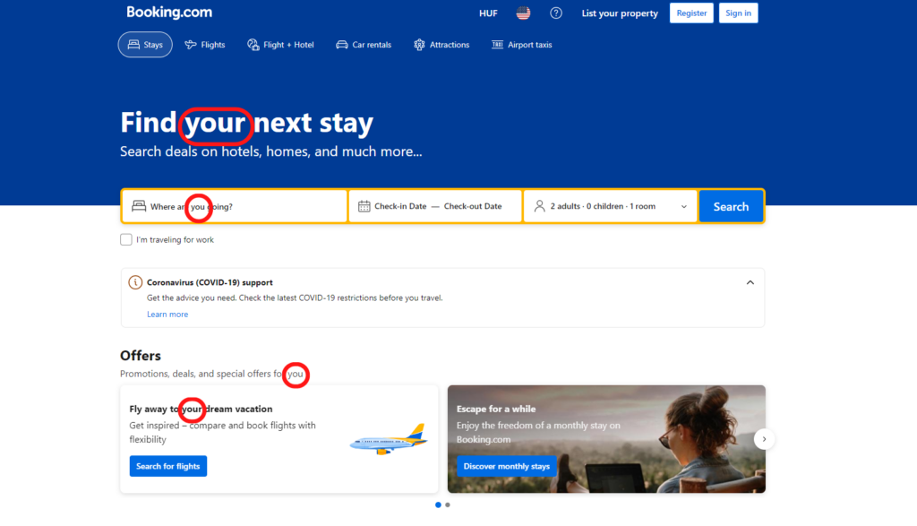
Using a “you” format
On our blog, we have already mentioned several times that using a “you” format in your texts and on your page gives a positive impression to your visitors. They can feel that the main character of your site is them. And that everything you do is for their satisfaction (and for the improvement of your conversion rates haha..).
Booking.com uses this technique in a professional way:
- Find YOUR next stay….
- Where are YOU going?
- Promotions, deals, and special offers for YOU
- The great getaway, YOUR way
By using these formats the website constantly has a kind of conversation with you.
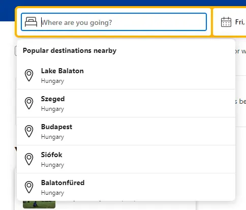
Giving relevant suggestions in the search bar
Another thing worth mentioning is that they are giving you relevant suggestions in the search bar. The website automatically recognizes your location and gives you destination recommendations that are close to you: “Popular destinations nearby”.
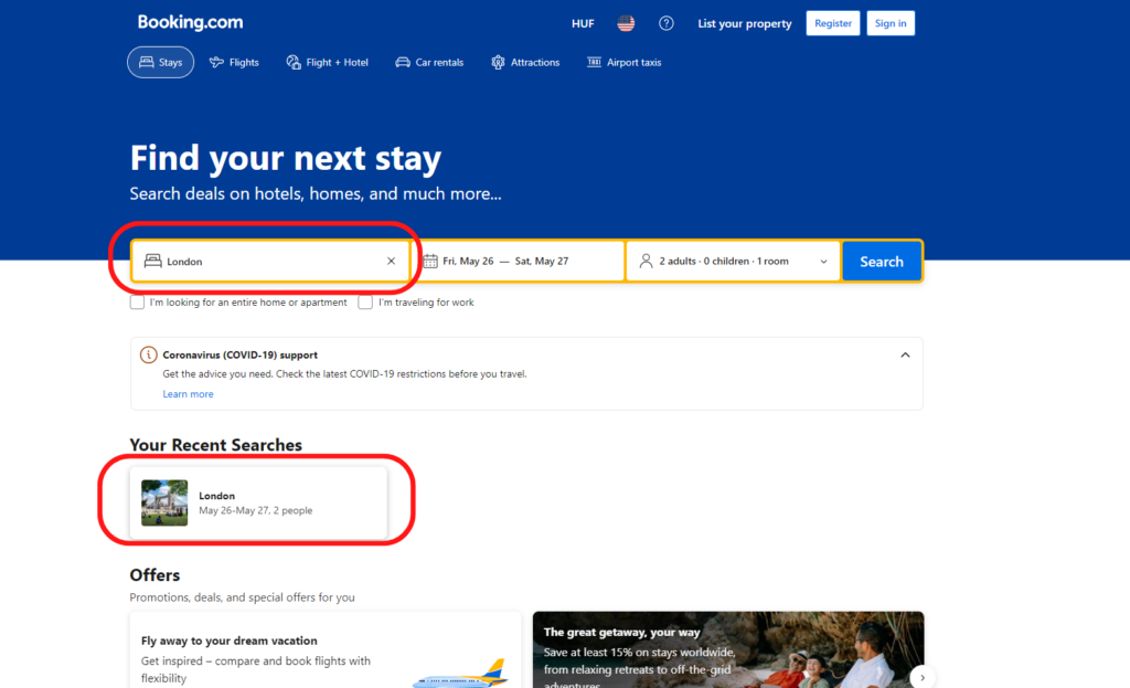
Retaining search query
This technique is a valuable conversion rate optimization (CRO) strategy utilized effectively by numerous websites. Its utility is evident when you visit Booking.com, where your most recent search is automatically recalled upon loading.
Such a strategy bolsters conversions by eliminating the need for users to recollect their searches, thus enhancing the convenience of their browsing experience.
After analyzing what Booking.com uses effectively let’s talk about the CRO practices that they don’t really use effectively!
Navigation buttons remain static
A quick glance at their homepage reveals that as you scroll, the navigation menu remains static and does not accompany you. As a CRO expert, I can affirm that keeping the navigation menu omnipresent is a superior strategy from a CRO perspective.
This approach ensures visitors can navigate and locate their desired information no matter where they find themselves on your site. They might scroll down and encounter an intriguing destination idea, and thanks to a readily accessible drop-down menu, current prices are always just a click away.
The color of the CTA doesn’t change while you are scrolling
An additional observation is that the color of their Call to Action (CTA) buttons remains consistent, even as you scroll down their site. However, changing its color while the visitor is scrolling down is a missed opportunity!
Strategically changing and moving elements on a website can greatly enhance user experience, improve engagement, and ultimately boost conversion rates. So I advise you (not like Booking did) to take every opportunity you can to use this strategy!
This approach to design, often overlooked, can significantly impact user engagement and conversion rates. A constant color for CTA buttons aids in maintaining visual consistency, which is a vital aspect of user interface design.
However, by employing dynamic color changes for their CTA buttons as users navigate the site, they could draw more attention to their primary CTA.

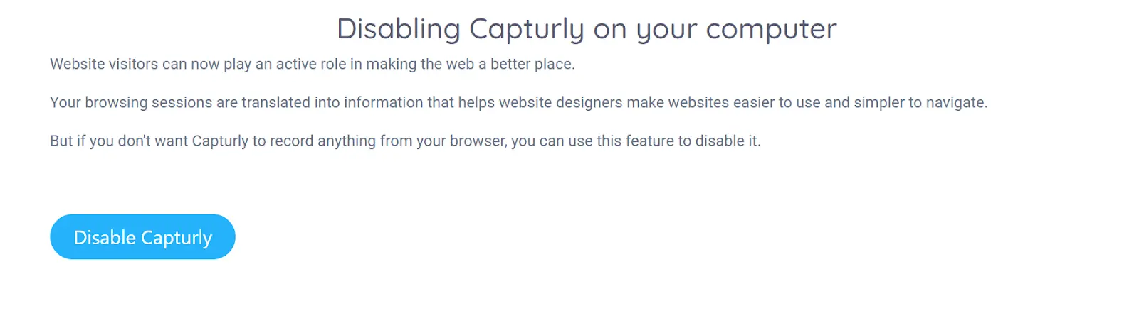
Let’s see a good example of moving and changing elements on the website of Capturly!
However Capturly is not a travel site, I thought it’s worth mentioning how amazingly the site is utilizing moving elements. As you can see even in the first image there are moving elements that can raise the attention of the visitors and keep them scrolling towards maybe a conversion.
As you navigate further down the page, you’ll notice floating elements that maintain engagement and encourage continuous scrolling. Another noteworthy feature is the call-to-action (CTA) button at the bottom of the site. While its color remains constant, there’s a subtle yet captivating change in the button’s background when you hover your cursor over it. This can enhance user interaction and engagement, potentially increasing the likelihood of the visitor performing the desired action.
Okay now that we have checked the world of accommodations with a tiny look at Capturly’s solutions let’s go into the air and check the webpage of an airline, Delta.
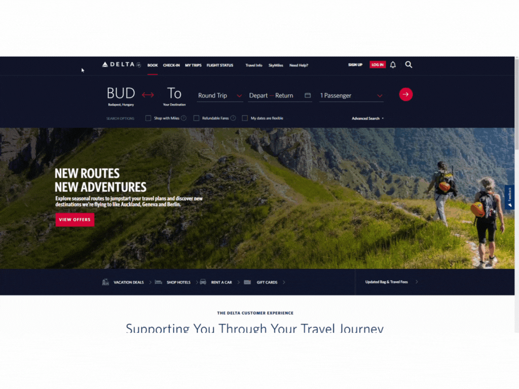
Delta
Delta is a popular global airline that serves 200 million travelers’ needs. That is the main reason why is it crucial for them to have an effective website.
Purchasing by the use of your miles
Airlines like Delta globally transform traveler engagement by utilizing innovative air miles purchase strategies.
One of the primary advantages is that it alleviates the potential discomfort associated with paying for travel. The sting of spending significant amounts of money on tickets is mitigated when customers have the ability to pay using their accumulated air miles, thus shifting the perspective of cost from a burden to a reward.
Moreover, this strategy fosters customer loyalty by incentivizing people to consistently choose the same airline for their travel needs. That is why this method absolutely serves conversion rate optimization purposes.
Illustrating humans in the pictures
On the homepage of Delta, the company illustrates 2 people who are hiking in a beautiful landscape.
Just imagine having to choose between two websites. One incorporates a picture of a person or people, just like Delta does, while the other uses a serene landscape as its visual. Which one would you opt for?
Undoubtedly, the one with a human presence. Why? Because it allows you to put yourself in their shoes, enabling you to experience their feelings.
Take, for instance, the homepage of Delta, featuring a photograph of these 2 people. Instantly, you can feel the fresh air and feel an intense desire to be in their place.
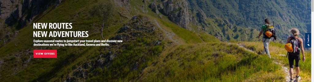
What would you do? You would instinctively search for the nearest mountain to fly there on the appropriate website you are already on Delta.com!
It could be an even better practice to indicate the happy and satisfied place of these people. Highlighting the facial impressions can have an even bigger effect on the feelings of the visitors.
Keeping the navigation menu
Unlike Booking.com Delta keeps its navigation bar. This is a good practice because this way visitors can book a flight or check-in anytime they want or anytime they got convinced.
Tripadvisor
Let’s check the CRO practices and strategy of another popular travel site, TripAdvisor!
Usage of nudges
Is “nudge” an unknown word for you? Let’s check what is that exactly!
“Nudge refers to a prompt or reminder designed to encourage a user to take a specific action or engage in a particular behavior. Nudges in business capitalize on psychological biases to sway purchasing decisions while creating a sense of naturalness in the buyer’s choice.”
So let’s see where TripAdvisor uses this nudge marketing strategy in order to increase conversions and sales!
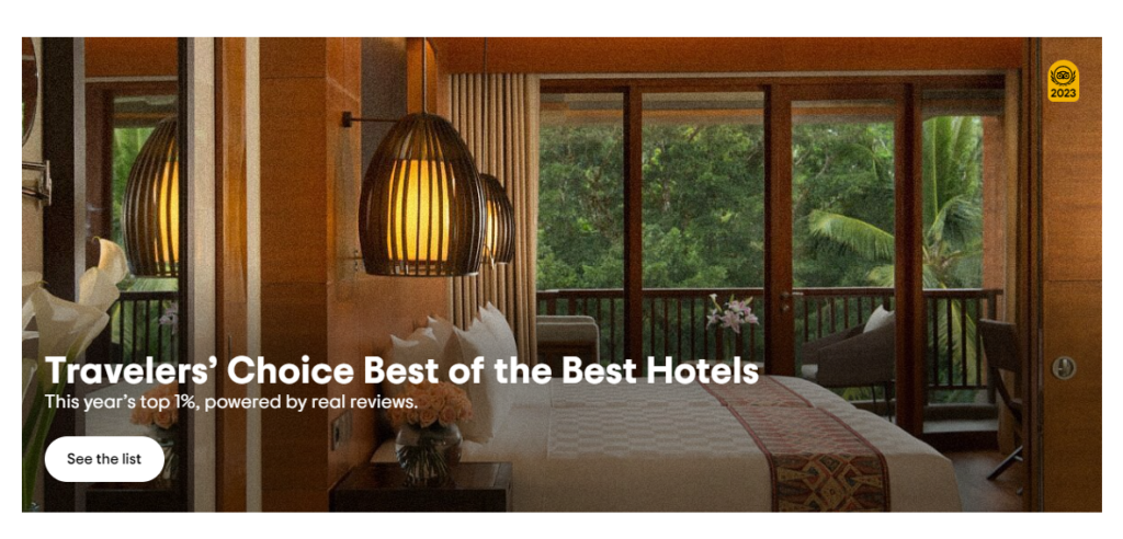
The text on TripAdvisor “Travelers’ Choice Best of the Best Hotels: This year’s top 1%, powered by real reviews” is considered a nudge because of several factors:
- Appeal to authority: The phrase “Travelers’ Choice Best of the Best Hotels” suggests that these hotels have been chosen and endorsed by travelers, an authority when it comes to hospitality reviews. This positions the hotels as highly rated and trustworthy, influencing the reader to consider staying at one of these locations.
- Scarcity bias: By highlighting that these are the “top 1%” of hotels, this statement triggers scarcity bias. People tend to place a higher value on items or opportunities that are scarce or exclusive. Knowing that these hotels represent such a small percentage of all available options may push people to act promptly to secure a reservation.
- Social proof: The phrase “powered by real reviews” leverages social proof, a psychological phenomenon where people assume the actions of others in an attempt to reflect correct behavior for a given situation. In this context, it suggests that many others have stayed at these hotels and had positive experiences, encouraging the reader to do the same.
Building on herding behavior
The sign Traveler’s Choice is also a nudge that TripAdvisor uses on several trips! When visitors are not sure about a decision, they often start copying their environment (other travelers here).
As they make decisions like most people, assuming that everyone else is informed or knows something they don’t – which is usually not the case. This is called a herding behavior, on which TripAdvisors builds by indicating a trip as Traveler’s choice.

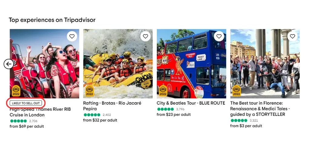
Creating a sense of urgency
When TripAdvisor signals that a trip is “likely to sell out,” they are strategically instilling a sense of urgency in their visitors. By employing this approach, they are leveraging the psychological phenomenon of loss aversion, where the potential pain of missing out on a desirable trip is perceived to be greater than the joy of securing it. This heightened anxiety prompts visitors to act swiftly, with limited time available to book their desired trip.
This concept is intricately tied to the scarcity effect, a cognitive bias where people place a higher value on an object that is scarce, and a lower value on those that are abundant.
TripAdvisor uses this principle to its advantage. When a trip is depicted as scarce or limited, it becomes exponentially more attractive to consumers. This perceived scarcity can increase the demand for the trip, making it seem more exclusive and desirable.
Moreover, the use of real-time scarcity, that is, suggesting that the trip is likely to sell out soon, adds another layer of urgency. It creates a running clock in the mind of the consumer, making them aware that every passing moment could result in a missed opportunity. As such, customers feel more compelled to make immediate reservations, thereby reducing their decision-making time, and potentially increasing conversion rates for TripAdvisor.
Illustrating faces
Contrarily Delta, TripAdvisor does not just show us humans TripAdvisor plays also attention to showcasing the faces of these people. When visitors see the radiant faces of these travelers, they can more readily imagine and sense the emotions these individuals are experiencing on the chosen trip.
Moreover, these images not only serve to enhance the attractiveness of the travel destinations but also to build trust and credibility. Seeing real people, as opposed to professional models or stock images, adds a layer of authenticity to the trips being promoted.
All in all, TripAdvisor uses this tiny psychological trick very well. But let’s see how TripAdvisor performs from a technological point of view.
The navigation bar stays with us
Unlike the other sites, TripAdvisor makes good use of this important strategy because as you scroll down, the navigation bar comes with you. From a CRO expert point of view, it’s a really good practice!

TripAdvisor also has an interesting solution, in that the menu jumps to the top of the page and remains static as visitors scroll. This motion makes the user experience even more interesting.
Testing and optimizing
As you can see, there are several strategies and tips that can help enhance your conversion rate. Carefully examine these and ascertain which can be beneficially applied to your website. Keep in mind that these strategies are not confined to travel websites; they can be effectively leveraged on any kind of website.
When it comes to confirming the effectiveness of your conversion rate optimization (CRO) practices, testing and optimization are key. Consider using a behavioral analytics tool like Capturly to help with this process.
Heatmaps provide an intuitive way to understand what aspects of your site are attracting visitors and what parts may be overlooked. Additionally, session replays offer a unique opportunity to track each visitor’s behavior on your webpage, providing invaluable insights into user experience and interaction patterns.
These insights can guide your optimization efforts, helping you fine-tune your website and strategies to effectively boost conversions and user engagement.
Remember, every website and audience is unique; the key is to understand your specific audience’s behavior and preferences and adjust your strategies accordingly.
Final thoughts
As an expert in Conversion Rate Optimization (CRO), my aim has been to provide you with insightful and practical strategies to boost your website’s conversion rates. Through these examples drawn from various travel sites, I hope I have sparked fresh perspectives for your CRO endeavors.
It’s essential to remember that good CRO practices are a combination of data analysis, creativity, and a deep understanding of user behavior. Successful optimization is not about copying what works for others but about tailoring those principles to suit your website, your offerings, and your unique audience. I hope the strategies discussed here will serve as an inspiration for your own CRO journey.
If you found these CRO practices useful and would like to delve into other kinds of websites (apart from travel sites) leave a comment including your idea for us.