Being an eCommerce business owner or marketer, you know how hard cart abandonment can hit your confidence! Potential buyers habitually tend to back out after proceeding to the payment page.
It’s natural to wonder why the sale didn’t convert, or what made the visitor change the purchase decision even after adding the item to the cart!
Well, did you invest adequate efforts or time to optimize your checkout process? E-commerce businesses usually focus on navigation, design, interface, and user experience. Amidst all these responsibilities, it’s easy to overlook the checkout optimization process. If customers encounter certain hurdles during their checkout process, they’re likely to repent the cart abandonment.
This implies that you need to optimize your buying procedure to enjoy better odds of making a sale.
Table of Contents
What does checkout process optimization mean?
When you optimize your checkout procedure, you deploy a strategy to boost the conversion rate of your online store. The core objective for getting your checkout process optimized is to reduce distractions for buyers. Besides, a seamless optimization mechanism ensures that buyers would the purchase would be backed by trust.
As many as 17% of online shoppers abandon carts just because the process of checking out is too complex. Unless you optimize your procedure of buying, the default process of checking out may not serve the interest of your customers.
Remember, strategies like upselling and cross-selling take place during the checkout flow. By optimizing the checkout process, online marketers can boost the average order value (AOV). Therefore, when you optimize your checkout process, your brand remains well-poised to earn more revenue.
Optimize your checkout process to reduce cart abandonment
Do you know that the average cart abandonment rate on eCommerce sites is 69.8%? This means you’re losing more than half your potential customers just because your checkout process isn’t streamlined.
Failing to optimize your process of purchase discourages potential customers to order a product in which they are genuinely interested. When someone added the product to the cart and proceeded to the ordering procedure, there was a purchase intent, right? So, what’s holding the customer from making the payment or ordering the product? Maybe your buying process is slow or cumbersome, which means you should optimize it. Even small errors in UX design can lead to cart abandonment.
Have a look at the prime reasons leading to cart abandonments.
To sum up, let’s evaluate the key reasons that lead to cart abandonment. Once you’re aware of these hurdles in your buying mechanism, you can optimize your checkout process.
- Lack of transparency
- Forced creation of accounts
- Complex or long payment procedure
- Load time and performance issues
- Errors like website crashes
- Few payment options
- Website security concerns
- Long delivery period
- No return policy
- Credit card declines
11 ways to optimize your checkout process to increase sales
Be transparent with pricing
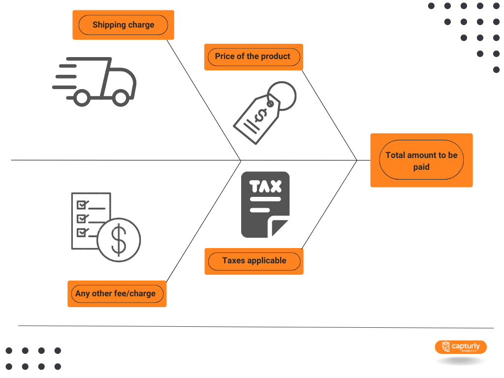
Surprise costs like product packaging, handling fees, taxes, and shipping charges constitute the top reason for cart abandonment. As we presented in the infographic, the lack of transparency leads to 48% of cart abandonment incidents.
So, when you optimize your buying process, make sure to remain transparent with pricing. List all the applicable charges upfront, providing a potential buyer with a comprehensive idea of the total amount to be shelled out. An informed buyer is less likely to get bad surprises, thereby increasing the possibilities of sales.
Present a cost breakup before the buyer proceeds to the checkout procedure, including the following:
- Price of the product
- Taxes applicable
- Shipping charge
- Any other fee/charge
- Total amount to be paid

Keep potential buyers informed about the overall amount to be paid right at the outset. With each additional cost, the chances of a customer purchasing a product decline.
Show progress or checkout flow
One of the best strategies to optimize your checkout process is to display the checkout flow. Integrate the process with a progress indicator, which would enable your customers to track where exactly they are during the procedure.
Right from selecting an item to finishing the purchase, your shoppers land on several pages as the checkout process progresses. To improve the user experience, make sure to inform them of the exact stage they are in while making the purchase.
Your progress bar should display the following details to your customers.
- The checkout flow enables shoppers to check the number of steps already covered.
- Customers can see the number of steps yet to be completed.
- It should give them an idea of the tentative time needed to complete the payment.
- A progress bar also guides the shoppers regarding what they should expect during the checkout procedure.
This way, potential buyers remain informed about the processes to be completed before they successfully place the order.
Allow guest express checkout
Do you know that customers purchasing from mobile handsets are 1.2 times more likely to opt for guest checkouts rather than logging into their accounts?
Of course, eCommerce marketers would like to acquire repeat customers. However, this shouldn’t prompt them to complicate the checkout procedure. As we mentioned, forced account creation contributes to 24% of cart abandonment cases. So, don’t force one-time buyers to create accounts. Offer an express checkout process to visitors, so that they don’t need to create an account to purchase your merchandise.
As you optimize your process of payment, make the website friendly to both guest buyers as well as repeat customers. One-time customers should enjoy a single-click buying experience. They simply need to furnish their credentials related to billing and shipping before making the payment to complete the purchase. Don’t force them to fill up forms, or provide their password or date of birth. Besides enhancing your customer experience, you can boost your conversion rate.
Provide multiple payment options
Optimizing your checkout process remains incomplete unless you provide multiple payment options to your customers. As you scale up your eCommerce business and target new demographics, make sure that the lack of payment methods doesn’t turn out to be an obstacle during the checkout procedure. Customers should enjoy adequate flexibility to make payments at their convenience.
Often, customers tend to be particular about how they make the payment. Whether it’s for security purposes, discounts, or any other reason, a potential customer may proceed to purchase only when his/her preferred payment method is available on your site.
Digital wallets, credit cards, and debit cards are currently three of the most popular payment methods across the globe.
So, when you try to optimize your checkout process, make sure to include as many payment options as possible in your payment gateway. This should include:
- Debit and credit cards
- Digital wallets like Google Pay, Apple Pay, and Samsung Pay
- Shopping apps like PayPal and Shop Pay
- Buy now pay later options
Optimize your eCommerce website for mobile-friendly UX
Around 72.9% of all eCommerce customers access the internet through mobile devices. So, when you advance your buying process, prioritize mobile users. Failing to streamline the checkout process for mobile-friendliness would lead to lost customers and revenue.
Do you know that more than 187 million global eCommerce customers are likely to engage in online shopping through mobile handsets by 2024? The estimated spending would be tentatively around $621 billion. As you optimize your checkout process for mobile users, take care of these aspects:
- Ensure faster page loading speeds by minimizing codes.
- Get a responsive design for your eCommerce site to make it compatible with different screen sizes.
- Enlarge buttons like ‘checkout’ and ‘add to cart’ to make them finger-friendly.
- Incorporate collapsible menus to reduce scrolling and save space.
- Wherever possible, provide the auto-fill feature and reduce the number of forms.
- Provide payment options specific to mobile devices, such as scanning through mobile cameras.
- Optimize your payment procedure so that the app remembers the data of customers.
Remember, customers explore new products during their leisure hours using their mobile devices. The more you optimize your checkout process for mobile users, the better experience potential buyers will enjoy.
Integrate live chat support option
Concerned shoppers habitually tend to be inquisitive about their next purchase. Given that eCommerce websites lack the human touch that buyers enjoy in physical stores, they look out for responsive customer support. Successful eCommerce brands integrate a live chat support option throughout the checkout flow. This way, you can optimize your checkout process and prevent potential customers from exiting.
Often, customers like to talk to agents and gain clarity about product guarantees, return policies, and other particulars. Forward-thinking eCommerce brands are largely counting on AI-backed chatbots to simplify the procedure. Around 41% of online shoppers made their purchases after using these tools. Besides, 70% of customers use chatbots for communicating with eCommerce brands.
You may even consider providing voice assistance to customers to optimize the process. This way, they can resolve their queries about product size, return, and shipping. Most importantly, the human essence through live chat support reinforces trust among online shoppers.
Display security badges and seals
Online shoppers tend to be skeptical while purchasing products from new eCommerce sites on security grounds. To win their confidence, display the security badges and seals of your portal throughout the checkout process. Customers trust eCommerce sites offering a transparent and safe payment mechanism. When you optimize your checkout process with security badges and seals, you can reinforce this confidence in their psychological space.
Some of the commonly displayed security badges and seals on eCommerce platforms include:
- Antivirus software logos
- SSL certificates
- Money-back guarantees
- Customer reviews
- Payment badges
With these elements, your eCommerce portal would look visually secure. This triggers a sense of confidence, prompting the visitor to proceed with the purchase process.
Simplify the checkout process
Remember, you are losing 17% of your potential customers simply because your checkout process is too complicated. Make sure to make your checkout process clear to reduce these frictions from the purchasing flow. These guidelines will help you streamline your checkout process to simplify the users’ experience.
- Do away with additional steps and include a few custom fields that you feel are essential. Try not to consume the extra time of your customers by requiring them to furnish unnecessary details.
- The password manager or browser should be retrieving stored data of users. Deploy auto-fill forms to utilize this stored data in the billing and shipping sections to reduce the checkout time.
- Optimize your checkout process by using an address predictor tool so that the user can automatically detect zip codes and addresses.
- Allow customers to preview their orders by integrating a ‘cart summary’ feature on the page for confirming orders.
- The pages with information on the shipping method should be self-explanatory.
- Retain customer data to optimize your payment procedure for repeat customers. They wouldn’t like to furnish the same details time and again.
- Don’t present complicated password requirements if you do want your visitors to create an account before the checkout process.
- Do away with distractions on the payment page and display the CTA buttons prominently.
- Make sure to maintain a neat website design, so that customers manage to retain track of their progress.
- Rather than completely losing cart-abandoning visitors, it’s logical to convert them to your email subscribers. Include an exit popup, so that these visitors continue to receive your newsletters and emails.
If your eCommerce site currently lacks any of these features, tweak them to optimize your buying procedure to ensure better CX.
Also if you would like to test how effective your checkout process is, Capturly’s session recordings feature can be a good choice for you. With the help of this tool, you can see exactly how people behave during the checkout process and you can easily identify and fix issues.
Allow customers to socially sign in
As an alternative route to get your visitors registered, enable social sign-ins. Customers prefer checking into your website using their social media accounts such as Google, Facebook, or Instagram. This would also mitigate complications related to remembering passwords or creating a new account.
Even existing customers would find the social sign-in process helpful. At times, they tend to forget their passwords. The password retrieval process turns out to be tedious, prompting them to switch to a different eCommerce site. However, chances are less that a potential customer would forget his/her Facebook password. Therefore, when you optimize your purchasing process by enabling social login, you don’t end up losing customers.
When someone logs into your eCommerce website using social accounts, your portal can capture the email address. As soon as the person signs in, the automatic mechanism verify their identity. So, they need not fill up the address fields since they get auto-populated.
Ultimately, your goal is to boost customer experience and ensure more sales. Optimize your checkout process with social sign-in options to address both of these priorities.
Count on psychological triggers
Online customers often face a dilemma regarding their purchase decision before ordering the product. They tend to think about whether it’s worth forking out money for the product, whether it would be safe, or whether the product is really needed.
Each time your customer hesitates to make the purchase, the chances of cart abandonment increase. This explains why you need to optimize your checkout process to motivate customers and prompt them to make the purchase.
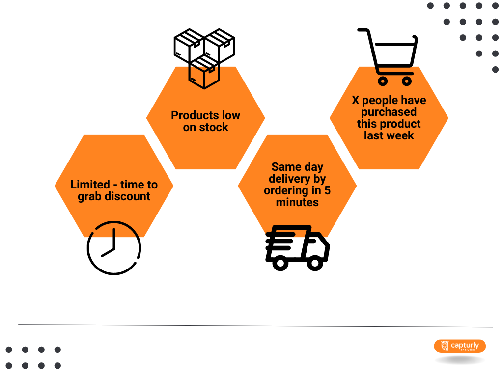
Capitalizing on your customers’ psychology, create a sense of urgency. When you nudge potential customers to reply to all their doubts in the affirmative, they complete the purchase.
When you optimize your checkout procedure, include psychological triggers like:
- Limited-time deals to grab discounts
- Products low on stock
- Get same-day delivery by ordering in 5 minutes
- 91 people have purchased this product last week!

Effective social triggers would counter the hesitation that crops up in your buyers’ minds. This way, you can reduce cart abandonment and pacify the payment.
Cross-sell and upsell products
Providing customized product recommendations to your customers can also advance your ordering process. Rather than considering these strategies from your sales perspective, consider providing personalizing the experience of your buyers. With thousands of products available to choose from, customers often find it difficult to find the exact requirements.
Apart from leveraging your sales, cross-selling and upselling products ensure that customers find products relevant to them. At the same time, you can increase your revenue as people spend more on your eCommerce portal.
When a potential buyer adds a product to the cart, your cross-selling apps suggest related products. For instance, a buyer shopping for tablespoons from your site is likely to purchase a spoon holder too.
On the other hand, upselling involves recommending higher-priced merchandise just like the one someone already has in the cart. This way, you can increase the cart value, which translates to higher revenue.
Conclusion
Now that you gained better clarity on how to optimize your checkout process, you would be expecting lower rates of cart abandonment. The checkout flow, security, and ease of making payments define the user experience as they shop from your website. With trust, comes confidence, which serves as the driving force behind your sales!
As an eCommerce merchant, you need to invest a lot of effort and time before a potential customer reaches the last step on your page. Unless you optimize your checkout process, you’d repent your lost opportunities. Ensure a smooth path to converting your visitors to customers and try to retain them to maximize your eCommerce revenue. Test everything to give the best possible to your customers!
Author’s bio

Fahad Khan is a Product Manager and digital marketing enthusiast who works at Ubuy Technologies. Content marketing, PPC, email, and social media marketing are among his areas of expertise. He has been exploring the field of digital marketing to share his pearls of wisdom with the whole world. He enjoys working on different niches and creating valuable content for readers.
Don't forget, sharing is caring! :)

