
Web design is a huge discipline with many schools of thought. You have those who rely on dark patterns to get users to take action, other organizations swear by brutalism. Don’t forget about material design and minimalism.
Whatever school of thought you happen to belong to, there are common web design elements almost every website has. When used properly, they can help increase conversions.
In this article, you’ll get a rundown of what web design elements are and how you can optimize them to increase your conversions.
Table of Contents
What are web design elements
In the context of this article, a web design element is anything a user sees or is able to interact with on a webpage. This definition is purposely broad because it’s important to think outside the box when optimizing your website. A few things to consider are:
- Buttons
- Menus
- Images
- Negative or white space
- Colors
- Textures
- Links
- Etc.
It can be daunting to fine-tune a website to meet your conversion goals. It’s also a must. When you get it right, people are excited to read your content, sign up for your newsletter, and pay for your products.
Everything from the colors you use to the way they’re placed on the page can affect a visitor’s perception of your brand.
In a study by Satyendra Singh, it was found that colors account for 62 – 90 percent of an assessment of people and products.
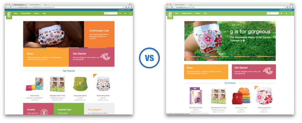
In an interesting case study, gDiaper was able to increase overall site conversions by 20% after adding white space between 2 callouts. The use of those specific elements also increased by 150%.
Even if the changes you make are subtle, they can have a huge impact on your conversions, and by extension, your revenue. Keep in mind that designs may take a bit of work to get 100% right so be sure to implement usability testing with small portions of your audience before rolling out changes sitewide.
Let’s look at 5 elements you can tweak for maximum impact.
Making colors your secret weapon
Color is an important design element. It helps emphasize (or deemphasize) specific areas of the page. For example, a CTA button can pop against the background or blend in. In either instance, it affects your conversions.
Postmates has a CTA button that contrasts with the rest of the page. It draws the eyes and encourages visitors to click.
The first step is deciding on your color palette. What’s your primary color, secondary color, and your accents? Afterward, choose the color you want to use for your CTA buttons. Consider using one CTA button color per page so your visitors know exactly what buttons represent. You might need to revisit your knowledge and take some graphic design courses to stay up to date with the most recent trends in color theory for better conversions
Another strategy is when you have primary actions and secondary actions, using a contrasting color for the primary action and a color that’s not as visible for the secondary action.
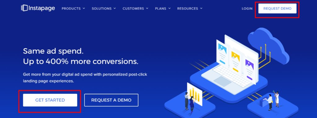
In the example above from Instapage, the main CTA is white and stands out against the background of the page. The secondary CTA only has an outline and blends in with the rest of the page.
Beyond using contrasting colors to emphasize and deemphasize specific actions, it’s important to understand the emotions color elicits in your visitors. Here’s a quick rundown of what specific colors mean and the emotions your visitors may experience.
- Red: danger, passion, and importance
- Orange: confidence, energy, optimism (Note: in some context, orange may denote cheapness so be sure you’re creating the right image before using it).
- Yellow: sun, happiness, attention
- Green: nature, growth, success
- Blue: comfort, relaxation, trust
- Purple: Luxury, spirituality, creativity
- Black: Power, elegance, sophistication
- White: health, virtue, cleanliness
Studies have shown there are further nuances in color preferences based on gender. Both men and women prefer blue while women dislike brown and men dislike yellow the most. Take this information, combine it with the top graphic design trends, and create designs that move your visitors to action.
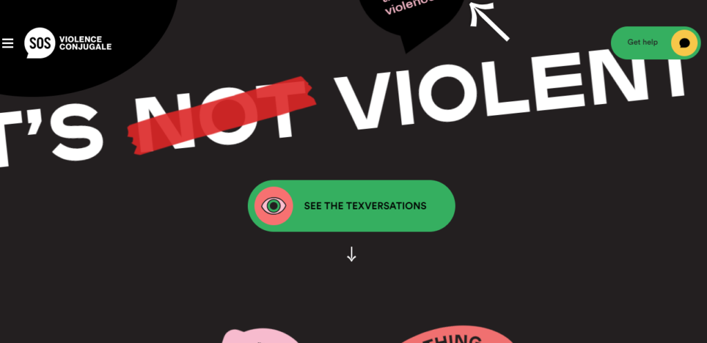
It’s Not Violent uses many colors to emphasize content and lead visitors to the main CTA. There’s red to denote danger and importance. There’s green to emphasize the CTA and let people know they’re clicking for growth. Yellow is also used in the CTA to communicate happiness and attention.
Consider how you can use colors to communicate your messages to visitors and increase conversions.
- Do contrasting buttons work for you?
- Can you use colors to emphasize specific elements?
- Can colors be used to deemphasize elements?
White space and proportions
White space, also known as negative space, is the area between elements. It helps focus attention on the most important aspects of your message. At the same time, it can be used to help with comprehension and retention.
There are two types of white space.
- Macro: This is the space between major elements such as text blocks, buttons, menus, images, etc.
- Micro: Is the space between small elements such as letter spacing and line-height.
White space can also be active and passive. Active white space moves people through a page and draws their attention to CTAs or other elements you want them to interact with. Passive white space occurs without active input from a designer. It tends to form naturally between elements such as graphics and text.
Of course, white space doesn’t have to be white. It’s any negative space (irrespective of color) that doesn’t have another element inside. 
Diana Danieli uses a lot of space between the text elements and the images on the page. It helps the visitor view each part of the page, one at a time, instead of trying to absorb everything at once. The end result is better flow and comprehension.
Another aspect to consider when using space and placing elements is the design and photographic principle called the rule of thirds. It states that images should be divided into nine equal parts by two horizontal and vertical lines. The main parts of the design are placed along the lines, at the intersections, or on either side of the center boxes.
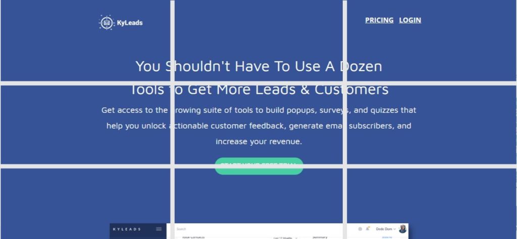
KyLeads’ CTA is on the bottom line in the center of the page. It draws attention because of its position, color, and white space used to emphasize it.
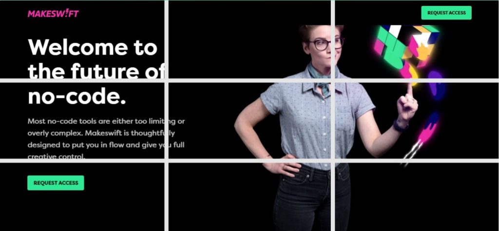
Makeswift has major elements in the top left box and the bottom left box. The text is squarely on the left-hand side and draws the eyes to important information.
Visual hierarchy
Visual hierarchy is a simple concept that focuses on the arrangement of elements so they communicate importance. This is often used on the homepage of websites to communicate a value proposition and identify their target market.
There are many things you can use to create visual hierarchy and communicate a message. A few of them are:
- Size
- Color
- Alignment
- Texture/style
The most common of these factors are size and alignment. At the same time, it’s important to understand how people naturally read pages. In multiple studies, it was found that people consume content in an F-shaped pattern.
You can take advantage of this when placing elements on your page by putting the most important information on the left and making it larger.
In the example from Reform Collective, the most important information is larger and placed on the left. Secondary information is placed on top and other information and imagery are placed below or to the right of the main text.
Consider rearranging your page so the messages you want your visitors to encounter first are on the left, are larger, and possibly have contrasting colors to draw the eye. Whatever you place on the right should support the content on the left of the page.
An interesting benefit of properly using visual hierarchy is increased customer satisfaction. This happens because people are able to find the information they need to make an educated decision without sifting through irrelevant content.
Breaking up forms
Forms are the bread and butter of the digital world. Without them, it’s difficult to capture leads and follow up with contacts to close the sale. It’s commonly accepted that 95%+ or more of your visitors will leave without taking any action on your website. Over 70% will never return.
Forms that capture contact information are an ideal way to stay in contact with visitors, understand them, and ensure they come back or buy from you over time. Not all forms are created equally. One company wanted me to give up all my information just to get a few templates.
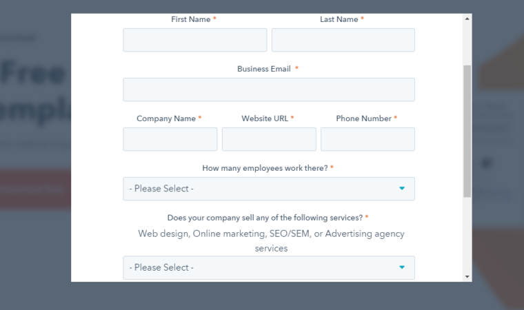
I decided to pass on the opportunity because they wanted too much on the first interaction. The form itself was a bit daunting too. Many businesses need a lot of information to qualify leads but there’s a better way to ask questions and get the information you need.
Multi-step forms
Multi-step forms are simply forms that spread out information collected over multiple steps. They can also ask for consent before presenting the form that’ll be filled out. These are commonly called Yes-No opt-ins.
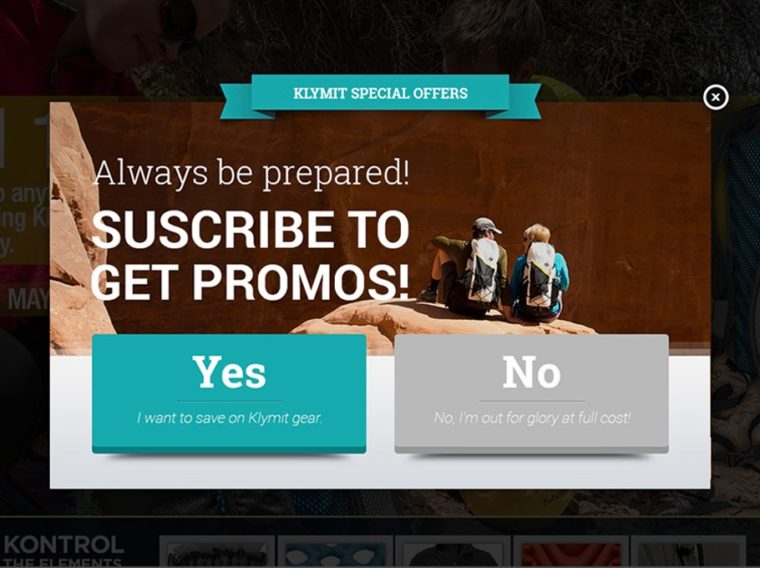
After the positive answer to your initial question, the form appears for them to fill out. Because people have already expressed interest, conversions are higher.
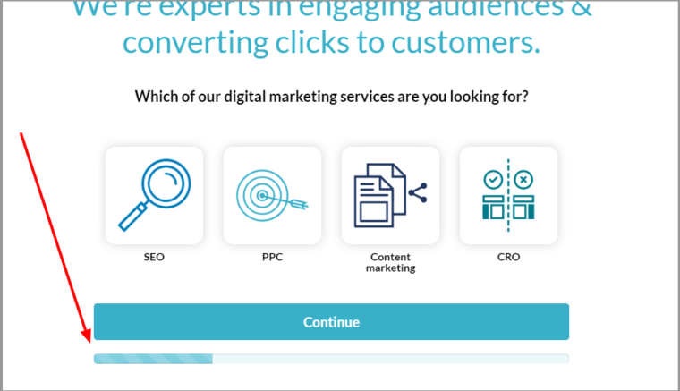
Take it a step further by creating multiple pages or progressive forms that only ask for one piece of information at a time. This prevents your visitors from being overwhelmed by a long form that asks for many pieces of information.
Another effective strategy is to break up the form and show a progress bar. It creates the right expectations for your users and builds a slight sense of accomplishment when they’ve finished.
Visual cues
The last aspect of web design I want to touch on is visual cues (also known as directional cues). These are elements on a webpage that subtly draw attention to important areas. Many things can be used as a visual cue but the most effective ones are arrows or lines and imagery with a clear line of sight.
There are two types of visual cues: implicit and explicit.
Implicit visual cues
Implicit visual cues draw attention based on things like color, shape, or contrast. They’re subtle and tend to be glossed over by visitors and are registered unconsciously. They don’t point at any particular object but can still work well to persuade visitors.
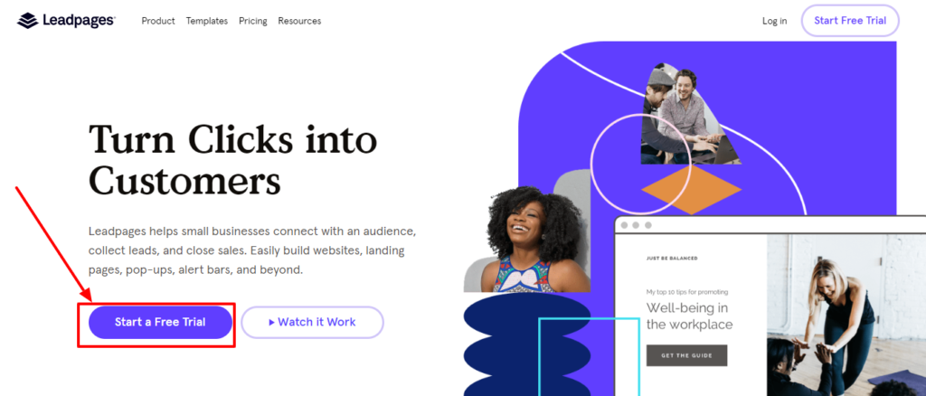
Leadpages uses color as an implicit visual cue to draw users towards the “Start Free Trial” button right above the fold.
Explicit visual cues
People are more familiar with implicit visual cues and if you’ve ever been on the receiving end of a web design proposal then you’ll be familiar with them. Explicit visual cues tend to use imagery, lines, or arrows to draw the attention of the website visitor.
Humans learn to follow the line of sight of others when they’re still children and this quality stays with us as we grow. When you see an image of people looking in a certain direction, you unconsciously follow their line of sight.

In the image from ICMIS, two people are looking directly at the form which ensures visitors will also look at the form.
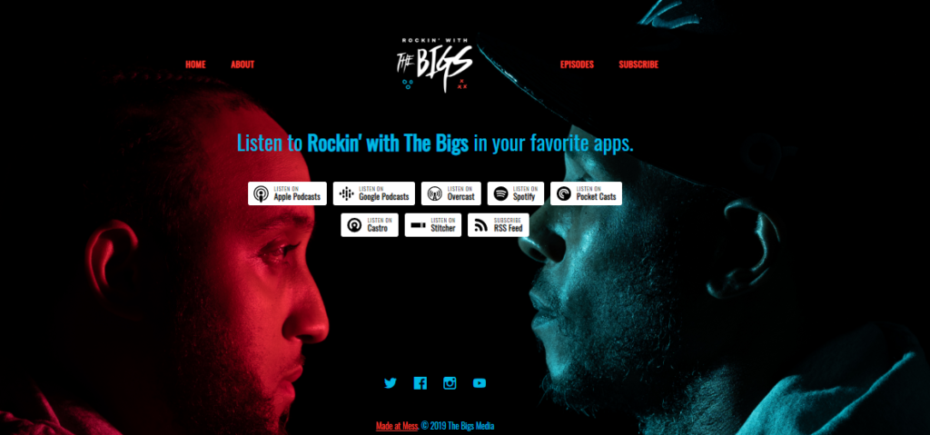
The Bigs is a group of podcast hosts and creators involved in the Chicago sports media scene. Their landing page uses a combination of explicit visual cues, colors, and white space to draw attention exactly where they want it to go.
Arrows are another effective way to take advantage of explicit cues. They’ve even been shown to hold attention longer than a human’s line of sight.
As the example above shows, it doesn’t even have to be a true arrow. It can be a design or graphic that’s pointing directly at the form or CTA you want to draw attention too.
Conclusion
Web design is always evolving. What works well today may not hit the mark tomorrow. This article has gone through five elements you can optimize for any design and increase conversions.
Start with one or two and see how they affect conversions. After you see a positive impact implement the other ones mentioned one by one. In the end, your website will be able to convert a large number of visitors and help you meet your goals.
Let me know what design elements you’re using to increase conversions in the comments and don’t forget to share.