In today’s world, we aim to make websites that look great and are very easy to use. They should match what people want. When you’re making any website, like an E-commerce store or a website for a company, the main goal is to make sure it’s smooth and easy for people to use. And that’s where website heatmaps for UX designers come in!
Now, let’s talk about heatmaps. These tools have revolutionized our UX approach. But, what is the power of heatmaps? They offer a visually striking, data-packed glimpse into how users interact with websites. But it’s more than just numbers – it’s like uncovering a user’s behavior, revealing what users engage with and what makes them feel frustrated.
Heatmaps are like your UX detective tool. They make the complicated actions of users easy to see and understand. This visual data clearly shows what works and what doesn’t on your website. Heatmaps show you everything from the most clicked buttons to the parts of the page people ignore. This helps you design websites that focus more on what users need.
In this article, we’ll explore heatmaps and how they can help you design better websites, especially if you’re a UX designer. We’ll look at some new and creative ways to use heatmaps, different from the usual methods, to come up with fresh design ideas. And finally, we’ll touch on some of the challenges you might face with heatmaps.
Table of Contents
Website Heatmaps for UX designers
As a UX designer, you know the importance of understanding your users. Heatmaps are your go-to for this. They provide a simple, visually appealing way to get the lowdown on how users interact with your site. They highlight what’s working and what needs a tweak. This way, you can make smart, data-driven choices. This amazing tool is key to building websites that aren’t just visually appealing, but truly user-centric. Let’s see how we can use them.
Discover User Interaction Insights
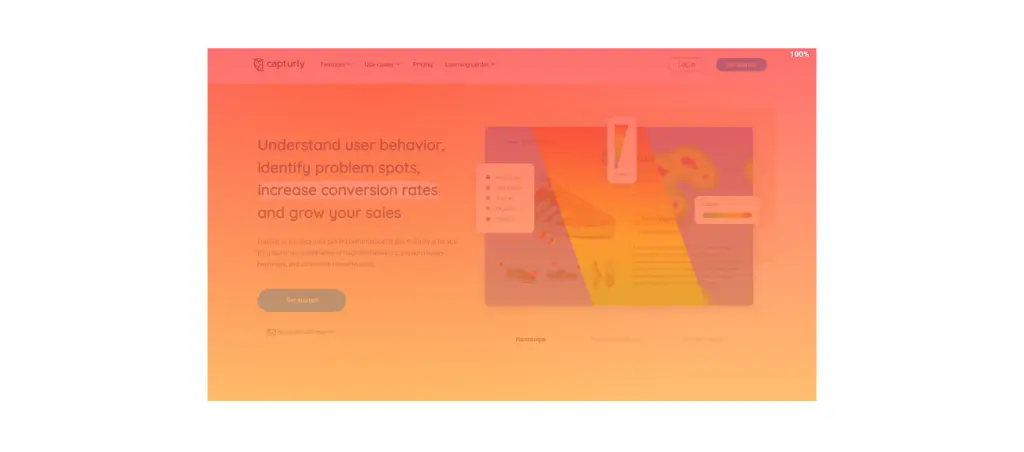
Getting a grip on user behavior is key. Heatmaps for UX designers are your window into this world. Imagine a tool that visually tells you where your users click, hover, or scroll the most. That is exactly what heatmaps do. They turn complex data into a colorful, easy-to-read map of user actions. This is really helpful for checking if your design ideas are good and making sure they work well with how people actually use your website.
Identify Pain Points And Opportunities
Heatmaps aren’t just about what’s working; they’re also about what isn’t. They help you identify the stumbling blocks in your design – those areas where users disengage or get confused.
- Is a crucial navigation element being ignored?
- Are users missing a key piece of content?
Heatmaps lay this all out for you, highlighting areas for improvement. But it’s not all about fixing issues. Heatmaps also show you what you’re doing well, pointing out chances to use things that are working. Seeing both what works and what doesn’t is important for improving your designs to make them as easy to use and effective as possible.
Make Data-Driven Design Decisions
In UX design, your decisions should be as data-driven as possible. Heatmaps provide empirical evidence to support your design choices. They help you stop guessing and relying on personal opinions, and instead base your decisions on actual data from users.
For example, when you implement a redesign, heatmap insights can guide you on what to keep, tweak, or remove.
This helps ensure that your design changes are not just about looking good, but really about making the user experience better. It’s about choosing wisely and knowing what will satisfy your users and make them more involved with your website.
How to Apply Heatmaps in UX Design
In the landscape of modern web design, adopting a user-centric approach is not just a best practice; it’s a necessity. Your focus is on creating experiences that resonate deeply with your users. This means you need to focus on designing with the user in mind and really understand their needs and feelings.
Embracing The User-Centered Design Process
The user-centered design process is a framework that places the user at the heart of every design decision.This process has several important steps, each one helps you understand and meet the needs and actions of users.
- It begins with extensive user research, where you gather insights about your target audience. Who are they? What are their goals, challenges, and preferences? This stage sets the foundation for the entire project.
- Next, you’ll start creating and testing ideas, turning your research into real design plans. This is where your creativity as a designer shines, but it’s crucial to keep the user’s perspective central. Regular user testing and feedback at this stage ensure that your designs are aligning with user expectations and needs.
- Finally, the implementation and evaluation phase sees your designs come to life. But even after your website goes live, focusing on users means you keep checking what they say and do, so you can keep making small, helpful changes. This ongoing process ensures that the website remains relevant and user-friendly over time.

The Importance of Empathy
The heart of user-centric design is empathy. Empathy is your ability to understand and share the feelings of your users. It’s about putting yourself in their shoes and seeing your design from their perspective. This approach is essential for creating designs that are not just usable but also meaningful and engaging.
Empathy in design manifests in several ways.
- It includes thinking about accessibility, making sure your designs work for people with various abilities.
- It means being mindful of cultural nuances and how they might affect user interaction with your website.
- It’s about designing for real people with diverse backgrounds, needs, and experiences.
Using Heatmaps for Website Analysis
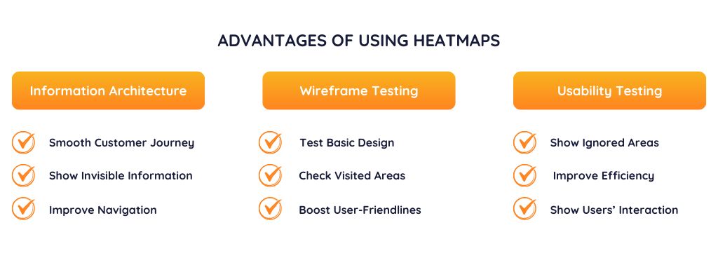
Here are some examples of the use of website heatmaps that can be particularly useful for UX designers. Let’s take a look at them!
Heatmaps in Information Architecture
In the world of information architecture, website heatmaps are a must-have for UX designers. They show you how users really interact with your site’s structure and layout. Understanding this is key for arranging content and navigation, especially focusing on areas that catch the user’s eye.
For example, if a heatmap reveals that users often overlook important info, it’s a sign to move it somewhere more noticeable. Also, heatmaps can show which navigation paths are more user-friendly, helping you make the user’s journey smoother.
In short, heatmaps are really good for making a website layout that makes sense and matches what users do and like.
Heatmaps in Wireframe Testing
Wireframe testing is essential in UX design, and using website heatmaps can really boost its effectiveness. In this step, heatmaps help you clearly see if your basic design and layout are good. You can do this without worrying about the final touches like colors and fonts.
When you use heatmaps on wireframes, you get to see how users are likely to use the core structure of your site or app. This means tracking where they click, how much they scroll, and which parts of the page grab their attention the most.
These insights let you tweak your wireframes to match real user behavior. This makes sure the base layout is user-friendly and easy to understand before you dive into the more detailed design elements.
Heatmaps for Usability Testing
Usability testing is about figuring out how easily and quickly people can use your website or app. Heatmaps are really helpful for this. They show you in pictures how people use your site during tests. This way, you can see which parts work well and which parts might be confusing or slow for users.
For example, if a heatmap shows that users keep clicking on things that aren’t clickable, it’s a hint that you need clearer visual cues.
Or, it might point out that important content is getting ignored, meaning you should make it stand out more. When you use heatmaps in your usability testing, you get real data on how people use your site. This helps you make changes that improve the whole experience for users.
Just to give you one example of one of the best heatmap tools, let me introduce to you Capturly. Capturly offers 3 types of website heatmaps for UX designers:
- Click Heatmaps
- Scroll Heatmaps
- Segment Heatmaps
One of the biggest advantages of Capturly is that you can create different segments to monitor and analyze your audience. You can set up segmentations based on the device they use, or based on country, for example. This ability allows you to identify differences and help you improve your performance with the critical groups of users.
Fortunately, Capturly offers you a free plan, and you can also try its 14-day free trial.
Out-of-the-box Usage Options of Heatmaps
In the following points, I will highlight some use cases that you may not have in mind. These creative ways to use heatmaps can help you deliver an exceptional user experience in some special cases.
Comparative Analysis Across Devices
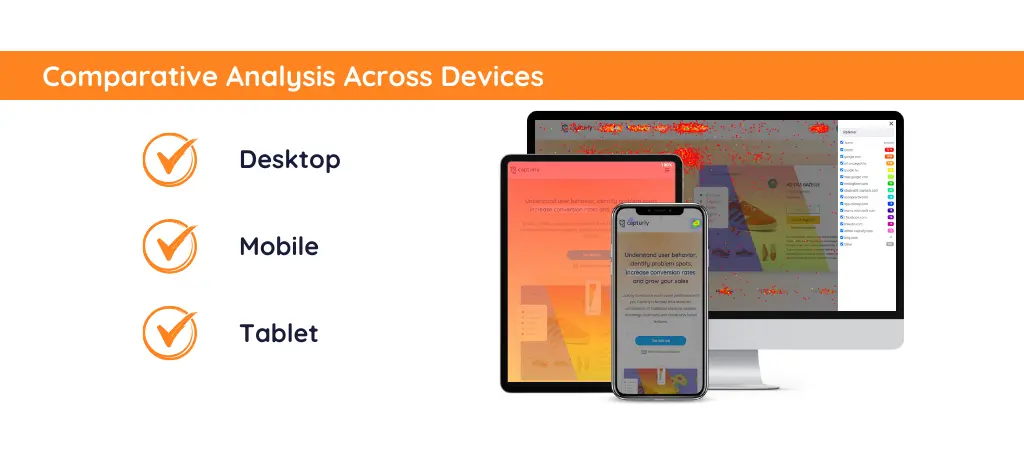
We often use heatmaps to understand behavior on a single device type. A smart idea is to look at heatmap data from different devices like phones, tablets, and computers for the same website. This can show how people use the website differently on each device. Then, you can make special design improvements for each type of device.
A/B Testing for Storytelling Elements
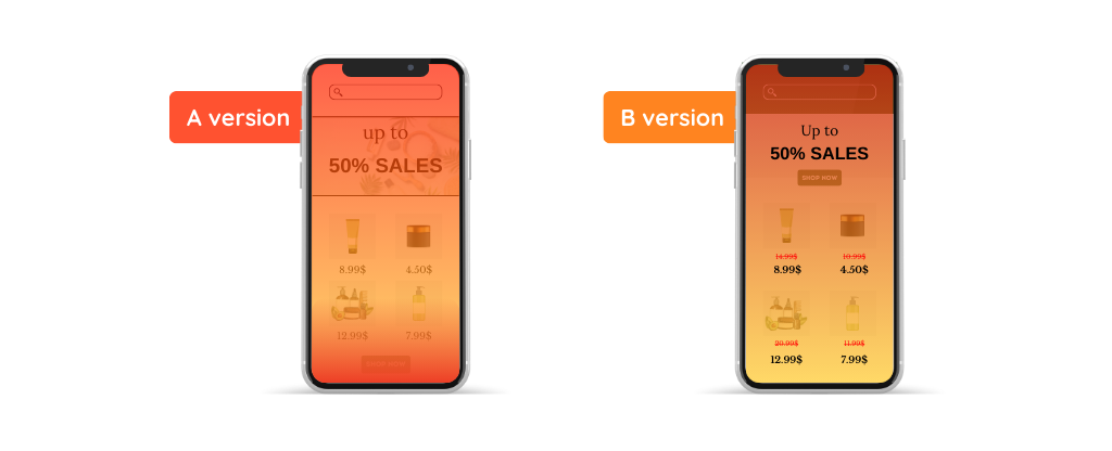
Heatmaps are commonly used in A/B testing for functional elements like buttons and menus. However, heatmaps can also be very useful for testing different ways of telling stories, like seeing how users interact with various types of content, such as:
- videos
- infographics,
- text blocks
This can guide you in creating more engaging and impactful narrative structures on web pages.
Accessibility Enhancements
You can use heatmaps to improve website accessibility for users with disabilities. For example, studying how users with limited movement use a website can help you decide how big and where to place interactive elements. Also, learning how users with thinking difficulties move around a site can lead to layouts and content that are easier to understand.
Cultural Usability Analysis
You can use heatmaps to study how users from different cultural backgrounds interact with a website. For example, cultures with different reading patterns (left-to-right vs. right-to-left) might show varied heatmap patterns, guiding designers in creating culturally adaptive designs.
Gamification Strategies
For websites with game-like parts, heatmaps can be used to see how users play with these features. This helps understand what makes these parts fun or not fun for users. This could be particularly valuable in e-learning platforms or loyalty programs.
Challenges And Considerations
Now, we know how many fields we can implement our heatmaps. In the following, I will highlight some advice and considerations you might find useful. Also, I will draw your attention to those factors that might limit the usage of heatmaps.
Limitations of Heatmaps
Heatmaps are a powerful tool in the UX designer’s arsenal, but like any tool, they have their limitations. Understanding these limitations is important for using heatmaps well and reading their data correctly. Two main areas where these limits show up are in how big the group of users is and how the data is shown, and in figuring out what users really want to do.

Sample Size and Data Representation
Heatmaps are awesome tools, but one big challenge is making sure you have enough data. The best website heatmaps work when there’s tons of user data. If your sample size is too small or doesn’t really represent all your users, your heatmap might give you the wrong idea about how users behave. This could lead to decisions that aren’t actually relevant.
For example, a heatmap based on just a few users or a specific group might show things that don’t match up with what most users do or need.
Another thing to remember is how heatmaps simplify user actions. They usually show data from lots of users all mixed together, which might hide the unique ways each person uses your site. This means you could miss out on some less common but important behaviors that really tell you what users experience.
💡 Pro tip: With Capturly you can analyze your audience separately based on many factors.
Interpreting User Intent
Another big challenge with heatmaps is understanding why users do certain things based on their clicks, hovers, or scrolls. Heatmaps show where users click or move on a page, but they don’t automatically tell you why users take these actions.
For example, a high number of clicks in a particular area could indicate interest, but it could also signify confusion or a lack of clarity in the design.
Also, parts of a page where users aren’t active might seem less important, but they might be doing their job just fine without needing users to interact with them a lot.
This limitation means that heatmaps should not be used in isolation. To really understand what users want, you should use heatmap data along with other forms of user research, like talking to users, running surveys, and usability tests. These methods give you more detailed information to know why users do what they do, as shown in heatmaps. This leads to a better and more complete understanding of how users act and what they like.
Now, let’s see what else you should keep in mind when deciding to implement heatmaps on your websites.
Ethical Considerations
Using heatmaps brings up important ethical issues, especially about keeping user information private and secure. It’s crucial to handle these issues well to keep trust and honesty in the design process.

User Privacy
Privacy concerns are at the heart of ethical considerations when using heatmaps. It’s essential to ensure that users are aware of and consent to the data being collected. This openness can be reached by having clear and straightforward privacy policies and user agreements. These should clearly explain how heatmap data is gathered and used.
💡 Note: it’s crucial to ensure that heatmaps do not capture sensitive personal information.
Making data anonymous should be a standard practice. This means making sure that heatmap results don’t show or record any information that could identify a person. This approach respects user privacy while still providing valuable insights for UX designers.
Data Security
Keeping your users’ data safe is just as important as respecting their privacy. When you use heatmaps, you’re gathering a ton of info, so making sure it’s secure is a top priority. You don’t want any data leaks or misuse. This means you’ve got to have strong security in place. Think about secure ways to store data, encrypt it when you send it around, and do regular security check-ups to stay safe.
Also, there should be clear policies and protocols for data handling and retention. This includes determining how long the data is kept, who has access to it, and how it is disposed of when no longer needed.
Combining Heatmaps with Other UX Research Methods
As I have just mentioned, heatmaps have their limitations. I have to admit that sometimes they work better when combined with other analytics tools.
Heatmaps Combined with Traditional Analytics
When you combine heatmaps with regular analytics, you get a full picture of how your website is doing and what users are doing on it. Regular analytics give you numbers like how many people visit a page, how long they stay, if they leave quickly, and how often they do what you want them to do. Adding heatmap information to this tells you not only what users do on your site, but also how they interact with certain parts of it.
For instance, traditional analytics might show a high bounce rate on a particular page. Heatmaps can add context to this data by showing you where users are clicking or how far they are scrolling before leaving the page. This combination allows you to pinpoint specific areas for improvement.
💡 Note: Perhaps users are not engaging with key content because it’s placed too low on the page, or maybe a high-click area is not yielding conversions due to unclear call-to-action.
Integrating heatmap data with traditional analytics also helps in making precise, informed changes that can significantly improve user experience and website performance.
Luckily, apart from heatmaps, Capturly provides you with traditional analytics features too. Moreover, you can try its real time analytics which shows you immediately the results after you implement changes on your website.
Heatmaps Combined with Surveys
Pairing heatmaps with surveys adds a qualitative dimension to the insights gathered. While heatmaps show where users click, move, and scroll, surveys provide direct feedback on why users make these choices.
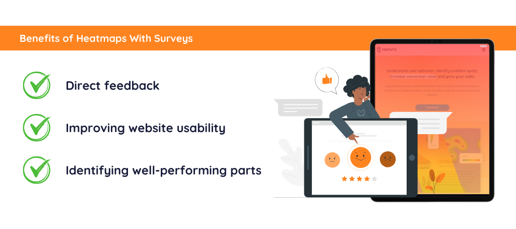
For example, a heatmap might reveal that users frequently interact with a specific feature on your website. Following this up with a survey can uncover users’ thoughts and feelings about this feature – do they find it useful, confusing, or in need of improvement?
Also, if a heatmap shows parts of your site that don’t get much attention, surveys can help figure out if it’s because people aren’t interested, can’t see it well, or for other reason.
When you use these tools together, you find out not just what parts of your design are good or bad, but also get useful ideas on how to make your website easier to use and more attractive, based on what users tell you.
Don’t worry, you never have to guess again, since Capturly’s survey feature will help you understand your users perfectly.
Conclusion
Alright, let me share my final thoughts with you. We’ve seen just how crucial website heatmaps are in UX design, revealing what users love and where they get stuck. Whether it’s organizing your site, testing wireframes, or running usability tests, heatmaps are your key to success.
Now, here’s a friendly nudge for you: start weaving heatmaps into your workflow.
They’re not just cool tools; they’re your guide to creating user-friendly, well-performing websites and apps. Remember, the goal is to make things easier and more enjoyable for your users, and heatmaps are a big help in getting there. So, go ahead, give heatmaps a shot and enjoy the benefits of them.
Don't forget, sharing is caring! :)


2 Comments
geometry dash meltdown
2023-12-06 at 09:22Heatmaps can add context to this data by showing where users click or how far they scroll before leaving. This combination allows you to identify specific areas for improvement. thanks for sharing
snow rider 3d
2023-12-20 at 08:46Regular user testing and feedback at this stage ensure that your designs are aligning with user expectations and needs.