
Regarding conversion rate optimization, the appearance of your product page plays a crucial role in influencing customer decisions. This stage often becomes the make-or-break moment for potential buyers, as it is where they ultimately determine whether or not to proceed with a purchase from your webshop.
A well-designed and strategically crafted product page holds the power to sway potential customers toward making a purchase. It serves as a critical touchpoint, presenting your product’s value proposition, features, and price in a clear and compelling manner. A visually appealing and user-friendly layout can instill trust, enhance credibility, and create a positive impression, ultimately boosting conversion rates.
In this article, we will cover 13 tips on improving your product page and with that increase your conversions!
How do you know that something is wrong with your product page?
First, a crucial question to address is, how can you determine if there’s an issue with your product page itself? The solution is straightforward – check the bounce rates!
You might be losing potential customers, but how can you ascertain if your product page is the culprit? Look into the bounce rate of that particular page!
If you observe a high bounce rate, it’s likely that the problem lies there. If you’re unsure of the root cause, a valuable approach could be to utilize behavioral analytics tools such as session replays or heatmaps.
What insights can these tools offer you? Nearly everything! With heatmaps, you can gain an at-a-glance view of your visitors’ behavior. Session replays, on the other hand, allow you to analyze individual users and identify any bugs and issues they encountered.
Tips on how to improve your product page
In addition to behavioral analytics tools, your product page can be significantly enhanced by utilizing some of our tips and tricks. Implementing these suggestions could elevate the overall quality of your product page, leading to a higher conversion rate.
Structure of the site
The structure of your product page is key as it is the base of everything. That is why you should pay particular attention to it!
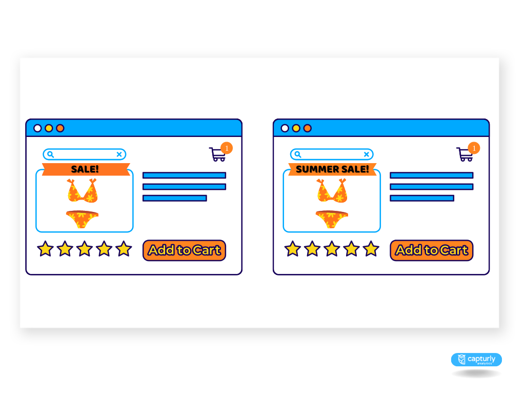
Use a unique product name
Use the most descriptive product name possible. These make it easier for your visitors to find your product as you provide them with the most accurate search keywords about it.
Let’s say you’re selling a handcrafted, full-grain leather wallet. Instead of simply calling it ‘Leather Wallet’, go for a more expressive name such as ‘Handcrafted Full-Grain Leather Wallet in Rich Brown’. This detailed product name not only offers a more vivid and enticing image of the product but also provides the most accurate search keywords related to your product.
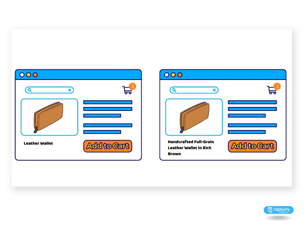
This practice will help your visitors find the specific product they are looking for in a quicker and more efficient manner, leading to an improved user experience. The better the user experience on your site, the more likely it is that the visitor will complete a purchase, thereby boosting your overall conversion rates.
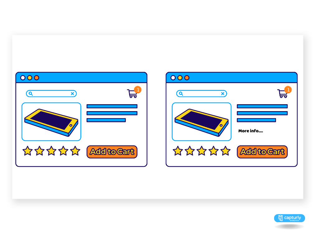
Add a “more info” button
Customers often believe that a purchase decision involving more details and information equates to a better deal. To bolster this confidence, ensure you include a “more info” button alongside your product.
Providing additional information is crucial, particularly for certain products. Take clothing for instance – information about the material, quality, and size should be readily available to the customer.
Prices
Prices are the most sensitive points for customers. People have negative feelings when they have to spend money, so you should do everything you can in order to reduce these feelings and make them positive as you can.
Position prices toward the bottom-left
You wouldn’t think but the place of the price on a webpage can have a huge impact. Individuals often visualize numbers along an invisible horizontal axis, increasing from left to right.
They also typically link lower positions on a page with lower prices, and higher positions with higher prices. As a result, strategically placing prices towards the bottom-left corner of a page can influence visitors to perceive the prices as being smaller.
Differentiate rational decisions from emotional decisions
The design and structure of your product page can be strategically adapted to align with the decision-making methods your customers typically employ. It’s a fascinating truth of human psychology that our brains process prices in distinct ways, depending on whether the purchase decision is guided predominantly by rational thought or by emotional impulse.
When do we speak about emotional decisions and when do we speak about rational decisions?
Emotional and rational decision-making have been pitted against each other for decades, In Kahneman’s book, ‘Thinking Fast and Slow’, they are described as two separate systems of thinking; an emotional and intuitive process that happens first followed by the slower and more effortful process of rational logic.
So, how should we approach pricing when a decision is more likely to be emotional, and how should we do so when it’s more likely to be rational?
When a customer’s decision is primarily emotional, price presentation should aim to minimize the pain of paying.
For purchases driven primarily by emotion, rounded prices tend to be more effective. The simplicity of round numbers is more readily and fluently processed by our brains. This speedy comprehension can result in the price feeling intuitively “just right”, a sensation that aligns well with an emotional, and potentially impulsive, buying decision.
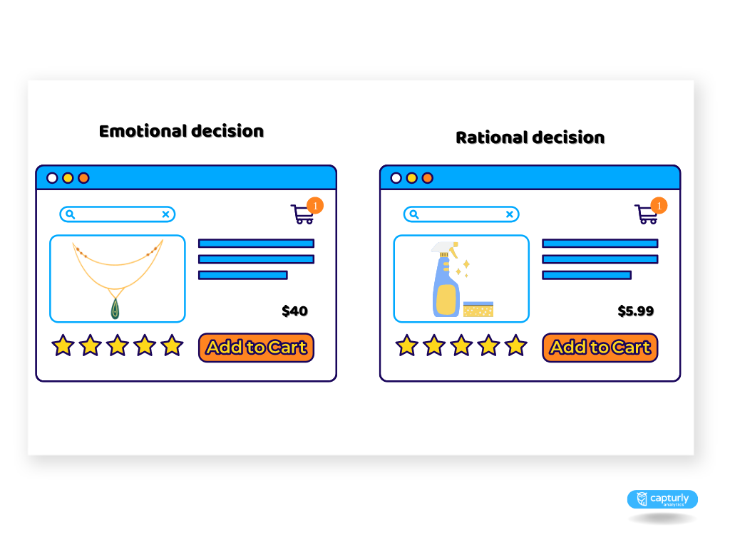
On the other hand, when a purchase is based on rational considerations, the opposite tends to be the case. Non-rounded prices require a greater degree of mental effort to process, which correlates well with more rational, thoughtful purchases.
Moreover, when making rational purchases, buyers often pay greater attention to value. By presenting a non-rounded number, there’s an opportunity to shape the buyer’s perception of the price value, making the product seem more cost-effective.
Use a smaller font-size
Utilizing a smaller font size can prevent it from becoming the most attention-grabbing element on the page. Furthermore, studies have shown that when people visually perceive something as small, they automatically associate it with being less significant. This principle applies to prices as well. Leveraging this psychological trick can subtly influence your visitors and boost your conversion rate.
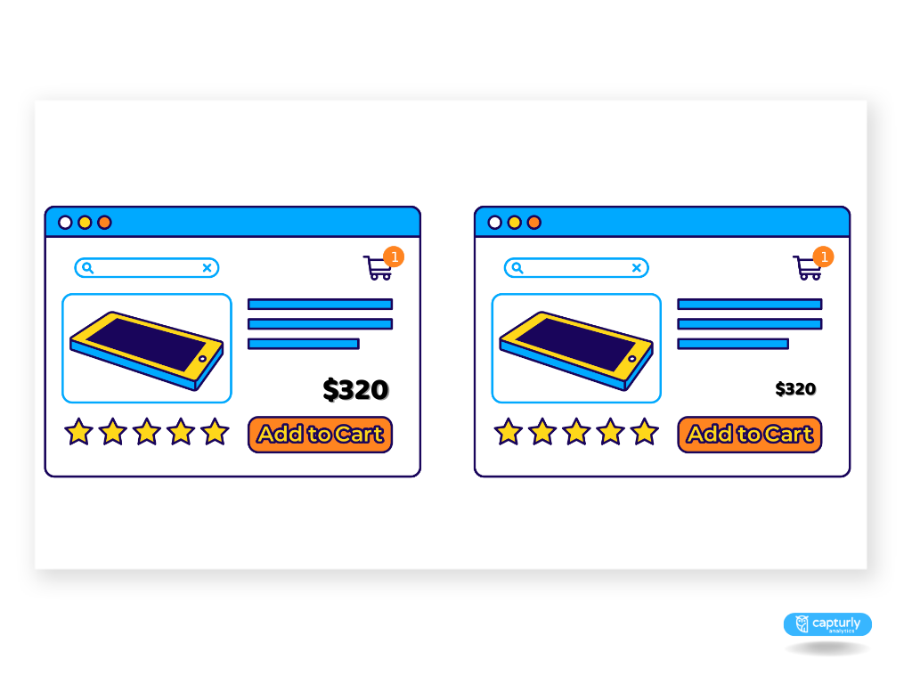
Remove the decimal points
Try to remove the decimal points if it’s possible. Customers will feel more comfortable if they see a price tag without a decimal sign. It gives them a clearer picture and does not give the impression that we are talking about a higher number because of all the zeros.
From a psychological standpoint, not displaying decimals (or cents) when showing a price can make the price seem lower and more manageable to the consumer. This pricing strategy is known as “charm pricing.” The theory behind it is that people read from left to right and tend to focus more on the first number they see, i.e., the dollar amount.
Don’t display the currency sign
Avoiding the use of currency symbols can help customers overlook the fact that they’re viewing prices, thereby mitigating any negative emotions associated with spending money.
Nonetheless, it’s important to subtly indicate that the numbers still represent prices. Be careful to avoid using other numerical values on the same page where pricing is displayed without currency symbols, to prevent any confusion.
Discounts
The purpose of your discounts is to increase your conversions. Would you think that your discounts can have an even better impact by utilizing some psychological tricks?
Give a reason for your discounts
Sometimes, customers may associate lower prices or discounts with poor quality, or assume that the product isn’t selling well at its original price.
Therefore, it’s crucial to portray discounts in a positive light, providing a clear and valid reason for the price reduction. Consider offering discounts tied to specific events or seasons, like a Christmas discount, a weekend special, or a seasonal sale. These prompts for discounts create a sense of urgency without eliciting negative emotions.
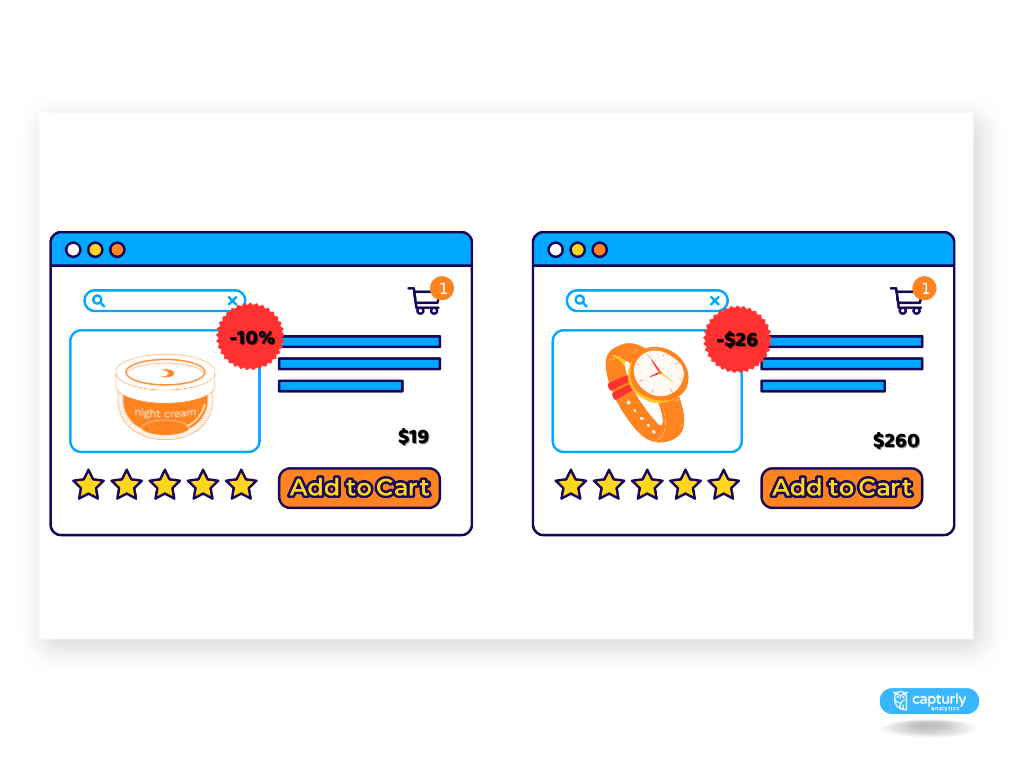
Display the discount in percentage if the product is below 100$
For products priced under $100, it’s advantageous to showcase the discount as a percentage. This tends to appear more substantial to the customer and can lead to increased perceived value.
Conversely, for products priced over $100, it’s beneficial to highlight the discount in terms of the monetary amount. In this case, the actual dollar value of the discount will be a larger figure, which can enhance the perceived savings for the customer, encouraging them to make a purchase.
Images
Last but not least let’s talk about images and what they can do to increase your conversions.
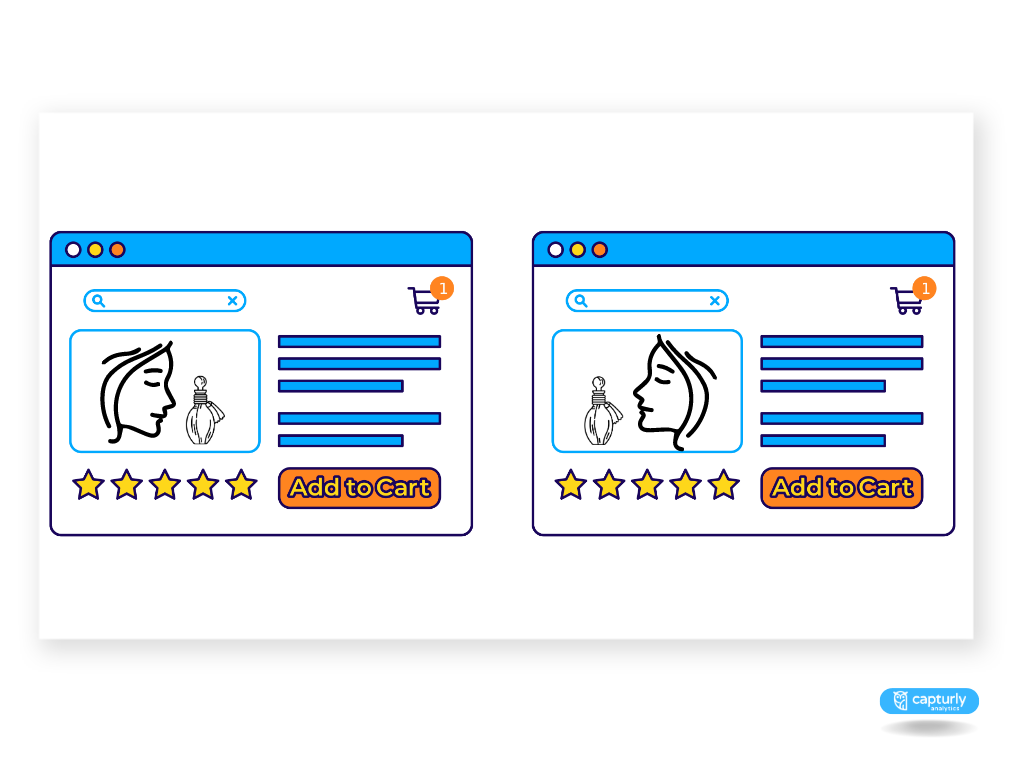
Position images on the left
The right hemisphere of the brain is responsible for processing visual information, such as images, while the left hemisphere handles the processing of numbers and text. Any sensory information that is received from the left side of the body is conveyed to the right side of the brain for interpretation and processing. Conversely, the right side of the body transfers its sensed information to the left side of the brain for processing.
That is the reason why you should place images on the left side of your product page and text on the right side of your product page. If you do so your customer’s brain will automatically reward this with a positive cognitive feeling.
The crucial factor for all elements of your website is seamless cognitive processing, as the more effortless and enjoyable users perceive your site to be, the higher the probability that they will proceed.
Show your product being used in several ways on your product page
Taking this crucial step can simply introduce people to your product, effectively demonstrating its usage, and, at the same time, inspiring them to give it a try. By doing so, potential customers can effortlessly envision themselves utilizing a particular product, integrating it into their day-to-day life.
The idea is to spark a narrative where customers see themselves as not merely passive onlookers, but active participants in the product story. You’re providing a window into a future where this product is an integral part of their lifestyle. They are not just buying a product; they’re embracing an experience, adopting a tool that fits seamlessly into their lives.
The psychological principle that comes into play here is the ‘visual depiction effect’. This phenomenon revolves around the concept of mentally engaging with a product even before physically interacting with it.
Try to show attractive individuals and models in your images
This notion closely ties to the previously discussed point. People inherently desire to perceive themselves as appealing, accomplished, and near-perfect. So, when it comes to envisioning themselves in a context with product images, it’s crucial that the scenario is as positive and desirable as it can be.
Incorporating attractive models in your product photographs can wield a powerful influence over your website visitors. This subliminal message suggests that purchasing that stylish dress will make them feel beautiful or that investing in the latest phone could enhance their sense of success and prestige. Hence, it’s vital to pay keen attention to the individuals chosen to represent the product in these visuals.
Put yourself in your customers’ shoes and try to think about what they aspire to become, and what their ideal self-concept looks like.
Faces should look to important elements on your webpage
This trick also plays upon deep-seated psychological cues. If your website includes people and faces, it’s imperative that they’re oriented toward key elements on your page for example registration or add to cart button. This visual cue steers your customer’s attention in
the same direction, ensuring they focus on the most important aspects of your site.
The psychology behind this is rooted in our innate social awareness as humans. We are naturally attentive and curious about what other people are doing or interested in. This human tendency is supported by studies such as the one by Mareschal, Calder, and Clifford (2013), which found that even infants as young as four months old follow adults’ gaze toward objects.
Final thoughts
By employing these powerful tips and tricks, you can boost your conversion rates. It’s crucial to dedicate particular attention to your product pages, as these are the hotspots where significant interactions and decisions take place on a website. It becomes futile to successfully draw visitors in, only to have them retreat at the last hurdle – the product page.
And if your interest in optimization extends beyond your product page and delves into the psychological underpinnings of consumer behavior, you may also be keen to apply these principles site-wide.
In that case, we recommend our other article that unveils the most recent conversion rate optimization techniques and tips that can be leveraged throughout your entire website. And we don’t tell you a surprise if we say these are also based on psychology.
1 Comment
Liana
2024-12-20 at 04:26thanks for info.