We have been using user experience design – or UX design for short -for many years now. In our present case, user experience design is actually web design but from a different approach. What makes this approach special is that every element of the design is a subordinate principle of the user; in other words, we inspect everything from the perspective of the user.
Table of Contents
The History of UX
I can’t talk about user experience without mentioning the person who has made a significant contribution to today’s UX Design. Our hero is called Don Norman. His name might sound unfamiliar to you, but he is the co-founder of the Nielsen Norman Group (NNG), a world-renowned firm that is specialized in publishing UX researches. The idea of doing something to ensure that there is no big gap between the design table and the end user’s expectations is not new at all. In fact, it’s been around since the ’80s. Don Norman defined that UX means not only the creation of products, websites, or apps but also “the whole experience” since the definition involves all interactions between the client and the company.
The expansion of user experience design has also helped to bring more and more complex products into the past decade. The workflow of the developers’ work has become more and more complicated, requiring new technologies and new planning approaches, such as Agile development. When we think about it, it’s logical, because when you release a complex product – or a website in your case – without making it user-friendly, it generates a lot of extra work.
Modern UX Design – in its current practice -, builds, analyzes, and optimizes the user experience of a company, so it is a complex process.
How Can User Experience be Improved? – UX and Development
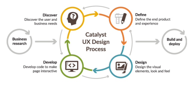
To understand the concept of UX and how it is connected to Development, let me talk about User-Centered Design or UCD for short. The idea behind the term comes from the fact that when you design something, like a website, it needs to be catchy for the end-users. However, in order to achieve this go, you must answer some very basic questions first:
– Who is my target audience?
– Why would they visit my website?
– Can I offer them a unique experience?
User experience design provides the development process with relevant information. As you can see, it’s more than just a plain process. It’s a philosophy that focuses on solving problems on both sides. You can learn more about the connection between UX and Development in detail later in this article.
What Are User Experience Goals?
Principles of UX
It is necessary to examine how effectively and in what way the user is able to complete different tasks on a website. The goal is to create a constant flow, where there are no mistakes in the process so the user does not encounter any obstacles that could ruin the “experience”. For this reason, it is important to lay down some basic principles. UX seeks to answer questions about who your users are, why they are visiting your website and consuming your content, what works on the site, and how the user’s relationship with your website changes over time.
Usability
The essence of usability is that your website should be easy and pleasant to use for everyone. If the usability requirement is not fulfilled, the whole design will fail to convince the visitor about his/her time is well spent. Usability, for example, is immediately interrupted when a visitor is encountering a malfunctioning page that has a broken link, throws error messages, or has no engaging content. The latter might sound like out-of-the box-thinking; however, as soon as your visitors feel like they’re wasting time, they’ll leave immediately and never return.
In other words, usability deals with navigation, website design, and content layout. In an ideal situation, the navigation should be logical, and links should lead to the appropriate content. The Call-To-Action (CTA) elements, headlines, menus must be effective and straightforward. Nevertheless, you also have to pay attention to the fact that too little or too much content can ruin the user experience and people can leave the page.
The growing popularity of UX as a concept also has a negative effect. It is often and automatically being compared to usability by default. The two concepts can easily be mixed, so when people hear about UX tests, they think that only usability is going to be tested. In many cases, the user experience is mentioned where usability would be enough, just because it sounds good. However, the user experience is much more than that. It is very important to note that if you use the term in such way, you will “downgrade” the UX. An example of usability can be the conversion funnel of a website. Getting to the shopping cart with the least amount of clicks and being able to pay for the product or service without any sign of uncertainty is expected from a user-friendly webshop. The user experience is not just about how an issue is addressed. Why would the user visit your website? What will happen after a visit session has ended? UX comes from not only the visit of the website but also the needs, the expectations and the motives that preceded it.
Getting to the shopping cart with the least amount of clicks and being able to pay for the product or service without any sign of uncertainty is a question of usability for the user.
Accessibility
In addition to having content that is sufficiently useful and logically organized, it should be accessible to everyone. This not only means that the website does not have any faults, non-working pages, but also that the load time and response time is short. Also, consider browser and device options to ensure that the page is accessible to everyone. People with some kind of disability – e.g. a person who is blind, color blind, or unable to handle technical tools in the usual way – should be able to use your website without problem.
Utility
If you really want to be thorough, you have to ask yourself whether your website is really useful to your visitors. It’s convenient to simply ignore this question, but in reality, most of the websites are much less able to meet this criterion. This is partly due to the fact that there are many tools that allow you to create a website without having little to no background in design, development whatsoever. Because of this, many entrepreneurs are unwilling to pay for professionals, so in many cases, business websites end up providing very little or almost no quality to visitors, which in fact means that they exist unnecessarily.
The contents of the website must be informative, relevant, and sufficiently unique, different from the others. It must ensure the satisfaction of users by finding what they are looking for. You should also be careful not to go into exaggerations with links, pictures, or videos. And you need to find the midway between the precious and disturbing content.
Attractiveness

Source: Markus Spiske
Attractiveness can be effectively ensured by the design and presentation of visual elements. There are factors such as the use of videos and images, typography, color schemes, and other design elements. They all affect the user’s senses. Visitors should feel that a website is sufficiently attractive and friendly, well-arranged and easy to read. Users will only stay on your website if they find it attractive enough to continue the consumption of its content. To achieve this, besides the visual elements and their layout, there is a need for captivating texts that are able to maintain readers’ attention even after the visual elements have succeeded in capturing their interest.
Credibility
Your page may be nice and it may be useful. However, this is not the case if your users find it deceptive. In order to create the right user experience, it will also be necessary for the website to demonstrate its credibility to the visitors. Users need to know that the information on this site is accurate, credible, and reliable. In other words, there is no more illusion-breaking experience than content that seems to be useful at first, but it turns out that it serves only one purpose, which is nothing else than selling something at any cost.
This does not mean you have to run a free private school in the form of a blog. Credibility is based on the mutual representation of interests. The user is sacrificing time – and we all know that time is money – for which you also invest time and energy. If you keep this in mind, you will have access to increased user confidence while the visitors are consuming your website’s content.
Credibility is based on the mutual representation of interests.
How to Measure User Experience: UX and Qualitative Analytics
UX Design is a highly data-driven process. Data is essential for a successful design and you should be aware of this, regardless of being a designer or just someone who wants to hire one. As I mentioned previously, you are not the user. However, by studying your target group, you can get as close to them as Icarus was to the Sun. (without burning yourself, of course). To succeed, you have to investigate how they interact with the service or product. Figure out what they like or dislike, etc.; this helps your design team to get to know and understand the users.
How can user experience be measured? The quality definition is about feelings and experiences. Basically, information that can not be measured by numbers. Given that the Web or Mobile User Experience is a unique, subjective entity that can not be efficiently portrayed, qualitative analytics is probably the best way to analyze them. Qualitative website analytics allows us to gain insights into websites quickly and efficiently. These insights allow us to learn more about users at individual or aggregate levels.
With these visual responses, developers, product managers, and UX designers can precisely identify where to interfere with the website, whether it’s about troubleshooting or optimizing.
Heatmaps and session replay features have huge potential. Heatmaps may be one of the most exciting topics in qualitative analytics. They serve in web analytics to capture some sort of important interaction regarding user behavior and to present an aggregate image about the user experience. There are several types of heatmaps:
The Click heatmap:
The click heatmap visualizes the most frequently used parts of the page, making it much easier to analyze the effectiveness of the structure. We can see that there are some parts, which are very popular (for example the search field and the categories). Clicking is a powerful indicator of interest. With click heatmaps, you can reveal what motivates your visitors. 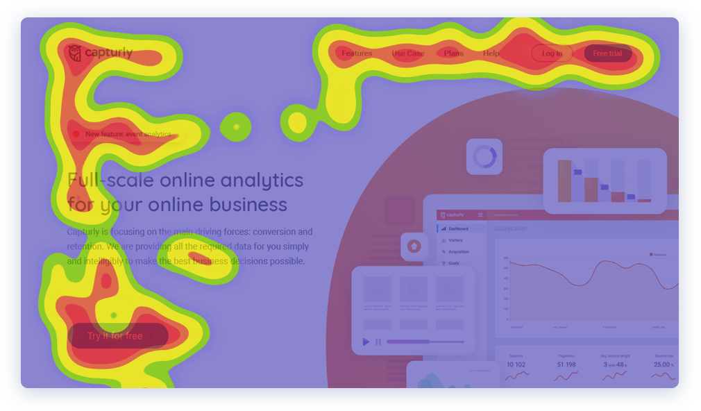
The Scroll heatmap:
The Scroll heatmaps are great for identifying the most engaging parts of your page(s). Do you have everything arranged in a way that the visitors can see them before leaving? Scroll heatmaps show you where you should put your main call-to-actions on mobile and desktop to catch the most attention. You can optimize the position of your elements based on the visitors’ behavior.
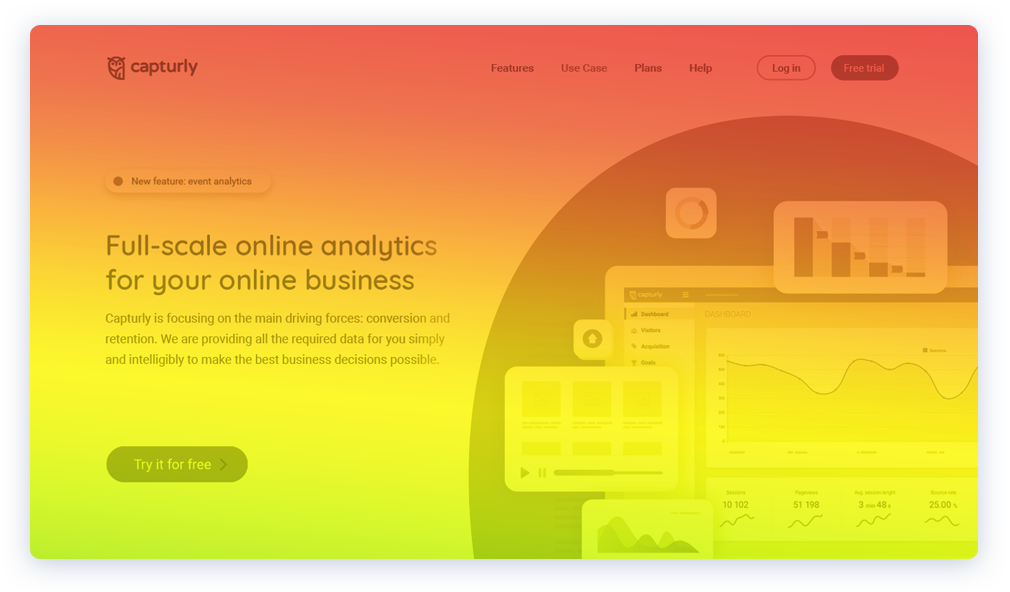
Although these two are best known for the heat maps, however, Capturly still holds something else. I wonder what’s in the case if I’m not just wondering where users are clicking, but wanting more in-depth information. How can I visualize this visually?
The Segment heatmap:
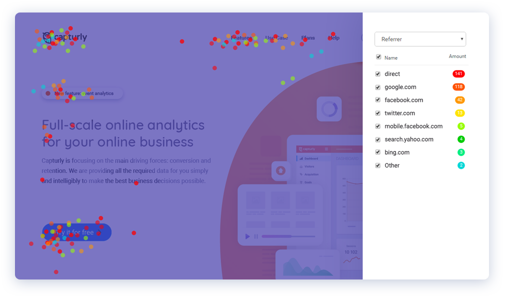
You can select the data you’re interested in by checking or unchecking the right segments. Identify the most popular areas of your page. See if any of the segments are behaving differently than the others.
Every segment has its own color for easy distinction. Check the source of the traffic in maximum detail. With segment heatmap, you can focus on a specific operating system, device, browser, or webpage and gather first-hand information about your visitors.
UX vs. UI
It is very common to mix-up UX and UI concepts. As described above, UX(D) is a shortcut to user experience design. UI(D), on the other hand, covers the user interface design. So the question arises: which one do you need? The answer is simple. Both are necessary. The UI, however, is easier to understand, since it is less “abstract”. The website is in front of you: You hold your mobile device in your hand, you see, feel and have a direct relationship with each and every UI element. In the meantime, UX is working in the background. Testing, analyzing data, and so on. UX design is a complex task. It combines IT development, process organization, psychology, marketing research activities with the aim of providing the user with a streamlined experience.

While the UI designer and the UI itself is responsible for the graphical appearance of the user interface, the UX is more about creating a suitable structure along the user’s expectations on websites and in mobile applications. For example, when you hear about creating good animations in UX, it usually describes the implementation of techniques and tools to alter the UI in a way that it creates a pleasant user experience. So in a nutshell; the UI is a part of the UX processes. This often leads to confusion when the two concepts are used as a synonym for each other.
The UX is said to be a joke. However, a joke is good only if you do not have to explain it later.
UX Design is Different
You have a product, website, etc. and there are users. The visitor of your website is experiencing something, but it is way more complex to plan and measure “feelings”, than UI elements. We have to understand that experience itself is already a result that is generated within the user. An experienced UX designer can do a lot to make the product usable and beautiful, but there is no direct way to influence the preferences of the users. These are all subjective factors. The UX methods, therefore, depend heavily on past experiences, the user’s personality, expectations, and the actual usability and visual characteristics of the website itself. UX design is a data-driven process. So when you hear that the user experience of a product, a service, a website is bad, it is worth taking a look at the past negative experiences of the users.
Sometimes your side may only need small changes as the root of the problem stems from an independent source of your own. Your website visitors have probably come to you because of a similar product or service, but have gained negative experiences during the previous session. In this case, they can amplify the smallest possible error. Such situations must be addressed. In web design and web development (and also in other areas of life), it’s a common mistake to look at problems as if they were no big deals: they will be solved once or simply go away. Maybe we are right, but is it worth risking that a dissatisfied visitor would feel that you are inadequate to meet the expectations? Think about how much it can improve your visitor’s judgment if you can satisfy them after a negative experience. This is a strong reference point in itself. Word-of-mouth advertising is one of the strongest motifs; however, negative words can be devastating in the business world.
We have to understand that experience itself is already a result that is generated within the user.
UX and Success
If you do it as you should, a good design has a peculiar feature that is unnoticeable. It may sound like I’m fooling around and convinced you to read a bunch of nonsense, but don’t worry, that’s not the case. Your website visitors – in most cases – are not aware of the design. Of course, they may note that your website is beautiful, but this is just a question of aesthetic preference. When you sit in your car every day, or get up on your bike how many times do you think about design? Almost never. Simply because it just works.
What if the door opener breaks on you or your bike chain falls off for the third time on the week? You probably will not even think about what’s behind a website until you run into a poorly designed one. People are not always willing to adapt to different design mistakes, so you have to pay attention to them. Happy users are more likely to buy from you. Make sure that your website/app surfaces are easy to understand and are user-friendly enough. To ensure this, you have to go through all the necessary steps from prototyping to testing. It is important that the visitors know what to do even when your website or app is absolutely new to them. This will make the experience that you provide unforgettable.
Here’s what can UX do for you:
- UX promotes loyalty – as in the case of news, it is also true that a bad user experience leaves stronger marks on people than what a good experience does. If you are constantly striving to improve your user experience to meet the expectations, this will ultimately lead to long-term trust in your brand.
- UX gives you a competitive advantage – UX teaches you how to build a user-centered approach. If you know what you can expect from your website, you are much more likely to meet the visitors’ expectations. In this competitive world, it is an excellent opportunity to gain an advantage.
- UX brings more money – do not imagine this as a running banner ad on your website. Think about time investment. The more time users spend on your website, the more likely they will spend their money. The more efficiently you apply UX, the greater the chance for customers to make decisions on your website. Keep in mind that it is likely that your offer is not the only one.
“57% of users say they will not recommend a business with a poorly designed mobile site .” – socPub.com
What Are User Experience Methods?
UX in practice
Agile design
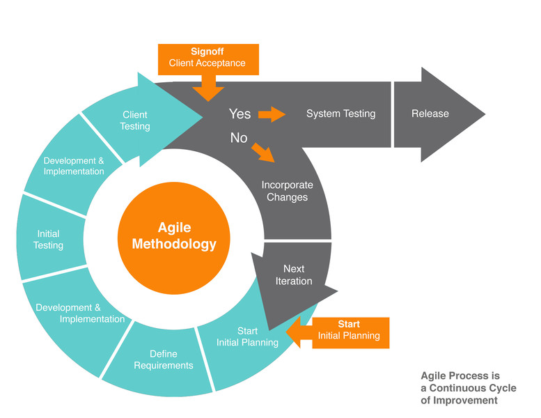
Agile design can be traced back to the big Internet boom. Although it has begun to spread thanks to the software industry, UX professionals have quickly adapted this technique and it is now replacing the obsolete Waterfall method. The way of the old method is that development and design processes follow each other. At first, the problem is introduced, then comes design, development and finally testing. Testing mostly cares about functionality. Based on pre-specified specifications, it verifies whether the project is successful or not. Needless to say, this is not a flexible solution. In fact, it is very linear. The agile approach is completely the opposite. The key is to break the projects into well-rounded tasks and simultaneous designing, developing and testing takes the place of a linear process.
Agile Techniques Supporting Techniques
There are two common ways that can be useful for everyone working in an agile environment. One of them – and the most widespread – is Scrum, which is a super effective management system. There is a list that is called the product backlog and it includes all the ideas and future tasks that we will once want to make. Development work is divided into sprints of the same length of time. Depending on a company or project, it may last two to four weeks to complete.
At the beginning of the sprint, the team decides what to do under the sprint. It is necessary to set goals that will have an impact on its end users. When designing a sprint, the selected task on the product backlog will be moved to the sprint backlog. Then, at the end of the sprint, the team checks together what has been achieved, what needs more time, and, if necessary, reorganization is carried out.
The second popular methodology is called Kanban. Its essence is the visual display of tasks. The Kanban table helps to do this. Individual work phases are marked by separate columns, while tasks are written on post-its or cards and placed in the columns. In a general layout, the following columns are used:
- Icebox: put your ideas and incoming tasks here
- In Progress: what we are doing right now
- Review: basically done, but still waiting for someone else to look at it
- Complete: 100% done and reviewed
- Follow-up: self-explanatory
Useful Techniques in Design
UX design always starts with some sort of market research and then works its way from there to assess the condition of your website.
Competitor benchmarking
It is one of the most intuitive research methods that you should consider not just when you want to enter an unknown market. You can get lots of useful information from the market and its participants. Even if not all of them are used in the design process, the collected data can be wasted, as later it can be useful when creating future marketing campaigns for your online business. Early benchmarking can also help to prevent problems that can only be solved later on with potentially significant financial investment.
Surveys
A proven method of gathering large volumes of easily quantifiable data. It is a more structured approach than competitive benchmarking, as the research is being pursued along a pre-defined questionnaire. For this reason, it is less flexible. The amount of time it takes to collect and process information is more and it can also be expensive, but it is indispensable for representativeness. It is one of the best methods if you want to collect demographic information.
What Are User Experience Guidelines?
Wireframing
Source: Sidecar
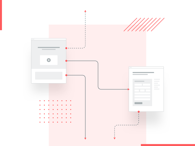
In order to try a variety of ideas, we need tools that can quickly produce some sort of results. This is wireframing. Wireframes are simple sketches that show the basic structures with different elaboration. In their preparation, complex elements and colors must be neglected, but that doesn’t mean that wireframes can’t be detailed. There are several ways you can make one, for example, the “old but gold” paper and pen version is called sketching. There are specialized digital solutions such as Balsamiq, Wireframe.cc, or MockFlow if you wish to try something cool.
Look & feel
After you have a draft in your hands you can start involving participants in the project so that no one will be surprised at the end and everyone will be satisfied. Look & feel is what the website or app looks like. Colors and precise shapes begin to take place. What makes this part really interesting is the fact that it is a subjective area.
The first step in designing the look & feel is a workshop where you involve the stakeholders of the project. Several versions and styles will be presented in this phase. The goal is to make it easier for you to make decisions about the project. If you have defined a style, moonboarding can come, which stands for collecting and sorting different styles into a montage. You have to look for similar works and sort them.
Now it’s time to create the first look & feel sketches. You select a specific screen from the wireframes and try different colors, shapes, and styles on this one screen. Look & feel sketches, as their name suggests, are not definitive pixel-point design plans but sketches. Their sole purpose is to try out different versions of the product within a short period of time. Do not mix up look & feel with the mockup, as they represent two different stages of the design process!
Expert reviews:
The biggest benefit of expert reviews is that they’re budget-friendly. Even someone with very little UX expertise can perform this technique. It’s done by pretending to be a novice user who never met the product or service before. Start by listing the main user groups that the product or service is focused on. Afterward, you have to identify related tasks. If you can not complete these tasks easily or you don’t understand the whole process, something’s fishy. Expert reviews can also be used as a support tool to perform usability testing later.
How to Test User Experience? – Usability tests:
Usability tests are one of the user experience testing methods. They are often referred to as User interviews. Its purpose is not only to demonstrate how a user uses a particular product (in this case, a website) but also to identify most of the relevant factors related to the usage. This includes the user’s emotions. You have to look for signs such as, is there anything that disturbs, confuses, or reminds the user of other applications. During the interview you should also observe the user’s body language and mimicry, so (with the user’s consent of course), the entire process can be recorded even on a video. Before starting the process, it is worth talking to the user, in order to have the most accurate information. For example, if our product is a real-estate portal, the technical background of the user is irrelevant when defining the target audience, however, if we are interviewing a web developer, we are likely to receive very different results than from a person who is less familiar with design patterns.

This technique can be really nerve-racking and satisfying at the same time, as it allows you to see the project through the eyes of the end-users. It can reveal details that you may have not even noticed before, or simply thought it was insignificant. It is worth noting that the word “test” in the title can be tricky. A Usability test is launched whenever you feel like or experience a level of uncertainty. When deployed early in the design process – after you have a prototype at least – it can be used for preventing problems just as competitor benchmarking in the research phase.
The beauty of user testing is that it does not require dozens of feedbacks since it provides a qualitative result instead of quantitative. This way you do not have to worry about statistical significance. It’s a good idea to work with a group of 5-6 users and allow them an hour to play around with the project.
This means that UX design includes market research, the design itself, project management, and development activities. In essence, UX design is an activity to improve the interaction between the company and its users.
How to Improve user Experience on a Website? – Efficient Onboarding Experience
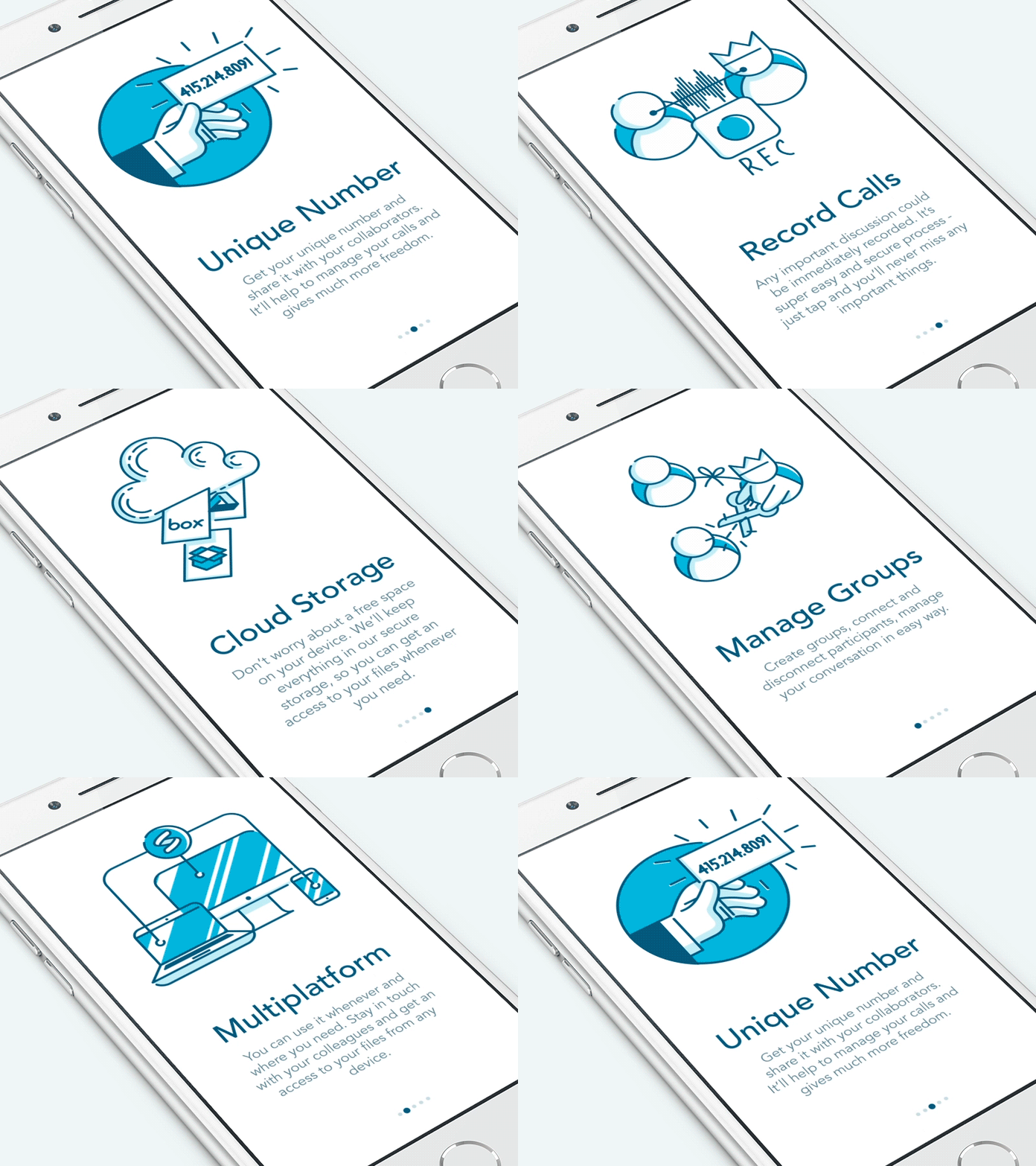
Let’s say you want to set up an effective chatbot on your website. The way visitors interact with your website can be very different. All kinds of operating systems, browsers, and devices influence the overall user experience. Due to the different screen sizes and shapes, you have to pay particular attention. Effective planning onboarding is critical, as visitors who have not been to your site will meet you for the first time. As I mentioned in the human factors, your visitors often have expectations of you and your website that you should respond to. Trust me, when I say the last thing you wish to leave behind is a bad first impression.
Source: Ramotion
1. The arrival
When the user arrives at a new screen – for example, when switching from desktop to mobile -, we look for three questions:
Where are you now?
When you get to a surface, you’ll look around. If you navigate from side to side on mobile, the same layout and colors assure that you are in the right place. If you click on a link and on the next page in the title returns the link text as expected, then thumbs up. In the case of menus, it is therefore important to highlight for the users on which page they are at the moment.
Why are you here?
It is very important that you show the user what he/she can do and how as soon as possible. Whether it is necessary to proceed or the current interface is the destination. A good example of this can be the checkout page of a webshop.
What’s next?
As it is important to plan the first half of onboarding, it is also important to take care of the users’ opinions and experiences after leaving an interface or the website.
“ A Website that loads in 5 seconds on mobile see 25% more ad visibility and 70% longer session duration.” – Google DoubleClick
2. Visual hierarchy and whitespace
Elements of a particular screen can be ranked based on how prominent and accentuated they are, or how soon we notice them. For example, the above-the-fold area is said to be the most valued segment of your website. What is accentuated should appear at the top of the hierarchy. Secondary, but still important elements – blog, technical details about the website, privacy policy, etc. – can be placed at the bottom in the footer section. Whitespace and uppercase letters can bring the most important parts of your website forward, providing additional visibility. It is an important lesson to not only highlight certain elements, but also “hide” them in a way that the visitors don’t have to look for hours, yet won’t be distracted. The text embodies the communication between the user interface and the user. It is worthwhile to make more versions and then test by determining which will be in the final position.
3. Conventions
During a website visit – especially on mobile devices -, solutions that users are accustomed to are widespread. These solutions are called conventions and visitors automatically search for them. For example, they expect to see your logo on the top left corner of the screen. The logo should take the user back to the home page instantly without having to click on a menu element. The same can be applied to Hamburger menus, links, etc.
4. Hand gestures
Since mobile devices are so important, you simply can’t ignore hand gestures when designing your website. When the user presses something, his/her finger will cover a portion of the screen. It is important to have only one thing below the finger at the moment of the press.
Another important aspect is how far the user can reach out with a thumb. When designing for mobile, it is advisable to position movable elements into areas that are easily accessible to the thumb. The use of smartphones has also changed over the years, so the interface has to be designed in a way that supports one-hand navigation. The restricted area is the top of the screen and the lower corners since users can be left or right-handed.
“5-5.1-inch is the most used screen size , 720 x 1280 is the most used screen resolution.” – Deviceatlas.com
5. Transparency
The finest surfaces that are easy and clear to understand, in other words: cleansed. This is not easy to accomplish, especially if new ideas and design conceptions are emerging in a project. When designing for different screen sizes, sometimes you end up displaying too much information on a single surface, which can be very overwhelming. During usability tests, users may find the “less is more” rule more appealing. To build and maintain a transparent feel of your website, you must always be ready to change.
The most important basic rules are, therefore:
- Ask the three questions until you have an answer regardless of the screen size
- The text is a part of the design
- Conventions are important
- Design for hand motions also
- Strive for simplicity because “less is often more”
Conclusion
UX is the art of ethical influence. It helps you understand the meaning and feeling of your users at the same time.
So what does a UX Designer do?
- It performs detailed market research, analyzing your competitors and your customers
- Project management performs tasks such as building your product, designing improvements, and communicating with your development team or coordinating workflows with you
- It will make you a wrought iron curve and plan it, prepare the prototype (a very common practice for web pages)
- Examines the performance of the product and the site in practice by using various techniques such as a focus group interview
Don't forget, sharing is caring! :)

11 Comments
Sampada
2020-12-15 at 15:02Excellent blog I visit this blog it’s really awesome. The important thing is that in this blog content written clearly and understandable. The content of the information is very informative.
UI UX Designer
2021-12-22 at 19:21UI UX designer is crucial to just about everything. It renders the latest technology accessible to the masses, makes our favourite apps and websites a pleasure to use, and determines which brands and products we return to over and over again. To put it simply, design matters.
smith infini
2022-03-04 at 08:49Great post share with us. keep sharing this informative article.
Sarah M.
2022-09-30 at 11:55This is really articulate. I really appreciate blogs that are well-made and in-depth. Keep it up!