Having a website is not at all easy! You always strive for the best performance. But there is always something you want to change to make it perfect and get the most out of it! Is this feeling familiar to you? Yes, for us too!
Improving a website is a never-ending story and a never-ending journey, if I may say so. You might think that for some sites that have all the resources, it would be easier, but no! Do you know the famous quote?
“The more you know, the more you realize how much you don’t know.”
This is true for web analytics sites as well. A web analytics site has all the information, knowledge, and resources, and that makes the whole improvement process even harder!
In this article, we invite you to join us on the website redesigning journey of Capturly! We will cover all the questions we had and all the decisions we made!
Table of Contents
How did the whole website redesign journey start?
Embarking on our website redesign was a complex task, demanding consideration of many many aspects. And it was about much more than just data! A significant part of our success was anchored in the varied insights and expertise of our team.
Each member brought a unique perspective to the table. Our graphic designer focused on aesthetics, aiming for harmony even in the minutest details. Our UX designer, meanwhile, was intent on improving the user experience. Our web developers handled the technical side, evaluating the feasibility of each new idea, and so forth.
However, the importance of data can’t be understated! In conjunction with our team’s insights, we closely examined the performance metrics of our website. This analysis formed the backbone of our website redesign strategy.
We scrutinized what was working and what needed improvement, carried out testing, and endeavored to devise the most effective website redesign process. Our aim was to blend human intuition with data, crafting a digital presence that resonates and truly stands out.
Everything About the Old Version of Our Homepage and What We Have Changed!
Our homepage was already okay if I can say that. However, we wanted to make it more dynamic to raise more attention. We also wanted to improve the user experience in a way that everything is available where it needed to be available, everything is perfectly accessible from everywhere, and so on.
Transitioning to Sticky Menu
Previously, our homepage featured a menu, that disappeared while visitors were scrolling. Upon reflection, it wasn’t our finest choice! Recognizing the value of a sticky menu that remains visible as visitors scroll down, we incorporated this change, aimed at boosting conversion rates.
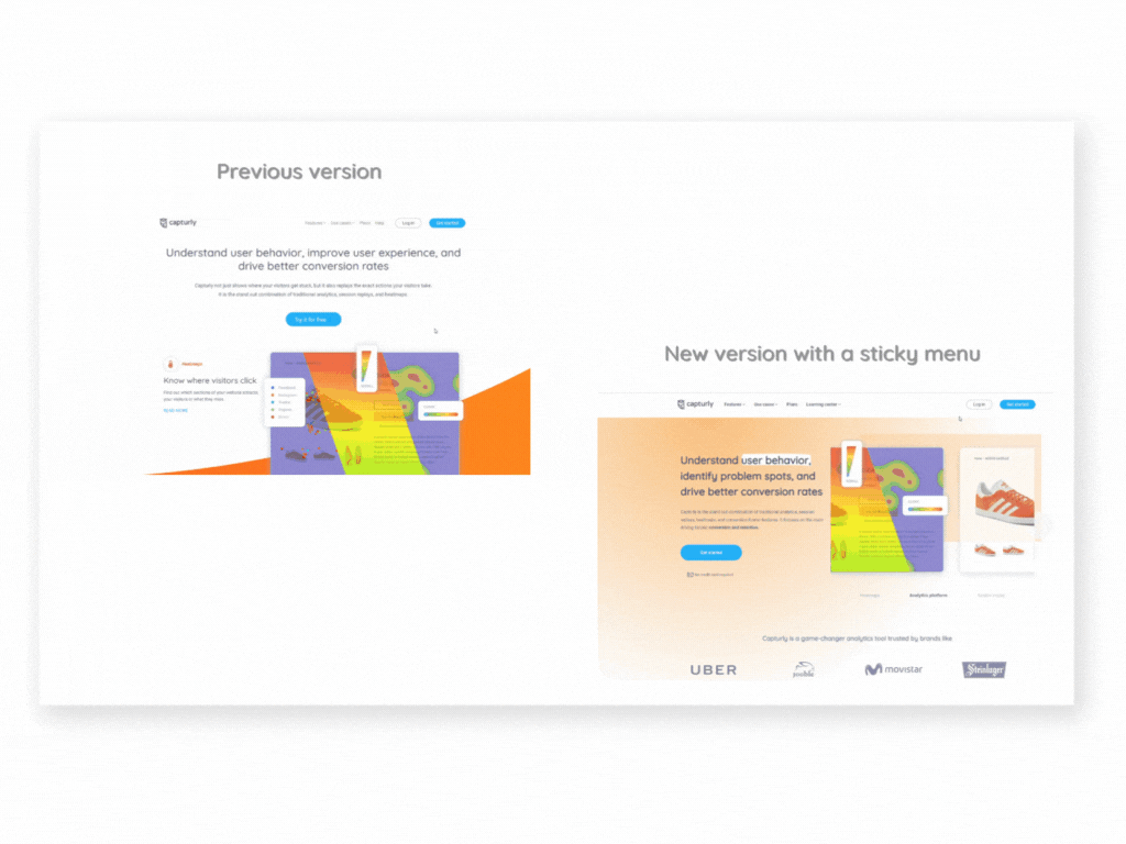
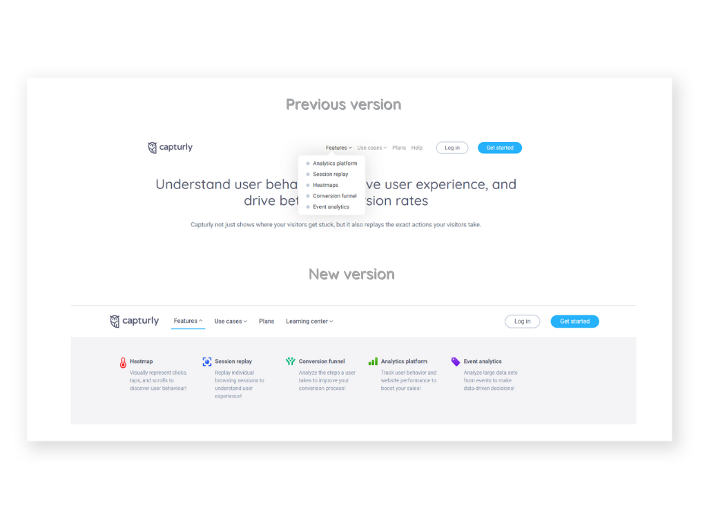
Redesigning the Navigation Bar
We’ve also overhauled our navigation bar. In the refreshed version, our features have been given a more visually appealing representation, complemented by descriptions so visitors already know what they are clicking on.
Additionally, we’ve rearranged the order of the features. After the redesign, heatmaps and session replays take precedence, as they truly set our brand apart. This transformation not only enhances user experience but also underscores our unique selling points.
Repositioning Text for Maximum Impact
We decided to reposition the top text. The old layout often resulted in half of our lead image being obscured when visitors loaded the site. A simple adjustment rectified this, ensuring visitors get an impressive, complete view right from the start.
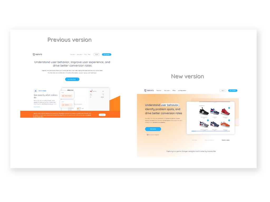
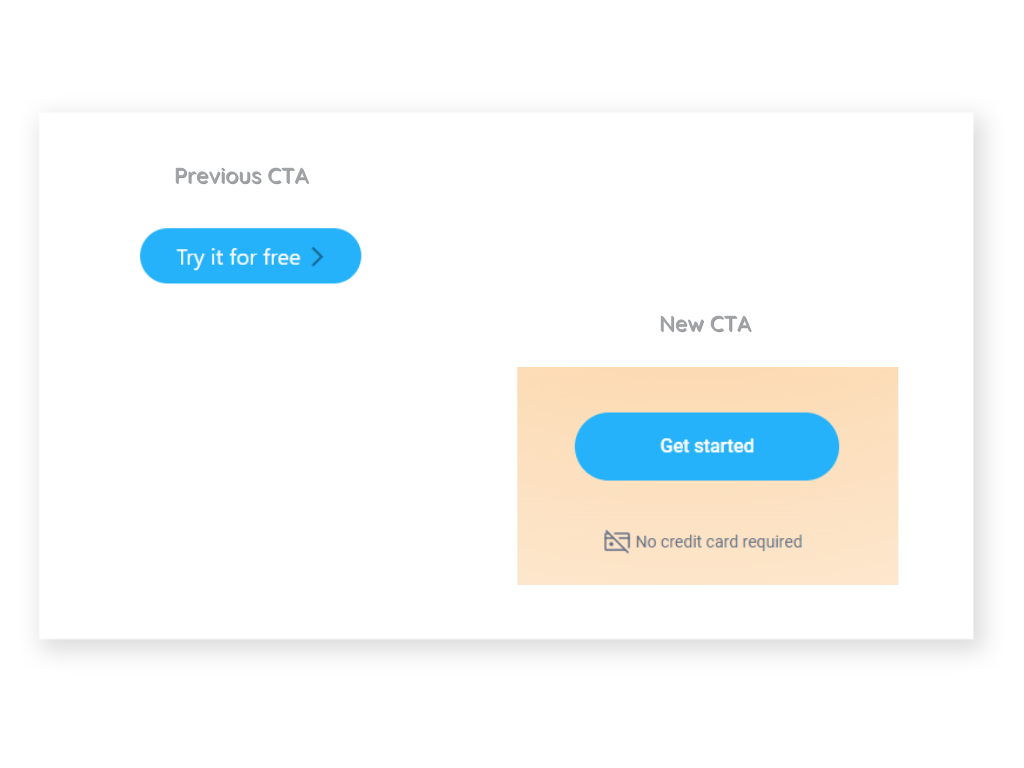
Fine-Tuning Our CTA Buttons
Our call-to-action (CTA) button underwent a transformation too. We changed the text from “Try it free” to “Get started,” and indicated next to the button that “No credit card required” which clarifies how this is working even more.
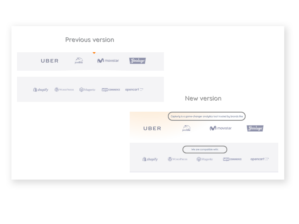
Clarifying the Meaning of Brand Names
We made some strategic additions to provide greater clarity. Introducing statements like “Capturly is a game-changer analytics tool trusted by brands like…” and “We are compatible with…” gives context to the brands mentioned, rather than just listing them randomly, which we did before.
Embracing Dynamic Elements
Our new design harnesses dynamic elements more than any previous version of our site. With images that glide in and a CTA button that moves on hover, we’ve created an environment that grabs attention and encourages continuous scrolling.
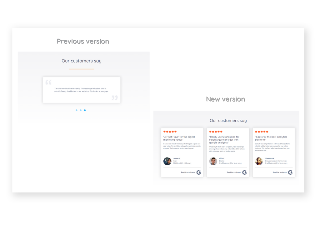
Revamping Product Recommendations
We’ve also revolutionized our product recommendations. Gone are the days of displaying just “empty” words. Now, we showcase the faces behind the feedback, enhancing trust and authenticity. This reassures visitors that the glowing reviews they see are indeed genuine.
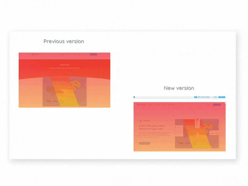
Everything About the Old Version of our Heatmap Feature’s Page and What We Have Changed!
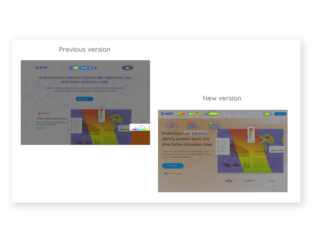
The situation was completely different on the heatmap feature’s site, which was in the initial stage before we started the long journey of the website redesign.
The kindling point was that there was a low conversion from this page and we wanted to change that!
Starting on the top
Even on the top of this page, we wanted to give an insight into what our product is about. That’s why we added a catchy headline and a short description with a colorful and dynamic illustration of a heatmap.
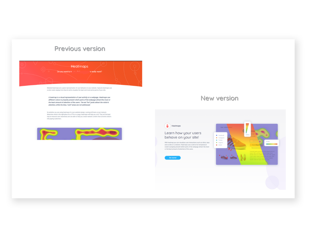
More white space, more structured texts
We recognized that our previous, verbose product description wasn’t effectively engaging our target audience. The lengthy content seemed to overwhelm visitors, hindering their ability to process the information we wanted to convey.
Our strategy shifted towards a more visually appealing layout, focusing on graphic and image-based presentations. We decided to compartmentalize feature presentations into distinct sections, incorporating generous white space, and curtailing blocks of running text.
Alongside these changes, we employed floating elements to capture and maintain the visitor’s attention, adding an interactive component to the user experience.
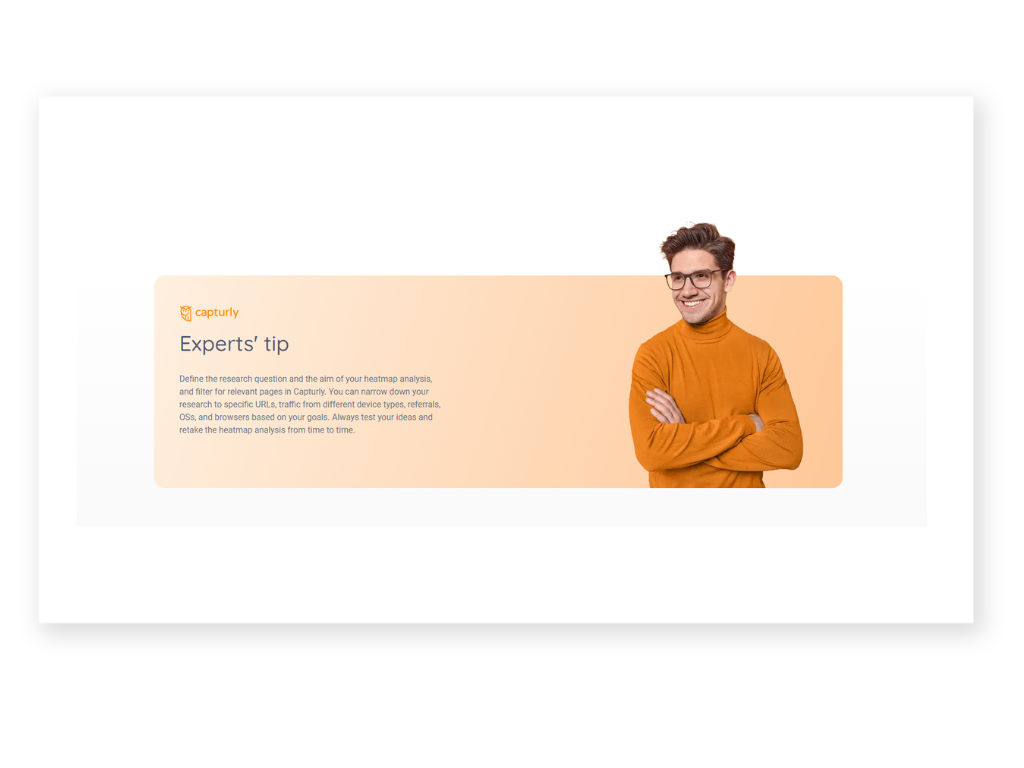
Adding an expert’s tip
We wanted to make our site a trustworthy one that’s why we thought it’s a good idea to indicate a real face on it. We could mix this with an expert tip that encourages people to try out our feature and also gives useful advice to them.
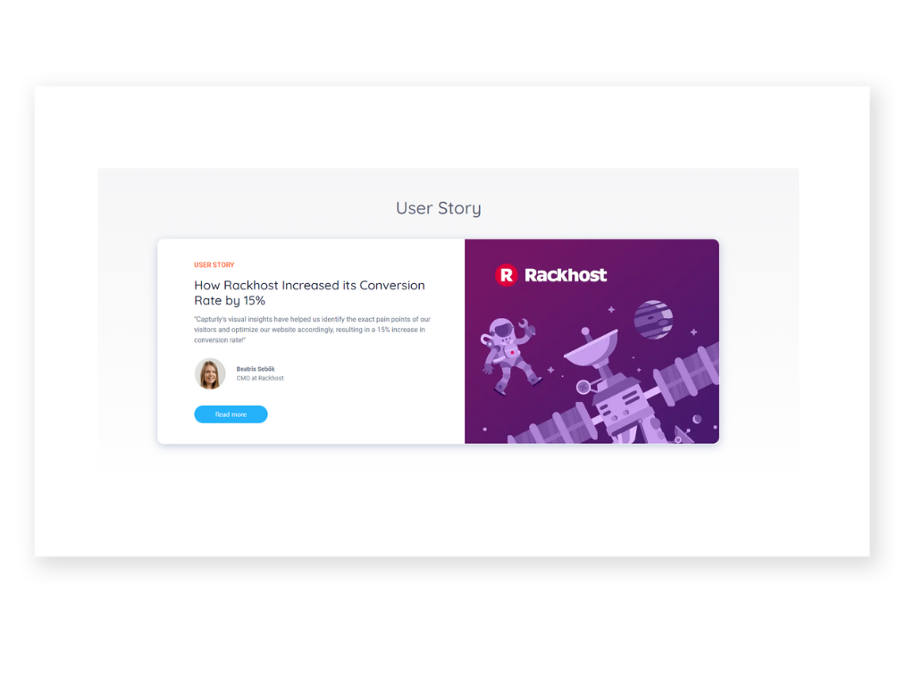
Adding a user story
A user story also helps to increase trustworthiness. People tend to believe that what works for one can work for many. So through these stories, they can get an insight into how helpful our tool is and how it can help businesses to increase their revenue. It’s important that here we also used a real face to illustrate a character behind the story.
“Explore more features” at the bottom
We’ve added an enticing “Explore more features” segment thoughtfully positioned at the bottom of our website. This section empowers visitors to delve deeper into our offerings, preventing any sense of reaching a dead end after perusing the content above.
Links to guide
The same role has links to our guides and blog. If someone is not really interested in our additional features we are giving them a chance to further read about our features.
The guides provide an opportunity to explore the potential and glean valuable insights into how our features can be leveraged, offering useful tips along the way. The blog tells interesting and engaging related stories to our heatmaps.
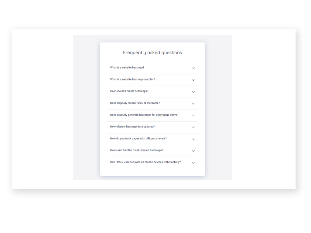
FAQ
Having a Frequently Asked Questions (FAQ) section on a website offers several benefits and we saw that many sites are already using it.
Firstly, it provides a convenient and accessible resource for visitors to find quick answers to common inquiries. Addressing frequently encountered questions proactively saves both the visitors and the website owners valuable time and effort.
Secondly, an FAQ section instills confidence and trust in the visitors. It demonstrates that the website is attentive to user needs and concerns, offering transparent and comprehensive information. This can enhance the overall user experience and encourage visitors to explore further or engage with the website’s products or services.
Additionally, an FAQ section can help reduce the number of repetitive inquiries received by customer support or sales teams. By providing self-service options, users can find solutions independently, freeing up resources to focus on more complex or personalized customer interactions.
These were the reasons why we have decided we definitely need a section like this. We tried to collect our most frequently asked questions and give short answers for each of them.
Everything About the Old Version of our Session Replays Feature’s Page and What We Have Changed!
We did similar changes and improvements on our other feature site. We replaced the lengthy content with engaging images, short texts, and a lot of white space.
Redesigning the session replay demo
We have a session replay demo option designed to showcase our session replay feature.
In our previous version, the design wasn’t so attention-grabbing. That is why we decided to highlight the whole section with a blue background. We also added an image that can raise visitor’s attention and while it shows a cursor it can encourage them to click.
Additionally, we’ve switched up our call-to-action from the generic “Start” to a more engaging and precise “Let’s Try!” This revamped phrasing gives a clearer idea of what the user can expect upon clicking the button.
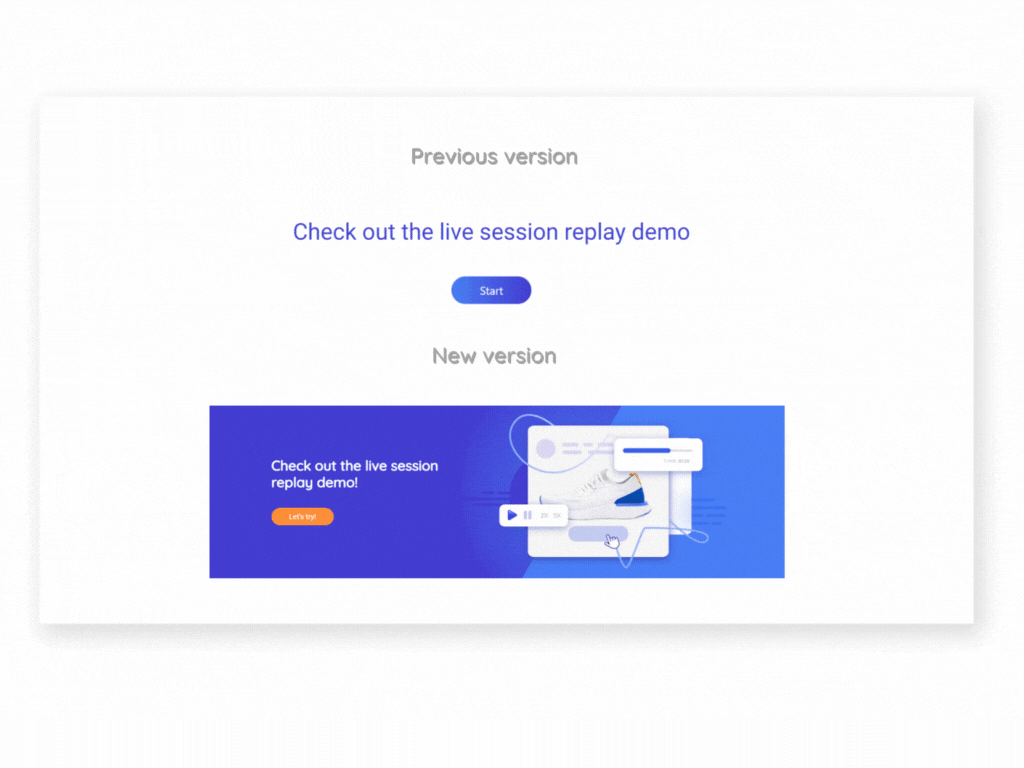
We provide explicit instructions on when to click, scroll, and even complete a form. Once these actions are performed, users can rewatch their interactions and gain a firsthand understanding of how session replays work within our interface.
Let’s see our results!
A couple of months after the changes were made, we took a look at what happened on our site. And of course, we leveraged our own tool for this evaluation.
You might be thinking, “Sure, easy for you to say, you have your own tool for testing, optimizing, and discovering what works best.” But here’s a thought – you can also use our tool for free, making this solution just a click away. We offer a limitless free plan, and all our plans come with free trials.
Now, let’s really see what results we got!
Clicks on our homepage
If you take a peek at our homepage, you’ll notice that our dynamic navigation bar has indeed yielded tangible results. By comparing the former solution with the revamped version of the navigation bar, heatmaps reveal a discernible uptick in the number of clicks.
A glance also reveals “blind clicks” underneath the navigation bar. However, these are actually clicks on the features in the new menu.
Do note the increased engagement with the new CTA button, indicating that its relocation and the text modification have yielded positive outcomes.
We’re not exaggerating when we say that the other modifications have yielded equally promising results!
Previously overlooked sections, like reviews, are now attracting clicks. And the data shows increased interest in the text accompanying our dynamic images, among other enhancements.
Scrolls on the heatmap feature site
Let’s take a look at what happened with the scrolls on our heatmap feature site! As you can observe in the previous version, most of the people didn’t scroll all the way to the end of our page, thus missing out on our last CTA.
Adding another CTA in the middle of the site was a wise decision, though they still don’t scroll until the end. Nevertheless, they do come across the CTA in the middle.
Furthermore, it’s worth mentioning that the new feature site is successful in capturing people’s attention for a longer duration. This implies that instead of a lengthy test, employing more white space and graphical images turned out to be effective in keeping visitors engaged for an extended period.
Absolutely, we’re well aware that there’s always room for improvement! However, I believe it goes without saying that a website can never truly achieve perfection. There will always be those small details that could benefit from some enhancement.
This means you will probably hear from our website redesign journey as well in the future!
Final thoughts
After all of these, watching our promising results, we definitely advise you to start the redesigning process of your website today! It may seem like a daunting journey ahead, but it’s one that’s guaranteed to yield fruitful results.
Leverage tools like heatmaps to constantly see and follow what you have reached with the website redesign. In addition, use these tools for testing as well. Try out different versions and check which one attracts more attention and clicks.
We’re eager to hear about your own website redesign journey and experiences! What did you learn and what changes have you observed? We encourage you to drop a comment below and tell us!