
Having a webshop that drives traffic is one thing. There’s nothing really special about it. It’s basically opening a store in a crowded part of the town. You fire up your marketing and people start visiting you.
How neat is that?
Too bad if they do a 180 degree turn and leave without any indication of interest. It turns out that getting visitors is just one side of the coin. Keeping them interested, motivating them to perform certain actions and go through your funnel are the real deals.
The first thing you have to understand is pretty obvious but somehow many website owners forget it after they get blinded by greens.
It’s all about the customers and their experiences! If they land on your webshop or landing page, they might be just curious without any certain intentions. However, that’s the first step. If they consider the time spent there rewarding or see the opportunity to solve their problems, you’re on track.
Now you might think that’s why conversion optimization tools — like a scroll heatmap or a click heatmap — were invented. This is partially true.
BUT
The thing is that usability and conversion optimization are both required to increase the conversion rate of a website, webshop, landing page.
Conversion optimization is all about the company willing to achieve certain goals. But the way usability works is that it focuses on the goals of the visitor. It aims to predict how the user will interact with the design.
Usability is about cutting a path in the jungle for your visitors by making your website transparent, predictable and easy to navigate.
Tip #1 The myth of the fold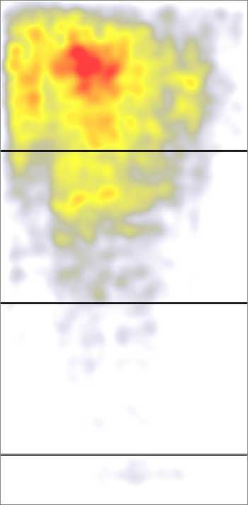
Source: nngroup.com
There has been a lot of confusion around this topic over the last couple of years.
Some say the above the fold section is still the most valuable part of your website and this is where you should focus your “firepower”. According to a study by Nielsen Norman Group, if you place certain elements 100 pixels above and below the fold, the upper part can draw up to 102% more attention.
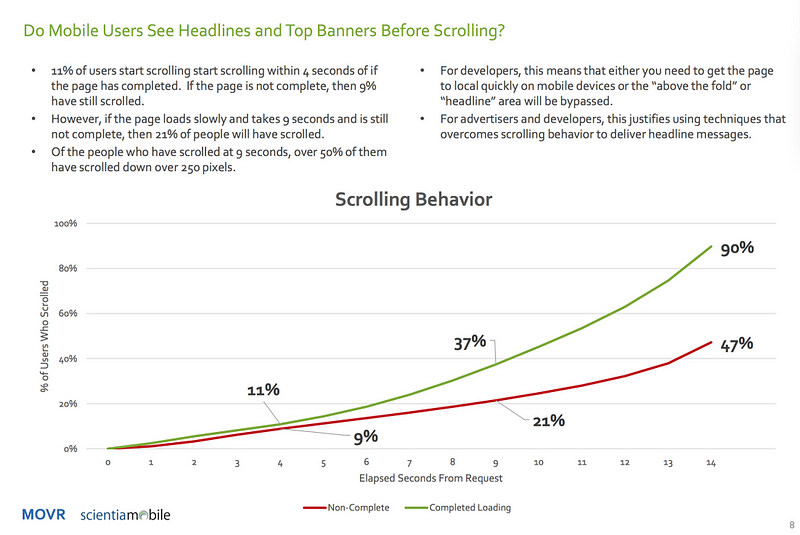
The thing is that there is more variety in screen sizes than 10 years ago. Just take mobile screens for an example and how popular they’ve become. Long pages and scrolling with your thumb have changed the way people interact with interfaces. Apple even removed the scrollbar in some cases, and since people do scroll, the below the fold area can be just as valuable.
According to a tweet from Luke Wroblewski, On mobile platforms, around 50% of the users scroll down more than 250 pixels if the page loads slower.
“ this means many users are not seeing what is “above the fold” on mobile”
In his article called “There Is No Fold” he points out that it’s not enough to put a giant Call To Action (CTA) button in front of the visitor as soon as he/she arrives and wait for the magic to happen.
In my opinion, the truth is somewhere in between NNGroup and Wroblewski. The above the fold section still matters, however, there’s really no point in squeezing everything in one place.
Think about the fold as a responsive element of your page. Focus on the actual content. The more added value it holds the better your chances are. People like to see what they get for their invested time. Make sure that you’ve included checkpoints that grab attention so when the visitors scroll it stops them from just skipping. A well-presented footer is also a valuable part of your website so don’t ignore that.
So “Don’t Just Tell Them, Show Them!” — Jesse Marlow
With the right motivation, people will explore your site, and if your above the fold section is appealing also, only then will it “click” for them!
Tip# 2 Annoying captchas
Spam can be a real disaster if it remains uncontrolled. If we take a form, for example, one solution can be captchas. To be honest, I think there’s a special place in hell for captchas. However, this would mean nothing without actual empirical evidence. According to a case study by MoZ, when the captcha was activated it reduced spam conversions by 88%. 7.3% of the total conversions ended up as failure or spam, where spam only counted for 4.1%. It was interesting to see that the amount of failed conversions reduced to 0% with captchas disabled.
“ That possibly means when CAPTCHA’s are on, the company could lose out on 3.2% of all their conversions!”
Tip #3 Adjusting CTAs
When placing your CTAs, you have to consider the fact that you might have to adjust it later. Call-to-actions are designed to grab attention by offering an opportunity and triggering an action. However, these aren’t just some elements locked in place permanently. Let’s say you inspect your visitors with click heatmaps and you see that they won’t click on it. After analyzing a scroll heatmap, you see that they just scroll down a bit and spend some time there, maybe reading the content. Maybe they are just looking.
How may I help? It would be appropriate, but this isn’t retail, and you have to figure it out.
So after collecting information about their behavior (i.e. how they interact with your website) with, for example, heatmaps, you have the opportunity to offer them a better time and place to make their decision.
The system is similar to a polite telemarker who asks if the time is goof for you to listen.
If you think that the visitors are simply uncertain about the product or service, show them some introduction, give them samples. Again, you have to SHOW them stuff!
If you ignore this, visitors will slam that exit in no time.
Tip #4 UI in motion
UX has changed a lot. Animations are not just unnecessary show-offs that get in the way of the user. They have become the cornerstone of User Experience design since if something moves, it appears to be responsive and alive.
If you are looking a reason to animate something, here are a couple examples where it can be useful:
- to increase responsiveness
- to unstuck the user from frustrating situations
- to slow down user interaction
- to build up a hierarchy
Motion related expectations
The term speaks for itself. Users have expectations even when they interact the first time with the UI. For example, when they see a simple floating action button (FAB) they assume that it can be expanded into a menu. Designers also have expectations. For example, when creating personas, they try to predict certain behaviors in order to minimize the gap between the user and the interface.
Interactions with the interface
Interactions can happen in two ways: realtime or non-realtime.
Real-time means that the user is interacting with the elements directly. As you can see the animation below, the user has full control over how and how fast he/she wishes to expand the different tabs.
Source: Uxinmotion.net
We can talk about Non-realtime when the animation happens after the input of the user. This comes in handy when the goal is to slow down user interaction and add an additional level of “entertainment” by spicing up the interface visually.
Source: Uxinmotion.net
Tip #5 Love that cart
Possibly one of the most annoying things is when the visitor goes through your funnel just fine but somehow the final desired conversion doesn’t happen. A typical example is the abandoned shopping cart effect. This is often caused by the fact that guest shoppers are getting confused on the checkout section. Spending money online requires more trust. Bombarding the guests with all kinds of registration forms — especially where they have to enter credit card details — without eliminating every obstacle might not be the best example of pleasant user experience.
Here are a couple of things you can do in order to boost your checkout page experience:
- have multiple locations for your checkout button. The less time they have to spend on figuring out how to navigate there the better.
- show that you’re serious about privacy. Add security and supported card logos where they can see them. Also include links to your privacy policy, FAQ in your footer.
- always have an option fto continue the shopping, but don’t just stop here, make sure that its color is distinguished from the checkout buttons’
- let them breathe, give your guests time to fill their carts without bothering them.
Make it so that registration is an option and not a critera!
By removing the registration button and allowing them to complete a process, you’re not limiting their freedom. However, make it beneficial to complete the registration! Notify your visitors about these advantages. Do this and your site will feel the real positive power of word of mouth!
Conclusion:
Traffic is one thing, converting is another. You can read about conversion optimization techniques that help you and your online business; however, usability is all about how you can help your visitors. For example, some say the above the fold section is your best shot to convert visitors into customers, while others say it’s dead. Call-to-action buttons can and must be located where the visitors expect them to be. A scroll heatmap or click heatmaps can be really helpful to find those sweet spots. Animations make the interface appear alive and responsive.
3 Comments