Nowadays websites and apps use a lot of tactics to increase their visitors’ user experience. It’s not a coincidence! The thing is, there was some research in this specific area in the last couple of years which all stated that today’s generations think differently than the older generations.
- 53% of today’s visitors leave a site if it takes more than 3 seconds to load according to Linearity.io
- Spiralytics research showed that 54% of users stop buying from a brand after experiencing a bad user experience
- 94% of the users won’t trust a website if it is outdated, founded by Yougov.
People nowadays connect joy and happiness with websites’ user interface. They not only want to like the product, or service that they are ordering from you, but they also want to love the route that leads them there. They want crystal clear instructions, gamification, and signals that your website or app acknowledges their actions.
The fact is, even if microinteractions are a small slice of website development, and not influencing the whole buying procedure (without microinteractions the buyer can still buy the designated product), they can be the answer to pass your buyers’ expectations.
In this article, we will learn more about this tiny detail; we will mention its relevance and possible types, and in the end, we will look at some real-world examples.

Table of Contents
What are microinteractions exactly?
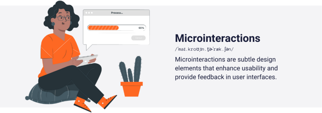
“Microinteractions are simple interactions within a user interface characterized by two elements: a trigger, which can be either a user action or a change in the system’s state, and feedback, which is a focused response to the trigger conveyed through subtle, contextually relevant changes in the interface, often visual.”
I try to demonstrate its functionality through an example: Imagine you’re on a website, and you need to click a checkmark to move to the next page. But here’s the thing: sometimes it’s not immediately clear if your click is registered, or not. That’s where microinteractions come in. After you click the empty checkmark button, it transforms into a reassuring blue color. This simple change tells you that your action was recognized, giving you the confidence to proceed to the next page. It’s a subtle yet effective way the website guides you through your interaction, making your experience smoother and more intuitive.
So microinteractions are little details that communicate with the visitors’ in a fun and understandable way to make their journey more remarkable.
What is their role in UX?
As we mentioned earlier, user experience is a huge factor in creating a popular website, or app. But what’s the role of these tiny interactions in boosting UX? That’s what we will meet in this chapter.
They can make the site/app more obvious
Imagine that a user clicks on something, but that element needs time to appear on the user’s screen. The user may need to wait 3 seconds, but nothing indicates that the response will show up. So, the user exits the site, before the response to the user’s click takes place. However, if you introduce a microinteraction, and set that the user’s click is the trigger, in response to this, you can place three moving circles. These three circles will indicate that the click was successful, and the element will load up after a few seconds. Like in this case:

With the help of this type of microinteraction the visitors understand what is happening around them, and hardly get stuck, which leads to a better user experience.
Microinteractions can make emotional connections
It happens that these tiny little details may have no real functional benefits. You may think: then what’s behind its existence? The thing is in a 1 on 1 human interaction, if our partner creates positive interactions in us, we are more likely to be engaged and there is a higher chance that we will build a stronger relationship.
We can insert this example into a website-human interaction. If the website is able to establish a positive interaction with the user, the user will more likely choose the site in the future. Microinteractions can be a decisive factor in that. This detail can generate emotions, and make the experience more human. Let’s see this web design concept:
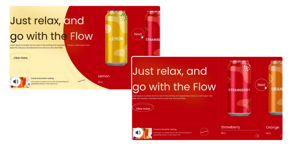
Here, when the user clicks on the “next” button, the background becomes redder, and finally, just the strawberry-flavored beverage appears on the screen. Does this little change make the site revolutionary? No, not at all! But these little creative things may establish positive emotions in the human brain, and when the user comes to the decision again, there is a better chance that the user will choose our site.
Microinteractions can give guidance to users
Customers may get stuck at one point in their shopping experience on your site. Maybe your site has too many features, the task is complex, or the site is not helping first-time users when an error message pops up. Well-established microinteractions can be one of the solutions to the given problems because these small details can give suggestions, explain rules, or interpret complex tasks.
Let’s see an example. We are on a sign-up page, where the users need to give their usernames and passwords. However, we may acknowledge that some of our potential clients open the site via their phone, and don’t have a cursor. So they may suffer from not knowing which field they are in, therefore they spend too much time in the signing up process. It can easily generate bad user experience, and negative emotions.
To avoid this, we can use microinteractions! When the user is not inside a required field, and the user hasn’t typed anything inside it yet, a red rectangle will show up. If the user is inside the field and starts to write letters in it, the red rectangle changes to a green rectangle. When there is some text inside the field, and the user clicks out from the designated field, the rectangle changes into the color of gray.
Thus, the user is always notified about its current location, and can easily detect if something is wrong. This guidance can save some time for the user and make the user more satisfied.

They can enhance brand recognition
All the above advantages are slightly more important than brand recognition, but we should not neglect this specific area as well because it has some relevance.
Brand recognition is basically an overall name to those brand attributes that a customer is able to memorize, and recognize later on, without seeing the brand’s actual name. You can boost your brand awareness by just showing that your brand is unique, or emphasizing engaging stories to your target audiences. However, microinteractions can be one slice of that uniqueness.

In this example, the rocket can either symbolize the company’s logo or emphasize that they are a very innovative, young company. Although the microinteraction may have other roles, the effect of the companies’ brand recognition can’t be left out as well.
Some real-world example
In this part of the article, we will introduce you to some real-world examples to convince you that microinteractions not only exist in templates but in the everyday world of apps and websites.
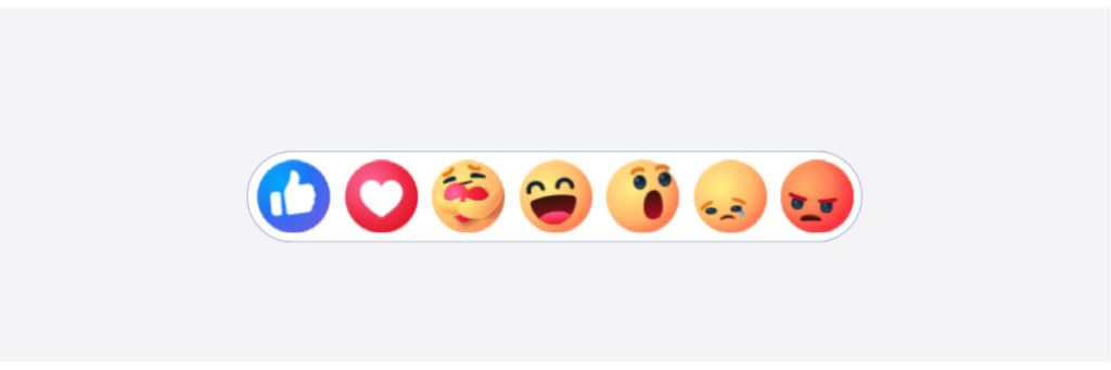
If you’ve never heard of LinkedIn, it’s basically the business world’s Facebook. Here, you can’t just only look for jobs, or search for employees, but you can even build connections with business leaders, and other influential workers.
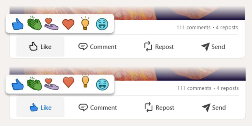
On LinkedIn, users can post stories, articles, and comments, and their network can rate them with six different emojis. Like, celebrating, sending support, heart, insightful thought, and laughing emojis exist to help the user interact with the post without too much effort.
But if you watch carefully, these emoticons are not static elements. If you hit the like button for a longer period, the emoticons not only bump into the screen, but they start to move up and down. They come to life, which is basically a microinteraction. Would the function of liking work, if LinkedIn disables this function? Yes, because microinteractions do not influence the sites’ and apps’ functionality most of the time. Rather, they can make emotional connections with the users, which leads to better user experience, and more sales.
This “moving emojis” technique basically works in every social media platform. Although, if they would use one or two funny microinteractions, they may not go anywhere, but these websites use these tiny details on other parts of their website’s interface as well.
Waze
As we previously mentioned some microinteractions not only exist just to build emotional connections with the customers, or for more brand recognition, but these tiny details can make key processes so obvious.
Waze, one of the most used community navigation apps, uses microinteractions to clearly notify you of the exact vehicle that you selected for your route. You can’t go on the exact route, and you can’t reach your destination for the exact time via taxi, and car. That’s why Waze needed to avoid having their users accidentally select the wrong vehicle, and rearrange their route in a moving vehicle.
So they figured out that if they took advantage of colors, they could differentiate the selected vehicle from the others. If the user clicks “Taxi”, the white and gray icon will be transformed into a colorful one. This way, the user is aware of the selected icon all the time and reaches travel destinations without app-generated misunderstandings.
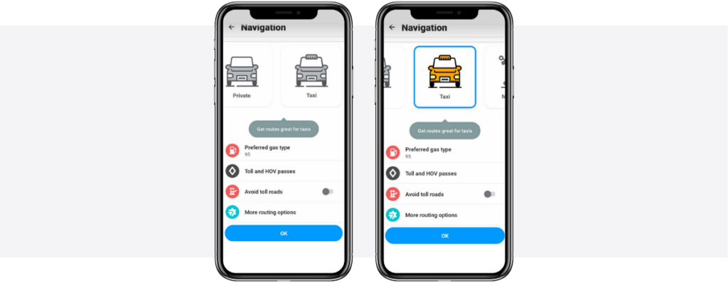
In conclusion: the user won’t have negative feelings about the app, and won’t try to replace it with the competitors’ navigation apps.
Tesla
Nowadays, the average website load time on desktops is 2.5 seconds, according to Tooltester.com. However, they also stated in this article that on mobile phones the average loading time comes up to 8.6 seconds!
We recommend that if your website’s loading time is more than 2 seconds, you must place a loading icon to calm the customers. “Don’t worry, the website reacts to the click, but the subpage needs some time to load up.” This is the case with Tesla’s website. If you want to order one of their available cars, you need to click on the chosen car’s name. Then to fully load up the concept of the car, they need a little bit of time.
But they don’t just place a completely empty picture, instead, they indicate the loading with a continuously rotating circle. It’s a microinteraction just because they wanted to make everything more obvious.
However, they use it as a brand recognition also. They just don’t want to miss this possible opportunity to meet the customers with their logo. So, inside this rotating circle, the Tesla icon appears and disappears from time to time.

How to measure their success?
You may think that it is almost impossible to measure the effect, and the success of these microinteractions for an obvious reason: these are nonclickable details most of the time, thus there is no metrical record of these effects.
Luckily, we have two techniques that still can analyze the success of your microinteractions. But first, you need data analytics software. These tools can track qualitative data from your customers, and with the help of them you not only detect the “what”, but the “why”-s as well. Most of the time, data analytics tools help you to get a clear understanding of how your visitors behave on your website.
We recommend you to give a try to Capturly Analytics, our tool, as it provides you with some extra functions which are needed to fully understand the effect of your microinteractions.
A/B testing
Capturly Analytics allows you to track more than one site at the same time, and we need to take advantage of that feature.
First of all, you need to create two site concepts, one with your implemented microinteractions, and one without them. Then, you have to set Capturly’s data tracking at both sites, which is an easy job. After that, you need to get traffic for both sites and if you have enough users, analyze the results.
Here comes the second feature!
Analytics platform
Our tool also offers an analytics platform even in our free plan, which you can reach through both of your connected sites. In this analytics platform, you can look at the sites’ sessions, average session lengths, bounce rates, and many more.
Here, if you experience better click-through rates, fewer frictions, or better conversion rates in your conversion funnels on that page that contains the microinteractions, you better use them in the long term.
Conclusion
In this article, you met with a tiny, but relevant part of websites: microinteractions.
There are tremendous examples in the online space that after developers introduced microinteractions on a website, they experienced:
- Better user experience
- Faster conversions
- Less U-turns (when the visitor goes back to one page from another quickly, as the visitor misunderstands something, or makes a misclick).
Also, as you can see, even the most popular brands use them from time to time to make their website/app more creative, and obvious, or to give guidance to their users. We should only recommend you to give them a try, and let your visitors experience a fantastic atmosphere on your website!