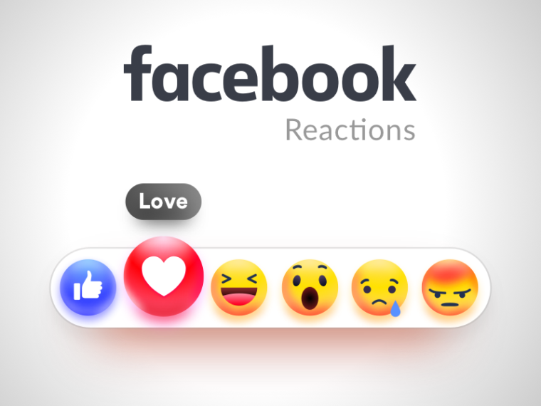
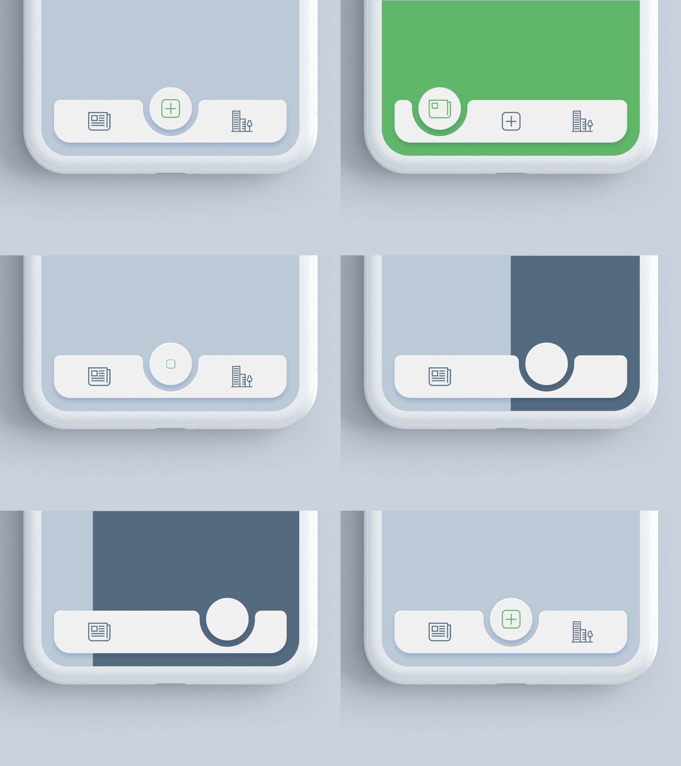
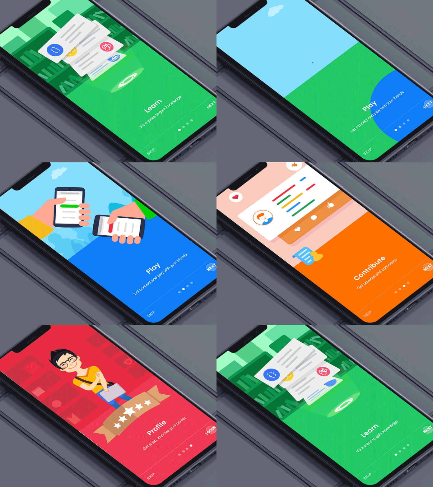
Microinteractions, which can be as simple as giving Likes to Facebook posts to email notifications to the animation referring to the loading process of a web page, continue to play a significant role in the digital interactions and activities.
Without microinteractions, the sophisticated user experience of apps seems to be impossible now.
Naturally, microinteractions are gaining importance with every passing day for app developers and digital strategists.
But before we explain the importance of microinteractions and how to use them effectively in the scheme of design elements, let us start by explaining the core concept and constituents.
![]() (Source)
(Source)
Definition and Types of Microinteractions
Microinteractions refer to the small span of time, facilitating interactions between design elements and the users. Well designed microinteractions help to make the user experience better through design-centric innovations and creative elements. On the other hand, poorly designed microinteractions only undermine and damage the user experience.
Another well-known definition of microinteractions put it in the proper perspective.
According to this, microinteractions are the kind of interactions that we seldom notice separately while they play a crucial role in making the user experience better.
From the Like button in social platforms to the usual pull button for refreshing a page, all seem to remain as unconscious design elements while not failing to deliver a better user experience. We only remain conscious of their value as and when they become absent. Just think of Facebook post without Like, Comment, and Share button. It instantly makes you realize the importance of microinteractions.
 (Source)
There are four parts of microinteractions, such as the below mentioned.
- Triggers: Triggers initiate the microinteractions. The Triggers for microinteractions can be either initiated by the system or the user. While in the case of the first, the software app kicks off an action based on certain interactions and parameters. In the case of the second, the user takes action leading to interaction with the software app.
- Rules: There must be rules to determine the triggering of microinteractions based on preconceived criteria and parameters.
- Feedback: When a micro-interaction takes place, it is the responsibility of the system to let the user know what’s happening through specific feedback.
- Loops and Modes: Loops and modes determine the after-effects and deviation of the preconceived interactions. For example, when using the “refresh” button, a page is reloaded. If it fails to load, the user can see a message about network error or slow connection or alternate solutions.
 (Source)
How Microinteractions Really Matter for the UX Design?
Now the question that is likely to come to your mind is that how these small interactions matter for the user experience.
Well, in spite of the fact that such small interactive design elements may not be visible all the time but they can play a significant role in engaging the users and helping them get things done more quickly.
Let us quickly see the key benefits if microinteractions design from the UX perspective.
- Microinteractions help to optimize the website navigation to a great extent.
- They help easier interactions with the users.
- By providing prompt feedback about any completed action, microinteractions enhance user satisfaction.
- They always allow users to enhance user experience with helpful tips and on-screen suggestions.
- Microinteractions, without drawing much attention, subtly improve user experience. In that sense, they cause the least cognitive lead on the web or app design.
- Thanks to microinteractions, users can share, comment, and like content and engage with the app or web content more effectively.
- Microinteractions always help to create an emotional bond with the users.
 (Source)
Key Things to Do and Avoid When Designing Microinteractions
Just think of content using headline-like font size all over the text to clarify the importance of every statement. Well, this will only create a huge cognitive load and undermine the usability and readability of the content. On the other hand, consider content using headline and body text with different fonts and interactive elements such as links and buttons to trigger actions.
Yes, such subtle and almost non-visible elements in and around the on-screen content actually help the engaging audience.
The same goes for microinteractions.
 (Source)
Microinteractions, without catching too much attention of the audience, subtly interact with the audience and help to engage the users in a frictionless manner. When designing microinteractions, follow the below-mentioned principles and tips for the most effective output.
- Always create microinteractions that are functionally superb while remaining almost invisible or inconspicuous.
- Always ensure that the micro-animations do not hamper the frictionless user interactions by preventing users from getting what they need the app for.
- Design microinteractions with the long term design objective in mind. Always make sure they don’t cause stress on the users because of repeated use.
- Always maintain simplicity when designing microinteractions. Make sure the microinteractions doesn’t take longer to load and undermine the otherwise fast-paced user experience.
- When designing microinteractions always make sure they fit perfectly into the design elements.
- When there is a certain level of complexity in the micro-interaction design, always evaluate how legitimate is it and how and when it can help your users.
- Always make sure the microinteractions remain as essential design elements for the user interface, and instead of creating a design, boredom actually becomes key UX elements for your digital brand. Consider how Facebook “Like” became synonymous with the platform.
Conclusion
Microinteractions will continue to enjoy great importance among the app and web developers. As these tiny interactive design elements are a crucial part of modern user-focused design, no app or web business can do without them.
Author Bio: Nathan McKinley is Business Development Manager at Cerdonis Technologies LLC – mobile app development company designing mobile apps by leveraging micro-interaction in it to enhance mobile/web and software applications user experience. After spending years in the tech industry he started writing on a variety of topics like Mobile/Web and Software App Development and Design, Artificial Intelligence, Machine Learning, Internet of Things.
Don't forget, sharing is caring! :)


3 Comments
Lauren Rodriguez
2023-07-17 at 13:53I have read your blog on How to enhance the user experience through interactive elements in a blog layout. It was very interesting and helpful but I can add some extra points in your article. Here some extra points:
1.Think from the user’s perspective.
2.Maintain a consistent flow in your website design.
3.Add Meaning to Your Interactivity.
4.Get in on the Action by using White Space.
5.It’s Time to Build a Chatbot.
These are some extra points to add to your article. Readers if you are confused about your web and App development , you can get a free consultation at Alakmalak technologies.Visit our site for more information.
Liana
2023-09-18 at 14:11thanks for info