Interaction design is one of those concepts that can’t be explained with a short sentence. One thing that can be said right away is that it plays a huge role in the vast online market formed by countless brands.
When it comes to presenting and selling products online, the broad field of interaction design is an important part of the equation. In order to understand it, we need to break down user interaction to the tiniest level and examine each of them in a different context.
To design an interactive digital product that actually helps you achieve real results, interaction design (IxD) is the way to go. You need to look at user interaction from a cultural, social, and business-based approach.
Before you get confused by what you just read, let’s delve a bit deeper into the subject.
Table of Contents
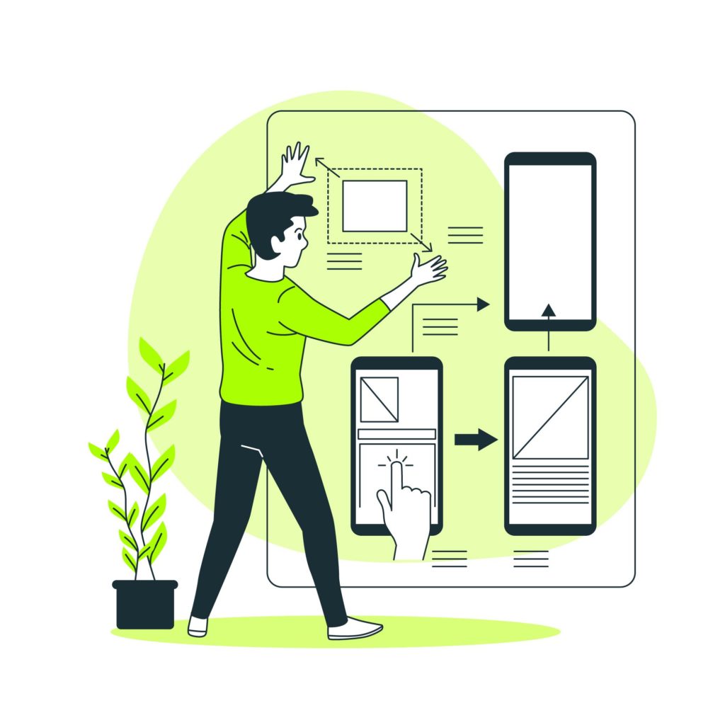
Interaction Design in a Nutshell
(Source)
Interaction design is all about creating an online service, platform, or product that the user finds engaging and easy to use. It is about hitting the perfect balance between aesthetics, marketing, and usability.
In this process, one of the most important goals is to make it straightforward for the user to interact with the software or website. The information in front of them has to be short and on-point while they know exactly where they are with the navigation.
In short, an interaction designer makes sure that the digital product is usable. It is one thing to introduce something new to people that solves one of their problems and a different one to take a look at its usability.
IxD or interaction design has a broad toolset to work with including industrial design, HCI (Human-Computer Interaction), electronics, applied physics, computer science, and informatics.
Interaction Design as Part of User Experience (UX)
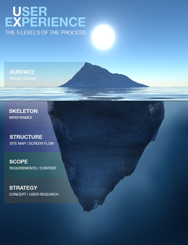
One simply can’t talk about interaction design without mentioning UX in the same discourse. However, it is important to understand the difference between the two. User experience, as its name says, revolves around users interacting with the digital product.
Just by saying that, we can already see that IxD and UX have to go hand in hand throughout the design process. The difference is that UX is somewhat broader and it takes the user’s whole journey into account in the application, platform, or software that is in the making.
UX can be divided into chunks such as information architecture, communication design, interaction design, and application design, just to mention the most important ones. The goal is to blend all these chunks so that users can find their way around in the resulting digital product.
By following the right methods, we can guarantee an overall user experience that actually pleases the crowd. Meanwhile, interaction design is the part of the puzzle that focuses on improving how users interact with the product moment-by-moment.
Improving interactivity largely contributes to the overall user experience. Working on all the different aspects of an application, software, or platform that the user can see is the responsibility of UX design. While UX is the writer and director of the movie, we can say that IxD is the choreographer of it.
It focuses on the momentary exchange that is going on between the user and the digital product. If this so-called exchange is straightforward and easy to follow, then the interaction designer did a great job.
What Makes a Design Stand Out?
How can you even measure if a design is good or not? Are there some factors that allow us to analyze it in the process? It turns out that there are always some characteristics to take into account when it comes to interaction design.
The quality and functionality of a certain design can be determined by asking two simple questions. First off, what does the user want to achieve? Secondly, is there a clear route to that particular goal? A digital product has to be as intuitive as any everyday gadget that we use.
For example, using a modern coffee machine is intuitive. We don’t really analyze what we are doing while making a coffee with it, as it is clear which buttons need to be pushed. The goal is clear and the steps toward getting a warm cup of coffee are all clear as well.
Of course, interaction design is often much simpler when it comes to such household appliances. However, it is based on the same idea. Users do not want to think about how the product works. They just want their question to be answered or their problem to be solved.
Therefore, it has to be intuitive besides being aesthetically pleasing. Improving the quality of the interaction between the user and the application is what interaction designers are all about.
Designing a Consistent System
Consistency is one of those key factors that ensure that the user doesn’t get lost while operating the system. You can design a consistent system by adding functionalities that generate the same response every time.
For example, adding a Back button to every segment ensures that users can always get back to their starting position. Straightforward navigation ensures that the most important segments of the system can be reached at any time.
In a platform, it is important to have commands that behave in the same way no matter when they are used. While using an Apple II, hitting the Esc button takes you one step back no matter where you are in the system.
With such consistency, you can minimize confusion and make it easy for the user to learn how to use the software. Designing a digital product to be simple and consistent at the same time can be hard. Yet it can also make a huge difference.
After all, a good tool is not only good because of its functionality but usability also plays a big role in the equation.
Working on Perceivability
Perceivability is what invites the user to operate the system the right way. It is what precedes interaction by presenting an intuitive interface. Just by looking at it, users need to be able to understand what is going on in the first couple of minutes.
Just take a look at how easy it is to open, close, maximize, minimize or save in any program in Windows. The operating system is designed so that you immediately know what to do. If you see an X, you know that it closes the window. If you see two squares on top of each other, you know that it maximizes or minimizes the window.
These little details can make it comfortable for users to use the system. They are easy to understand and their positioning also helps you find them. It is not too small for you to miss it neither annoyingly big. Interaction design makes sure that every functionality is visible enough and simplified to the point that it is intuitive to use.
This requires you to be familiar with imagery that carries a subconscious meaning. Understanding how people interact with certain tools, either in real life or in front of the computer, is essential. Otherwise, you can fall into the mistake of creating a system that is confusing instead of being engaging.
What you want to avoid is users hopelessly looking for the right thing to click on while relying solely on luck. The less thought it requires to navigate through the platform, the better.
The Affordance of Objects
Basically, affordance means that users can see whether an object can be interacted with or not. For example, it is not enough to make a square-shaped button. By adding some shades near the edges, you can make it look like it is actually pushable.
We associate virtual objects with things we can see in the real world. Creating buttons that beg to be pushed is also part of the interaction design process. By affordance, we refer to the perceivable characteristics of objects that can be found in the application, platform, or software.
It helps the user to immediately understand what the object does and how to initiate its function. In order to achieve this, you need to use color, location, texture, shape, and size in the right way. Hitting the perfect balance between limited and limitless possibilities is also an important factor.
By applying constraints to an object, you can make its function crystal clear for your users. The more possibilities there are, the more confusing it gets to use the platform. One of the simplest examples is when certain pages in the menu are blurred out on a website.
This indicates that those pages are temporarily unavailable, saving users some time and confusion because they would not be able to reach them anyway.
Give Your Users Feedback

Interaction design only works if it gives your users feedback about whether the action they called is initiated by the software or not. When you install software, you usually press the Install button and then the loading bar shows the progress.
Once it gets to 100%, you get a message that it is successfully installed and press the Finish button. Without these indicators, you would have no idea about what is happening in the background. The keyboard is probably the simplest example when it comes to reassuring feedback.
While you are writing your essay by pushing the buttons, the characters appear on the monitor. The software reassures you that what you do actually has a visible effect on the screen.
Designing Navigation With IxD

Without proper navigation, a website can feel like a labyrinth. Users need to know exactly where they are in a system and how to find their way back to the starting point. Connecting all the dots and creating navigation that is straightforward to use is essential. Especially if you want the end product to be successful.
We have already talked a bit about navigation and how certain objects resemble real-life things. Now we are going to bring these two together and explain how good navigation looks like. You only need to sit down in front of your computer screen and take a look at the icons.
Popular operating systems design their icons and buttons in a way so that you immediately know what they do. These icons often resemble things you can find in a typical office such as documents, files, magnifying glass, notepad, or calculator.
Depending on your goal, you always know where to look for the program that solves the problem. You also know how to get back by hitting X on your upper left. This is how interaction design utilizes placement, imagery, and adherence to real-life objects when building navigation from scratch.
Usability in Interaction Design

Creating a digital product that looks great is not an easy task. However, it is even harder to create a layout and overall appearance that satisfies the needs of your users. Usability is an important part of the puzzle, as users need to be able to quickly understand what they see.
Usability is hard to measure if you don’t test it with people that weren’t included in the design process. After all, the design team doesn’t need any hints about how the system works. Usability can be tested, as there are plenty of ways to measure human behavior.
This part of interaction design includes industry psychology, cognitive psychology, and ergonomics as well. Besides looking awesome, your digital product also has to be practical and user-friendly. Investing in usability testing is a much better alternative than making your product public and adjusting it afterward.
While you accumulate the user data you want to work with, you also lose a lot of your traffic. It is due to the suboptimal user experience. This is why it is better to figure out as many of the flaws as possible beforehand by performing usability testing.
Designing a system that is actually usable will require you to implement psychology principles that can be applied to digital interaction.
Usability Principles that Every Interaction Designer Should Know
-
Ensure an easy-to-follow system status
Users need visible and consistent information about what is going on in front of them.
-
Illustrate objects and processes with their real-world examples
There are always short words, conventions, or concepts from the real world that can be used in your digital product. This allows you to familiarize users with its various features.
-
Give your users freedom and control
Since users make mistakes, they need to be able to be returned to a previous state in the system. Such functionalities include Undo, Redo, and a Close button.
-
Check the system for errors
Before you let the users in, do your best to find certain conditions in your system that can result in errors and fix them.
-
Hit the balance between aesthetics and functionality
Although some elements might look great, they may also be irrelevant or even confusing to users. Make sure not to display irrelevant information because it can distract user attention from those that are actually relevant. A minimalist design can also look awesome.
-
Consistency is key
Every platform has its own conventions that the user needs to get used to. Pretty much all PC users know how a Windows operating system looks like and how to operate it. The main conventions remained consistent for decades. Such examples are good to follow as interaction designers.
-
Put essential information in front of the user
One way to make things simple is to highlight the right information at the right time. Every option, object, and action needs to be easily accessible at the right moment. This principle is about minimizing the memory load of your users, allowing them to recognize things instead of recalling them. As a result, they can make decisions faster and in a more satisfactory manner.
-
Create a flexible and efficient system
You need to count for the more computer-savvy users and the less experienced ones as well. While making the whole system easy to understand, it is also important to add shortcuts. A flexible system can satisfy the needs of both experienced and inexperienced users. Besides shortcuts, sometimes advanced tools can be added as well during the interaction design process.
-
Being able to provide help is essential
Make sure that you add thorough documentation about the system so that users can open it whenever they get stuck. Adding a search bar to the knowledge base makes users able to get help based on keywords. Adding live chat, email address or contact phone are also great alternatives.
-
Provide a way out for your users in case they get stuck
If there are any errors or blind alleys to be expected, you can help users out with an error message. It feels much better to run into an error message that explains the problem than to hit a wall without knowing why. Error messages should be explained in a straightforward way instead of using raw terminologies or code. By suggesting solutions, you can help users get back to their starting point.
Summing up
Interaction design is something that you just can not ignore if you want to have a successful website with an exceptional user experience. It’s an important part of the UX where you have to be creative, but it is even more important to be unequivocal.