Certain products that we use in our lives seem to fit so perfectly, mirroring the feelings that we experience when the final missing block of the jigsaw is found. How in the world are these products so well-designed while, on the other hand, there are some products that only the mere idea of using them makes us mentally exhausted? The difference is a designer who understands the products’ target audience.
UX Design and some disciplines of psychology, particularly human psychology overlie each other. As a UX Designer, it is not only important that you know your users, but also use that perception to create a satisfying product experience for them. Most of the UX designers often combine the two- User Research and Human Psychology, in order to understand their audience.
In this article, we will go through such fascinating ideas and explore how they contribute to UX Design.
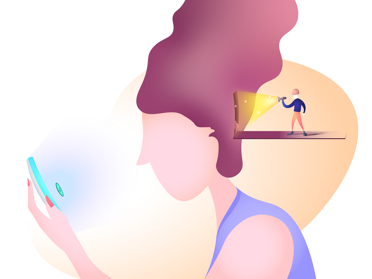
1. Okay! 9567412…Ahh…What Was It Again?
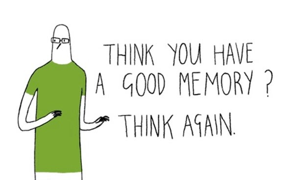
The computer’s ability to store, retrieve, encode and decode information is exceptional, and it is true that humans built it. But if you’d ask me that if human memory is equally as reliable, I’d have to reply in negation or I’ll maybe just make a side-to-side movement of my head.
Source: Scientific American
The unreliability of memory is caused by cognitive overload. As a modern-day product, UX designers must ensure that users don’t have to remember most of their details. Throughout the product usage, user details must be remembered and stored. Emphasis on the part that all-important information like prices, product name, deadline dates must be displayed on all pages or screen to reduce the user’s effort of looking back and forth at pages.
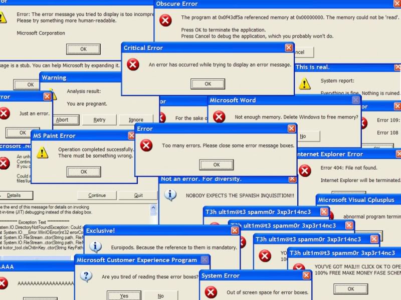
2.To Not Err Is Impossible (For Humans)
In today’s internet world as afraid we’re to the shiny red exclamation mark, we as humans are in the same frequency, if not more prone to commit mistakes. It is common for us to run into errors while interacting with the product and most of us are familiar with it, but at the same time errors irritate and create further discouragement for the user to continue using the application or product.
Source: TechSource
UX Designers should aim to minimize the possibility of a user running into an error. Not just to resist the frustration and pain experienced by the user, but it also benefits the company by saving their money to fix these errors in the future and save designers’ loss of time.
3. Could You Pass Me That Remote Please…
The principle of least effort states that humans tend to choose paths that appear to them least relatively easiest among the lot. That’s the reason the average working-class people tend to live longer than any other.
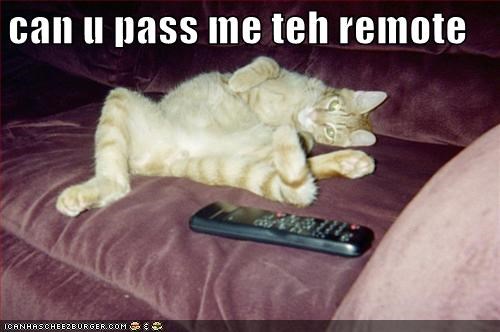
In our context, you may have experienced that when you click on a website from Google hoping to find the solution to our query, you’ll get treated by a bang below-average website with poor navigation and readability. You still might click around to see if you could find anything fruitful, but then close the tab bursting with frustration.
The next time, you click the second link, which has perfect navigation, it’s clean, simple and contains what you were looking for. It feels much better, not having to waste time and effort to accomplish a simple task.
4. Have You Ever Tried The Fibo-Nachos?
Ever seen that a certain set of websites related to a niche, follow a similar pattern in their designs, flow, and colors? This is because people landing on a website or using an application expect the website or app to perform in a certain way based on their experiences from such products.
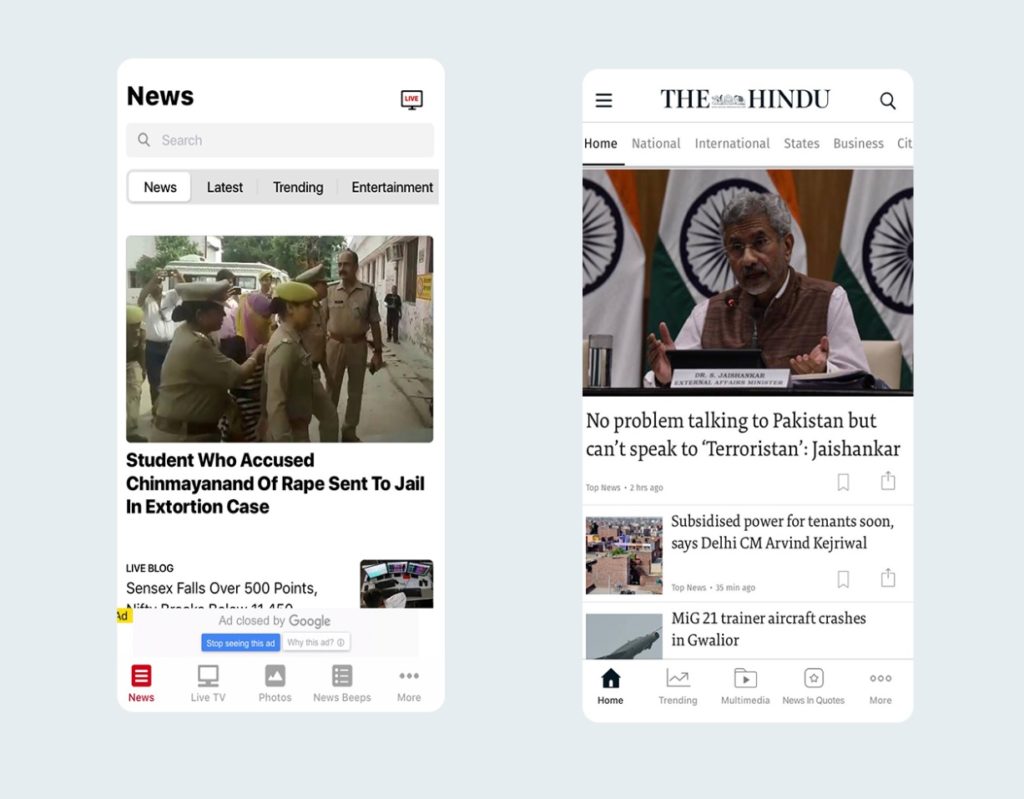
Newspaper apps following almost similar design patterns.
For example, you’re visiting a news website or using news app to read about current affairs and maybe some business news, you’ll most probably see images of the local politicians giving speeches, interview transcripts, stock market analysis or robbery reports, but what you won’t see random pictures of cats and dogs, as this will send the wrong message to the audience about your brand’s credibility (here: The Press), giving out untrustworthy vibes.
Lemme Leave Some Carbon Footprints For Y’all
This is more of an analytical approach rather than the psychology + UX crossroads.
If only it was more obvious, user experience is all about the users, and it makes sense to approach it with a user-centric method.
Heat Maps is one such qualitative tool that lets you collect data of user’s behavior on the website, enabling you to make better decisions based on behavioral patterns learned from optimizing these data.
What are Heat Maps?
A tool for visualizing website clicks, scrolls, and other web page activity. It uses color as the scale of measure. Red being the most active and blue being means the part of the page with the least number activity recorded.
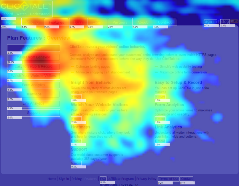
Source:pixelter.com
Heat map data can be collected from web pages, mobile, and desktop screens. It also offers three major types of views-
- Scroll maps – Highlight user scrolls on a page
- Click maps – Highlight user clicks the mouse (or tap on mobile devices)
- Move maps – Highlight user mouse movements (without clicking)
A Heat Map is worth tons of insights, giving a collection of data of your platform’s UX to validate and look for opportunities to improve. Here are some key points on how using a heat map benefits your design process.
- Cabinet best-performing pages: Designs on their own could be great, but in the business world, heat maps let you demonstrate the performance of your designs to the client.
- Identify working CTAs: Analyze which CTAs or prompts are performing well and which are getting ignored. Identify and test different solutions until you meet numbers that content you.
- Measure Scrolls: No user acts the same, scrolls maps tell you to what extent did the users scrolled the webpages. This tells you the average scroll-fold of the users that visit. You can use this information to redesign and change the placements of the CTAs and other important prompts.
- Resolve Problem Clicks: A lot of users click random spots on the page thinking it to be a link, click maps can help identify such spots, you can use this information to either add links there or fix those spots.
Conclusion
Designing is much more than creating a user-friendly interface, it is an endless task. One day you’re designing an online learning portal and the next day you could be re-designing a digital agency’s website. Good designs have to look good, but it is much more than that. Effective and successful designs come by understanding the users, some greats designs have the ability to influence people and the future stream of work as-well.
Author Bio: Chintan Bhatt is the founder & chief designer at YourUXTeam, a company that works with startups, software firms and design agencies across user testing, high-level UX design, gorgeous UI design, and interactive & motion prototyping to design products that are incredibly easy and delightful to use. Connect with Chintan on LinkedIn and Twitter.
4 Comments
Anil
2023-02-21 at 10:40The most crucial aspect of the website is the user experience.
portrait photo retouching services
2023-04-05 at 07:31I really appreciate you for publishing this blog here about UX Designers, it’s really a helpful and very useful for us. This is really appreciated that you have presented this data over here, I love all the information shared. Great article!
Best Web Development company Faridabad
2023-05-15 at 14:56Very Good & much Great. Enjoyed reading the article above, it explains everything in detail, the article is very
interesting and effective. Thank you and good luck with the upcoming articles.