Online sales are very tempting for many. There is no need for salesmen or employees. Everything can be measured using all kinds of web analytics tools. Things can be automatized and so on. At first glance, it looks very simple: you launch a webpage run a few ad campaigns, and customers are coming champagne bottles popping.
It might look something like this in people’s imagination, but the reality is not that simple. The success of your website is influenced by a number of factors, which, in most cases, are fortunately measurable.
Your website is worth nothing if it doesn’t convert.
Table of Contents
What does conversion mean?
The term “conversion” is widely used by the web industry, in the way that the visitor is “transformed” into an interested person, customer, subscriber, and so on.
Optimally, a website has more visitors – much more- than any active engagement. In other words, most of your visitors will leave in the first few seconds and this is completely normal. However, you can do a lot in order to increase the efficiency of your website.
When can we say conversion is going to happen?
Conversions don’t have to be sales but can be any key performance indicators (KPI) – such as Customer acquisition cost or Shopping cart abandonment rate – that matter for your business. In other words, the conversion will happen when the website owner’s goal – which can be anything – is realized.
Here are a couple of examples of potential goals:
- Contact the owner of the site
- Order
- View a specific website page
- View a particular order of sub-pages on a page
- Sign up for a newsletter
- Downloading material from the site e.g. ebook
- People download an app and also use it
- Subscribe to a trial
The list goes on. You set conversion goals in your web analytics software for whatever you want to track.
How can conversion be measured?
To measure conversion, you need to things:
- An appropriate web analytics software.
- A proper website structure, design, and programming where each step (even on the URL level) makes the visitor’s activity visible.
As you can see, here again, it is proven how much web design is brain work.
We will only be able to measure what we have built measurably.
The easiest way to measure conversion is by setting a goal in a web analytics tool. The sophisticated web analytics tools put special emphasis on measuring and optimizing the conversion.
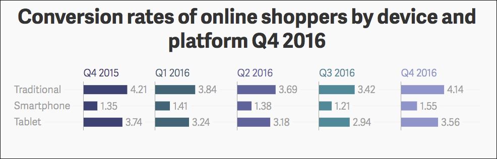
When can you say that your conversion rate is good or poor?
Varies per industry. However, as a good rule of thumb, most companies reach a conversion rate of 2-3 percent. By default, the conversion goal is met by the order. If the appropriate level of conversion rate is between 1 and 5%, most sources consider 3% acceptable.
If your conversion is below 3%, you can start thinking about why. There are dozens of explanations. If your web analytics show that your conversion rate is low, it means your site is not attractive or somehow you attract people who aren’t part of your target group. The conversion rate can often drop because of usability issues.
Here are a couple of examples of the most common usability issues:
- The website design is not attractive, not aesthetic, or obsolete.
- The website is hard to navigate, and confusing (e.g. call-to-action buttons and links are hard to find)
- The landing page is badly defined or configured (e.g. the visitors come from a running ad and the landing page doesn’t meet their expectations or it’s misleading).
- The visitor’s goal differs from your conversion goal (e.g. the visitor visits your site to gather information, but is not interested in buying your product).
How can you improve your conversion rates?
Don’t do anything until you know where you are! Ask yourself the following questions and try to answer them from the visitors’ perspective:
- Is the website easy to navigate?
- Is it easy for me to reach my goal?
- Do I have to wait for the site to load up until my coffee gets cold?
- Do I get what I’m really looking for or I’m just wasting my time?
User experience plays a significant role when it comes to improving your website’s conversion rate.
So, in order to claim that the design is able to fulfill its mission, the requirements mentioned above must be met at the same time. In other words, usability, aesthetics, and efficiency are key factors.
If you only considered one of these when thinking of designing your website, it’s time to step back and inspect the picture as a whole.
Tip #1 Web Design and User Experience
Remember that silly joke about the 5-second rule? Well, there are only 8 seconds to convince visitors.
Some things you need to be aware of:
- Make the layout clear.
- Make sure you apply positive feedback.
- Use high-resolution images.
- Make it super easy to log on to your site.
- Use simple forms to be effective for your call-to-action buttons.
Seriously. People hate forms.
Tip #2 User Testing
Your landing page and its elements should always be optimized with A/B tests to determine what works for your target audience and what does not. And how to do that?
Try to use behavioral analytics tools like Capturly’s heatmap tool. Heatmaps provide valuable insights by visually representing user behavior and interactions on your site, helping you determine which version of your site performs best and drives the highest conversion rates.
User testing is the Rambo in your arsenal.
User testing allows you to see the project with the eyes of the end users. It can reveal details that you might have missed or simply thought that they weren’t important. It is recommended to conduct it as soon as possible in the early design process. If you do so, A/B tests can help you optimize your conversion rate. You can identify the challenges people face while using your website, and why they do not convert.
Tip #3 Proper Call-To-Actions
The physical locations of your screen elements are important. So practically, all the elements of the webpage, and even beyond, can affect conversion optimization. Making it confusing to complete easy tasks such as downloading a desktop version of an app is not the best idea.
Let’s look at the CTA button design in detail.
If conversion optimization is your goal, it won’t succeed without efficient call-to-action (CTA) buttons. Those who have not dealt with web design, conversion optimization, the design of landing pages, and refining CTAs, may not even begin to understand why designing a call-to-action is so important.
Use proper contrast.
This isn’t a game of hide-and-seek. There is a reason why these elements are called Call-To-Action and not Find-The-Button. Make sure that these buttons/links are visible enough to achieve the following:
- Grabbing attention in an intuitive way.
- Improving accessibility for the visually impaired.
Using low-value contrast – as you can see in the right image – can be a challenge to read for people with color vision impairments.

Another example of contrast:
If you have never visited the website of Blizzard.com – a leading company in the video game industry – you can find it confusing to download their app. You have two options:
- Get the app by clicking the CTA on the slider. However, if the slide changes before you can click on it, you have to navigate back to the particular game and look for another CTA on the specific page to make the download.
- Click the anchor text below which is hard to spot since it’s basically blue text on a blue background.
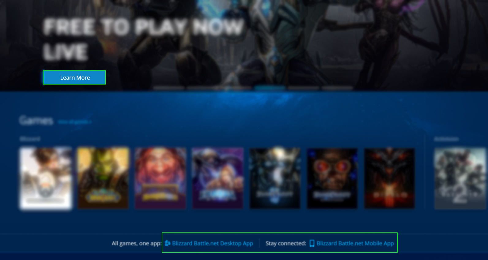
Source: Blizzard
The size of call-to-actions also matters.
According to Fitt’s law. The time needed for a click to happen is defined by the size of the object and its distance from the pointer.
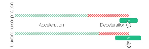
Also, when the user is in close proximity, the mouse movement will slow down to avoid a potential misclick. This way if the size is increased, the time to manage a click reduces.
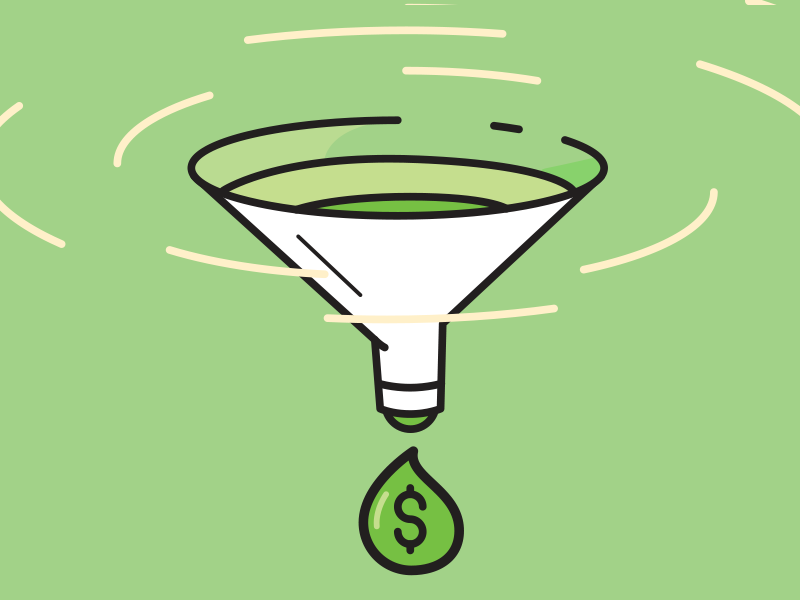
Tip #4 Funnel Optimization
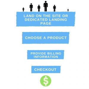
Every tip mentioned above aims to improve your conversion funnel. In marketing, the funnel describes the user’s journey through an application or a website/webshop. The sales or conversion funnel shape – like shown in the image below – comes from the fact that at every stage the company loses a certain amount of users as they proceed through. Your goal here is to bring more visitors to the top of the conversion funnel.
However, when it comes to increasing the efficiency of the different levels, marketing, and design have to work together. After you’ve collected the necessary amount of information and have a rough idea of what’s going on in the users’ minds, you can proceed to fine-tune the structure of your design. Even if people are coming to your site to order something. However, the difficulty raises as you wish them to go further in the conversion funnel.
Trust is playing an increasingly important role.
Building trust does not go from one moment to another. Confidence-building is a process where you need to think of not just a website, but a conversion funnel.
For example, to get a newsletter subscription, it’s easier to get an email address, as they may get some useful content for free. But this is another story when it comes to serious issues like when visitors have to pay heavy money for your product or service.
Conclusion
“Unfortunately”, nowadays it’s not enough to have an excellent product, or service that you simply put on the Internet. Moreover, launching a successful online business is not cheap (as you might think). You can kill hundreds of thousands to make your website look beautiful and still have a bad conversion rate if you don’t use your web analytics tools – such as scroll heatmaps or click heatmaps – smart, and if you don’t have a thought-out, well-designed strategy.
Advertising costs have been chewed up, and fast-paced tricks are obsolete, so without a proper conversion optimization strategy, your ads will burn more money than you realize. The secret of effective sales lies in gradual growth and confidence building.
8 Comments
Alfred
2018-06-05 at 03:08Great article Sophie, sales funnels work as great for B2B leads as they do selling products direct to customers such as free plus shipping funnels.
Sophie
2018-06-05 at 13:13Agree with you, Alfred! Thanks for your feedback:)
MaksimMB
2022-07-01 at 16:24Great article, you can tell right away that the auto knows what she’ s talking about. I have experience with UX and in my daily life I sometimes notice how people decide to skimp on quality research and outsource design to bad experts. It really takes a toll on the quality of their product. It’s always better to delegate such things to professionals)
Wordle answer today
2023-12-08 at 10:18Your writing is enjoyable to read. This is an excellent document for me. I bookmarked it and will return to read new posts.