
If I had to pick a single thing that causes me immense agony, that would be poorly designed forms without a doubt. Especially signup forms are often one of the most neglected aspects of web design. However, they are also the part which the customer interacts with the most and hold a central role in the conversion process. Sign-up forms come in different shapes and sizes. They can be simple registration forms, contact forms, or checkout forms, etc. It usually depends on the company’s lead generation goals.
Regardless of which type of form the website owner is using, a mistake in its structure, field placement, format, validation message or captcha can be extremely detrimental to the website’s online indemnity and lead generation process. In this article, we take the opportunity of explaining the 6 most common mistakes web designers do when designing a sign-up form, and how you can fix them.
Table of Contents
Unnecessary Fields that Kill Conversion Rate
Have you ever filled one of those forms issued by your government or bank? It’s almost like you’re signing the devil’s contract. There are certain use cases where this can’t be avoided, however, when it comes to your website, please think twice before asking the potential customers to fill out a field that is irrelevant to the action. Valuing your prospective customer’s time is the first lesson you need to start with, otherwise, your conversion rate will plummet. Not everyone has the same level of tolerance for overly extended fields and additional attributes. You want to make your form simple, concise and relevant. This ensures the customer does not frustrate in the middle of the process and abandons the page. You can start by asking the important questions first and removing the unnecessary fields for secondary contact numbers, email addresses, and home addresses. Instead, add progressive profiling to your lead generating strategy and ask additional questions once the lead has been confirmed.
Not Showing the Right Labels
Field labels hold a deciding role in whether customers will enter their information or not. These labels not only explain what information is requested but also indicated if a field needs to be filled or not. For example, the customer’s age is usually not required in signup form but marketers still add a field in the form to get an idea of their user demographics. This often becomes intrusive to some users who do not wish to share their personal information with the company. To make this error-free, you can add an optional label next to the main field title. This allows the user to avoid any optional field and skim to the key details of the form before submitting it. You should explain how you want users to input your data or why you need it. Do you need their birth date or their full name? Then tell them why as this builds trust and the user will thank you for it.
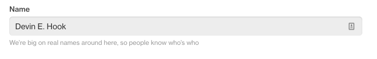
On the example above, it is visible, that the main reason why your full name is required is to provide easy identification. Moreover, the marketer also benefits from the probability of getting the information since many customers don’t mind sharing a few their personal details.
Not Using Placeholders
While field labels get the customer to understand what is asked in the form, there still lingers a chance that the user might enter the wrong type of information. This happens in the absence of a placeholder, a common mistake among designers.
Just like field labels, place holders are also a key element of a good signup form. Placeholders are text attributes which hint the user what type of information needs to be entered. This includes the context and the format of the information, such as alphabetical or alphanumerical. The placeholder informs the user about the expected value of the field and appears in the absence of user input. This exemplifies the complete set of information in the field. Not everyone agrees with this. For example, according to Nielsen Normann Group, placeholders are harmful to your conversion rates.
NNG claims that:
- disappearing placeholder text strains users’ short-term memory
- without labels, users cannot check their work before submitting a form
- when error messages occur, people don’t know how to fix the problem
This might be true when we consider long forms – like those issued by governments -, however, when it comes to registration forms, you can count on the user’s muscle memory. To simply put, there are so many generic layouts out there that the chance of someone missing one of these through his life is nearly zero. These forms have developed a certain hierarchy over the decades, therefore email comes first, then repeat, then password, then repeat, then phone, etc. you get the idea. Even if you fail to read the whole placeholder, you’ll surely know from experience that after you fill out the input for email, you’ll have to repeat it in most of the cases.
Take a look at eBay’s registration form for a good example.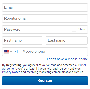
If for some reason you decide to stick to NNG’s standpoint, then dynamic placeholders are your jam.
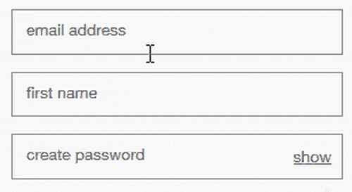
Once the customer begins typing their information, the placeholder disappears. This renders a better user experience and prevents chances of error in entering and receiving information through the sign-up form. It’s a great way to keep the customer informed about the input process without adding elements outside the fields that can ruin the form’s aesthetics.
No Proper Spacing and Layout
Poor spacing and layout are two main factors that determine the cosmetic appeal of the sign-up form. Websites owners who sideline this crucial element are often the ones complaining about unprovoked conversion drop. A well balanced negative spacing and a clean layout stimulates engagement and encourages the customer to enter the information happily in the fields. A structured layout that features proper hierarchy through field groups and relevant attributes ensures a good input flow for the customer. This also helps the website owner to view and organize the information more efficiently once the form has been submitted.
Right-aligned labels consume less vertical space, however, you have to be careful with the horizontal spacing, too long labels may have to be separated into two lines.
Left-aligned labels can be beneficial in western cultures, where people read from left to right, so they prefer a hard edge on the left.
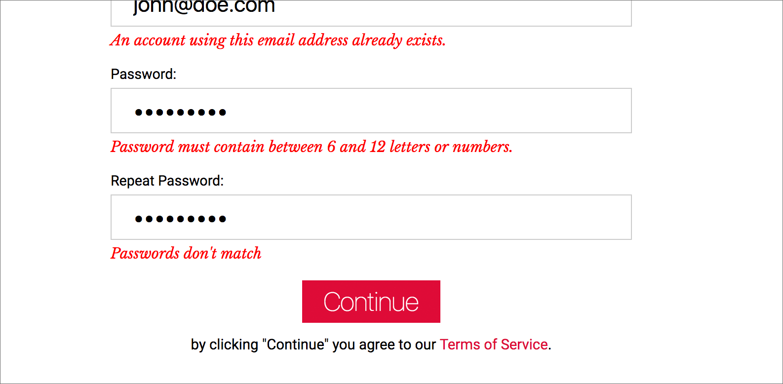
Wrong Choice of Error Messages
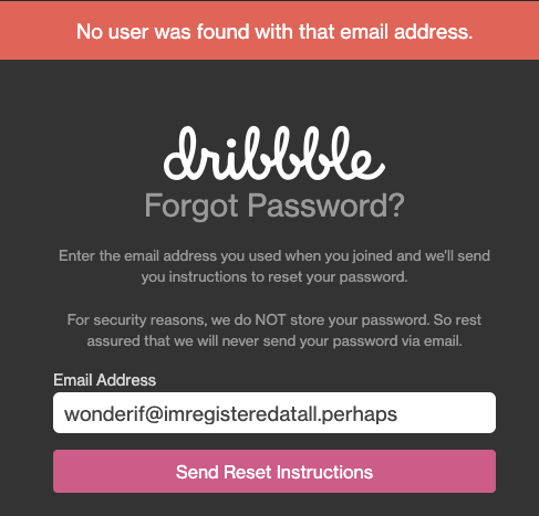
Confusing error messages are one of the notorious reasons behind falling conversion rates. Users prefer simple and easy to use self-explanatory forms. However, chances of error are always there and when users enter the wrong type of information an ugly error message pops up, just mentioning the form cannot proceed but not pointing out where the error has been made. This not only frustrates the user but also keeps them from entering the right information in their next attempts. You have probably experienced the situation when you sent out a verification e-mail but you weren’t even sure whether you’re registered at all. The results of this situation are often undesired for website owners. You can fix this easily by showing validation sign or error message near the field. If that’s too much you can show it at the top as well as the bottom of the form instead of leaving it by the end of the submission. Dribble dissipates this confusion in a simple, yet elegant way.
To avoid custom development cost, there are numerous extensions available in the market such as Magento 2 Custom Registration Fields which allows you to add custom fields and enable input validation for each field.
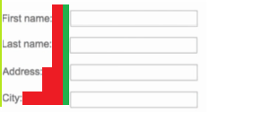
Make sure to implement live feedback. If you look at the example below, you can see where this form – that should be super fast to fill – bleeds out. There’s a special place in hell for those who let their users suffer from such experience.
Not Sending Confirmation Emails
Yes, confirmation emails delay the registration process and can be frustrating, however, having no feedback at all is even worse. In fact, confirmation emails are among the most important emails that your customers expect as it is essential to inform the user about their sign-up success. Without proper confirmation, you can’t even talk about conversion rates. Some designers and marketers neglect this crucial aspect when integrating sign-up forms on their website. Customers who share information with websites often have reservations about the authenticity of the platforms, their security, and speed of form approval. Sending a confirmation not only washes away all these reservations but gives a positive impression about the brand, its responsiveness, and the quality of its operations. You can add a custom message according to your preferences to inform the user about their sign-up success.
Wrapping up
While sign-up forms are an excellent channel to secure conversion and collect valuable customer, designing an effective sign-up form takes a lot of consideration. By studying these 6 mistakes and their solutions, you can build a well-structured lead generation gateway that is functional, aesthetically pleasing and user-friendly.