Are you drowning in e-commerce data? Are tables upon tables of traffic source data, logistics reports, and billing receipts making your head spin?
We feel you, and we’re here with the antidote.
While e-commerce stores are blessed with an enviable amount of data compared to their brick-and-mortar counterparts, trying to make sense of it can be like pulling teeth. Most people would rather visit their dentist than wade through Google Analytics to find actionable steps that would help them improve their store.
There’s no getting away from data if you want your store to be a success. But you can make analyzing said data a lot more enjoyable and effective.
The trick is to present e-commerce analytics data visually.
Table of Contents
The problem with e-commerce data
There’s no almost no limit to the amount of data you can collect and analyze regarding your online store. From marketing and website engagement to sales and logistics, digital tools and platforms provide instant access to data.
In theory, such a huge amount of data should make it easy to discover meaningful insights and trends that you can use to improve your store’s performance. In reality, that’s not always the case. The sheer amount of data available to store owners and managers means that e-commerce analytics can be complicated. As a result, they’re often ignored.
One issue is that it’s hard to get an overview of all of your important metrics in one place. Sure, your e-commerce platform may show you website and sales data, but it won’t necessarily include data on how an Instagram marketing campaign is performing or the state of the inventory in your warehouse.
It’s hard for e-commerce entrepreneurs to connect the dots, according to Chase Zieman, the chief data science officer of Cart.com, who said:
“Founders often fail to see relationships between insights from disparate corners of their business — social media ads, on-time delivery rates, or product-return requests — and miss out on additive lessons that arise when they address those data streams through a single unified platform.”
But this is also because e-commerce data can be so hard to understand. Pages of figures don’t make for the most enticing or legible read. It’s hard to get actionable insights from your site’s analytics unless you devote hours to combing through every chart and table.
Data visualization is the answer
The answer isn’t to disregard your data. Rather than shutting down your laptop, get a better lay of the land by turning that data into beautiful reports. Visualizing e-commerce data is a much more effective and efficient way to analyze your brand’s performance.
Why? Because humans are visual learners. Our brains process images 60,000 times faster than text. Around 90% of the data our brains process is visual. A team of neuroscientists from MIT even found that our brains can process whole images in as little as 13 milliseconds. That’s unbelievably fast.
By using charts, graphs, shapes, and other visual formats, data visualization turns dreary text that takes hours to understand into engaging insights we can consume in seconds.
The benefits of doing so include the following.
Better insights
The impact of your store’s optimization hinges on the quality of your insights. As we’ve already discussed, standard e-commerce data doesn’t provide clear insights automatically. By visualizing e-commerce data, you can comprehend it better and generate insights that will positively impact your business.
Faster insights
Speed is key in e-commerce. Every day matters, and the faster you can start making decisions about your business, the quicker you’ll see results. This isn’t possible with standard e-commerce data, but by turning it into visual reports, you’ll be able to see essential metrics at a glance.
Better storytelling
In cases where you need to get marketing or budgeting decisions approved by executives or shareholders, visual data makes for a much more compelling story. Senior leadership doesn’t want to waste time scrolling through tables of statistics any more than you do. By showing them graphs, you can get your point across succinctly and get your new budget approved fast.
It’s easy to turn your e-commerce data into visual reports, and there are many ways to get started.
To rapidly unlock the power of your e-commerce data, you need an end-to-end data analytics platform to automatically extract data from all your systems and combine that data into interactive and automated dashboards.
Create a web analytics dashboard
If you’re an e-commerce store, there’s a good chance you have an analytics tool installed. More than 28 million sites use Google’s free analytics platform alone.
That’s not a surprise, given the sheer amount of data the right analytics generates. Unfortunately, there can be too much of a good thing. When you have a lot of tables and charts to sift through, key insights can get lost. Rather than sift through dozens of reports your analytics platform creates for you, build a dashboard within the platform instead. A dashboard will distill your data, presenting only the key insights that actually matter to your store on a day-to-day basis. That means you can see at a glance how things are going and what needs improving.
Here’s an example of what a dashboard looks like in Capturly.
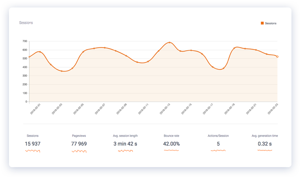
Your analytics dashboard is made up of individual metrics that allow you to get a visual snapshot of the health of your site. Clicking on any of them will bring up a larger graph you can use for analysis.
If you’re creating your own analytics dashboard on Capturly or another analytics tool, take care to avoid overloading it. If you add too many, it can be hard to glance at your dashboard and immediately understand your performance. That ruins the whole point of visualizing data in the first place.
Consider limiting your visual dashboard to the following metrics and KPIs:
- Site visits
- Sales
- Traffic acquisition channels
- Conversion rate
- Bounce rate
- Average session duration
Not every metric needs to be presented visually, but the more charts and graphs you add, the quicker you’ll be able to assess the health of your store.
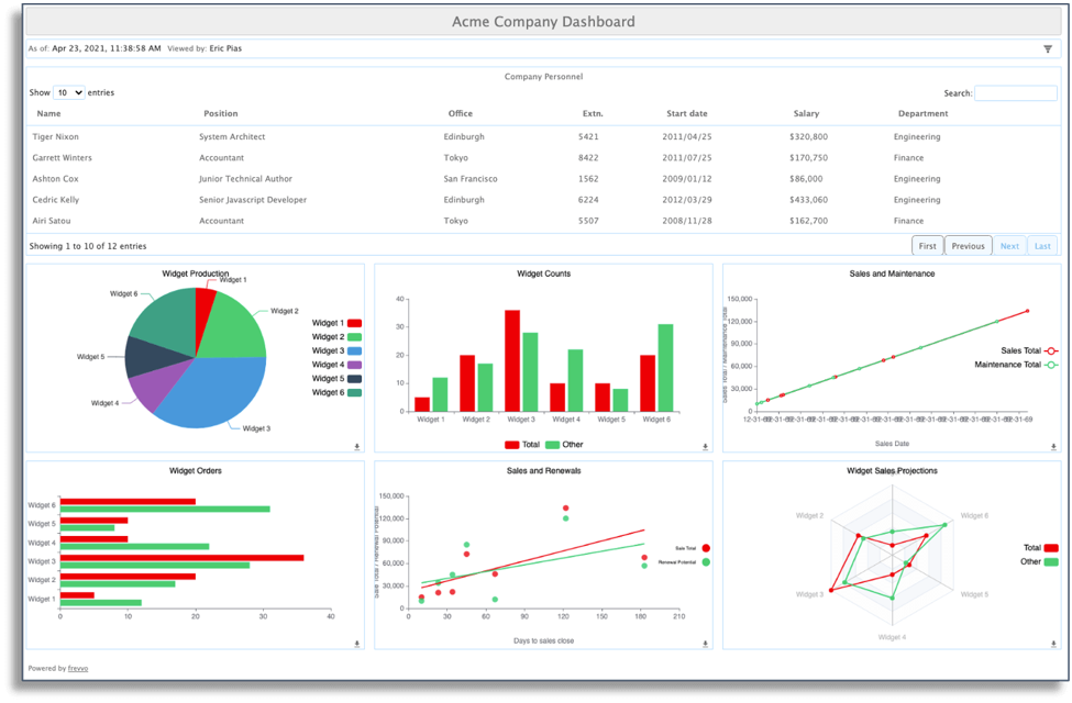
Build a comprehensive e-commerce dashboard
If you’re going to the trouble of building a dashboard, why limit yourself to analytics data? Plenty of tools make it possible to collate a range of disparate data sources to get a complete view of your e-commerce store on a single screen.
You can add almost any data you want to your e-commerce dashboard. That being said, there are several data sources we recommend including.
Sales metrics
Every e-commerce store owner wants to know how many sales they’re making over a given timeframe. But you can get more specific by including a widget that shows this week’s best-selling products or the geographic location of customers.
When you have sales data front and center, it’s easy to spot issues with one of your most important KPIs. A sudden drop in sales could suggest an issue with your website or payment processor that you’ll need to rectify immediately. On the other hand, a sudden increase can act as a reminder to check inventory levels.
Typical sales KPIs include:
- New daily sales
- Rolling weekly sales figures
- Average order value
- Number of new customers
Site analytics
This is where you’ll want to integrate Capturly to access all of that juicy behavioral website data. Steady traffic levels are vital to the health of any e-commerce store. That’s why you need to keep your eyes on those metrics at all times.
Many of the KPIs we discussed above will be relevant here. In particular, you’ll want to think about including:
- Traffic levels
- Acquisition channels
- Bounce rate
- Average time on site
Financial data
Go beyond sales by highlighting and analyzing your store’s financial data. Revenue figures will likely be a core part of any e-commerce dashboard, but you may also want to draw in data from your invoice management tool to create a chart that tracks monthly invoices or helps you understand your bank balances at a glance.
This is particularly helpful for store owners who don’t want to log into their bookkeeping software or online banking portal every day.
Other financial KPIs and metrics include:
- Average billing amount
- Taxes
- Revenue by payment method
- Cost of returns
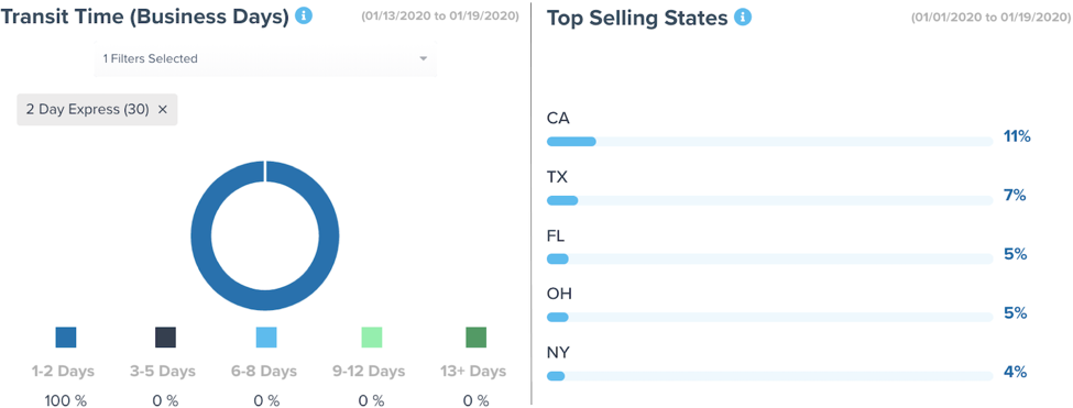
Logistics and warehousing data
Inventory and logistics management are two of the biggest e-commerce challenges, which is why including them on your e-commerce dashboard is essential. By doing so, you’ll know how much stock you have, how long shipping is taking, and what percentage of items are being returned.
Making supply chain decisions like when to reorder inventory and which items to cut becomes significantly easier, too.
Logistics KPIs include:
- Number of orders sent
- Average delivery time
- Inventory levels
Note: While each of these data sources should be a part of your e-commerce dashboard, many deserve a dashboard of their own. There’s absolutely no reason you can’t have multiple dashboards — one that offers a birds-eye view of your company and several more that drill down into each part of it.
Use heatmaps to see how visitors interact with your site
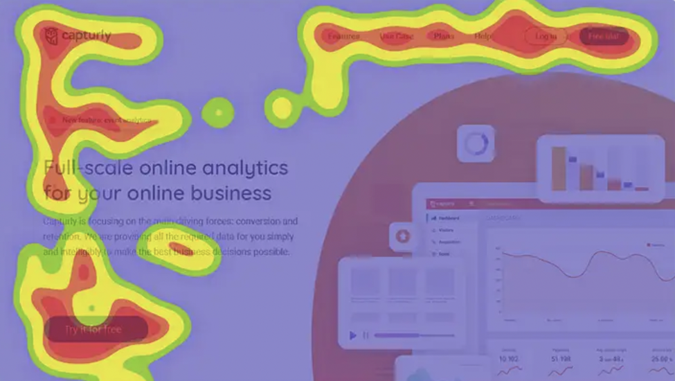
Web analytics isn’t the only way to understand user behavior. A heatmap provides an aggregated view of how users click and scroll your site.
Color-coded overlays show where users spend most of their time when browsing. Red and orange mean users spend a lot of time on these areas, while yellow and green receive less attention.
As you can see in the image below, users spend most of their time on Capturly’s homepage focused on the navigation bar and the call to action button.
There are several heatmaps you can create using a tool like Capturly. These include:
- Click maps
- Hover maps
- Scroll maps
- Attention maps
- Eye-tracking maps
Click heatmaps focus on where your users click. This is the type of heatmap shown above and is a great way to find out whether users are clicking where you want.
One of the biggest insights e-commerce store owners can get from a click map is whether images should be clickable or not. If your non-clickable images are receiving a lot of clicks, it could suggest users want to see a larger image before making a purchase decision. It can also help you remove distracting elements — like the navigation bar when you want customers to checkout. You can create these heatmaps for tablets and smartphones, but those are called touch maps.
Hover maps track your users’ mouse movements. These can be informative, but they shouldn’t be used to optimize your site on their own. Mouse movement doesn’t always correlate with eye gaze. In fact, users often leave their mouse on the right-hand side of the screen.
Scroll heatmaps show how far down your page users scroll. This is an excellent way to measure the design of your pages and how committed your users are to scrolling. The warmer parts of the map are where users spend most of their time, and this is where the money is. If your important elements aren’t in this zone, it might be worth moving them.
The trouble with a tool like Google Analytics — even when you use a visual dashboard to understand the data — is that it’s not always obvious why users behave the way they do. Seeing that one of your product pages has a 70% bounce rate shows that there’s a problem. But it doesn’t explain what the problem is.
A heat map can solve this issue and others like it. Because you get a visual representation of how users spend their time on your site, you’ll see which areas capture their attention and which don’t.
Maybe 70% of users don’t take action on your product page because the call to action is all the way at the bottom of the page, and they’re not scrolling there. The answer won’t always be this obvious, but heatmaps can still help you visualize the problems your analytics tool highlights.
The data provided by heatmaps is incredibly actionable. When you can see exactly how users browse your store, you can start to make impactful changes to your pages. Those optimizations aren’t based on assumptions, either. If the heatmap shows that customers aren’t looking at your product images on certain pages, you know that changing them will have an impact.
It also spells out where your time is best spent. Bros Leather Supply Co. used to spend ages on its product copy. However, by using heatmaps, the company found that customers overwhelmingly focus on its product images rather than descriptions.
As the brand’s founder Adam Kail says:
“Heat Maps have reinforced our need for great images on all of our product pages. We used to slave away over the right copy– but now we spend time getting images just right. Each image shows a different use or angle for our bags… Future customers want to know how the bag looks with a laptop inside, when it’s full, when someone is wearing it.”
Create a conversion funnel to visualize the customer journey
The customer journey of most e-commerce stores is long, winding, and certainly not linear. To master the customer journey, you first must deeply understand the needs of your customers.
Customers typically take a variety of actions and visit your site multiple times before completing a purchase. There are plenty of ways for them to enter your funnel, but plenty of ways for them to leave, too.
That’s why real-time data on the state of your funnel that allows you to identify leaks, make improvements, and optimize your conversion rate is so important. The impact on your bottom line could be huge.
Baymard Institute estimates the average large e-commerce site can increase conversion rates by 35.26% through better checkout design alone. That equates to over $260 billion worth of purchases.
Analytics data that describes which pages suffer from high bounce rates can be fine, but it only shows you a part of the journey in isolation. A better way to understand your customer funnel as a whole is to create a visual conversion funnel.
A conversion funnel report is a diagram of your store’s conversion funnel that shows how people arrive at your site, the routes they take next, the places they leave it, and the percentage of consumers who complete a purchase.
There are several ways to create a funnel visualization report, but one of the easiest is using Capturly’s built-in conversion funnel tool. The tool helps you identify the key journeys on your e-commerce store, like signing up for a newsletter, adding an item to your cart, and checking out. Once identified, you can analyze them and combine your findings with the rest of Capturtly’s tools to find out where your visitors are dropping off and why.
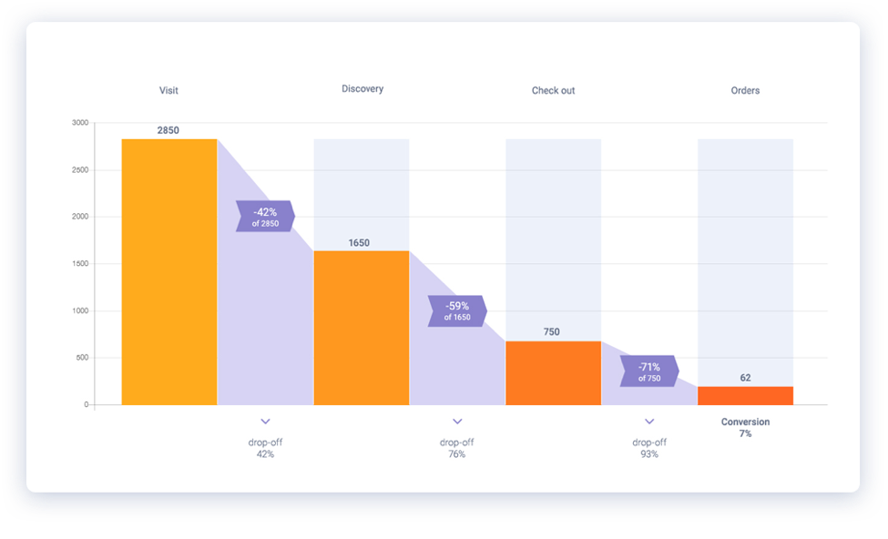
The graph makes it very clear how many people fall out of each stage of the user journey. To understand why users are falling out of your funnel, combine the conversion funnel diagram with another of Capturly’s features: session recordings.
Session replay is an analytics tool that shows you the mouse movements of real visitors. It’s essentially a playback video that shows exactly how users interacted with your site. For instance, if a significant number of users are leaving your shopping cart halfway through checkout, you can use these recordings to understand exactly what is happening there. By watching session replays, you might see that users aren’t willing to wait for your third-party gateway to load and are leaving before they pay. In this hypothetical case, you may look at integrating a new payment gateway with faster load times.
Ultimately, session replays take your conversion funnels and make them even more visual. And the impact can be very powerful. By using the combination of the conversion funnel report and screen recordings, Tamagotchi-style fitness app Tep managed to identify and fix problems with its conversion funnel. In their case, users were too impatient to wait for the page to load. By implementing a splash page, they saw a 10% decrease in bounce rate.
Start putting visual data into practice
Are you feeling better? Making sense of e-commerce analytics doesn’t have to be a tedious task. We humans can make far better sense of images than we can text and numbers. So it’s time to do away with page after page of facts and figures and start to visualize data instead.
By visualizing e-commerce data through a dashboard, a heat map, or a conversion funnel, you can quickly get a sense of the health of your e-commerce store and how you can improve it. Thanks to the sheer number of data tools available to store owners, getting started is easy.
So put that calculator away, bring out the pie charts, and start making sense of your e-commerce data.
Guest Author Byline
Axelle Dervaux has experience in digital marketing with a focus on B2B marketing for SaaS companies. She’s working in various marketing fields such as SEO and SEA, social media, lead nurturing, customer retention, product marketing. She is the Marketing Manager at clicdata.com, a cloud-based business intelligence, and data management platform.