In the bustling world of e-commerce, your product page is your digital sales representative. It’s not just about showcasing your product; it’s about creating an experience that convinces potential buyers to click that “Add to Cart” button. In this guide, we’ll unravel the secrets of product page optimization, exploring each crucial element step by step.
Table of Contents
1. Make sure your website is working
This should go without saying, but your product page needs to work. Find errors and problems in your code with this JavaScript tracking feature.
2. Optimize Product Title
Your product title is the first impression your potential buyer gets. It’s not merely a string of words; it’s a concise masterpiece that should grab attention instantly. Let’s dive into the art of product title optimization.

Nike Air Zoom Pegasus 40 – Older Kids’ Road Running Shoes
Nike demonstrates expertise in crafting product titles that transcend mere description, instilling a sense of excitement. The name “Nike Air Zoom Pegasus 40 – Older Kids’ Road Running Shoes” goes beyond the conventional shoe details, imparting a feeling of speed and empowerment to potential buyers.
Nike demonstrates expertise in crafting product titles that transcend mere description, instilling a sense of excitement. The name “Nike Air Zoom Pegasus 40 – Older Kids’ Road Running Shoes” goes beyond the conventional shoe details, imparting a feeling of speed and empowerment to potential buyers.
Inclusive age designation
Instead of just saying “running shoes,” they specifically mention “Older Kids.” This helps parents quickly know it’s meant for a certain age group. No confusion.
Dynamic branding
They use words like “Air Zoom” and “Pegasus” to show these shoes are high-tech and part of Nike’s famous running shoe collection. It’s not just shoes; it’s like joining a cool club.
Model version indication
The number “40” means it’s the latest version. If you know Nike’s shoes, this tells you it’s the newest and best. It’s like the iPhone 13 of running shoes.
Functional description
“Road Running Shoes” isn’t just a label; it tells you exactly what they’re for. Whether you’re jogging or sprinting, it’s clear these shoes are made for outdoor running fun.
Engaging language
The tagline “Unleash Your Fast” isn’t just a boring description. It’s like a cool invite to have a speedy and exciting experience. It’s not just about buying shoes; it’s about feeling fast and powerful.
Evoking emotion
When they say “Air Zoom,” “Pegasus,” and “Unleash Your Fast” together, it’s not just about running; it’s about flying. The name makes you feel speedy, agile, and free.
Market positioning
By mentioning “Older Kids” and using high-tech words, Nike is saying these aren’t just regular kids’ shoes. They’re for young athletes who want top-notch performance. It’s like stepping into the world of pro athletes.
Consistency in the naming convention
Nike always similarly names its products. This helps us easily understand and trust what we’re buying. It’s like a friend who’s always the same – reliable.
In short, the name “Nike Air Zoom Pegasus 40 – Older Kids’ Road Running Shoes” isn’t just a name; it’s like a carefully chosen message from Nike. It tells you about the shoes, connects with the right audience, and makes running feel awesome. Nike’s not just selling shoes; they’re selling a feeling of speed, power, and excitement. Cool, huh?
According to Convertcart’s study, 85% of consumers place a high priority on reading long, accurate product descriptions and having accurate pictures of the product, as this is the only way they can decide whether or not to buy it.
💡 Key Takeaway
Craft product titles that go beyond descriptions, creating an emotional connection with the buyer.
3. Create The Right Design For Product Page Optimization
So, imagine your online store is like a real store, but on the internet. When someone walks into a real store, how it looks can make a big difference in how much they enjoy shopping. The same goes for online stores!
Why Does it Matter?
First impressions count
When you first meet someone, you want to make a good impression, don’t you? The first thing people notice in your online store is how it looks.
Easy shopping experience
Think of it like this – if a store is messy and confusing, you wouldn’t want to shop there, right? Same online. A clean and cool product page design makes it easy for people to find what they want.
Now, let’s dive into why Apple’s way of doing things online is so cool and how you can bring some of that magic to your online store.
Taking Notes from Apple’s Online Store
Apple’s product pages are a testament to the power of simplicity. High-quality images, minimalistic product page design, and a focus on the product create an immersive experience. Users don’t get lost in unnecessary details; they focus on the product.
Imagine if your favorite store was a superhero – it’d probably be Apple’s online store. Here’s why it’s like the superhero of online shops and how you can borrow some of its superpowers.
Fantastic pictures
Think about it when you’re checking out something online. You want to see it, right? Apple’s online store is like a gallery of superhero-level pictures. Clear, bright, and ready to show off every detail.
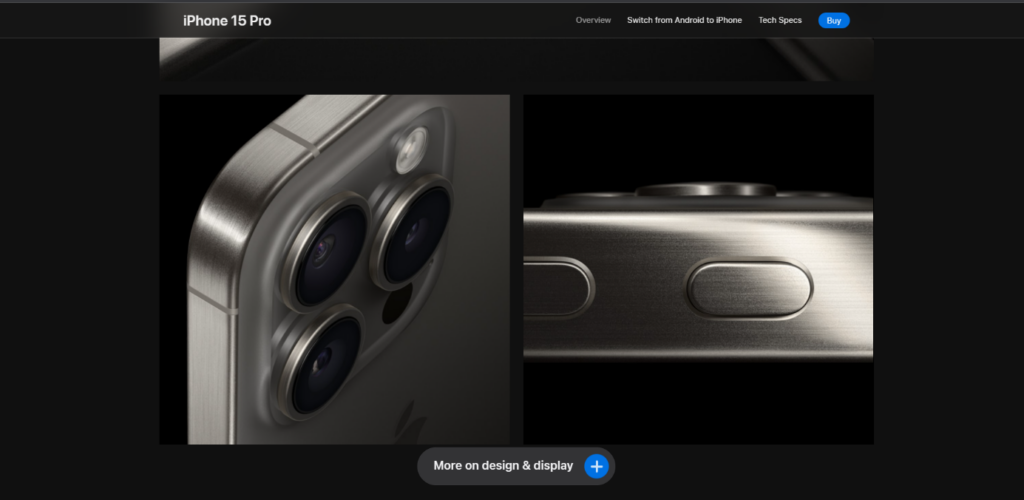
The images are so sharp, it’s as if you’re not looking at them through a screen. It’s sophisticated, we can see the product from many angles. There is even a video of the product available. It is like being in an offline shop and holding the product in your hands.
Keep it simple
Have you ever been to a store where everything is everywhere, and it’s hard to find what you want? Apple’s online store doesn’t play that game. It keeps things simple. Products have their space to shine, not get lost in a mess.
When you go into a store, you want to find what you’re looking for without distractions. Apple’s online store is a pro at this. It keeps the focus on the products – no unnecessary drama stealing the spotlight.
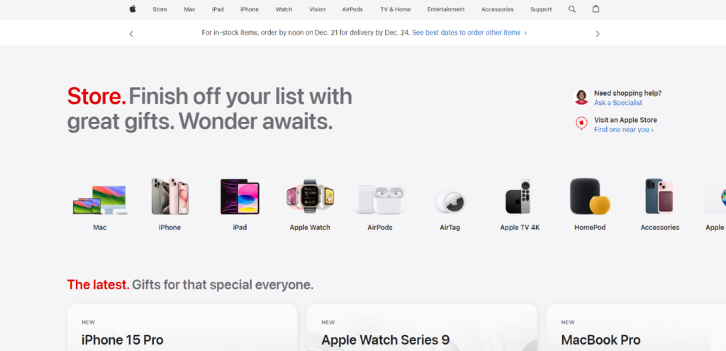
You can see how easy it is to navigate between product categories. Under the product categories tab, there are additional product types, so you can easily and quickly select the product you need.
💡 Key Takeaways
- Channel your inner Apple when setting up your online store. Use top-notch pictures that make your products look like the heroes they are. Keep it simple, don’t overload with stuff, and let your products be the stars of the show.
- Prioritize a clean and visually appealing design to captivate your audience.
4. Build Your Product Page Structure Well
Structuring your product page is like creating a roadmap for your customers. It should lead them from the initial glance to the final purchase with ease. Your shop should be well-designed because 88% of customers will not return to the same website after a bad experience.
Imagine your online store as a vast adventure park awaiting exploration. The goal is for people to navigate, discover, and revel in their shopping experience. Here’s where creating a clear path, or what we call “product page structure,” becomes pivotal.
Why Does It Matter?
No one likes getting lost
Ever wandered through a massive store unable to find what you were looking for? It’s frustrating. Your online store should be the opposite – easy to navigate, akin to stepping on marked paths.
Roadmap to the good stuff
Your customers are treasure hunters. With a clear map (or structure), they can effortlessly discover gems (or products) without aimless wandering.
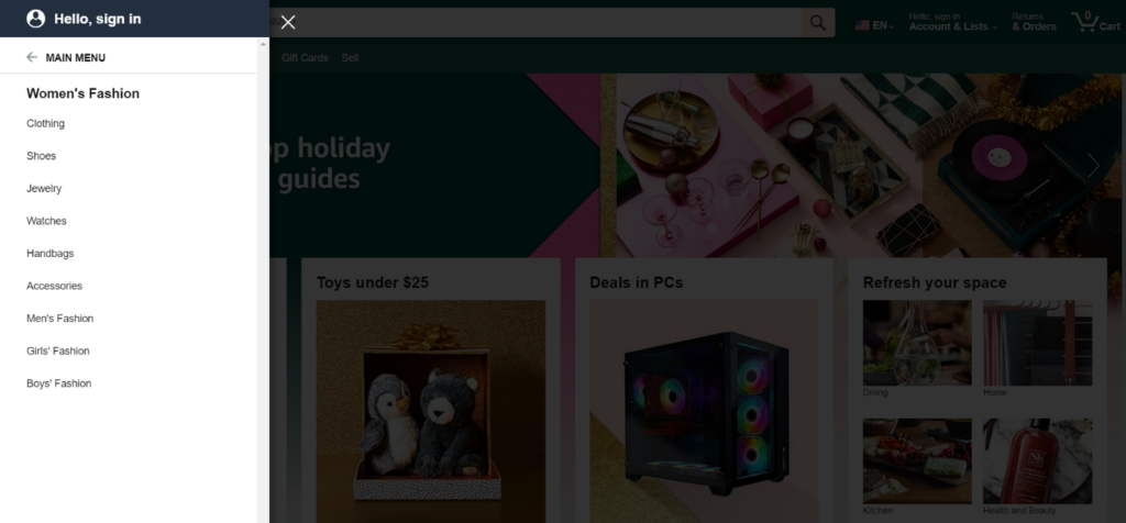
How To Do Good Product Page Optimization Through The Example of Amazon
Take a glance at Amazon. It’s akin to having a superhero guide. They employ tabs for everything – product details, techie stuff, and customer reviews. No need to scroll endlessly; it’s all neatly organized.
Segment your products into categories
Amazon also sells women’s clothing. Within women’s clothing, it has created sections for shoes, bags, dresses, and accessories. It’s like creating different areas in your adventure park.
Use tabs or sections
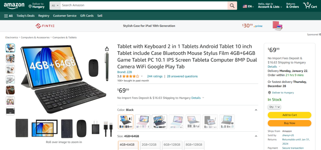
Follow Amazon’s lead. Employ tabs or sections for product details, specs, and reviews. It maintains tidiness and ensures easy access. Here you can see the perfect product title. Almost a full product description.
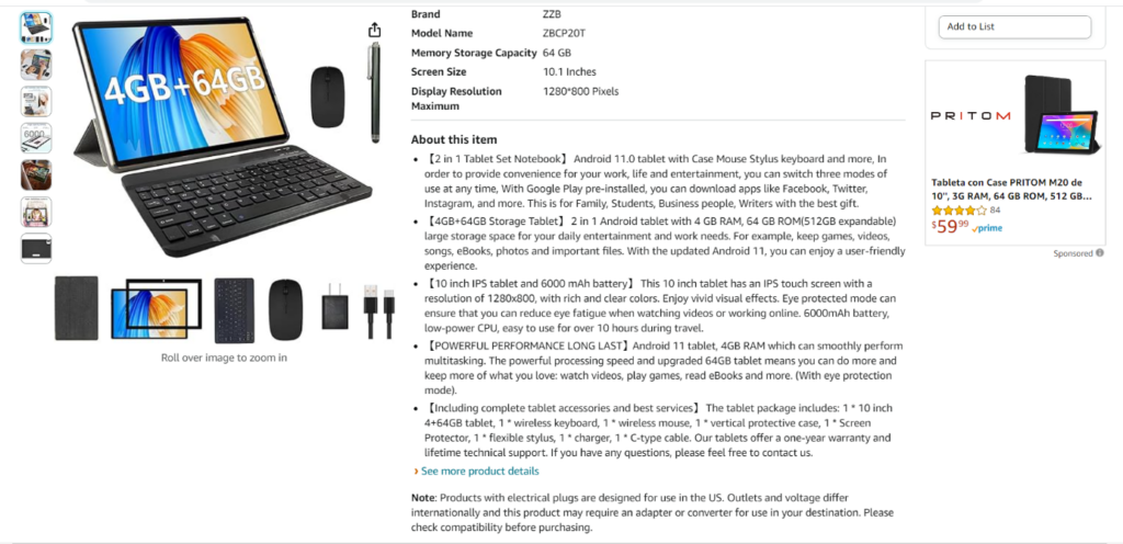
However, if that’s not enough, you can read the product description and even scroll down to see product comparisons.
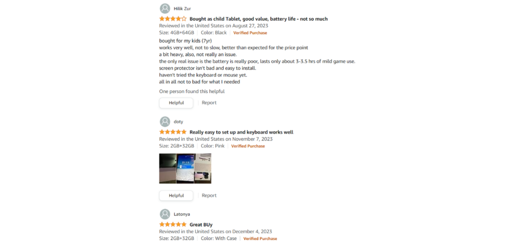
Share reviews from previous customers
People generally believe the opinions of their peers much more than those of a company. Amazon is very good at exploiting this opportunity and sharing with visitors what previous customers think about a product.
Why is feedback so important?
Based on the Fera study 30 customer reviews can increase conversions by 25%, and 100 customer reviews can increase conversions by up to 37%. It comes down to trust, as you may have read. And what if you don’t include customer reviews? Consumers are 270% more likely to buy 5 products that have previous customer feedback on the site than one that doesn’t have a single comment.
To maintain credibility, it is also a good idea to keep negative comments up, of course with moderation, but this is how a webshop can remain credible. Don’t delete negative comments, they can increase conversions by up to 85% based on the Fera study.
Less scrolling, more exploring
Nobody enjoys endless scrolling. Break down information into bite-sized pieces. It’s akin to creating signposts in your park – direct and easy to follow.
💡 Key Takeaway
Crafting a smooth structure for your online store is akin to providing customers with a treasure map. Make it simple for them to explore, find what they desire, and relish the adventure. Learn from Amazon – organize, label, and guide your customers on a hassle-free journey through your fantastic online world.
5. Use Different Sales Strategies
Let’s dive into some cool strategies that can jazz up your online store – upselling, downselling, and cross-selling. Product page optimization isn’t just about convincing users to buy a single item. It’s about maximizing each visit’s value through strategic upselling, downselling, and cross-selling.
Upselling
Imagine you’re checking out a pair of sleek sneakers in an online store. Now, imagine the website says, “Upgrade to the deluxe version with extra comfy insoles for just a bit more!” That’s upselling.
It works because people like feeling a bit fancy. Upselling offers them an upgrade, making them feel special. It’s like getting a little extra awesomeness for just a tad more money. Who wouldn’t want that?
When we talk about upselling, the idea is that you’re not offering a new product or service, just an extra, more premium offer.
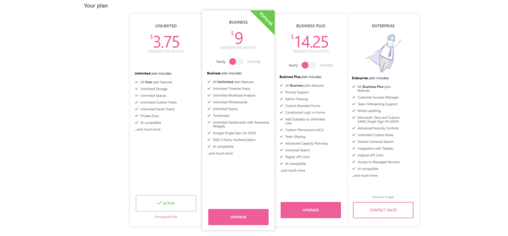
That’s what ClickUp does because the customer can choose between different package offers at their convenience, but they also have the option to buy the best package.
Downselling
Now, picture this – you’re eyeing a snazzy camera online, and the website suggests, “Looking for something more budget-friendly? Check out this fantastic alternative!” That’s downselling. It is important to point out that this happens after the visitor does not want to buy the more expensive product (the upsell product), but this downsell product is still more expensive, as you can see in the picture, than the original offer would have been.
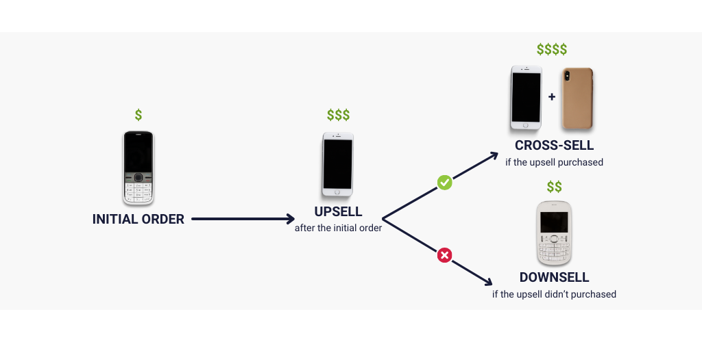
Downselling is like saying, “Hey, we’ve got great stuff for different budgets.” It makes customers feel seen and catered to. It’s not about pushing the most expensive thing. Downselling offers alternatives, making the customer feel comfortable with their choice.
Cross-selling
Imagine you’re eyeing a cool tablet online, and the website suggests, “Customers who bought this tablet also loved this sleek keyboard – perfect for turning your tablet into a mini laptop!” That’s cross-selling.
Cross-selling is like saying, “Hey, these things go great together!” This improves the overall customer experience. It helps customers discover complementary products they might not have thought about. It’s like a shopping adventure.
To give you a simple but great example, you’re buying a mascara from Sephora’s online shop. You don’t even have to put the product in the basket, just scroll down a little and there’s a cross-selling offer.
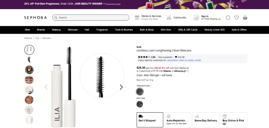
The company will offer you an extra product, in this case, either an eyeshadow palette or an eyeliner, so that you don’t forget that these products also contribute to a beautiful makeup look.
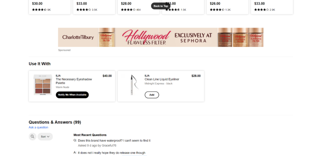
How simple is it? Isn’t it? It doesn’t weigh you down, but it still signals that hello, don’t leave these behind.
💡 Key Takeaways
- Picture yourself at an online store, and it’s like a friendly guide, saying, “Hey, here’s something fancier, something budget-friendly, or how about these cool things that go perfectly with what you want?” That’s the magic of upselling, downselling, and cross-selling – making your shopping experience feel personalized and full of awesome choices.
- Strategically place upsell, down-sell, and cross-sell suggestions to boost your average transaction value.
6. Use Capturly for Data-Driven Decisions
No optimization journey is complete without robust web analytics. Capturly plays a pivotal role in understanding user behavior, identifying pain points, and doing product page optimization for maximum impact.
Capturly’s analytics reveal valuable insights into user interactions. From click heatmaps to session recordings, it empowers you to make informed decisions on layout adjustments, content placement, and overall page optimization.
💡 Key Takeaway
Integrate web analytics tools like Capturly to enhance your understanding of user behavior and optimize accordingly.
Conclusion
Product page optimization is a continuous process of refinement and adaptation. By paying attention to product title optimization, product page design, structure, and strategic selling techniques, you can create a product page that not only attracts visitors but converts them into loyal customers. Remember, each element serves a purpose – analyze, adapt, and watch your revenue soar.
Ready to elevate your online store? Start implementing these product page optimization strategies today and witness the transformation in your sales figures!

2 Comments
Happy wheels
2024-01-15 at 09:06Your work is fantastic, and the material is well-written and easy to grasp. I will return frequently to see what you have to say.
geometry dash
2024-01-26 at 10:42The guide also discusses product page optimization design. Comparing an online store to a physical store emphasizes first impressions and ease of shopping. A cluttered online store deters customers just like a messy physical store. The guide draws inspiration from Apple’s strategy and recommends a clean, appealing design to improve shoppers’ experiences.