Whether you are an online marketing newbie or a veteran in web analytics, you must have heard of Call-To-Action or CTA for short. This abbreviation is commonly used in website optimization and conversion-related topics. This marketing term appears in the form of an image, text, button, or other types of content. Call-To-Actions are intended to draw the attention of the visitors and cause them to perform a specific action. This action can be anything that takes the visitor further into the sales funnel (eg. buy, sign up, register, follow, etc.). CTA-s have a major role in conversion rate optimization, and we got you a few case studies to prove the point.
Importance of CTA-s
As mentioned earlier, Call-To-Action buttons help the customer advance towards a transaction. Therefore, a bit of thinking is necessary before the implementation. Remember to test your CTA-s’ performance. You can use site heatmaps, session replays, or other web analytics tools to see how your ideas work.
4 Tips to Create High-Converting CTAs
1. Placement of CTAs
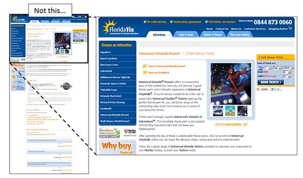
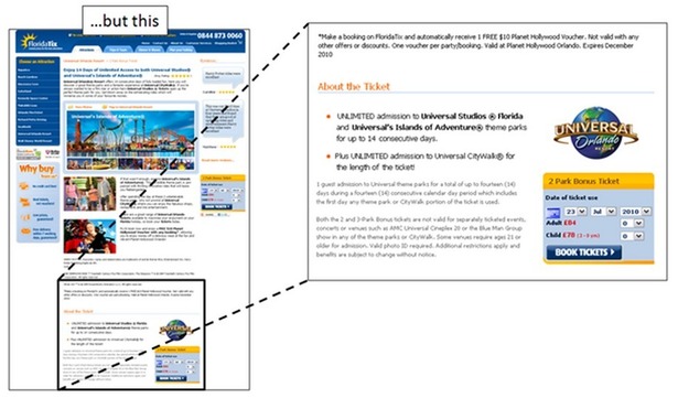
For instance, there are a few things to consider regarding the placement of your CTA. It is a so-called best practice to place your CTA above the fold. The travel company Florida Tix experimented with placing the CTA below the fold. The product description was complex and rich in detail, they thought it would be better for the customers to understand the value before performing any actions. It was indeed a good decision, their conversion increased by 20%. Remember, there isn’t one solution for all websites. Make sure to perform tests and experiments to get the best results.
Source: HubSpot
2. Length of CTAs
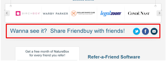
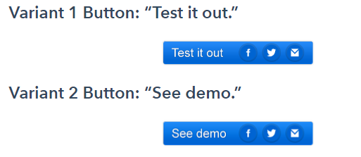
The length and content of CTA-s are also critical when it comes to conversion. Any link urging to perform a user action refers to content. The text on it should be catchy, short, and attractive. Friendbuy is a company that helps websites attract more visitors by implementing widgets on the pages. They wanted to share a demo version that gains popularity. Their banner ad was a bit long and complicated. Their CTR (Click-Through-Rate) was 1.44% which is not bad, but their marketers desired improvements. As an A/B test, two new CTA variations were implemented. The first variant got 2.47%, the second one got 4.49% CTR.
3. Content of CTAs
The new CTA-s were shorter and kept a clear direction. The second variant also had the word “demo” in it, a term easily understood by anyone.
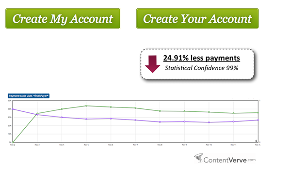
There are nuance changes that raise – or ruin – your rates. The marketers of ContentVerve had an idea of changing the CTA on a payment page. They only changed one word: “Create My Account” became “Create Your Account”, and guess what. The conversions on that particular page dropped about 25%! Using a first-person approach can raise more attention, and get more clicks. Despite the failure, this is not a bad test result, though. You benefit from every test as long as the results provide you new insights, whether they confirm or deny your assumptions.
Source: Unbounce
4. Design of CTAs
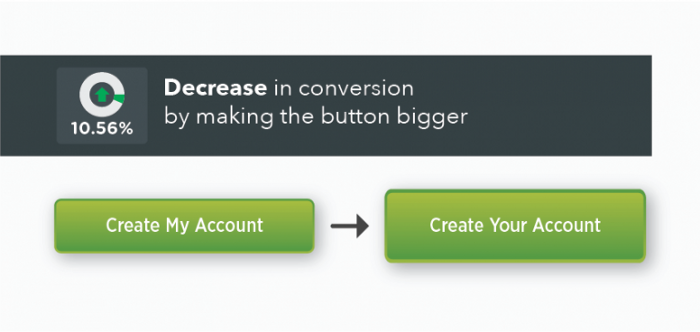
The placement, content, and length of CTA-s are, as mentioned below, are essentials. Additionally, changing the design of these buttons can result in major changes, too. We talk about everything that comes to mind. Font size, color, shapes, the whole package. In the below cro case, the conversion decreased by 10.56% after making the button larger.
Source: Unbounce
Wrapping Up
As you can see, minor amendments can turn your conversion rates upside down. Call-To-Action buttons don’t seem like a big deal but trust me, they are. For the users to take action, and proceed, they need to perform some kind of action on your site. For that to happen, you need clicks. CTA-s is the bridge between visitors and customers. Well-built CTA-s result in conversion, the poor ones make visitors bounce. It sounds easy, right?
Well, it isn’t hard, but you need to monitor, experiment, and test the CTA performance to succeed. It is important to note, that no best practice applies to every webpage. Sometimes you need a long text, sometimes a word is enough. The CTA can be above, or below the fold, only testing will tell. It can be colorful, bold, rounded, or circle-shaped. Make sure that your CTA-s are not too aggressive, and that customers feel benefitted by clicking through them. As you can see in the cases above, you can only find the best way by trying out new options and keep checking the performance. If you get your CTA-s in order, you will get those neat conversion rates.
Don't forget, sharing is caring! :)

3 Comments
poppy playtime
2024-01-17 at 04:57That is an extremely useful piece of information. I’m glad you simply shared this helpful information with us. Please keep us informed in this manner. Thank you for your contribution.