There are some sources where you can get ideas for conversion. Different industries have different businesses, and different businesses have different goals. The main metrical goals in e-commerce are RPV (Revenue per visitor), CRO (Conversion Rate Optimization), and AOV (Average order value). You can focus on either acquisition or conversion. The acquisition is about gaining traffic insights and finding room for getting new customers. You might have hundreds of people visiting your site but you see no revenue. Why? Because they do not convert.
You can find the reason with the help of some A/B testing. There are several ways to improve conversion. Free trials, demos, enhanced customer service, reassuring authenticity, free shipping, or a well-optimized landing page. It is business dependent though. What works for others, might not work for you. The key is field testing, and if you don’t have anything on your mind, that’s where cro case studies help you.
Real-life examples of conversion rate optimization can bring up unexpected results. You can learn a lot from these cases, and utilize the findings when optimizing your site. When reading the cases, don’t think about “what happened”, think about “why it happened”. Businesses are different, and so are customers. You don’t need to copy every method, you need to look behind the curtains. Find your “why”, and you will find the best ways for boosting your business.
And now, let’s get to it!
Table of Contents
User Case #1
Have you heard of the “F” pattern? A while ago, a Nielsen study analyzed user interaction with search engine results. They concluded that people interact with content in an “F” pattern. People read from left to right, and their attention tends to reduce while reading. Analyzing with website heatmaps, this pattern clearly shows.
On the SumoMe app’s page, you can see blocks of content, and not text. Nevertheless, the “F” pattern applies.
The F pattern on SumoME
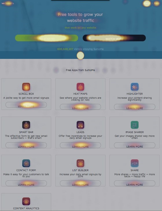
Key Take: The most important content should be on the top left part of the page. If you spread the information through the whole page or block, your visitors might miss it. For instance, when running a webshop, you should put the best-selling items on the top left corner, so they keep selling.
User Case #2
Crystal Clear landing page – Weather Channel Interactive
Offering complimentary content for visitors is always nice, but the business goal is to attract people to use premium services. Weather.com has already had heavy traffic to the site, but Notify!, their premium service hasn’t delivered the right numbers. Their marketers organized multivariate testing to enhance the Notify landing page. First, they analyzed their current state, including traffic sources, conversion rates, and user demographics. Then, they highlighted elements to inspect, such as Call-to-Actions, offers, or the presence of the Weather Channel brand. It turned out that tornado warnings were the most popular service among subscribers. The marketing team jumped on it and used a combination of text and graphics illustrating a tornado to show the visitors how Notify! works. They modified the headline, created CTA variations, and began testing. After a week and over 1000 variations, the team was satisfied with the result. The tests returned a 225% rise in conversions! Overall, the landing page got leaner, different CTA-s, and a new hero shot with Flash graphics resulted in a great improvement.
Key Take: Don’t overcomplicate your landing pages. Strive for simplicity, keep testing, and visitors will find their way into the sales funnel.
User case #3
Let Free Be Free – The Sims 3
Probably I don’t have to introduce The Sims to you. The best selling PC franchise released The Sims 3 in 2009. In-game sales play a major role in the business accomplishments of the game. After buying the game, you can register your account on the TheSims3.com website, which allows you to make purchases. The game launcher platform provided offers, messages, and other useful information. Players usually visited the launcher to play the game, and not to see the offers. The marketing team hired WiderFunnel to help them improve the game launcher platform. After testing five different variations, the results showed a 128% increase in game registrations! The solution was simple: highlight the benefits of the registration, and let the customers know what they can get in return.
Emphasizing “Free” in the game launcher
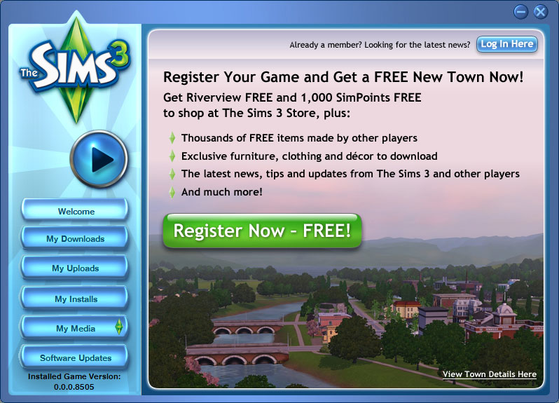
Key Take: More customers will go towards conversion if they have a clear vision of the benefits. If you offer something for free, make sure that your customers won’t miss it.
User case #4
Get on the Chat – Intuit Enterprise
Customer service is significant for every company. If you go to a site and see a chat option, you feel a bit safer knowing that you don’t have to wait days for a reply. Intuit, a company offering business solutions, implemented proactive chat boxes on different areas of the website. The results? The average order value increased by 43% with the chatbox at the checkout page. Sales showed a 211% increase after placing the chatbox on the product comparison page.
Chatboxes can be useful on many sub-pages
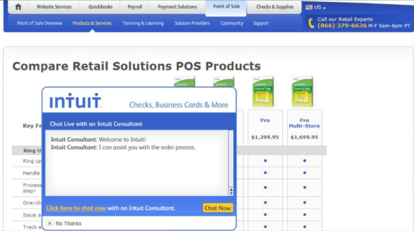
Key Take: Implementing a proactive chatbox may improve customer confidence and thus, conversion. Visitors can ask questions directly via chat, and doing so they feel more comfortable proceeding with the purchase.
User case #5
Authenticity Wins the Race – Express Watches
Today, when almost every product has fake replicas sold all over the world, authenticity weighs a lot. Express Watches, a Seiko watch seller site decided to take a shot at testing it. The purpose was to find out whether customers preferred authenticity over price. And they did. Sales increased by 107% after placing the credibility label over the one assuring a great price.
The “Authorized Dealer” variation
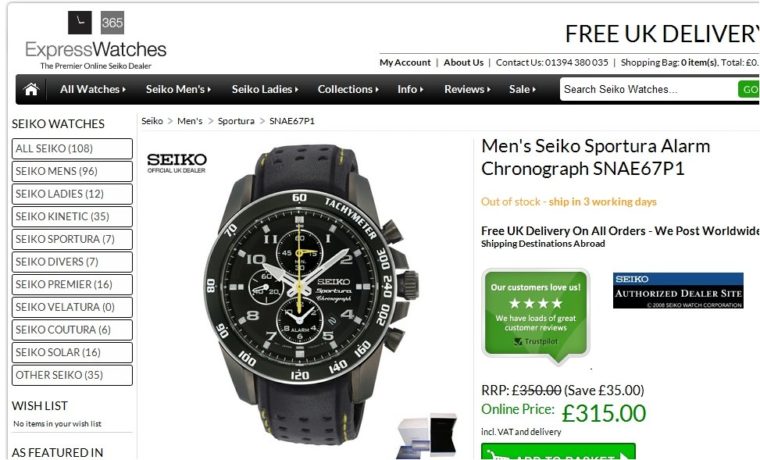
Key Take: In every industry where scam and fraud are present, assuring customers of the authenticity will help conversions.
User Case #6
Prices Up-Front – SafeSoft
Displaying prices on an e-commerce site can have a backlash – or great results. The fact that visitors can judge immediately based on the price can either deliver or ruin your expectations. SafeSoft, a multichannel marketing automation service provider set a new business goal: generating leads through their contact form. At a point, they had to decide whether or not to display the price on the page. After performing an A/B test, the choice was obvious. Displaying the price on a large green button resulted in a 100% increase in leads generated.
The green price image says it all

Key Take: Visitors already have a price on their minds before submitting a contact form. Having this price provided people become more confident in submitting their details.
User Case #7
Get Social – AMD
As a leading semiconductor company, AMD has a wide range of customers in the computer technology industry.
On their website, there are news, updates, and products displayed. As a new business objective, AMD wanted to increase the social sharing of such content. The marketing team implemented a ShareThis icon, but the results were not satisfying. The team set up a few variations and started A/B testing. The variations involved different placements and icon designs. The winning version was positioned on the left, with dynamic size adjustment. Social sharing increased by 3600% (!), however, engagement conversion was not affected.
Social Media Share Buttons on the Left
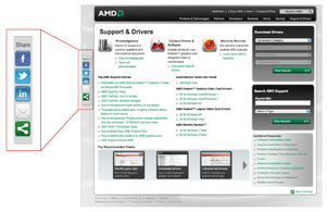
Key Take: Finding the best place for your social media buttons takes time and testing, but using the best version will be worth the effort.
User Case #8
Success in CTA-s – SAP
In the business management area, SAP is a market-leading company. The group had a software trial page which did not deliver the expected lead generation. They saw the solution in landing page optimization. After a thorough analysis, the marketing team ran tests with a few variations. Replacing the small, blue download link with a big, orange button resulted in a 32.5% conversion boost.
Before and after changing the download button

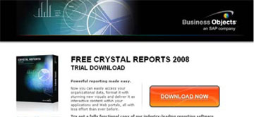
Key Take: After careful analysis, developing CTA-s can have a major impact on lead generations.
User Case #9
Details Matter – Expedia
Expedia, one of the world’s leading travel companies gained a $12 million profit increase by removing a single field. That’s right. On their booking site, they deleted the “Company name” field. They thought that visitors got confused, and sometimes put their bank address in the address field. Due to the incorrect data, transactions failed, and visitors bounced off. Expedia did nothing more than removing that one field, and success followed.
The Two Variates with-and without the Company Name Field
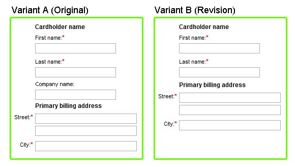
Key Take: Unnecessary, confusing content at the registration might confuse your users. Simply removing these parts will simplify the process, generating more leads.
User Case #10
Make Discounts Be Worth It – Meebox
Meebox, a Danish web-and cloud hosting company wanted to increase its overall venue. They started looking on the pricing page. The page offered three variations originally, each offering information like cost per month, or bandwidth. The new variation offered a 20% discount to those who signed up for 2 years. The idea behind the change was the promise of a long term agreement. Meebox’s revenue increased by 121%, and a 46.24% increase in the average order value topped the results.
Two years for 20%
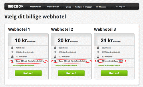
Key Take: Probably not as many users would sign up for 2 years without the 20% off. Make sure that you benefit from customer discounts.
User Case #11
Redesign – Majestic Wines
This UK based, wine-selling webshop set a new business objective: increase conversions. Their marketers decided to gain conversion from submission forms. Weddings mean catering, and catering means wine for many. To know what to change, they gathered feedback from their customers and staff. Eventually, the team came up with a few ideas to test, but multivariate testing proved to be too time-consuming. Instead, they re-designed the webpage and tested it for conversions. A whopping 201% increase in inquiry form submission followed. The new launch included clear CTA-s, embedded video, reduced clutter, and a new design.
The original, and the new page designs
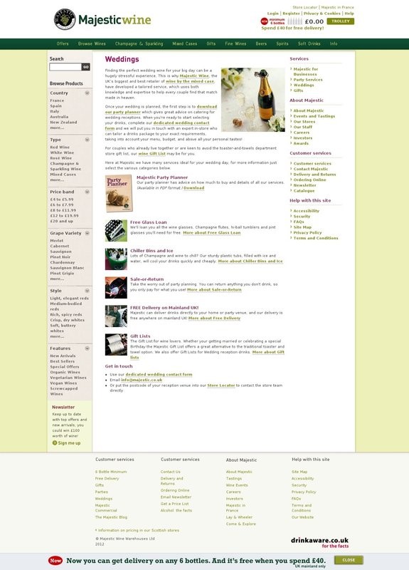
Key Take: Again, simplicity. As you can see, the old site showed way too much information. Emphasizing the key elements, using clear CTA-s and exacting design will make it work.
User Case #12
Page Load – Mozilla
Loading speed proved to be a key element for conversion rates. Mozilla discovered that the page-load of Firefox was slower than that of Opera and Chrome. For example, the entire Chrome page loaded faster than the header of Firefox. After some adjustments, the loading speed was reduced by 2.2 seconds. Download conversions increased by 15.4%, exceeded their expectations.
Key Take: Dare to put effort and observation into the page load. The faster your landing page loads, the more advantage you have.
User Case #13
Get Smart Visuals – Underwater Audio
With products such as waterproof headphones and players, Underwater Audio has some good stuff for the pool. Their goal was simple: increasing sales. The team came up with a concept called “visual hierarchy”. This concept aims to guide the visitor with visual cues so that they process information the way you want. Remember the “F” pattern? The marketing team adjusted the content on the page to follow the eye movement. Sales increased by 35.6% after the re-arrangement.
Before and After the Adjustments
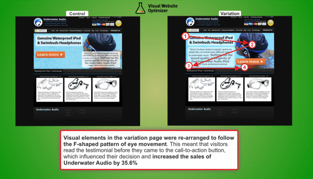
Key Take: Try not to place text or buttons on pictures. Arrange content accordingly, and mind the “F” rule.
User Case #13+1
Clever Trial Signup – WedBuddy
Wedbuddy.com helps customers to build a good-looking wedding website. As they offer SaaS (Software as a Service), clicks mean the world for them. Their goal was to increase trial signups. Originally, the signup option was emphasized by reduced risk, like “no credit card required”, or “free trial”. Mentioning credit cards might remind customers that eventually, they will have to pay. That way, connecting free trial with payment will make them bounce. The team decided to change that and emphasize the benefits instead. Highlighting the great features, reducing the home page, and shortening the list of customer testimonials helped. SaaS signups increased by 73% after the testing!
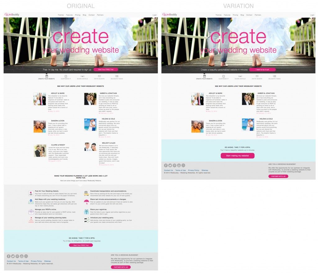
Key Take: Sometimes removing the payment reminders can improve conversions. Testimonials are useful, but your visitors won’t read them all. Less is sometimes more.
Conclusion
There are limitless options to get your numbers up. Adjust the button text. Put your CTA above the fold. Or below. Emphasizing discounts, or removing the word “free” from the offer can also help. Improving loading speed, redesigning your landing page, or highlighting the social media sharing options. You have to be open-minded, and up to experiments. The above-mentioned cases might work for your business, but they might as well decrease your conversions. You cannot universalize a solution for every company, because they are business-dependent. There is one thing to be certain of, though. Whatever idea you have in mind, test it. Create alternatives, gather feedbacks, and start analyzing. You may have great or awful results, they will move you closer to your business goals nonetheless.
3 Comments
Lindsey John
2025-10-22 at 10:06Great read on your article about “CRO Case Studies to Increase Conversion Rate”.