Does your online store have a landing page? If not, it might be time to build one. A good landing page boosts brand awareness, captures lead information, and drives sales, among other benefits. Plus, it’s an opportunity to spotlight your products or services and guide customers where you want them to go.
WordStream says the average landing page converts at around 2.35%, meaning that 23 out of every 1,000 visitors become paying customers. By comparison, some top-performing landing pages convert at 11.45% or higher. Small changes, like using a different font or changing the color of CTA buttons, can impact the conversion rate.
You may already have a great homepage or product page, but you may need more to drive sales. These informative pages may contain navigation data, outbound links, or other distracting elements.
E-commerce landing pages, on the other hand, are built with the sole purpose of driving conversions. They revolve around specific call-to-actions (CTAs), keeping customers focused on your core message.
With that in mind, let’s see the key elements of a landing page and how to optimize them for higher conversions.
Table of Contents
Why Landing Pages Are Crucial for E-Commerce Success
Most people who arrive on your website will land on the homepage or a product page. They may read the information provided, browse your site to learn more, or join your email list—that’s exactly what they should do. However, their actions won’t necessarily translate into sales.
Consumers who land on product pages are 72% more likely to bounce than those arriving on other pages. Additionally, they view 42% fewer pages than those who land elsewhere on your site.
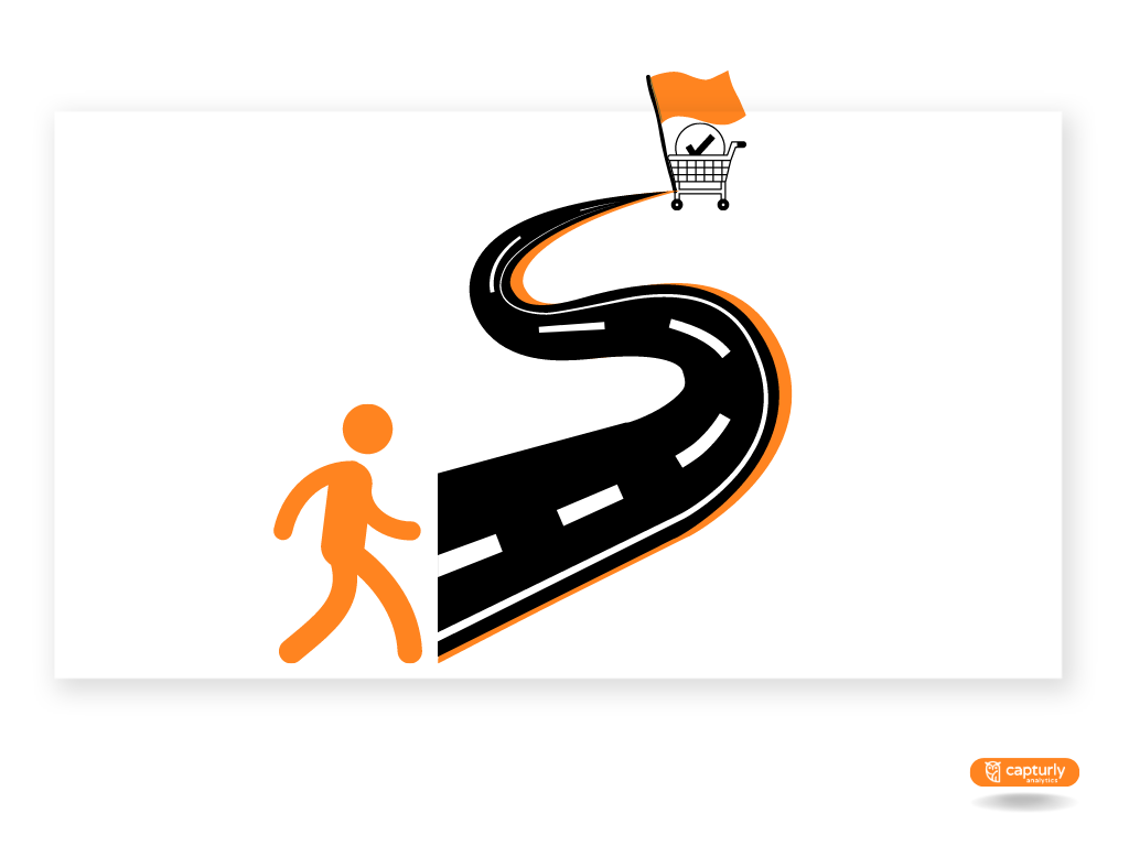
Product pages drive sales, too, but landing pages often yield better results.
The latter is optimized for specific marketing campaigns and has a clear CTA. Its primary goal is to generate leads for that marketing campaign. For example, you may build a landing page to promote and sell a new product, give away a free eBook, or grow your list.
By comparison, product pages may contain multiple CTAs and don’t revolve around specific marketing campaigns. Plus, they may include useful links, product recommendations, educational resources, etc. Their role is to inform visitors about your brand and products.
Ideally, you’ll want fully-optimized product and landing pages on your e-commerce site. The former will educate potential customers, while the latter will speed up the purchase process.
The Anatomy of a High-Converting Landing Page
No two landing pages are the same, but the best ones have some things in common. The keywords here are simplicity and efficiency.
First, make sure your landing page revolves around a single offer. Including multiple offers can confuse visitors, resulting in 266% fewer leads.
Second, build multiple landing pages around different products. Companies with at least 40 landing pages generate 12 times more leads than those with fewer than five pages.
Third, remove navigation links and other distracting elements. This step alone can improve conversions by 100% – primarily because it leads to increased focus for your reader and also faster loading of important landing pages.
Next, add the following elements to your landing page:
- Your company’s logo
- Engaging visuals, including a hero image
- A catchy headline
- A sub-headline summarizing your unique value proposition
- Supporting copy, including problem-solving differentiators
- Social proof, such as customer reviews and testimonials
- A lead form for capturing customers’ email addresses
- Multiple CTA buttons with a single conversion call
Alternatively, you may also include quizzes and other interactive elements. For example, visitors could take a quiz to see if your product meets their needs. After that, you can use their input to make them a personalized offer by email.
Also, highlight any discounts or special offers and create a sense of urgency around them. Place your CTA buttons above the fold and try out different colors, designs, and copies to find the best fit. Go one step further and personalize your CTAs based on the customer’s location or buying intent.
Last but not least, use colors that match your message.
The color red, for instance, creates a sense of urgency. Black evokes sophistication and luxury, whereas green is associated with wealth and good health. Orange and yellow are attention-grabbing and work best for CTA buttons.
How to Build an Effective Landing Page
Crafting impactful landing pages is both an art and a science.
On the one hand, you need data to identify, engage, and convert leads. On the other hand, this process requires a good understanding of demand generation versus lead generation, consumer behavior, and market trends.
On the other hand, you must let your creativity flow and think outside the box. For example, create engaging visuals, put a fresh spin on your content, and leverage storytelling to drive sales.
Landing page templates can make your job easier but still require a personal touch. You’ll have to add images, CTA buttons, web copy, and branding elements. Every word and image on your landing page should have value and purpose.
Ready to get started? Follow these guidelines to build landing pages that inspire people to take action.
Understand the Buyer’s Journey
Before getting started, know where your prospects are in their journey. Based on this information, you can determine what type of landing page to use and how to optimize it for the target audience.
E-commerce landing pages fall into four main categories, depending on what stage of the funnel the customer is in.
These include:
- Top-of-funnel landing pages
- Mid-funnel landing pages
- Bottom-of-funnel landing pages
- Repeat purchase landing pages
Top-of-funnel landing pages introduce customers to your brand or products. Their role is to drive brand awareness and capture prospect information. For example, a local gym may use top-of-funnel landing pages to promote events or special offers. This approach would allow it to gain exposure, generate leads, and increase website traffic.
Mid-funnel landing pages target visitors who have interacted with a brand in some way but are not ready to purchase. At this point, you want to move prospects further down the sales funnel.
Marketers can also use mid-funnel landing pages to capture lead information like email addresses and phone numbers. This practice allows them to nurture potential customers, increasing conversions and revenue.
Bottom-of-funnel landing pages appeal to potential clients who show high interest in a product or service (e.g., customers who have abandoned their shopping carts). As a result, they’re more focused and action-driven than other landing pages, offering valuable insights into customer behavior.
Last, you may use repeat purchase landing pages to drive customer loyalty. As its name suggests, this type of landing page helps convert customers into repeat buyers.
Define Your Goals
The end goal of a landing page is to drive conversions, but you must determine what type of conversion you’re looking for. For example, do you want visitors to join your list, download a guide, or install an app? Perhaps you expect them to buy a specific product or book a phone call with your team.
As discussed earlier, landing pages have specific goals. So, if you want prospects to download an eBook and buy your products, you’ll create different landing pages around these objectives.
Each page will have only one CTA, depending on the outcome you’re after. This factor will also influence the design and core message.
Start with a Strong Headline
A strong headline will compel visitors to stay on your page and keep reading. Therefore, it should grab their attention and tell them what to expect.
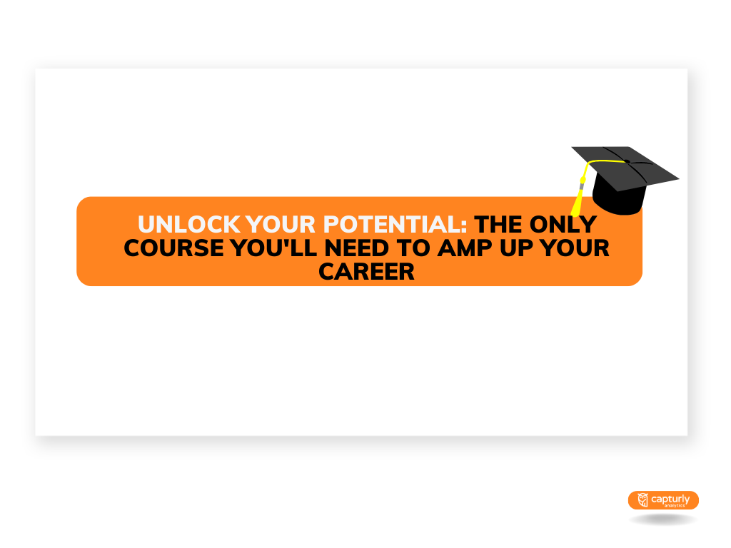
Let’s say your landing page promotes an online software engineering course. Motivating software engineers to sign up will be challenging because they already have access to countless resources.
Your best bet is to tap into their inner motivation, such as their desire to grow professionally or achieve a better work-life balance. Your landing page headline could be something like:
- Unlock Your Potential: The Only Course You’ll Need to Amp Up Your Career
- Upgrade Your Skills to Thrive in a Saturated Market
- Stuck in a 9-to-5 Job? Unlock Your Potential So You Can Build the Life You Want
Keep your headline under 20 words, and use power verbs to inspire and engage your audience. Let’s see a few examples:
- Advance
- Level up
- Move the needle
- Jumpstart
- Elevate
- Amplify
- Unlock
- Maximize
- Ramp up
- Expand
- Brush up on
- Put an end to
- Take hold of
- Prevail
Generally, it’s best to use words that tap into people’s emotions, show value, or imply urgency.
Avoid those that sound overly promotional, such as “groundbreaking,” “once-only,” “game-changer,” or “hidden gem.” Apply these principles to your copy, too.
Keep It Simple
Remember those old-school landing pages featuring dozens of CTA buttons, stock photos, and salesy messages? They had zero credibility and looked like a big mess.
The highest-converting landing pages have a minimalist design. They highlight a brand’s unique value proposition without making unrealistic claims or overloading readers with too much information.
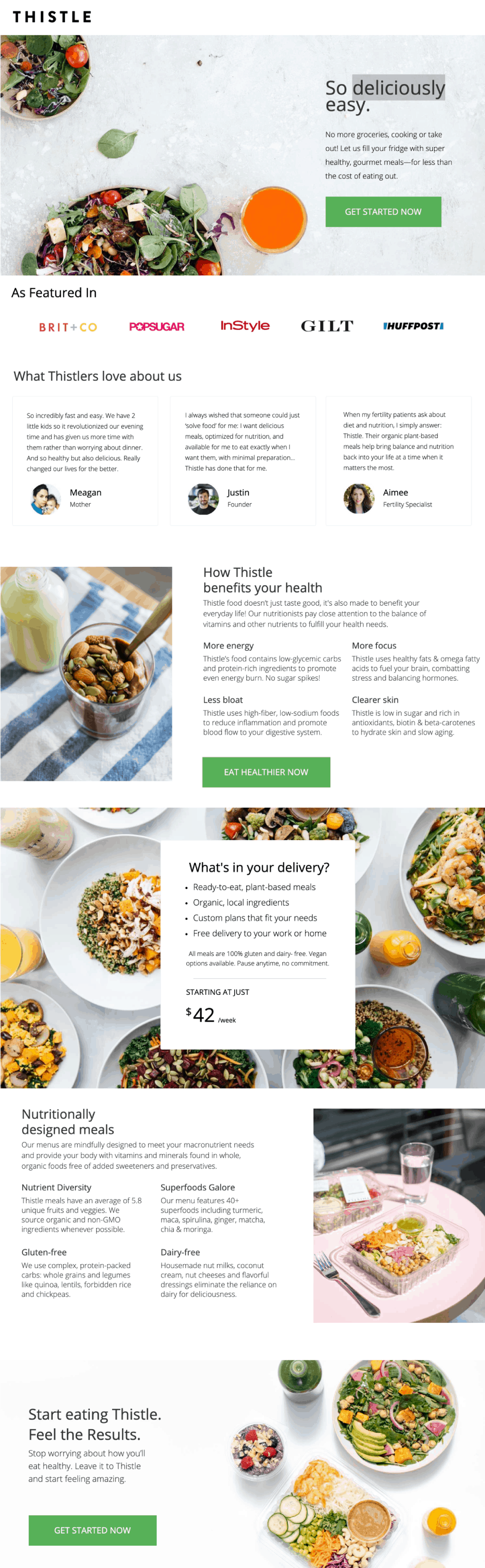
For example, Thistle’s landing page revolves around the brand’s unique selling proposition. It has a clean design, eye-catching visuals, and three CTA buttons that entice visitors to take action. The word that comes to mind when you see it is “simplicity.”
What matters most is to focus on that one thing that sets your product apart. Limit distracting elements, such as clashing colors, multiple offers, odd fonts, and unnecessary details.
Leverage Social Proof
Approximately 46% of buyers trust online reviews as much as personal recommendations. What’s more, a staggering 98% of consumers read reviews to learn more about local businesses.
No matter your industry, you need social proof to build trust with potential clients. You may have the best products, but you can’t expect people to just take your word for it.
However, social proof isn’t limited to customer reviews.
It can also take other forms, such as:
- Celebrity endorsements
- Earned media (e.g., social media mentions)
- Business credentials
- Trust seals
- Awards and certifications
- Expert’s stamp of approval
- Case studies and customer success stories
For example, Zendesk has an entire page dedicated to case studies. In addition, the company mentions its top clients, including big names like Tesco, Four Seasons, and Siemens. On the other hand, Fender leverages the “wisdom of the crowds” social proof to persuade visitors to take action.
Its landing page states customers took over 44 million music lessons, spent 17,000 hours studying, and left 75,000 five-star reviews. Moreover, the brand received mentions from Forbes, Guitar World, Teen Vogue, Marie Claire, and other trusted publications.
Social proof can reinforce your brand’s value and give customers confidence that they’re making the right choice. For instance, prospects are more likely to trust a software company with trust seals from Microsoft, Salesforce, or McAfee than one without such credentials.
You can still leverage social proof to build trust even if your business is new. In this case, list its credentials, social media mentions, trust seals, or links to press releases on your landing page.
Optimize Your CTAs
Another aspect to consider is the placement of your CTA buttons. For best results, place one CTA button at the top of the page and another one or two buttons throughout the content.
A landing page can have multiple CTA buttons but should revolve around a single goal. Thistle, for example, has three CTA buttons: one above the fold, one in the center of the page, and one at the bottom.
Similarly, LinkedIn uses three CTA buttons on its landing page, all pointing to the same action: “Create an ad.”
Your CTA buttons should be clear, visible, and compelling. Better yet, customize them based on the user’s location, lifecycle stage, type of device, or referral source. HubSpot says personalized CTAs perform 202% better than the average CTA.
Generally, use action words and contrasting colors to make your CTA buttons stand out. Write in the first person and try to create a sense of urgency. Then, tell visitors what you expect them to do, whether booking a call, buying a product, or requesting a free demo.
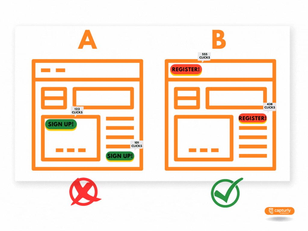
Last, perform A/B testing to compare multiple variants of your CTAs. For example, a red CTA button might work better than a green one, depending on the message you want to convey. Even small changes, such as using the word “Register” instead of “Sign up,” can make a difference.
Fine-Tune Your Copy
Gartner reports nearly half of all consumers will leave a landing page without taking any action. Therefore, ensuring your copy, headlines, CTA buttons, and everything else resonates with the target audience is crucial.
Gartner recommends focusing on the benefits associated with your product rather than describing its features. Then, after reading your copy, buyers should know what’s in it for them and have a reason to choose your brand over others.
For example, DoorDash emphasizes the benefits of becoming a Dasher, such as the flexibility to work how and when you want. The brand also focuses on the financial aspect, showing gig workers what they’ll get in exchange for their services.
You’ll also want to highlight your unique value proposition with a hero image and eye-catching visuals, such as:
- Headers and banners
- Image galleries
- Animations and videos
- Photos of customers using your product
- High-quality product photos
About 76% of buyers, including 85% of Millennials, are more likely to buy a product after watching a video about it. They want to see how it works and where it fits into their lives. This type of content can be just as effective as social proof.
Also, ensure your landing page is easy to skim and has a logical hierarchy. Write in plain language, avoid jargon, and steer clear of buzzwords like “industry-leading,” “integrated solutions,” or “satisfaction guaranteed.”
Use the Right Tools for the Job
As you can see, a lot goes into crafting high-converting landing pages. This process is more or less difficult, depending on what you sell and the type of conversion you’re after. However, the right tools can make your job easier, so you should check them out.
Unbounce, for instance, features a landing page builder, ready-made templates, and AI-powered copywriting tools. Another good choice is OptiMonk, which offers several tools for optimizing your landing page. You can use it to conduct A/B testing, make personalized product recommendations, add smart tags, and more.
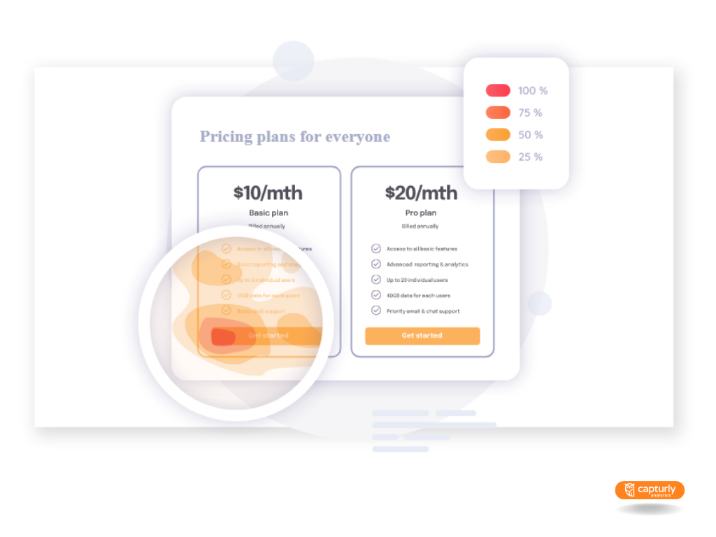
Capturly, on the other hand, tracks customer behavior in real time. You can see who visited your page, their actions, and where they came from. The tool is also good for conducting A/B testing as you can compare the performance of different landing page designs and layouts. Also you can detect problems, for instance, you can easily find a non-working button on your landing page.
You can also use Popupsmart, a no-code popup builder. Finally, if you need assistance with landing page design and copywriting, look into Instapage. Its intuitive platform enables users to build landing pages, create personalized experiences, and optimize page loading speed.
Create Landing Pages That Drive Results
So, are you ready to start building your next landing page? Follow the steps above, and you’ll get better results in less time.
Remember to have a crystal-clear value proposition and build your narrative around it. Opt for a minimalist design, leverage visual content, and display social proof. You’ll also want to showcase the benefits of your product instead of focusing solely on its features.
Most importantly, your landing page should provide value at every step of the buyer’s journey. Avoid meaningless buzzwords and focus on what makes your offering unique. Limit the clutter, go easy on the links, and have one clear CTA.
Lastly, test your landing page and commit to continuous improvement. Experiment with headlines, sub-headings, CTA buttons, colors, and other elements. The more you test, the better you’ll get your point across and entice the reader to take action.
Author Bio: Andra Picincu is a digital marketing consultant and copywriter with over 14 years of experience. She works closely with small businesses and large organizations alike to help them grow and increase brand awareness. Over the past decade, she has turned her passion for marketing and writing into a successful business with a global audience. Visit her LinkedIn profile to find out more!
7 Comments
geometry dash subzero
2023-06-12 at 06:48Your landing page need to deliver value at each and every stage of the buyer’s journey. This is of the utmost importance. Stay away from useless jargon and concentrate on the aspects that set your product apart from others.
Sophia Brown
2023-07-17 at 15:06Reading your blog I came to know very important points that need to be included in Landing page. Reading different article I have noted some of the other points that are also very essentials, check them below:
1. Scannable Content.
2. Progress Indicators.
3. Scarcity and Urgency.
4. Responsive and Clickable CTAs.
5. Visual Cues and Directional Cues.
So these were the hacks for the best landing page. Due to issues in the landing page user where not getting engage to my website then I decided to get my website rebuild and hire web development company in India Alakmalak Technologies. They provided me the best development and design of my website’s landing page. I would like to suggest other readers to rebuild their landing page at Alakmalak Technologies and you can see the result very soon.
Lead Generation Companies
2023-10-05 at 11:21It explores how important landing page design is to conversion rates in e-commerce. Lead Generation Companies The landing page optimization advice given is quite instructive. It’s clear that a successful e-commerce company may be greatly impacted by a well-designed landing page, and this post offers insightful advice.
dinosaur game
2023-11-06 at 03:40The more you test, the better you’ll get your point across and entice the reader to take action.
dinosaur game
2023-11-07 at 03:02You’ll also want to showcase the benefits of your product instead of focusing solely on its features.
wordle 2
2024-01-10 at 08:24Landing pages convert more traffic because they are focused on one goal or call to action by providing information about a specific offer or item.
Car Games
2024-01-18 at 05:52Also known as a destination page or lead capture page, a landing page is used to generate leads or sales by getting visitors to respond to a call-to-action (CTA).