
A Landing page is a platform for engagement on your website. As a website owner, your goal is to get in touch with people who are interested in your offers. Whether you want to sell goods, provide services, or just share your thoughts on the internet, the more people you attract, the more chance you have to succeed.
In this article, we will run over the basic definitions in connection with landing pages to make you understand the reasons and importance of them. Then we are going to guide you through the necessary substances and components of a landing page, and show you the correct methods of creating and using them. If the term “conversion rate optimization” doesn’t ring a bell, I recommend you to read this conversion rate optimization guide.
Table of Contents
Gather data
First things first as they say. Think about your landing pages as digital sales representatives whose duty is to convince the visitors about the fact that your website will soon be the answer to their questions and the solution to their problems. However, you have to understand your visitors first and therefore, the conversion optimization process requires lots of data. Lucky for you, conversion optimization tools can deliver the data right at your doorstep.
A well-optimized landing page allows you not only to build those relationships but it also makes it easier for your real sales reps to focus on the most qualified contacts. Before you start getting leads or convert visitors into paying customers, you have to build relationships. So once again the only way you can do so is by gathering information. The data can be quantitative or qualitative.

Source: Adeolu Eletu
Qualitative and quantitative data
Quantitative metrics can answer questions such as:
- How much?
- In what order?
- How often?
These questions, however, won’t reveal what lies behind the curtains. Using only quantitative methods you won’t be able to answer the “hard-to-measure” ones.
- Why do your visitors leave your landing page without clicking on the CTA?
- Why do people leave the shopping cart full of items?
- How friendly and easily navigable is my website?
- Why can’t the visitors find what they seek?
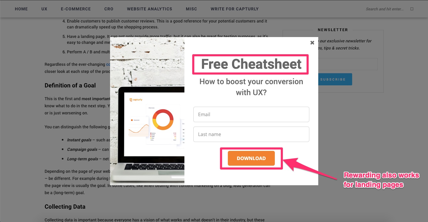
Let’s say the goal of your landing page is to gather fresh leads for an upcoming e-mail campaign. You fire up a landing page designed to capture the attention. You offer a handy cheat-sheet in exchange for the visitor’s e-mail address. At least this is what you expect, but it turns out that something’s not quite right. Did you just create another bad landing page example?
Don’t guess, measure!
From a quantitative point of view, you can tell that your landing page performs poorly because you’re not getting any leads. You are certain that the conversion funnel is leaking at this point, however, you’re not sure about what lies behind the problem. At this point, you have visitors on your landing page or webpage who won’t convert into paying customers or leads. It’s important to track their behavior from start to finish as you can learn a lot from their actions.
Turn visitors into leads
The difference between a visitor and a lead lies in a word called awareness. The awareness phase is when a person knows about your website, maybe regularly visits it, and collects information from the site. In this phase, she/he’s not yet a member of your community.
They are called visitors, they probably have an interest in what you do but not convinced enough yet to join you.
Another level of awareness is within a huge step forward. The lead is aware of your site and maybe has a specific connection with it. This transformation is one of the most important processes of your website, a highly significant part of your success.
We simply call this the conversion process. Only a few of your visitors reach this phase and go through this mechanism. If 20% of your visitors reach your landing page you can call it a success. But to reach this rate you have to be aware of some important factors of the landing page.
Firstly, let’s discuss two main tools that stick to the whole category of landing pages together.
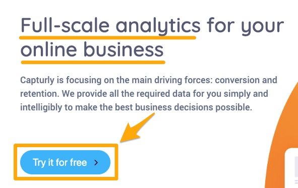
Optimized CTAs
A Call to Action button is literally the gate to the other side. This will take the visitor to the next level, to a whole different dimension of your website, where he won’t be staying a visitor anymore. A CTA can appear in a lot of forms. In most cases, it is a nice, perfectly visible button placed on the location of your site where people can easily recognize it. But where is that?
Scroll heatmaps
There are great qualitative web analytics tools to help you with the placement. Scroll heatmaps tell you how far your visitors scroll down on a certain page. With this tool, you can get a better idea of where to place your main CTAs on different devices to get the highest conversion rate possible and catch the most attention based on visitors’ behavior.

Click heatmaps
CTAs lead visitors to the landing page so its design, placement, color, and the call itself are really important. They have a word or phrase written on them in an imperative form such as: subscribe, buy it, try it for free, join us and the list goes on and on. Make sure to keep in mind all those aspects and create them in a way that people can easily recognize it.
Click heatmaps show you everything about your visitors’ clicking habits. Clicks are one of the most powerful ways to express interest. With click maps, you can discover which parts of your website are the most popular, what should be clickable, and what shouldn’t. And test which color, shape, text, or design work the best for your goals.
Keep in mind, that you can’t rely entirely on a button all by itself. Just because you see a fancy button that grabs your attention you won’t subscribe to something right?
Describe your product/service in a few informative sentences. If your visitors have to close the landing page just to read more about you and your stuff somewhere on your page you’re literally throwing out money on your window. Remember that the first piece of a well-created landing page is a great CTA backed up by short yet informative sentences.
Session recording
Your CTA is fully optimized but the click-through rate still falls short of expectation? Session recording comes to the rescue! This qualitative website analytics tool lets you have an insight into what your visitors see and experience on your website. The CTA problem can be caused by such a small issue as a pop-up message, for example, which can be solved with session replays at any time.
Forms
What a landing page uses to gather those necessary and valuable information is a so-called form. Pay attention to how much information you ask for because this step is crucial. Remember that data that can be pretty useful to your company may seem embarrassing to ask for from the point of the visitor’s view. Instead of asking for too personal or too particular information, focus on the obvious ones. However, asking for the visitor’s name is fairly important.
Too personal questions can chase visitors away, but remember, the landing page is for building a relationship between you and your visitors, to convert them into leads. Asking for their e-mail address is a must too. If they give you only those two pieces of information you’re in a winning situation. That way you can get in touch with them to discuss the following details, and it is obvious that a salutation such as “Hello Sally” is far more personal and attractive than a cold form like “Dear Sir or Madam”. I don’t know about you, but the latter one usually lands in the trash instantly in my case, and you should stop using them. Drawing attention that you will keep their information private is also a good idea.
Now that we have clarified the basic definitions, explained how each aspect of a landing page works and why they are so important, we can move on. As we discussed before, it is good to have more and more landing pages, but you have to be aware that it is not enough. Quality is more important than quantity so let’s run over some of the very basic techniques and tips for creating a landing page.
Create the Landing Page
The next part of the conversion optimization process is to create the landing page itself. Landing pages are designed to offer a non-personal communicational form with the visitor.
You must know that these are one of the most important pages on your whole website in the sense of success which obviously lies in building a community, and more importantly, enclosing visitors into leads. Remember that the more landing pages you have, the bigger the chance is to transform even more visitors into leads. Numbers don’t lie:
statistics have shown that websites with 10-15 landing pages tend to increase conversions by 55% over business websites with less than 10 landing pages.
To create a well-functioning landing page, you should be aware of its main function, which is by definition getting to know things about your visitors.
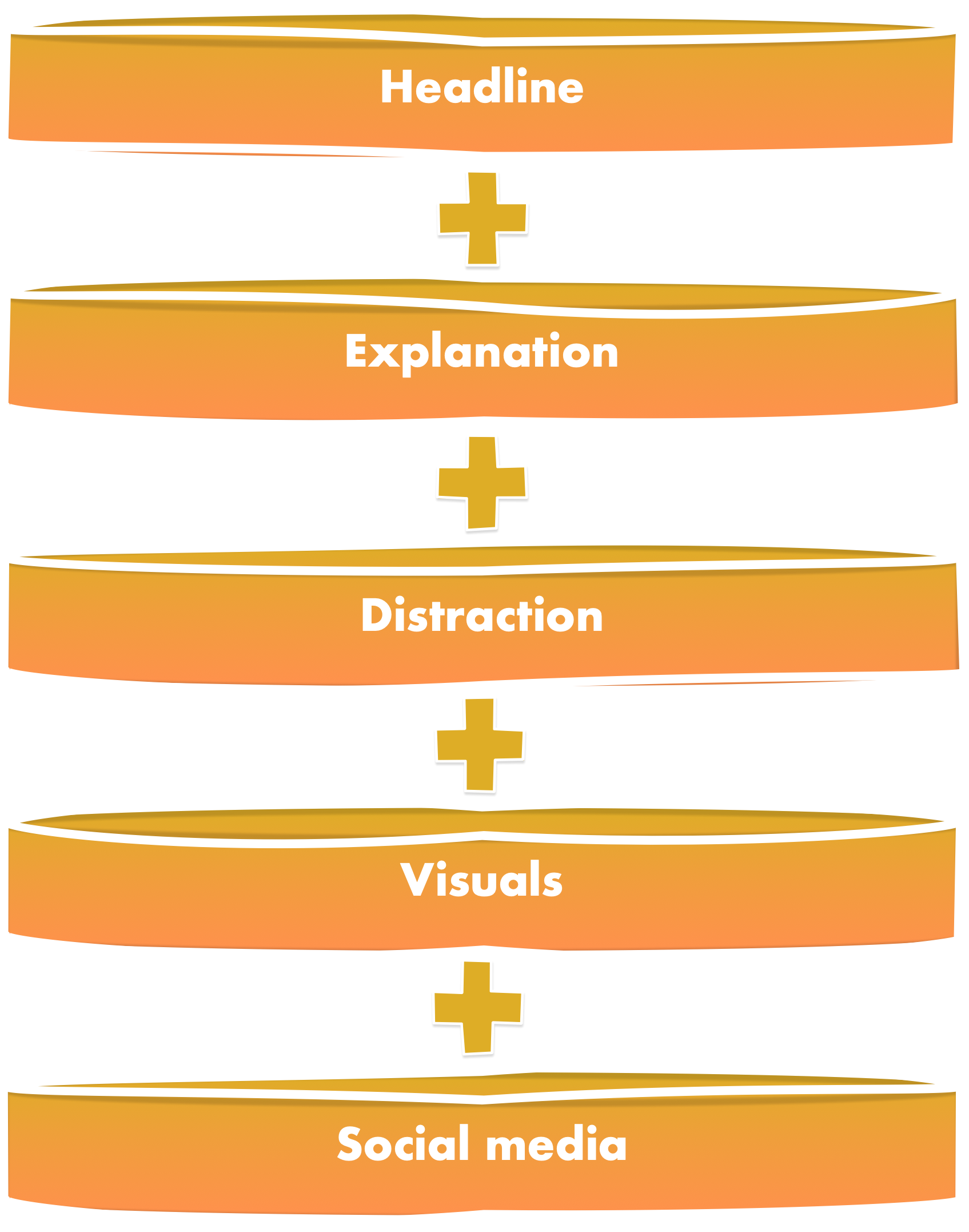
Probably the easiest way to introduce the methods of making a successful landing page is to run over each of the substances it’s made of. We have already discussed the importance of CTA-s and how to place and design them so let’s move on to the next aspect.
Headline
Keep an eye on the duty of your landing page (and also your whole site) which is: offering solutions to people’s problems, giving answers, and help. In the headline, you should summarize this will and also, how you going to make all those things happen. According to these, your headline must be clear, concise, and action-oriented.
Tell your visitors what they’re getting and how they are going to access it. All of these can be condensed into a short phrase (make sure it contains an action-verb) surrounded by a colorful, well-contrasted text box just to drive attention perfectly. Also note that you also have to explain the offer itself, and how it benefits the lead. One of the most important SEO technics is the use of keywords in the headline. Make researches, use words that represent the offer the most, and combine them in a way, search engines will understand them.
Explanation
The main informational data, about your offer, you are about to transmit through your landing page, is maybe the most crucial part of it. In this section, you must expound on all the information that lies beneath the headline. Explain what the offer is, tell them about the value and importance of the offer and how it can help them. Remember to keep this site as concise as possible, people make up their minds in just seconds. That means you got to keep your content above the fold so people don’t have to scroll in order to reach for the information they need. Bullets, bolding and numbers can help you make it transparent and easy to read.
Help your visitors stay focused, with as many moves as you can. One of these tricks is to remove the navigation menu and links from the landing page. Try to find the golden mean, with too short phrases the information you want to share can become incomplete, and with too long texts you can easily lose the attention of the visitor. Enclose them into leads with kind, attractive, but useful and informative texts.
Distractions
The more valuable the offer, the more information you can ask for. We have already talked about the information you can supplicate. Keep in mind that the landing page and the form too must mirror the value of your offer. Too much information asked is just one disturbing factor among many others.
Stay away from unnecessary design elements, phrases, questions, etc. and reduce any sort of friction that would prevent a visitor from filling out your form and becoming a leader. Run a different kind of analysis process and find out, which are those elements if you aren’t sure about them.
Importance of visuals
Catching, driving and keeping the visitor’s attention is the main goal when It comes to websites. And there’s the same with landing pages too. An inviting, eye-catchy but still gentle picture, graphic, scale, or video can raise your conversions exponentially.
But it can have a bad effect on them too, so consciously design and place your visual content on your landing page, make it attractive, not distractive. Remember to give your pictures alt-texts too so search engines will easily understand them, and guide even more people to your site too.
Social media sharing

Social media became the infinitely large main space of communication and socialization. You should have to give leads the opportunity to share each offer they like. This could be quite useful as it can gain even more awareness around your company. A well placed, nicely designed button of a Facebook, Twitter, or Google plus logo can also add value to the visual aesthetics of your landing page.
Wrapping up
Remember that conversion is one of the most important processes to be well treated. Create its platform, the landing page with care too. Keep these aspects in mind and try them. We’re sure, you’ll be satisfied with the results. Keep in mind that analysis is very important in this case too. Analyze and optimize your landing pages as frequently as you can, make changes based on the activities of your visitors and remember, Capturly can always give a hand in that.
2 Comments