Your CTAs or in other words, call-to-actions are among the most vital elements of your website! You might wonder why. Well, they may appear minuscule at first glance, but effective CTAs have the power to instantly drive conversions.
That’s precisely why it’s paramount to keep them at the forefront of your mind and optimize them effectively to yield the best possible results.
This article will guide you through the crucial steps required to achieve that goal and maximize your CTAs for more conversions!
Table of Contents
Understanding CTAs
First of all, it’s crucial to understand what CTAs are and why are they important for your business and for your conversion rate optimization goals.
CTA stands for call-to-action which refers to a specific instruction or prompt designed to encourage users and visitors to take a desired action. It is typically presented as a clear and concise directive that guides users toward a specific goal, such as making a purchase, signing up for a newsletter, downloading a resource, or requesting more information.
Usage and role of effective CTAs
CTAs are commonly used in marketing and advertising materials, websites, landing pages, emails, and other communication channels to drive desired actions and to boost conversions.
The most common purposes of the usage of CTAs:
Boosting Conversions
Conversions are the primary purpose of CTAs. The reason for their existence is to motivate users to take actions that are ultimately leading to conversions. It can be buying a certain product, subscribing to a newsletter, registering on a website, and much more.
Encouraging User Engagement
CTAs are effective in increasing user engagement by encouraging interaction and involvement. By providing clear directives, such as “Learn More,” “Get Started,” or “Join Now,” CTAs guide users to explore further, interact with content, and actively participate in the desired action.
Focusing User Attention
A well-designed CTA stands out on a webpage or within marketing materials, attracting immediate attention and drawing users’ focus to the desired action.
Providing Direction and Clarity
CTAs provide explicit guidance to users, eliminating ambiguity and making it easier for them to understand the next steps in their buyer’s journey.
Creating a Sense of Urgency
CTAs can effectively instill a sense of urgency by utilizing phrases like “Limited Time Offer,” “Act Now,” or “Don’t Miss Out.” This can encourage people to take the desired action without any hesitation.

Facilitating Conversion Tracking
By monitoring CTA performance, such as click-through rates, conversion rates, and engagement metrics, businesses can gain insights into user behavior and optimize their strategies accordingly.
Measuring the effectiveness of your CTAs
The effectiveness of a CTA is often measured by various metrics. All of these metrics show you a different perspective regarding the effectiveness of your call to action. Constantly following these metrics are essential to evaluate their impacts on user engagement and conversions.
It’s good to know that by analyzing multiple metrics and considering user behavior within the broader context of your website can gain a more comprehensive understanding of CTA effectiveness and make even more informed optimization decisions.
Let’s see what these key metrics are:
Click-through Rate (CTR)
CTR calculates the percentage of users who click on a CTA compared to the total number of users who view it. By analyzing this metric you will be able to see how many visitors have found the CTA button and how many of them have actually felt the urge to click on it.
Conversion Rate
Conversion rate measures the percentage of users who complete the desired action after clicking on a CTA. It shows not just how many people were clicking on a certain CTA button but also how many of them took the desired action after.
Bounce Rate
Bounce rate measures the percentage of users who leave the webpage without taking any further action after clicking on a CTA. A high bounce rate could indicate that the CTA or the landing page experience needs improvement to better align with user expectations.
Heatmap Analysis
Heatmaps provide visual representations of user interactions and behavior on a webpage. By analyzing heatmap data, you can identify areas of high user activity and see if users are engaging with your CTAs as intended.
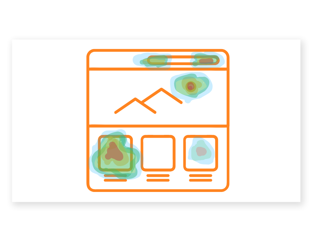
Scroll heatmaps let you know if your CTA button is too far down on your page and visitors don’t scroll down to it. In addition, web analytics software that offers segment heatmaps will show you which visitor segments interacted with your CTA button and how. This way you can measure the effectiveness of your CTA separately in different visitor segments.
A/B Testing
A/B testing involves comparing different versions of CTAs to determine which one performs better. By creating two or more variations of a CTA and randomly displaying them to different users, you can track metrics like click-through rate or conversion rate to identify the most effective design, copy, or placement.
Heatmaps are also a really effective tool to conduct A/B tests. By using them you can compare which version of your CTA got more clicks and by doing so generated more conversions.
Conversion Funnel Analysis
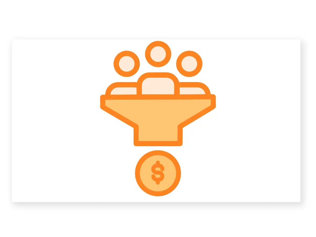
Analyzing the user journey and conversion funnel helps identify the effectiveness of CTAs at different stages. By examining drop-off points or bottlenecks in the funnel, you can determine if CTAs need improvement to better guide users towards conversions.
Key Elements of Effective CTAs
There are some key elements, tips, and tricks that can guarantee the effectiveness of your CTAs. If you be aware of these there is a higher chance that your CTAs will lead to conversions.
Let’s take a look at what are these elements:
Clear and Concise Language
A strong CTA communicates the intended action succinctly and clearly. It uses concise and straightforward language that leaves no room for confusion or ambiguity. Avoid jargon or complex phrases that may hinder user understanding. Using clear and concise language is the easiest step to take in order to increase your conversions.
Action-Oriented Verbs
Incorporate action-oriented verbs that inspire users to take immediate action. Words like “Buy,” “Subscribe,” “Download,” “Join,” or “Discover” prompt users to engage actively with the CTA and indicate the specific action they should take.
Compelling Value Proposition
Convey a compelling value proposition highlighting the benefits or incentives users will gain by clicking on the CTA. Clearly articulate what users can expect or how their needs will be fulfilled upon taking the desired action.
Design and Visual Appeal
Make the CTA visually appealing and eye-catching by utilizing contrasting colors, appropriate sizing, and compelling typography. It should stand out from the surrounding content and be easily identifiable. Consider using whitespace to give the CTA breathing room and enhance its visibility.
Placement and Visibility
Position the CTA prominently in areas where users are most likely to engage with it. Place it above the fold or within the user’s natural eye path. Ensure it is easily visible without excessive scrolling or searching.
Mobile-Friendly Design
With the increasing use of mobile devices, optimize CTAs for mobile screens. Ensure they are large enough to be easily tapped with a finger and that they maintain readability and visual appeal on smaller screens.

Sense of Urgency
Create a sense of urgency or scarcity in your CTA to encourage immediate action. Incorporate phrases like “Limited Time Offer,” “Only 2 Spots Left,” or “Ending Soon” to instill a fear of missing out and prompt users to take action promptly.
Trust and Credibility
Build trust and credibility by incorporating trust signals, such as testimonials, customer reviews, security badges, or satisfaction guarantees, near the CTA. These elements help alleviate user concerns and increase confidence in taking the desired action.
Addressing Common CTA Challenges and Pitfalls
There are several challenges and pitfalls that marketers often encounter when implementing CTAs. By being aware of these you can easily avoid them. Let’s check the 3 most common challenges and how to overcome them in the easiest way! Avoiding these are essential for creating an effective CTA.
Overcoming User Resistance and Objections
In today’s world, people are greatly influenced by the internet and the external environment. Therefore, it is crucial that your CTA buttons not only stand out from the crowd but also grab people’s attention effectively. But don’t worry as there are some tricks you can do in order to grab your visitor’s attention!
Clearly Communicate Value
Users may resist engaging with a CTA if they do not perceive enough value. Clearly communicate the benefits and value proposition of taking the desired action. Highlight how it solves a problem or fulfills a need.
Address Objections
Anticipate common objections users might have and address them proactively. Use persuasive copywriting techniques to alleviate concerns and build trust. Testimonials, social proof, or money-back guarantees can help overcome objections.
Dealing with Banner Blindness and Ad Fatigue
Banner blindness is when internet users consciously or subconsciously ignore or overlook banner advertisements displayed on websites or digital platforms.

CTAs can also be seen as ads for visitors and they tend to ignore them. If you want to get conversions from your CTAs you have to avoid this effect somehow and overcome it. Let’s check how you can do this.
Placement and Context
Ensure your CTAs are placed strategically in locations where users’ attention is naturally drawn. Consider the context of your website or platform and make the CTA relevant to the content surrounding it.
Refresh and Rotate
To combat ad fatigue, regularly update your CTAs to provide fresh visuals and messaging. Rotate different variations of CTAs to maintain users’ interest and prevent them from becoming blind to repetitive content.
Native Advertising
Incorporate CTAs seamlessly into the user experience, so they appear more like content rather than intrusive advertisements. Native advertising can help overcome banner blindness by making CTAs feel less obtrusive and more relevant to users.
Avoiding Common CTA Design Mistakes and Pitfalls
Common mistakes happen everywhere, and this holds true in the world of UX design and conversion rate optimization efforts. The impact of these mistakes is particularly significant when it comes to your CTAs (Call-to-Actions).
Clarity and Visibility
As it was already mentioned before ensure your CTA stands out and is easily visible. Use contrasting colors, compelling typography, and appropriate sizing to make it visually distinct from the rest of the content.
Concise and Action-Oriented Copy
Keep your CTA copy concise, compelling, and action-oriented. Use strong verbs that clearly convey the desired action and create a sense of urgency or excitement.
Mobile Optimization
With the increasing use of mobile devices, it is crucial to optimize CTAs for smaller screens. Ensure your CTAs are easily tappable, and the landing pages are mobile-friendly to provide a seamless user experience.
Final thoughts on effective CTAs
CTAs hold immense power in your hands, capable of propelling you towards your business goals. That’s precisely why it’s vital to give them utmost attention and craft them with finesse, for effective CTAs can make all the difference.
Utilize the key elements that lie at the core of their effectiveness, and don’t forget to measure the impact of your optimization endeavors. By doing so and steering clear of the prevalent challenges surrounding your CTAs, your triumph is assured! With careful attention to detail and strategic refinement, you can unlock the true potential of your CTAs, paving the path to resounding success in your business endeavors.
Don't forget, sharing is caring! :)

