The world switches to mobile: there are already 3.5 billion people use smartphones, and the number will grow to 3.8 billion by 2021. The desktop-only approach isn’t going to work these days. No matter what product you’re making—a blog, news portal, online shop, or e-learning website—it must look good on mobile devices.
There are two popular options: make a native (iOS or Android) mobile application or create a responsive design for your website.
App development isn’t a cheap service, though. It takes time, and it costs a lot. That’s why responsive web design may be your way out.
In this guide, we are explaining what responsive web design is, why it is used, and when it’s better to make a bet on web design rather than app development.
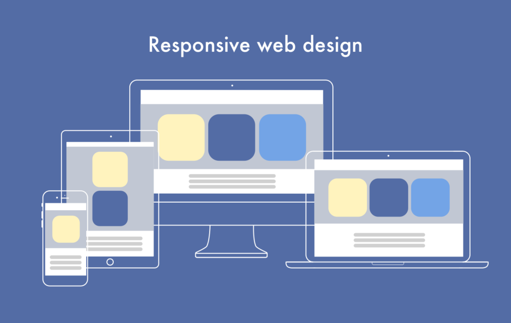
What’s Responsive Web Design?
Everyone knows what a mobile app is, but what’s unusual about a responsive website?
Responsive websites adapt their design to the screen of your device. No matter what the target device screen size is. It allows the web page to change its height and width and show correctly on any screen because of a ‘fluid’ layout and ‘fluid’ grid.
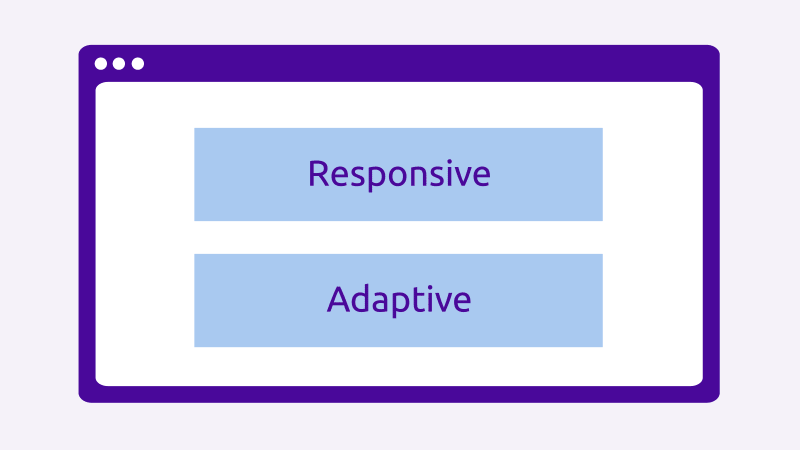
What’s the difference between responsive and adaptive design?
Responsive design is often confused with adaptive web design. Both adaptive and responsive web designs solve the same problem— make your content look well on various devices. But they do it in different ways.
- Responsive web design shows the content based on the available browser space: one website—all devices.
- Adaptive design has multiple fixed layout sizes:
- 4’-6’for smartphones
- 7’-11’ for tablets
- 12’ and over for desktops
When the websites detect the available space, it picks the most appropriate layout for the screen and shows it to the user.
Here’s how it looks like in practice:
Responsive Website Design vs. Native Mobile App
Let’s finally figure out which is better—mobile app vs. responsive website, and when.
You need a mobile app when…
-
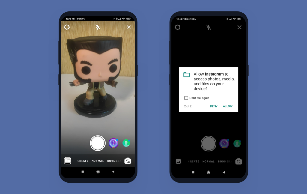
You use native functionality
Take Instagram—it has a web version, but its audience uses mobile devices. That’s because Instagram makes use of phone cameras, audio, and geolocation.
If your product needs to access the native functionality of the device (camera, GPS, microphone, NFC, Face ID), you need to create an app, not a responsive website.
-
You need 24/7 access
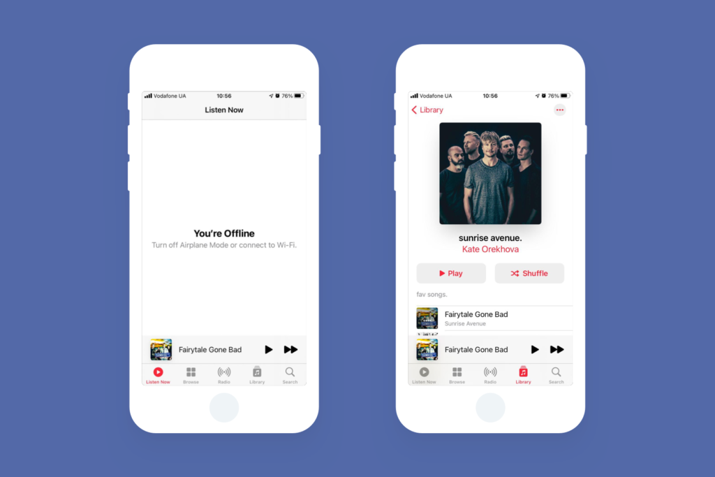
You can’t use a website without an Internet connection but can use a mobile app. Like when you double-check messages on WhatsApp or listen to tracks saved on Spotify.
You can’t access a website if you’re offline, but most app features will continue working even if there’s no Internet connection. Apple Music (as well as similar music streaming or music production apps) allows its users to download tracks for offline listening.
-
You need it to run fast
Native apps work faster. Well-written native code always performs better than a responsive web code.
That’s because mobile apps can store data on devices’ file systems and not rely on a linking processor (your web browser) to perform the most elementary functions.
-
You need it to be consistent with Android/iOS design
Native apps act and look the same. The design remains the same for your user, as well as the process of interacting with the app.
In turn, people spend less time figuring out how to use your application. And there’s an icon on users’ phones which remind them about your product, so brand visibility is in action.
Responsive web design is enough…
-
When you have specific content
Responsive websites are more suitable when there is no difference between viewing and using the website on a mobile device or PC. Considering different UX design trends on your website is important though.

News websites, blogs, or websites with food recipes don’t need a mobile app—people already use the product. At least, until you have the audience of The New York Times and the need to expand.
Same for e-mail services. Of course, Gmail and Yahoo have mobile clients, but it all depends on your audience’s size and end target.
Besides, website content is more sharable — you only need to send someone a URL to the website, not ask them to download and install an app.
-
When you have a limited budget
Native apps cost a lot. You’d most likely want to cover two platforms— iOS and Android—thus, you need to pay for at least two developers. Not to mention designers and QA engineers. While responsive websites can be accessed from any browser, working equally on various platforms and devices.
If you still need an app but don’t have much money, you may try multi-platform technologies like Flutter or React Native. They allow using one codebase for two apps, cutting down the development cost.
-
When you have limited time and resources
It’s hard to get new users on mobile—they need to have a reason to install your app. And not abandon it after the first launch (that’s what 21% of app users do).
For you, it means spending more on marketing services and advertising in order to get more downloads.
With a responsive website, there’s no need to install something on your device. Just type your website URL into the browser address field, and you can access it. Content from the website appears in Google or Yahoo, and people will see it in search results.
The website will be visible as soon as the domain name and web hosting are ready. Developers don’t need to wait a few days to get approval at the App Store and Google Play as with mobile apps. Which reduces time to market.
Which One to Choose: App or Responsive Website?

(Source)
Ideally, both. Even if your website is already responsive, in time, you may need to create an app, too.
Instagram uses both a responsive website and an application, giving its users a choice of how to access the content. Still, you can’t upload photos on the Instagram website, only view them. Some app features aren’t available on websites because of tech reasons—you need to download the app to get full access.
Now, what if you only have one shot—an app or a responsive website? It depends on your audience, then.
- If your target audience uses PCs or laptops, go for responsive design.
- If your audience spends more time on smartphones or tablets, make native apps. For that, learn how to create a better app UI and UX design.
What if the users are split 50-50? Then look up the current trends and where they’ll be going, evaluate your budget, and where your business will be in three years.
Author’s bio: Vitaly Kuprenko is a tech writer at Cleveroad, which is a mobile & web app development company in Ukraine. Vitaly enjoys telling about startups, tech innovations, and digital ways to boost businesses.
30 Comments
Ink Web Solutions
2021-07-15 at 11:49It is a great blog post.I am always read your blog helpful and informative tips. I like it thanks for sharing this information with us
Novateus
2021-07-30 at 20:42You’re doing a great job Man, Keep it up.
Vervelogic
2021-09-07 at 14:26Its really an interesting post! Thanks
Rajesh Sawant
2021-12-02 at 21:33A responsive website is really very important and your article has explained to us exactly why is useful. I had always heard about responsive website design but I was not clear about the concept of responsive website design until I read your article. I have learnt a lot about responsive website designs and the importance of creating mobile-friendly websites through your article.
Aaron Taylor
2022-06-23 at 13:07Thanks a lot for this superb article. Your thoughts are honestly fantastic.
Sloboda Studio
2022-07-08 at 18:14Great article! Building an application requires a different set of skills than modifying a site for mobile. Most businesses need, and already have, mobile-optimized pages these days. And while native apps generally perform more efficiently, not every business needs one to be successful.
Sloboda Studio
2022-07-11 at 16:34Wonderful article! By using responsive design, you can save money by eliminating the cost of paying for a mobile site. Thanks for sharing!
Phanom Professionals
2022-07-15 at 11:17Nice Post Thank you For Posting
Phanom
2022-07-15 at 11:17It is a great blog post.I am always read your blog helpful
Trank Technologies
2022-07-22 at 12:14Great article sharing useful information
Best Website Designing Company Kolkata
2022-08-18 at 11:40Thanks for sharing such great information. It was really helpful to me. I always search to read the quality content and finally I found this in your post. keep it up!
London Web Design
2022-10-04 at 08:55Enjoyable article, web design and development must be based on your customer and their needs. However, this must also be balanced with budgets and timescales. App development can also be expensive and needs to be thoroughly researched to ensure proper functionality.
Web Development Company in Mohali
2022-10-10 at 13:33Thanks for sharing such great information. By using responsive design, you can save money by eliminating the cost of paying for a mobile site.
E-Commerce Development Company in Delhi NCR
2023-02-28 at 13:19I am very ecstatic when I am reading this blog post because it is written in a good manner and the writing topic for the blog is excellent. Thanks for sharing valuable information.
Rahul Shastri
2023-03-01 at 11:27Great site, continue to work hard, you will come back soon crazy your articles, content is very rich and colorful.
Arshiya Ghosh
2023-03-20 at 06:34Very good article
Hetal Desai
2023-03-20 at 06:40Nice Article!
Atanu Halder
2023-03-21 at 08:16Very good blog
Jay
2023-03-27 at 06:52Thanks for sharing this content
Mindamade Technologies
2023-04-22 at 14:13Wow! such a interesting and informative article, Thanks for posting this Blog.
Web Development Service
2023-05-03 at 11:44our writing style is engaging and informative, and I look forward to reading more of your content in the future!
social media marketing in Mumbai
2023-05-06 at 12:03Amazing blog thanks for sharing with us.
Hot Foil Stamping Machine
2023-05-18 at 09:40Wow! such a interesting and informative article, Thanks for posting this Blog.
Sophia Brown
2023-06-21 at 14:36You have really given good information on how to create responsive UI for Android. You have added almost all the points that are necesssary to understand. But I would like to add some more points that can help user to learn more:
1. Test with Different Languages
2. Leverage Android Jetpack Components
3. Gather User Feedback
4. Use Flexbox Layout
5. Implement Scalable Icons
So these were some of the other points that can help you to create more responsive UI design for android. But if you don’t know how to do it I would suggest you to hire android developer. I had also hired Alakmalak Technologies for this, they provide me the best UI UX design for my app at very affordable rates. So it can save your time as well as money.
Victorius
2023-11-16 at 09:16Good article
Victorius
2023-11-16 at 09:17Good article
lolo potter
2023-11-16 at 09:17Good article
lili
2023-11-16 at 09:18Good
nikohealth.com
2023-11-23 at 09:44Good article
Attract Group
2024-01-08 at 07:10Choosing between a responsive website and a mobile app is a pivotal decision in today’s digital landscape. Both options have their merits, and the right choice depends on the specific goals and requirements of your project.
Responsive websites offer versatility by adapting to various screen sizes, providing a seamless experience across devices. They are cost-effective and easier to maintain since updates apply universally. However, they might not harness the full potential of device-specific features.
On the other hand, mobile apps deliver a tailored experience, leveraging device capabilities like push notifications and offline functionality. They can foster user engagement through a dedicated platform, but development costs and maintenance can be higher.
Ultimately, the decision hinges on your project’s objectives. If widespread accessibility and cost efficiency are paramount, a responsive website may be the way to go. For a more immersive, feature-rich experience with a dedicated user base, a mobile app could be the key. Striking the right balance ensures your digital presence aligns seamlessly with your goals.