
‘Nothing is easier than finding new customers and convincing them to buy from me’ – Nobody ever said that quote. Why? Because the situation is the opposite. It is quite hard to find new visitors, pause them for a minute to instruct them on your value proposition(s), make them believe that your brand is the best in that sub-market, and finally convince them to make a purchase or just a simple registration on your registration page.
Many researchers concluded that it is way easier to sell something to those who once bought something from your shop, than those who did not. According to Huify, grabbing a new customer is five times more expensive than retaining an existing one. But sometimes you have no other choice just to acquire more visitors.
In these hard times, you need to plan every penny of your costs. Yet, some marketing experts believed that acquiring new customers would be cheaper in the online scene. Well, I can tell that all is quiet on this front still. A good registration page can be the zero step in reaching out to newcomers.
But like everything else on web page design, a registration page is full of exact rules, and possible mistakes that can bring your company to the sky, or rock bottom. This article will help you erase the clouds to discover the Sun. We will help you understand how to optimize your registration process, and how a well-built-up registration page looks!
Table of Contents
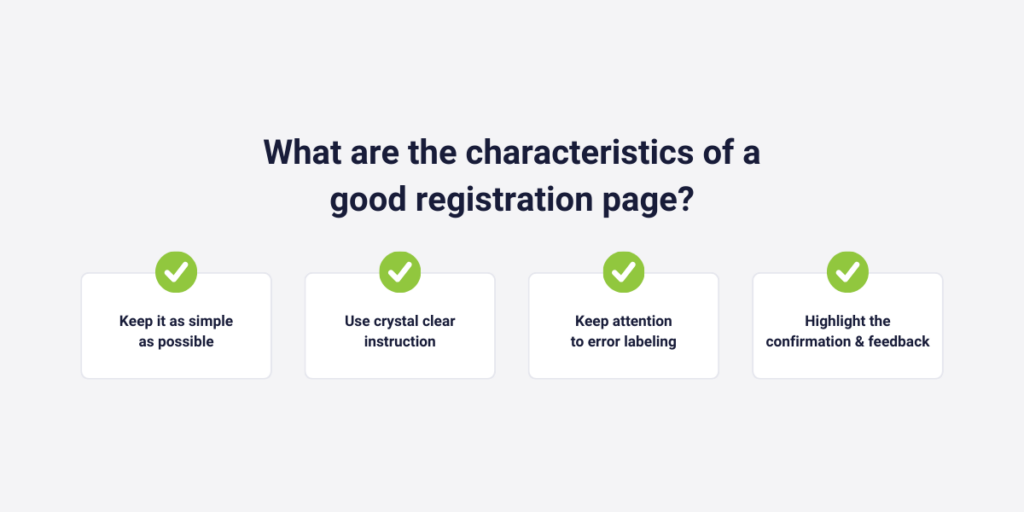
What are the characteristics of a good registration page?
A good registration page relies on many factors. In this chapter, we will discover these.
✅ Keep it as simple as possible
You don’t need to share all the information here. Moreover: it is rather bad if you want to convince the buyers in this phase. Here, they don’t want to read more information about your brand, your mission, or anything else. They reach your registration page because they are interested. In this phase, you need to achieve one more little push to send your visitors their contacts to you.
But simplicity not only covers too much-written content. You also need to neglect too many fields. Who wants to apply for something if the visitor needs to fill out 20 different fields? Only ask them the most important things. Those which are unavoidable to give them proper service.
Most of the time, these are:
- Email address
- Password
- A checkbox for terms of service
- CAPTCHA to prevent spam registrations.
✅ Use crystal clear instruction
Almost all boxes the user needs to fill out should be labeled with clear meaning.
A good example of this is the “password” question. You don’t need to define what a password is; we all know that. But there are different password rules, across different sites. To make the user’s task easier you need to define your rules of making a password on your site.
Do you demand capital letters, numbers, or special characters? Be sure that the visitors know these, before creating their own passwords, or it can generate negative feelings and anger.
✅ Keep attention to error labeling
It’s one of the most frustrating things in terms of a registration process if you can’t complete the process, because the page doesn’t let you. There were 10 different boxes, which one did I fill out in the wrong way? It’s really hard to tell. However, these kinds of mistakes are rare nowadays.
But unclear error labeling is not. What do I think? For example, when there is an error labeling that you made a mistake in one box, but doesn’t indicate what it is exactly. This issue occurs with dates usually. You know that the program did not accept your version of the “birthdate” box, but the problem can be various.
- You used dots instead of commas, or reverse (07.03.1987, or 07,03,1987)
- The structure is different from yours (1987.15.12. or 12.15.1987)
In these cases, it is important that even if the task is so obvious, you must share clear error labeling with those who spoiled something. Or prevent trouble with clear instructions, just like IKEA does:
✅ Highlight the confirmation and feedback
An efficient registration page not only provides a clear and obvious route for those who want to register to your site, one of your products/services, or your newsletters. A good registration page also shares information about what will come after the end of this process with their clients.
What we see in this picture, is a good start because we are notified that the registration process ended successfully, and we will get the newsletter regularly. But still far from perfect.
I like it when they also refer to the name of what I registered earlier. “Congrats Joe! You registered for our XY course successfully.” – Here I can check once more that I registered for the correct course/event, for example.
But in terms of an event, it is also quite important to write down the starting date, and the place of location again. Following the last example, in this case: “Congrats Joe! You registered for our XY course successfully, which will be held online through Discord, on April 26.” Here, you give the user one more chance to recognize this crucial information.
Where can the registration page design go wrong?
So a great registration page is simple and clear, and when there is a problem with your registration, the program quickly notifies you of that mistake. If just these instructions make a registration page perfect, people would never complain about this topic again.
As in many industries, the situation is not that easy in this one either. In this subchapter we will look at 3 factors, which if you don’t care can negatively impact your registration page, and in the end: the registered number of users.
❌ Lack of mobile optimization
Many web developers believe that when they create a webpage it is automatically responsive to mobile devices as well. Well, in the past this was completely false, but today some sites ensure you all-inclusive mobile friendliness, without some more work to do. But, not all! So you must check first whether your site is mobile-friendly, and if not, you need to take action as soon as possible.
According to Datareportal, 58% of the world’s traffic is coming from mobile users, so you better take care of them.
But what other implementations can enhance the mobile users’ experience? Well, there are a bunch of other options, like:
- changing your fonts to more mobile-friendly
- increasing the site’s speed
- optimizing images
❌ Forget to test
Yes, I know: it is so obvious! But most of you are still not taking it so seriously.
The problem is the following: creating the registration page requires too much time, and you want to save some of your precious time by just skipping this last step. Why not? Because you never make mistakes, right? Well, if you only make one mistake in a year, it will definitely appear the night you don’t test.
And the problem with registration pages is, this is what decides everything. It is less relevant if one CTA doesn’t work on the blog articles section, it is even less relevant if that tiny mistake is on the landing page.
But imagine the situation: you need to create a birth date box on the registration page, and you set a calendar on the box. In the calendar the visitors can pick the right numbers, and move forward. But here’s the issue: if you were born in 1964, you need to go back sixty years to find the right date!
Not many of your visitors will click that much to complete the registration. They rather go away. In this situation, if you make some tests, you will realize that this approach is not working, and you will let your visitors set their birth date manually.
This situation occurred in many cases in the past, however, it wouldn’t take too long to check whether everything worked right.
❌ Not using a website analytics tool
Where are the users struggling? What impacts can solve their problems?
You never know the answers to these questions, if you don’t try web analytics tools. These tools are capable of understanding your visitors with you, without any interactions.
But companies not only use them for understanding visitors but to detect issues that really make your visitors mad. In the next chapter, we will learn some more information about heatmap analytics, session recordings, and funnels which are all impactful parts of web analytics softwares.

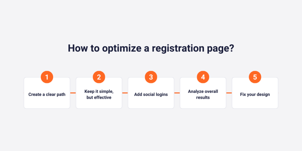
How to optimize a registration page?
In this part of the article, I will lead you to some of the main steps of creating an optimized registration page.
1. Create a clear path
Creating the best registration page on the whole internet requires some prior knowledge. You need to know what your customers scan first, and where the busiest points of your pages are.
Of course, there was some research about this topic lately: Gravityforms conducted that right-sided forms are usually more accurate than left-sided ones. Moreover, Unbounce increased its conversion by 41% with a simple tip: to make the form above the fold!
Yes, these tactics will generally increase your chances to generate more registrations and make your registration site more optimized. But these won’t solve all of your problems. Why? Because there are specific aspects that only refer to your own audience or the specific industry that you are working in.
If almost none of your visitors click on a specific CTA, do you really need to place it there? If none of them click to sign up with email, do you need to stick with it instead of recommending social logins?
Capturly’s heatmap analytics has three different heatmap options.
These are:
- Scroll heatmap – it analyzes the depth of the visitors’ scrolls. This heatmap option evaluates the maximum distance visitors scroll down in one session, and demonstrates the change between the watched pixels of all of your visitors with red and blue colors, and their shades, where red color indicates the higher densities, and blue is the lower.
- Click heatmap – analyze the visitors’ clicks on the designated site. The more the users click in one segment, the more important that part is for you. The red color indicates busy points, while blue indicates less busy points.
- Segment heatmap – this heatmap option is capable of analyzing scrolls, and clicks, but not just the whole data set, but also in parts of it. There are five different segmenting options, where you can compare clicks and scrolls based on new vs returning visitors, devices, or browsers.

2. Make your registration page simple, but effective
Here, based on the data of your previous registration pages, or other external s you can build a simple, but effective registration page.
We already mentioned some tips that are connected to this step:
- Don’t make your registration process too long – your visitors will eventually get bored, and don’t complete it
- Don’t write unnecessary content here – they are not curious about another product, they want to fully concentrate on registration to your site. Don’t try to get two in one, as you will fall between hell and high water.
But there are some other things we have not yet mentioned:
- Make a minimalist design – outside of a plain background (which is recommended to be your brand color), you don’t need anything else. You don’t need a special design at this stage.
- If you have more questions sort them into more slots
3. Create social logins
One of the most crucial steps nowadays. The trends are still the same for years now: customers don’t want more passwords! They are almost begging for other options, and the best is a social login.
It means that the visitors do not necessarily need to create a new password to end the procedure, as with their META, Apple, or Google accounts’ credentials, they can also move forward. LoginRadius, a well-known CIAM platform’s report from 2020 concluded that more than 70% of the 18 to 25 years old users preferred this method, instead of the classic one.
The last couple of years have generated a boom of 50+-years-old social media members, and social login is also more and more preferable for them.
In 2023, Blue Research found out that more than 50% of the visitors think of a possible leaving, after not finding a social login button in one of the registration processes. In the next few years, social login will completely change the normal password and username combination, and it is not a problem.
4. Analyze overall results
Now we are finally reaching the main point. We need to analyze whether our registration page actually works successfully. We need to analyze how many percent of the visitors that came to your site earlier are converted into registered users. The best way to make this right is to choose a web analytic tool and choose one of their plans.
In Capturly Analytics all of our plans (even the free as well) contain a funnel analysis option. In this part, you can manually make funnels by just inserting goals after goals. Let’s see an example of that, and then we will discover the relevance of this opportunity.
A normal funnel would look like something like this:
- visit the site (2500 users)
- click on the pricing page (500 users)
- create the registration (120 users)
As you can see these funnel options individually track the number of users that reach each step. But that’s not all! They can also calculate drop-off rates, from those who left before going to the next step. In the end, 120 users ended the funnel, so this funnel’s conversion rate is 120/2500*100= 4.8%
With this tool, you can not only analyze your results but also understand where most of your visitors drop off. In this example, the problem is not with your registration page, as the drop-off rate there is only 76% compared to the pricing page stage, where it’s 80%.
In Capturly’s package, you can also discover an event analytics option. If you label your registration page, and the tool tracks your user’s activity on that site, you can even earn more information. Total visitors, total sessions (you can calculate how many visitors make more sessions), or the total values you get after they complete this process, if they need to pay to register.
5. Replay individual sessions to fix the dark spots
Although funnels can help you detect that “Hey, there is a problem”, this function can’t provide you with solutions. Moreover, with just that you can not be sure what the issue is exactly. That’s what individual sessions show to us.
Web Analytics programs have another superpower. This is called a session replay or a session recording, which basically lets the website record, store, and rewatch individual sessions from their users. These tools generally use data masking, which means they hide sensitive data from hackers, other malware programs, and even from themselves!
But what can we figure out from these rewatched clips of session recordings in terms of creating a better-optimized registration page? Well, things that we would not discover if we neglect using this tool.
- Rage click detection – understand where the visitors get frustrated inside the registration phase
- U-turn detection – if there are miss-clicks, or slow-loading elements which is our responsibility
- Javascript error detection – if our codes are faulty
Moreover, Capturly’s session recording tool is integrated with heatmaps and funnels, so if we acknowledge an interesting trend in those data, we can take a look at individual sessions to understand the “why”-s as well.
Conclusion
In this article, we mentioned a bunch of different tips on how you can optimize your registration page.
In conclusion, you need to take care of:
- Create a simple site, with clear instructions
- Use the error labeling function, and give feedback to the registrators
- Optimize it for mobile, and don’t forget to test
- Use web-analytics
But, if that hadn’t been enough, we also created a step-by-step analysis of a well-optimized registration page. It contained 5 steps, which we can also interpret as 5 requirements you need to obey as soon as possible.
These requirements are getting more relevant than ever, so you better consistently steer your ship to these tips and implement them till the time it isn’t too late.