
With more than one billion devices all over the world, Apple is one of the biggest technology companies that have the power to make any idea or design mainstream. But do they know everything about user experience and user interface?
In this article, we will take a look at Apple’s overall website statistics, the multifunction site from landing pages to product pages, analyze some UX takeaways, and get to the bottom of a few case studies with heatmaps and other advanced web analytics tools. Are you interested? Keep on reading.
Table of Contents
Apple’s Overall Website Statistics
Compared to all other sites in the world, Apple has the 72nd biggest traffic rank. It is in the category “Computers Electronics and Technology” and won (or rather earned) second place compared to all other sites in this category globally. Have you ever wondered what metrics and traffic a website with such a position might have? Well, here are the answers.
1.1. Quantitative metrics
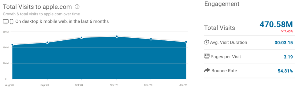
Quantitative website metrics are measures of quantitative website assessment. For Apple’s site, the average visit duration is three minutes and fifteen seconds. It shows how much time a visitor spends on the website while visiting it on average.
Their users typically visit 3.19 pages during a session. Pages per visit measure how many pages a particular user views on a website, and it is mostly displayed as an average. Another important metric is the bounce rate which is 54.81 percent. It may seem like a high value, but it’s actually quite average compared to last year’s rates in the industry. The bounce rate is calculated simply, you can get it by the total number of one-page visits divided by the total number of entries to a website.
1.2. Traffic
The United States is the home of Apple and where apple.com is best-ranked. So it is no surprise that most of its traffic comes from the USA. They typically account for 30 percent of total traffic. The US is followed by Japan, China, the United Kingdom, and Canada with a value of around 5 percent each. In January 2021 the visitors of Apple’s website came from 247 more countries.
It also indicates that it is a global, popular and upscale website moreover brand leading to total visits of 470.58 million in six months.
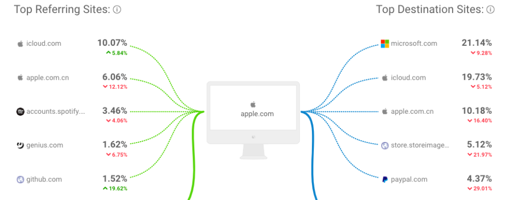
The search is definitely the strongest source of desktop traffic for Apple’s website. It accounts for more than half of the traffic. 95 percent of search traffic is organic, while only 5 percent is paid. The top five organic keywords are apple, iTunes, apple tv, apple id, and apple store. Direct traffic follows with 33 percent.
Referrals, social, mail, and display traffic are minimal. On the other hand, we can not ignore the fact that there are hundreds and thousands of people coming from these sources. So maintaining these channels are also important in Apple’s marketing strategy. The most important social channels for Apple in terms of incoming social traffic are Youtube, Twitter, Facebook, Reddit, and Linkedin.
Now we have a better idea of the raw data and metrics. Let’s dive right into Apple’s website, shall we?
Apple’s Multifunction Website
You’ve probably visited Apple’s website already, if not you must have heard about it. The page design spreads the full width of the browser, it is responsive so the possibility of the content and product imagery might get cut off is zero. The consistent modern and simple design has become a favorite for many. But why is it so popular?
2.1. Smooth navigation
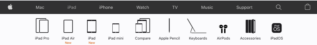
Despite the wide range and variety of products, Apple has a simple and effective navigation system. It has seven main categories, each submenu appears as a clear icon. Without any drop-down menus, Apple provides smooth navigation which makes the UX better. Users can find what they are looking for quickly and easily. This is important because internet users are used to getting information fast. If they don’t get this, they quit and look for another source, leading to a high bounce rate.
Possibilities for Development
As we have already mentioned, there are seven main categories on the website and each submenu appears as icons. Nevertheless, when you scroll down the site, the navigation bar disappears so if you want to switch between products you have to scroll all the way up. A good solution to this problem would be if the navigation bar could respond to scrolling, or if there would be a button that takes you back to the top of the page.
The essence of usability analysis is to find out how easy and efficient a website is to use. This is extremely important for the UX. We have to meet the expectations of our visitors or even soar beyond to provide the best UX possible. When it comes to conversion rate optimization, it could be a great start to test usability. With advanced web analytics tools, like session replays and heatmaps tools you can easily get a better idea of what causes frustration for your visitors on your website. Apple has a smooth navigation system, however, there are minor major gaps that could be improved.
2.2. Simple and modern design
Less is more. It is true in web design and user experience. Crowded subpages, strong contrasts, lots of CTAs, and an exaggerated amount of information can confuse visitors and lead to an unsatisfying UX. A simple and sleek design creates a modern and professional effect. Apple uses white backgrounds and negative space, simple colors, typefaces, and graphics. Whitespace, in addition to having a very modern and sleek effect, helps to divert consumers ’attention to products. Modern not only describes Apple’s items but the web design and style as well. Minimalist colors like white, grey, black, and the light san-serif font amplify the modern effect.
Animated elements also intensify the modern outcome. Apple’s website often uses animated elements that are mostly focused on the products and new deals. Most often, the visitors only become aware of the animation when they start scrolling down. This will help increase the time spent on the website, grow the number of visited subpages in one session, and increase the chances that visitors will also encounter content at the bottom of the page. If your target audience gains excellent experience visiting your website they are more likely to go back there, and it is all thanks to the unique user experience.
Are you interested in how far your visitors scroll on your website? You can get a great picture of it with the help of scroll heatmaps.
2.3. High-quality pictures

You may have seen the same faces on different websites over and over again. Free stock photos are a great way to get high-quality images for your websites, however, they are not unique and might make your business look less professional. Apple is at the forefront of high-quality images. Not only their product photos are outstanding, but so are the images where they present their products in use. Usually, this happens in a natural setting so that visitors can imagine themselves even more in place of the models.

As for their product pictures, Apple uses sleek images and visualizations that make visitors crave their products. They usually use drop shadows throughout the website which is helping products appear to sit and in certain cases hover. This effect also helps the potential buyers to imagine the product and even see them as their own.
Possibilities for Development
High-quality and high-resolution images can impress visitors and make you seem like a real professional. On the other hand, these large photos and excessive space increase the scroll length. Without a “Back to top” button, this could be a real nightmare in terms of user experience.
2.4. Consistency in style

For Apple, consistency is paramount. It is not only characteristic of the website, but also of the brand itself. Sophisticated, modern, valuable, minimalist only a few phrases that come to mind asking people about Apple. The products and the packaging are in perfect harmony with the website. Apple’s website is a large site with hundreds of subpages. Yet you could just simply tell what website you are on if you were to remove all of the imagery from the page but keep the texts and colors because of the consistent design and style. The colors and fonts that appear on each subpage can also be found on the boxes of products that further maintain the Apple brand.
Apple’ Main User Interface Characteristics
The user interface or UI is the series of screens, pages, and visual elements that allow people to interact with products and/or services. Apple is definitely a player in the digital world who sets the trends, it’s no different with the UI either. So what characterizes the user interface of Apple?
Shadows, focus, and translucency are the main trademarks. As for everything else, it is subtraction. Simplification is the driving force in the world of UI nowadays. People live in a digital world, becoming more and more familiar with themselves in the online space. Many applications and features are no longer new even to those who were not born into this. That is why it is unnecessary to overcomplicate an interface or place unjustified blocks of text. Visualization is king, as the new saying holds. More images and visuals, less text and data. As for the shades, gradients are the new colors, but they are also more restrained.
Apple’s User Experience Performance
The popularity of Apple made a lot of e-commerce experts curious which led to numerous performance reviews and website analyses. One of the latest research by Baymard Institutes included 705 different design elements, 12 rounds of qualitative usability testing, in-lab eye-tracking testing, and 8 quantitative studies with thousands of participants. Despite the hype, they found that the overall UX performance of Apple’s website is acceptable.
Let’s see what are the weakest and strongest parts of it.
4.1. Order Tracking and Returns

According to the results, these are the strongest parts of the UX. Based on the guidelines the “Order returns” are good, the “Orders and Order Trackings” are decent.
4.2. Homepage and Category
In this performance section, the “Main navigation” is rated the highest. As we have already mentioned, Apple has a smooth navigation system that is the basis of a good UX. The “Homepage” and the “Category Taxonomy” are decent. However, the “Site-Wide Layout” is mediocre.
4.3. On-Site Search
![]()
This is one of the weakest parts of Apple’s e-commerce user experience. By contrast, the Search form is good and the Search Autocomplete is decent, the Search query types, Results Layout & Filtering, Results Logic & Guidance are underperforming.
4.4. Product Lists & Filtering

This factor of the user experience includes the following: list layout, loading products, list items, filtering (available filters, scope & logic, interface & layout), sorting, comparison tool. The overall performance of this is mediocre.
4.5. Product Page
The Image Gallery UI and Product Variation is the strongest part of Apple’s product page UX according to this performance indicator. Buy Section, Specification Sheet, and User Reviews are acceptable but the Cross-Sells & Cross-Navigation are poor.
4.6. Cart and Checkout

It is a decent part of Apple’s user experience performance and also by far the most complex. The researchers reviewed 131 guidelines in this category. Account selections & Creation, Order Review, Order Confirmation & E-mail, and Field Labels & Microcopy are the poorest factors. There are some acceptable parts that need improvement, these are Shopping Cart Behavior, Form & Page Design, User Interactions & Distractions. An unquestionably strong part of this category are Default Values & Autocompletion, Cross-Sells, Credit Card From, Payment Flow, Shipping & Store pickup, Gifting Flow & Features, Customer & Address information.
4.7. Customer Accounts

This factor is hardly mediocre. The main cause of low performance is the Account drop-down but the Account Sign in, Navigation, Structure & Information are areas for improvement.
4.8. Mobile E-Commerce
To study Apple’s mobile e-commerce performance, the researchers took 205 guidelines into consideration. The overall production is acceptable, the Mobile Homepage, On-Site Search, Product Pages, and Mobile Site-Wide Features & Elements degraded the average judgment. The Checkout and the Navigation are outstanding in the mobile version as well.
Apple’s Heatmap Analysis
Have you ever wondered how 1.8 billion mouse movements look like on a website? A few years ago around the battery fiasco, Seotify made a heatmap analysis on Apple’s website. Website heatmaps are advanced web analytics tools in other words it is a special data visualization technique. A heatmap shows the most and least popular parts of a website. Sections that are viewed or clicked by many are marked with warmer shades like yellow, orange, and red, while less popular sections are shown in green and blue. When it was revealed that iOS updates are slowing down old devices, people attacked the support page and the number of visitors increased by 23x on that page.
November 2017

January 2018

Apple thought that the act of slowing down old devices will motivate people to switch to new generation phones. However, it resulted in a huge drama, and people affected preferred to replace the battery instead.
Above all, a site heatmap is an excellent tool to get to know your own website a little better. In Apple’s case, it was apparent what was the problem but if you have difficulties on your website that you just simply can not get to the bottom of, heatmaps could be a lifesaver.
For example, with click heatmaps, you can get a better idea of what parts of your website should be clickable. Scroll heatmaps show you how far your visitors scroll on each page. Knowing where to place the most important content and CTAs is a major way to get those conversion rates higher. Segments heatmaps show you how different your visitors behave from variant operating systems, devices, browsers, or webpages.
You have the possibility to think with your visitor’s brain. With that, you can provide the best user experience possible especially if you also use session replays.
Wrapping up
Apple is one of the biggest trendsetters and has such a huge influence on the companies in the online world. The animated elements, white backgrounds, negative space, simple colors, typefaces, graphics, and sleek design that creates a modern and professional effect are all trademarks of Apple. Its impact on today’s UI trends is unquestionable as simplification and visualization have gained ground among today’s online trends.
Let’s be real. The popularity of Apple’s website is mostly due to the brand’s flair and reputation that the company has built. Having said that, without an exceptionally good performing website, it would not mean much. The smooth navigation, simple and modern design, high-quality images, and consistency in style are also essential to be an ideal of many businesses.
3 Comments
adya
2023-10-20 at 07:37This article is quite lengthy but very helpful for me. Thanks for sharing a best and worth tips. I appreciate the author writting skills.
slope
2023-11-23 at 04:56I really like the information you share. Thanks to that, I know many more interesting and useful things.