A heatmap analysis answers lots of questions. In the following, you can learn how and when we recommend using heatmaps. We’ll list the benefits of the analysis.
How to create a heatmap?
There are some easy steps you need to follow while creating a heatmap. You can read their brief explanation here. In the case of using the Capturly heatmap tool, you don’t need any manual settings, since the heatmap is created automatically. After adding Capturly’s tracking code and receiving the first clicks or taps, heatmaps will be visible immediately. You can also add some filters like date range, device type, visitor type, referrer, OS, and browser.
When should I use a heatmap?
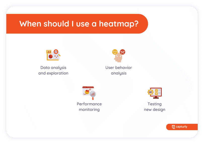
Heatmaps are used when you’d like to track user behavior, so every time is the right time to apply them. There are no similar cases since each user acts uniquely. Every time you do heatmap analytics, it provides you with different pieces of information. But there are some situations in which it is recommended to use a heatmap.
One of them is when you’d like to redesign your website. Since a heatmap displays the most and least attractive spots of a page, you can find the right place for each element based on their importance. According to these analytics, you can also filter the elements on your website. The ones that got the most attention deserve a valuable spot. The ones that didn’t receive the right number of clicks can be eliminated or replaced.
It is also good to use a heatmap when you want to insert a new module into your website. It should be right where users are likely to look for it. Heatmap analytics warns you if users stumble upon unnecessary or non-clickable elements while browsing.
In general, heatmaps are useful if you’d like to learn more about the user interactions on your website. They help you to make your website user-friendly, which is a key factor earning a huge success.

What are the benefits of using heatmaps?
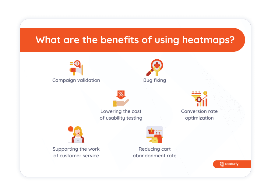
The main benefit of using a heatmap is that you can get feedback on user behavior on your website. In the following, we gathered the most popular benefits of heatmaps when they are used properly:
- Conversion rate optimization: Conversion occurs when a user completes a desired action, such as a purchase or newsletter subscription. The conversion rate is calculated by dividing the number of users who completed the desired action by the total number of visitors. During the whole customer journey, there can be some distraction that leads to high drop-off rates. By defining and analyzing each step in the conversion funnel, the conversion rate can be optimized in each stage starting from micro to macro conversions. You can find out whether users manage to reach the important content on the website, or they fail to see it. You can also get information about how many of the users click on a certain call-to-action. The analysis shows you if some unnecessary elements block users from finding the key spots. It is also good if you run a website that is optimized for multiple screen sizes.
- Reducing cart abandonment rate: In many cases, online shops suffer from a high cart abandonment rate, so they lose their visitors on the checkout page. What does that mean exactly? The user adds an item to the online cart, but there are no sales, they leave the site without purchasing anything. The shopping cart abandonment rate is calculated by dividing the total number of completed sales by the initiated transactions (add to cart event). By analyzing the heatmap of the cart and every URL that is in the checkout process, you can reveal the pain points which lead to a high cart abandonment rate.
- Lowering the cost of usability testing: Instead of conducting expensive and time-consuming user interviews and focus groups in-person to examine user experience and usability of the website, heatmaps offer a low-cost solution for observing user behavior and interactions with the page. With Capturly you can turn your visitors into testers in seconds because it’s like sitting behind the customers and observing how they behave and what they look for. A heatmap shows how far users scroll while looking for information. With the help of that, you can reveal errors made during the screen size settings. Non-clickable elements can also be disturbing, fortunately a heatmap also indicates the percentage of users who actually wanted to click on those elements. Heatmaps help you by finding the right place for the link placements. They show you not only the number of clicks on each call-to-action but also the popular and unpopular links. All these benefits grant a better user experience on your website.
- Campaign validation: Heatmaps are useful for marketing campaign validation. Visitors can come from different countries and from different cultures, due to which they can act differently on the landing pages. You can customize your destination pages based on real data to make the most of your campaigns.
- Bug fixing: Bug fixing can be a never-ending fight because there is no such product in software development. Resolving them requires lots of effort, but with heatmaps when one of your visitors reports a bug on your website, you can quickly and easily check what the user saw exactly on your site to reveal the problem.
- Supporting the work of customer service: Heatmaps can provide all the key information about users and their interactions. Replicating user issues is easier than ever before, moreover, all the technical details are available such as the browser, location, and OS version among others.

How can I optimize conversion rates by using a heatmap?
Optimizing conversion rates is one of the hardest things to do. But heatmaps can help you to make it easier. Heatmaps represent the behavior of all the users. The benefit of this method is that clients don’t even know that you’re studying them and that’s why they will act naturally. You can get further information about their browsing habits, and by analyzing all their movements, you will learn what catches their attention the most. According to that, you can change the design and the layout of your website. Users are more likely to revisit a website that is user-friendly and provides the needed information as soon as possible.
Discover user behavior on your website with our comprehensive tool that combines click, scroll, and segment website heatmaps!
What UX problems can heatmaps show?
UX problems that can be revealed by heatmap analytics are in connection with call-to-actions, navigation, images, titles, page length, and optimization. Let’s see a list below of the UX problems that heatmaps show.
- Misplacing of call-to-actions: Call-to-actions are specially designed to increase the number of clicks on a certain link. If the click heatmap displays these CTAs as ‘hot’ spots, you did a good job. Users found the link attractive enough to interact with it. If you see them as ‘cold’ spots, those links didn’t receive enough visits. There are plenty of reasons for that, about which you can read in more detail below.
- Disturbing design elements: Although some design elements might look stunning, some of them could be disturbing for the users. Once the design is too glitchy, it completely detracts the user’s attention from key elements. Content that is too colorful, sparkling, or flashy has been shown to be unpleasant for users. It can make them stop browsing since they can’t find the information they’re looking for. Users prefer clear and simple content. If the result of the heatmap shows that users stop browsing at some point of your website, analyze the design elements around that spot.
- Non-clickable elements: It usually occurs that users expect some items to be links and they try to click or tap on them. Click heatmaps reveal these items. Some of them might get enough clicks to be considered ‘hot’ spots. In this case, try to rearrange your website and replace these non-clickable elements with call-to-actions. It is also a good strategy to insert links into these non-clickable spots.
- Optimization: It is a key to success to optimize your website for multiple screen sizes. You can boost your conversion rate by doing so. Users hate browsing pages that don’t fit into their screen size. It’s really annoying when some parts of an element stay hidden on some devices. Not to mention that users can miss important content in this way. Click and scroll heatmaps also inform you of the success or failure of the optimization. If click heatmaps display some key elements as ‘cold’ spots, the main cause could be that the content is invisible on that screen size. Scroll heatmaps can give you additional information about how likely users are to scroll vertically and horizontally. In general, scrolling vertically is more common than horizontally. That’s why you should avoid content that doesn’t adapt to the screen size horizontally.

How can I validate marketing campaigns with heatmaps?
Heatmaps are also useful if you’d like to study a marketing campaign. With Capturly’s heatmaps, you can analyze the landing pages where newsletters and advertisements lead the users. The benefit of using one of Capturly’s heatmaps for this aim is that it’s able to identify the unique parameters and UTM URL-s that are normally used in ads. Email campaigns are going out of fashion these days. That’s why it is really important to study their results. With a unique and eye-catching email campaign, you can stand out from the crowd.
What bugs can heatmaps reveal on my site?
Bugs can completely ruin the user experience. Luckily, some of them can be revealed by a simple heatmap analysis. Let’s see some examples.
- Scroll heatmaps warn you if the page seems to be too long. Users don’t like scrolling too far, and at some point, they may lose interest and abandon the website. In this case, try to tailor the content or separate it into two pages. It’s also a good idea to explain long topics with the help of a video or some graphics.
- Click heatmaps remind you to optimize your website. If some key elements don’t receive the right number of clicks, it might be caused by the change in screen size. Content appears differently on different devices. You have to design more versions of your website according to multiple screen sizes. In this way, you can make sure that all the elements are visible to everyone, which greatly affects the user experience.
- Click heatmaps tell you if any non-clickable elements confuse the users. Some non-clickable elements may be so attractive that everyone wants to click on them, so they will be marked as ‘hot’ spots on the heatmap. If you get results like this, insert links on those elements or rearrange your website. Don’t waste ‘hot’ spots for elements that don’t trigger user interaction.
- Lastly, both scroll and click heatmaps reveal if the design is too glitchy. Some items might disturb the users or draw their attention away from something important. If users come across elements like these, they are expected to lose interest and give up browsing. Focus on creating clear content with a classy design.
Can I use heatmaps on e-commerce stores?
Of course, it is possible to use heatmaps on e-commerce stores. It guides you to create a user-friendly and easy-to-use webshop. Heatmaps show you the number of clicks on certain products or categories. Based on them, you can rethink the layout and the design of the webshop. Put the products you want to advertise in the ‘hot’ spots. Use the ‘cold’ spots for outdated products. Make sure that all the items are right where users expect to find them. In this way, the webshop will be easier to navigate. Heatmaps can also help to decide the length of the pages. If you see that users abandon the website too early, try to divide the products into more pages. Remember, user-friendliness can highly improve the conversion rate of your e-commerce.