
With thousands of other websites to compete with, many website owners are always on the lookout for new ways to stand out. It’s not just about showing off what they can do; it’s about making the revenue that will keep their site (and business) running. Heatmaps are a frequently neglected tool that can have a significant impact on your sales.
Take a moment to consider how you presently monitor the performance of your website before we dive into exactly what heatmaps are and how they may help. You most likely have Google Analytics installed on your site, and you use it to track how many people come to your site over time.
This will allow you to keep track of trends on your own. Maybe your website is busy during the summer or during the holidays. Knowing the typical cycle can help you plan, but it won’t help you sell more.
You may follow the path of visitors through your site using a tool like Google Analytics. You can observe which page they enter the site from and which page they leave from. You can assume why they departed in certain circumstances, but there is no evidence available to deduce what really happened based on human behavior.
You must determine whatever aspect of your website is impeding the conversion of a visitor into a customer, and you must make adjustments to your site to make this process easier. This is only possible if you know how users interact with each piece of your site, and heatmaps are the most effective tools for doing so.
Table of Contents
What is a heatmap exactly?
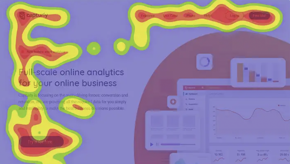
A heatmap is a visual chart used in digital marketing that shows how visitors interact with your website. Basic traffic analytics reveal the number of users who visit a specific page over time. These heat maps enhance this data by allowing you to readily view visitors’ flow across your website and determine where the majority of your conversions (or lack thereof) originate.
It can show you which portions visitors scroll past or skip over. Essentially, the purpose of this application is to offer data on which aspects of your business attract the most interest from potential and present clients.
Heatmaps get their name from the fact that they are color-coded. A page with a red or “hot” color implies that the region receives more interaction. The colors then shift to the “colder” end of the spectrum, with blue representing areas with less activity. Because you’re already familiar with the warm-to-cool color system, this style of the graph is effective because it’s intuitive.
It’s a graph in which each box represents a point on the X-axis, and the size of the box is inversely proportional to the time spent observing that point on the Y-axis. They’re employed in a variety of analytics, but they’re most commonly utilized to show user behavior and track clicks and conversions on a website.
The visibility of these data in the user interface improves a website’s usability by displaying who visited the page, when they visited it, and what they did while they were there. It’s simple to figure out which parts of your website your visitors visit the most.
Types of Heatmaps
Heatmaps come in a variety of shapes and sizes, and they’re a wonderful method for marketers to see how their website’s response changes over time, as well as to figure out how people perceive the site’s structure, user experience, and so on. A heat map is just another graphical depiction, and while they can be scary at first, if you learn how to analyze them, they aren’t difficult to understand.
There are even tools available to assist you in creating your own heatmap so that you can see which portions of your website want attention and which do not.
Link Map
In SEO circles, this is the most often utilized heatmap. It displays links to a page that has been clicked on, and the color of the heatmap changes while the mouse hovers over the link.
The ideal approach to using links in heatmaps is to use them to display various insights about the inbound links that a webpage may have. This can be used in conjunction with your scroll map tools to showcase the most popular links on your site or even your index page.
Other forms of heatmaps, such as scroll and click maps, can be integrated with link heatmaps. Link heat mapping is particularly useful for SEO consultants who wish to highlight a page’s natural connecting patterns and demonstrate the content relevancy of incoming links to help search engine algorithms identify a page’s relevance and what keywords are utilized in the anchor text of a link.
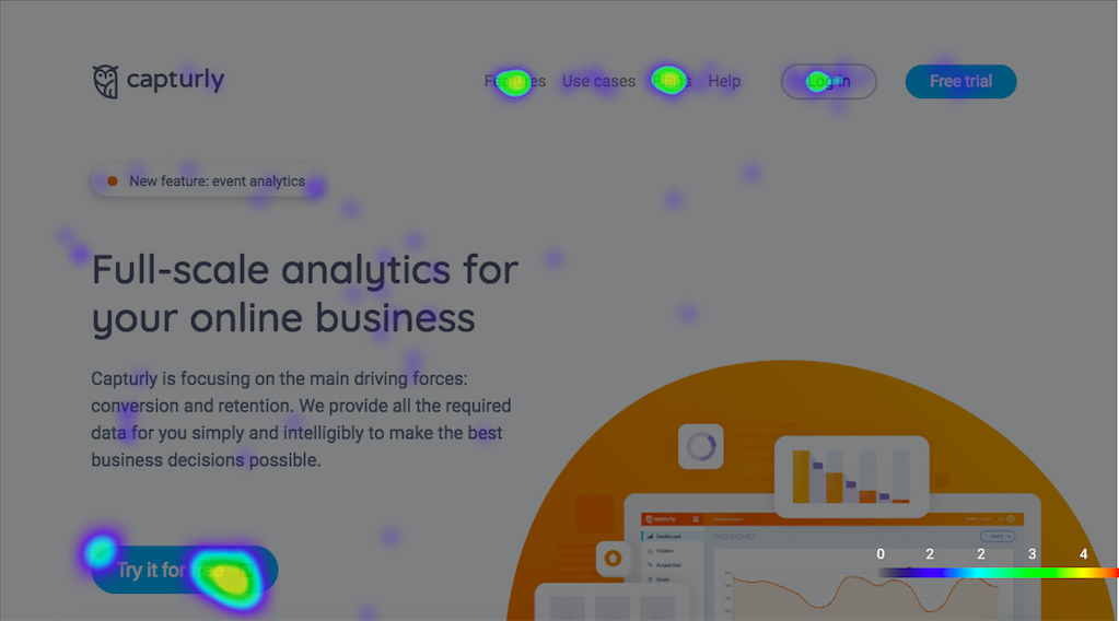
Click Maps
There’s the simple heat map, which displays the number of clicks to a specific element on your site as a percentage. You’ll want to use this heatmap to figure out what percentage of your audience clicks on specific links.
For example, your site’s landing page may have a high number of clicks per page. That page might have a lot of adverts on it, or it could link visitors to other parts of your site where they will spend more time. You may find out which areas of your site are attractive to visitors and make adjustments to your website as a result of tracking clicks. This is extremely beneficial for optimizing landing pages.
The “click by location” heatmap is also available. You’ll have a good notion of where your audience is clicking on each of your links if you use this type. Each click corresponds to a spot on the heatmap, allowing you to see exactly on which page your visitors are clicking on your links.
For websites that display text or other pictures, click maps are particularly popular. This tool can also be used to track user movement throughout your website. It enables you to see where your visitors first clicked on your website. You can utilize this information to improve the content that your visitors see and implement strategies to make your sites more engaging by studying where they have been clicking on your website.
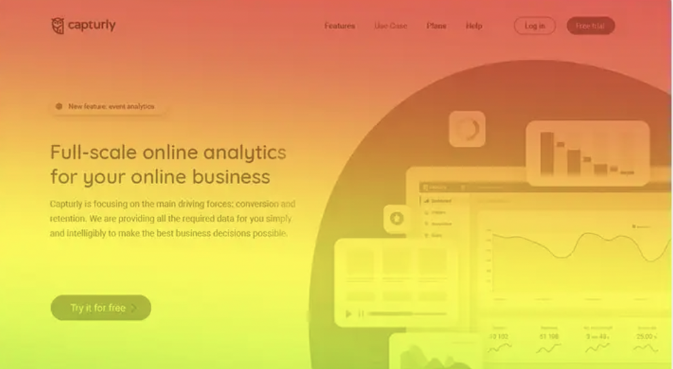
Scroll Maps
Different colors are used in scroll heatmaps to visually indicate how far down a web page your visitors have scrolled. When you hover your mouse over a specific scroll area on the heatmap, you’ll see how many people have really scrolled to that position. This makes it easy to see if there’s any important content hidden too far down the page, as well as whether or not your visitors are being enticed to scroll up or down.
If you’re utilizing a navigation bar or menu to showcase items or services to your consumers, for example, a heatmap placed above or below this information might be a nice option.
The importance of Data Visualization
Even for your e-commerce site, heat maps clearly display what people do while on your site, allowing you to adapt content, architecture, and content design to target these behaviors and enhance conversion rate. If most visitors to your sales page only look at the left navigation in a vertical direction, for example, you should make changes to the right navigation, such as adding navigational shortcuts or promotional banners, to make it more visible. Conversion rates will rise if you create an effective layout that addresses the most prevalent behavior.
Visitors are more likely to engage if they can locate what they’re seeking quickly and easily. This raises the possibility that they will visit the sales page and buy the product, increasing the likelihood of transactions and enhancing your search engine results.
When Google debuted Google Heat, a data visualization tool, it was an instant hit since it not only enabled users to see data graphically but also allowed them to analyze it to discover how changes observed impacted the website experience. This was useful information for firms in determining what adjustments to make and why. Heat maps can help you comprehend your visitors’ data and behavior on your business website in the same way.
Advantages of using heatmaps to improve your marketing
Heat maps are a data-driven tool for making decisions. Using a heat map for your website is a terrific approach to verify your site meets its business goals because it provides information promptly.
Here are just a few of the benefits that a heat map can provide to help you improve your website.
Webpage optimization
You can make informed decisions about where to put the most important material on your site by evaluating where visitors spend time and click.
Website visitors constantly looked to the top left corner of the page first, then over to the right, then down the page in my eye-tracking research. It follows the same process as when we read a book.
With this information, you can make decisions like putting a new product announcement in the top left corner of your homepage, where it will garner the most attention.
Before a website overhaul, a heat map is quite important. You can alter the page contents to boost interactions by using heat map data to find locations on your site that receive visitor involvement.
Conversion increase
Use a heat map whenever you want to boost the conversion rate of your website. A heat map can help you increase sales on your website or persuade visitors to enter an email address so that they can be added to your marketing funnel.
The data from the heat map displays whether visitors see a form to fill out or a “purchase now” button to click. This provides you with the knowledge necessary to reorganize homepage elements in order to maximize the possibility of taking the actions required to generate conversions.
Enhances testing
You should test your website as part of the optimization process. You have no idea if the adjustments you make will benefit or damage you. These tests can benefit from the use of a heat map.
A/B testing is a common testing strategy. You create two copies of the same homepage, one with your changes and the other without. When enough customers have visited both pages, compare the heat maps to see if the new page produced better results.

Heat graphs show you where visitors moved their attention if website updates resulted in a drop. This allows you to keep your testing going in the proper direction.
Communication improvement
A heat map can help you convey what’s going on to coworkers, managers, and other parties more effectively. With its vivid images, a heat map speaks out your points.
It might also assist you in gaining support for your strategic plan. Others will find it difficult to refute the data offered by a heat graph.
Look for parts of your website that are underutilized
People may easily pass-through sections of your site’s pages without reading them. This may be a photo, infographics, or some other piece of information that encourages people to buy from you. You can see whether portions of your page receive less interest than others using heatmaps.
Heatmaps, help you understand how people interact with a webpage. You’ll need to make some changes if the crucial parts of the website are skipped.
This type of research leads to a more attractive general page layout that converts more effectively than before. Even if the area that is disregarded is an advertisement for a different product instead of a direct conversion chance, you could be losing out on sales since that advertisement has not been viewed.
Examine how changes in design affect the behavior of your visitors
Traditional analytics will show you the number of visitors you draw, and you’ll be able to see whether there’s a difference if you change your design. You won’t be able to monitor how your visitors’ browsing habits have changed, however.
When comparing historical heatmaps to heatmaps for your new design, you can see how visitors responded to your changes. They may click or hover in different places, focus their attention on different page portions, and have a whole different experience when using your site.
While analytics figures are useful in general, clicking and hovering heatmaps will demonstrate if the modifications you’ve made have affected where users engage with the site. You can commit to maintaining the modifications or return to your prior design once you’ve assessed whether they’ve had a beneficial or negative effect.
It’s entirely feasible to attract more visitors while generating fewer purchases, or vice versa. What matters is that you can see the change that the modifications have made by using heatmaps.

Optimize the Layout of Your Web Page
Your substance could be on point in certain circumstances, but the method you portray it is off. You could not be providing the best user experience if you don’t use enough SEO components like header tags, photos, and white space.
Heatmaps can be used to test different versions of a webpage to find which one works best. Determine where friction points occur, such as CTA buttons or specific pictures, so you can solve them and enhance outcomes.
Conclusion
Any CRO (conversion rate optimization) plan relies on a heat map. For how powerful it is, it’s also an underappreciated tool.
Heat maps show you exactly what your visitors are doing on your site. You can quickly and simply determine whether or not your material is being read and whether or not visitors are clicking on your CTA rather than visuals and words.
You may also track the origins of your visitors, monitor your pageview-to-click conversion rates, and much more.
Instead of trying to figure out what’s going on based on data like bounce rate and time spent on a page, or tracking goal conversions in Google Analytics, heat maps allow you to see which elements are being clicked and which are being ignored.
We’ve seen how heat maps may be utilized to better understand conversion behavior and improve sales funnel efficiency. A basic heat map will help you see if visitors are clicking on your conversion items, and if they aren’t, what they are clicking on instead.
It’s virtually always something out of the ordinary.
Furthermore, it allows you to answer a question that no amount of bounce statistics can: why are people abandoning your site? It’s possible to come up with a better design and copy and achieve considerably higher conversions based on that understanding of reality, rather than imagined, user behavior.