E-commerce offers a competitive advantage to those who know how to engage customers and close the sale. The design of your product pages is like your storefront to the world. People will either get the information they need and make a purchase, or they’ll bounce away to a site that meets their needs.
Insider Intelligence through eMarketer reports a 13.7% growth in retail e-commerce sales in the United States for this year. There’s plenty of room for companies to excel in the digital retail marketplace in the foreseeable future.
You’ve likely noticed most product pages have a similar layout.
The reason is that it works to have an image of the item, bullet points, a price, and a call to action (CTA). However, there are many adjustments you can make that create a higher conversion rate for your site.
Why Is Design Important in E-commerce?
Your product page design is the first thing visitors see when they land on your website. This is an opportunity for a great first impression. Placing the right information in the ideal spot shows them they are where they need to be to find the product they’re looking for.
If anything in the process isn’t customer-friendly, they may grow frustrated and bounce away. Make prices and orders as straightforward as possible. Answer questions the user has before they ask them. The more detailed you are, the more likely you’ll gain a sale.
How to Improve Product Page Design
Once you get the basics on your product pages, what else can you do to ensure the customer experience (CX) is the absolute best it can be? There are a few steps you can take to make your website and conversion rates better.
1. Engage the Senses
When describing your product, think about what senses you can involve. Utilize sight, smell, taste, touch, and sound if possible. Your description should be accurate and factual but also have a creative edge.
If someone were in a brick-and-mortar store, they’d be able to pick the object up and engage with it. Anything you can do to repeat that experience virtually will improve the CX of your e-commerce site.
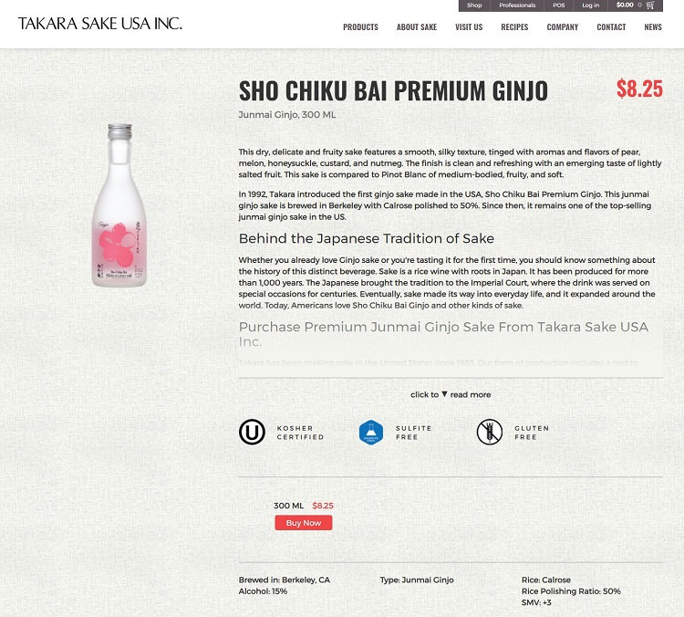
Takara Sake describes its product by talking about the tastes of the sake. It discusses the silky texture, the aroma of pears, and the taste of lightly salted fruit. The description is so lively that it renders the water from the reader’s mouth in anticipation.
2. Try A/B Testing
If you want to convert as many website visitors into customers as you can. It’s a good idea to perform split tests to verify their response to your product pages. Utilize software that directs 50% of visitors to page A and the rest to page B. Make one change at a time so you can measure the response.
Survey your customers and ask why they chose to buy from you. Is there anything in this process that you can do better? Your buyers are representative of your target audience. Listen to their feedback to enhance your product pages and complete more sales.
3. Contact Information
Keep in mind people landing on your page may have never heard of your brand before. They have no reason to trust you’ll sell them a quality product or stand behind it if there is a flaw. You must work to gain their trust.
Put your toll-free number in a location easy to spot and access, such as the top of the page. Make sure it is set up to work with mobile devices, so people can just click on the number and call you instantly.
You should also include a physical address so they know where to write to you. In addition, you may want to offer an email address or contact form.
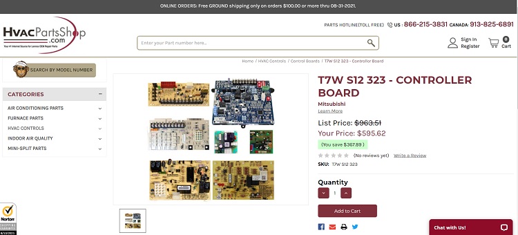
HVAC Parts Shop places a toll-free number on its website. It serves customers in the United States and Canada, so it includes contact info for both countries. By placing the number at the top of the page, users see they are there and ready to help if needed. It adds another level of comfort to ordering something they may not typically buy online.
4. Choose the Right Plugin
If you run your site on a platform such as WordPress, choose an open-source plugin or one regularly maintained. The more people who use the software, the more likely it will meet all your needs as a digital store owner.
WooCommerce makes up about 92% of the shopping plugin market share. You will find add-ons to suit your needs, as well as plenty of tutorials. Your design should tap into the layouts the plugin you choose already has loaded.
5. Offer Reviews
Another trust factor for your site visitors is what others say about your products and services. Allow online reviews on your site. If someone ordered an item, encourage them to share their thoughts and rate the product.
Don’t be afraid of negative reviews. See them as a way to improve the quality of your products or services. Do answer any complaints, so others can see you take customer service seriously and actively work to improve.
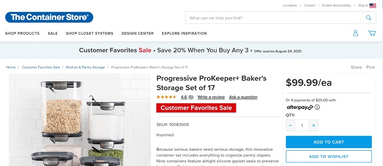
The Container Store adds a star rating and links to reviews under each product it sells. You can see how popular an item is by how many reviews it has or click on the link to get more detailed information about the rating.
6. Name Your Product
Make sure you use a strong product naming system and place it in an H1 heading so search engines can sort it appropriately. When someone searches for “red leggings for ballet,” you want your product page indexed for that item.
Think about the exact search terms someone might do to locate the product. What is their intent, and how can you express that in your headings? Search engines have to rely on your website signals to determine if your page provides what someone is searching for. Do everything in your power to help them drive traffic to the right places.
7. Offer Insider Discounts
If you want to drive people to proceed with a purchase, give them some incentive. You can create an option for members where they save a percentage on each order or start a clock where they can get free shipment for the next 24 hours. Think about what perks might entice them to buy.
If you sell higher ticket items, people may need more time to think through whether they want to buy from you. In those instances, offer a perk if they sign up for your mailing list. You want to reach them even after they leave your site and point out the advantages of ordering from you.
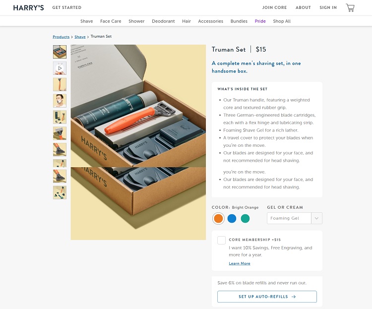
Harry’s adds a note to its product page stating you can get 10% off by signing up for a one-year membership. You also get some perks, such as an engraved box. Since much of its target audience is people looking for gifts, this is a nice incentive to get them to spend more than they might otherwise.
It also includes a note you can set up auto shipping and save 6% off on blade refills. Both offers get to the heart of the convenience of their service.
8. Place Image in Upper Left
Your product image should be near the top of your page. People want to know what the item looks like. You can present it as a slider with pictures from various angles and provide a 360-degree view video.
Think about each thing the user might want to know when deciding to buy your product. They can’t see it in person, so they may want to get an idea of how it compares in size to a human. They also want to know how easy it is to lift, and what it looks like from the side, top and bottom.
You should showcase it in different colors if there is more than one. If various sizes are offered and it makes sense, show the difference side by side. This may not work as well for clothing, but it’s a perfect option for things such as pots and pans and home decor.
9. Tweak Your CTA
Your call-to-action button can make or break conversion rates on your product pages. You must consider placement, color, language, and size.
Ideally, your CTA will be above the fold, so people can quickly add the product to a shopping cart if they’re interested. The color should contrast with the rest of the page and grab user attention. The first thing the person’s eye gets drawn to should be the CTA.
You can also experiment with sizing and language. Make the button a bit larger to see if it grabs more attention, and move it to different areas of the page. Play around with the language, using first and second person and other verbs.
Make sure you conduct multivariate analysis to see what changes work best with your particular audience.
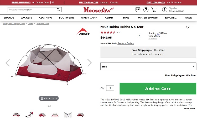
Moosejaw uses a large green CTA button with the words “Add to Cart” to convert people from browsers into buyers. It contrasts with the white behind it. Note how it’s a bit larger than some CTAs, indicating this one is of importance. The language is concise.
Moosejaw uses a large green CTA button with the words “Add to Cart” to convert people from browsers into buyers. It contrasts with the white behind it. Note how it’s a bit larger than some CTAs, indicating this one is of importance. The language is concise.
10. Know Your UVP
What is your unique value proposition (UVP)? Your UVP makes you stand out from competitors. Ideally, it will get to the core of why you do what you do and how it benefits your customers.
Spend time studying your competitors’ websites and figure out what they claim their UVP is. Yours should be something different, but you want to also match them in other areas, such as shipping speed and customer service.
There should be one unique benefit to doing business with you that no one else offers or doesn’t do as well. Once you figure out what your UVP is, share it on each product page.
11. Add More White Space
If you want a visually pleasing website, you must limit how much you put on each page. A minimalistic approach is challenging for product pages because you also want to share enough detail to sell to the lead.
Think about the balance on your page among text, images, and negative space. You must give the eyes a break from time to time, or the user might feel overwhelmed and leave your site.
Keep only the most vital information and lose anything else. Stand back from your computer and make sure things fall into place and don’t run on top of each other. Check the look on mobile, too, to see how your site appears on a small screen.
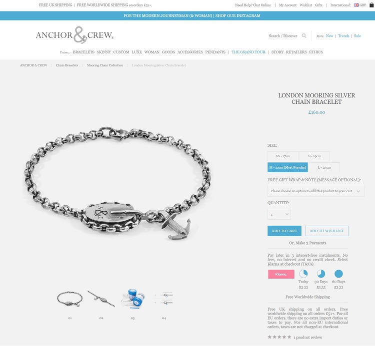
Anchor & Crew leaves plenty of negative space around the image and different sections on the product page. Note how the eye drifts naturally to the photo of the bracelet. Other things are highlighted, such as the size, call to action and payment options.
12. Secure Data
When people land on your product page, one of the first things many will check before sharing sensitive data is whether the site is secure. You should use a secure socket layer (SSL) with the lock image in the address bar to show things are safe.
No need to wait more and buy SSL certificate today to secure your website. You will find different types and providers in the market that can fit with the website’s requirements.
You might also want to explain how you protect your customers, even with a simple link to your privacy and protection policies.
Revamp Forever
Refining the above items will lead to better conversion rates, but you must constantly strive to improve the design of your product page. Listen to your customers about what they like and don’t like. Each audience is a bit unique, so what works for one store might not work for another.
Share the details of your products but make sure the personality of your brand still shines through. Write an expansive description and share more photos than you think you need. You can’t go wrong with additional information as long as it pertains to the product at hand.
3 Comments
Nancy
2021-12-29 at 22:43I feel this is the need of the hour, moving forward, applying changes should be the top priority of ecommerce businesses, I feel its about the presentation as well, as I have did with logo company, it helped me a lot and company did made fortune, people nowadays miss the fact that presentation attracts.
Buck Branch
2022-04-05 at 13:08A very informative article as I have started a business by myself such articles really help us in understanding the ecommerce business.
Expedia API
2023-02-16 at 08:30Thank you for sharing a good piece of blog. I read your blogs and managed blogs by myself.