We’ve got some exciting news for you! Capturly is releasing a brand new feature that we think you’re going to love. Introducing our rage click detector tool, available now in session recordings!
Have you ever had to sift through endless support tickets to try and identify why users are getting frustrated with your website? Have you struggled to pinpoint the exact moment when a user’s frustration boils over and they start clicking furiously on a button or link? If so, you’re not alone. Rage clicks are a common issue for website owners, and they can be incredibly frustrating to deal with.
But don’t worry – with Capturly’s new rage click detector tool, you’ll be able to identify and address rage clicks quickly and easily. Here’s everything you need to know about this powerful new feature.
Table of Contents
What do we mean by website usability testing?
Since rage clicks serve only one purpose, and that is to improve usability and user experience, let’s go over what we mean by website usability testing, since that is essential to what rage click detectors are for.
Website usability testing is a way to see how easy and intuitive it is for visitors to use your website. It’s kind of like having a focus group, but instead of asking people what they think of your website, you watch them use it and see where they get stuck or confused. The idea is to get feedback on things like how easy it is to find information, how quickly people can complete tasks, and whether they understand what different buttons or links do.
By doing this, you can identify areas where your website might be causing frustration or confusion for users, and make improvements to make it more user-friendly. There are different ways to do website usability testing, for example, you can do it remotely using tools like heatmaps, session replays, or
Website usability testing is a really important step in making sure your website is easy and enjoyable to use for your visitors. It can help you identify and fix issues that you might not have even been aware of otherwise!
What are rage clicks, and why do they matter?
As I mentioned in the introduction, this article will be about a new feature in Capturly’s offer, which is just to be placed inside the session replay tool, namely rage clicks.
First things first – let’s talk about what rage clicks actually are. Put simply, a rage click is when a user clicks on the same element (e.g. button, link, form field) at least multiple times within a short timeframe. In Capturly, at least 5 clicks in 1 sec is a rage click within a 50-50 px area.
But what can be the reason behind a rage click? This usually happens when a user is getting frustrated with your website. Perhaps the page is taking too long to load, or they can’t find the information they’re looking for.
But rage clicks aren’t just a sign of user frustration – they can also be incredibly damaging to your website’s performance. When a user rage clicks, it often indicates a problem with your website’s usability or functionality. This can lead to higher bounce rates, lower conversion rates, and a generally poor user experience.
Aaaand… we all know where this is going! It will lead to losing your customers and the money will leak from your conversion funnel.
However, by identifying and addressing rage clicks, you can improve your website’s usability and create a better experience for your users. Not only will this help you retain users and improve your website’s metrics, but it will also help you build a better reputation for your brand.
But let’s check the most common problems that can cause user frustration!
What kind of problems can be signs of a rage click?
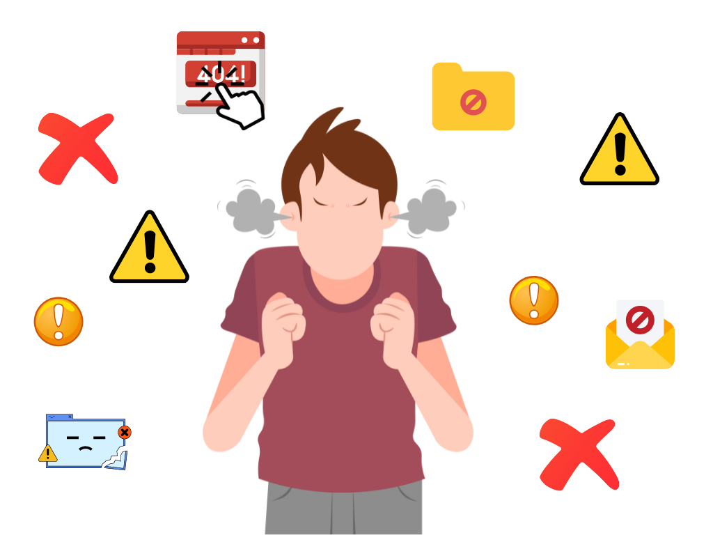
Rage clicks are typically a symptom of a poor user experience or technical issues on a website or application.
Users may become frustrated and angry when they encounter technical issues such as broken links, error messages, or slow loading times. These frustrating factors can often contribute to rage clicking behavior. By addressing these problems and improving the user experience, developers can reduce the incidence of rage clicks and other negative behaviors on your websites or applications.
Slow loading times
Users can become frustrated if a website or application takes too long to load, especially if they are trying to complete a task quickly. You would also become frustrated in a situation like that, aren’t you?
How much does the loading time really matter?
A North American fashion retailer Nordstrom saw online sales fall 11% when its website response time slowed by just half a second. There couldn’t be a better indication of how much of a difference a second precise makes when loading a page.
Confusing or unclear user interface
If a website or application has a confusing or unclear interface, users may have difficulty finding the information they need or completing a task, which can lead to frustration. Confusing navigation can include things like unclear labels, poorly organized menus, broken links, or a lack of search functionality. All of these issues can make it hard for users to navigate a website, leading to a negative user experience and potentially causing users to leave the site.
Important to note!
Confusing navigation and a lack of clear calls-to-action (CTAs) can also have an impact on a website’s bounce rate, which refers to the percentage of users who leave the site after viewing only one page. If users can’t quickly find what they’re looking for or aren’t sure what action to take next, they may leave the site and seek out a competitor.
Technical issues
Broken links, error messages, 404 error pages, or other glitches can cause users to become frustrated and angry, especially if they are trying to complete an important task. Technical issues can also disrupt the user’s flow and cause them to lose their place on the website. These problems make it more difficult to achieve their goals and lead to further frustration. They can be caused by JavaScript errors, so watch out for them with a JavaScript error tracking tool.
Limited functionality
If a website or application does not have the necessary features or functionality to complete a task, users may become frustrated and click repeatedly on elements that are not working for them properly. For instance, if a user is trying to make a purchase on an e-commerce website but cannot find the checkout button, they may click repeatedly and rapidly on different parts of the screen in frustration, resulting in a rage click.
Lack of feedback
When users interact with a website or application, they expect some sort of response or feedback to confirm that their action has been registered. Users may become frustrated if they do not receive this confirmation that their action has been successful. It can also cause them to repeatedly click on an element in an attempt to get a response.
Good to know!
Lack of feedback can not only lead to rage clicking, but can also cause users to mistrust the website. Users may feel like their actions are not being registered or that the site is not functioning properly, which can lead to frustration and a lack of confidence in the site’s overall effectiveness.
Unmet expectations
If users have specific expectations for a website or application and those expectations are not met, they may become frustrated and exhibit rage clicking behavior. For example, if a user expects a website’s search function to return relevant results quickly, but instead experiences slow load times and irrelevant results, they may become frustrated and exhibit rage clicking behavior by repeatedly clicking on the search button or links without success.
How does Capturly’s rage click detector tool work?
Capturly’s rage click detector tool is incredibly easy to use. When you view a session recording in our tool, any instances of rage clicks will be highlighted in the playback timeline with an “angry emoji”.

You can click on the rage click event to see more details, such as the element that was clicked and the time and date of the event.
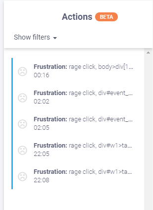
By analyzing these rage click events, you can gain insights into how users interact with your website. It is also useful for and identification of areas that may need improvement. For example, you may notice that users are repeatedly clicking on a button that doesn’t work, or that they’re struggling to find a particular piece of information.
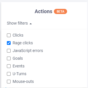
Moreover, you can also use a filtering feature which, among many other filtering options, like JavaScript errors, U-Turns, and Mouse-outs allows you to choose events where a rage click has occurred. You can also track not just actions that are most probably occurring because of a bug but you can track your goals and events as well.
Have you heard about it?
With Capturly you can detect not only rage clicks but also other typical errors that may occur on your site. These errors, like rage clicks, also have their own sign and can be used for various bug fixing. Let’s see what are these!
- JavaScript error: invalid or unexpected syntax, logical errors, or other issues that prevent the code from running correctly.
- U-Turn: action taken by a visitor who navigates back to a previous page or steps in the user flow, rather than continuing forward.
- Mouse-out: occurs when the mouse pointer is moved away from the webpage.
What other usage does the new rage click detector have?
The benefits of Capturly’s rage click detector tool go beyond just identifying rage clicks. You can also use this tool to:
- Identify areas of your website that may be causing frustration for users
- Test and optimize changes to your website’s design and functionality
- Track the effectiveness of your user experience improvements over time
With these insights, you can make data-driven decisions about how to improve your website’s usability and create a better experience for your users.
But before all that, first and foremost you need to be able to establish exactly where and when the rage click happened.
How can I reduce rage clicks on my website?
Reducing rage clicks on your website is all about improving your website’s usability. Here are a few tips to get you started:
- Improve page load times to reduce wait times and increase responsiveness
- Make sure your website is easy to navigate and information is easy to find
- Ensure your buttons and links are easy to click on and have a clear call-to-action
- Implement user feedback mechanisms, such as surveys or contact forms, to gather feedback directly from users
By taking these steps, you can create a better user experience and reduce the likelihood of rage clicks occurring. But in case you encounter rage clicks on your site, try to define as soon as possible what might be causing the users’ frustration. Then in the next step try to remedy it to ensure that you provide the best user experience possible to your visitors!
Final thoughts
Rage clicks can be incredibly frustrating for both users and website owners. But with Capturly’s new rage click detector tool, you can quickly and easily identify instances of rage clicking, and use these insights to improve your website’s usability and user experience.
By analyzing rage clicks, you can gain insights into how users interact with your website, and identify areas that may need improvement. With this information, you can make data-driven decisions about how to optimize your website’s design and functionality and create a better experience for your users.
Reducing rage clicks on your website is all about improving your website’s usability. By improving page load times, ensuring easy navigation, and implementing clear call-to-actions, you can create a better user experience and reduce the likelihood of frustration and rage clicks.
We hope this article has given you a better understanding of what rage clicks are, why they matter, and how Capturly’s new rage click detector tool can help you improve your website’s user experience. If you have any questions or feedback about this tool, don’t hesitate to get in touch with our team! Don’t forget, we’re always here to help!
Don't forget, sharing is caring! :)

