Designing a website that attracts new customers is not easy. Of course, you need to have great content and also having a good inventory on your site is a must. But one of the most important things to a successful and attractive website is the page design. This is, arguably, the most challenging thing to do. Many people have been trying to strike the balance between these three aspects, but not many have got it completely right.
Many big and small businesses have done product page design very well, and they have been rewarded richly for it. Some companies try to be a bit more direct in the sense that they display their items directly to the customers, while others try to create a unique and authentic experience with a design that is seen nowhere else.

For this reason, we have scouted and found some of the best product page design layouts that have been used by big and small companies and have been very successful, and ones that you can incorporate in your business right now, even if you are a small business. We will take a look at some of the best layouts and analyze just why they have been so successful.
What makes a good product layout?
In addition to a good graphical design and a good layout of things, there are some other considerations that you need to keep in mind in order to impress customers. For starts, you need to keep in mind the positioning of elements on your product page. Firstly, you need to identify what you want to stick out on the product page; whether it is the image, the features of the product or both. Then you need to design the page accordingly.
When it comes to customers, they (we) are either attracted or turned off in a matter of seconds. This is why first impressions are so important for these types of pages.
You need to pay close attention to your product page and what you put above the fold and the information that you put under the fold.
The information and data above the fold should attract the user, as this is where most decisions are made (then you keep loosing visitor’s attention). Things like product images, price, customer ratings, variations of the product and the add-to-cart button should be. These elements are essential on any product page and should be above the fold. Under the fold should be additional information – quality, informative stuff like customer reviews, description and maybe a demonstration video.
 Another thing to consider is to keep your layout unique. By providing a great user experience in e-commerce, customers will easily associate with your site and recognize you and your business much easier just by looking at the page design. This will not only make you unique but also you will create a lasting impression on the customer and they will want to come back for that experience.
Some of the best product layouts
Now, we will take a look at some of the layouts that have been used and have worked wonders for bigger companies but can also be used by a smaller business right now. Not all of them have complex programming formulas behind them and you do not need to spend an awful lot of money on them. Instead, you can use these layouts as inspirations for your future layouts.
Volkswagen
The Volkswagen product page design is a really interactive one and very unique because it lets customers customize their own car and the features of it. You might think: “what could be so interesting about a car website and the products?”, right. But this one actually nails the user interaction very well.
It lets you customize your own perfect car – it all starts with choosing the engine, the version of the car, the color and styling (you can even choose your seats and the choice between different colors) and all the features of the car. Here you will have a variety of choices that will make you interested in the car and might make you actually buy it.
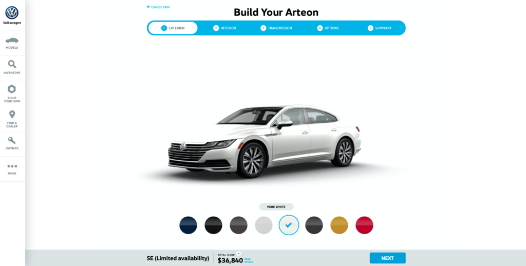
It is quite a unique attempt to attract customers in car and Volkswagen was probably the first company to do so – others have followed suit since. Not only is it immersive, but it lets the users choose what they want to choose.
Bellroy
Bellroy offers another interactive layout for customers to play with. The product page of the Bellroy wallets display all of the important features and actually focus on the main selling point of Bellroy wallets – they are thinner compared to other wallets out there, and they demonstrate this by giving you an interactive graphic where you will be able to see how the wallet would look like with cards in it.
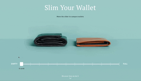
Not only that but below the fold, there is much more information that describes the product in more detail. This is the closest thing to seeing the product live in online shopping that you will ever see. When you open a specific page of the product, you also get all the essential information on one page.
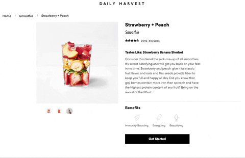
Daily Harvest
Daily Harvest is a company that focuses on delivering quality food products right to your doorstep. They make smoothies, soups and other healthy products that taste great. What impressed with this layout is the product description, which is very convincing and reading the description alone makes you want to try one of these smoothies.
When you open a product page, you will be able to see the description, and also all the ingredients that were used to make the product. These ingredients will also be described in an interesting manner, that will attract your interest. Also, the landing page is very well designed too – very simple with a call-to-action button very clearly visible.
All-birds
The product page layout of this company has absolutely all the essential ingredients that are required for a good product page. As we have identified above, it is very important to display quality information above the fold. We can see all of these ingredients on this product page – price, sizes, colors, a brief description of the product and a call-to-action button (select a size).
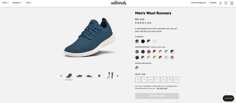
Below the fold, we find some very informative and rich information; from material description to benefits of the materials and the products and positive customer reviews. Overall, this product page offers absolutely everything that is needed on a product page for a successful marketing campaign.
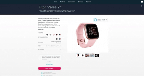
Fitbit
Fitbit is a company that sells smartwatches for health and fitness. Instead of product description on the product page above the fold, we get a very convincing and brief description of the product and its features. We also get a good quality image and also we can choose the colors of the product, the size and choose the edition.
If we scroll further down, we will see absolutely everything we need to know about the product. We will learn about the features and see the descriptions of them, we will be able to see pictures of the product, clear and concise information about the sizes and also a very comprehensive check of specs. We get everything we need from a single page that is organized very well.
Orangina
Orangina is a company that produces citrus beverages and has a lot of tradition. But the product page is something very unique. When we enter the home page of the products, we are able to see all the products they offer. If we hover over the products with our mouse, the products will produce an effect and will shake around like they are dancing. Very interesting and also manages to get attention. The colors are also very bright, which actually fits in well with the product.
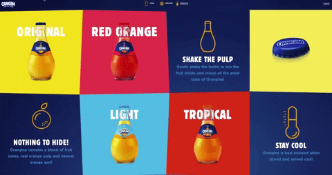
If we click on a certain product, we then get a full description of it. It is brief but contains all the information that we need – a photo, the contents of the beverage and taste description. We also get an option to see the full nutrition info about the beverage. All in all, a very attractive and unique design.
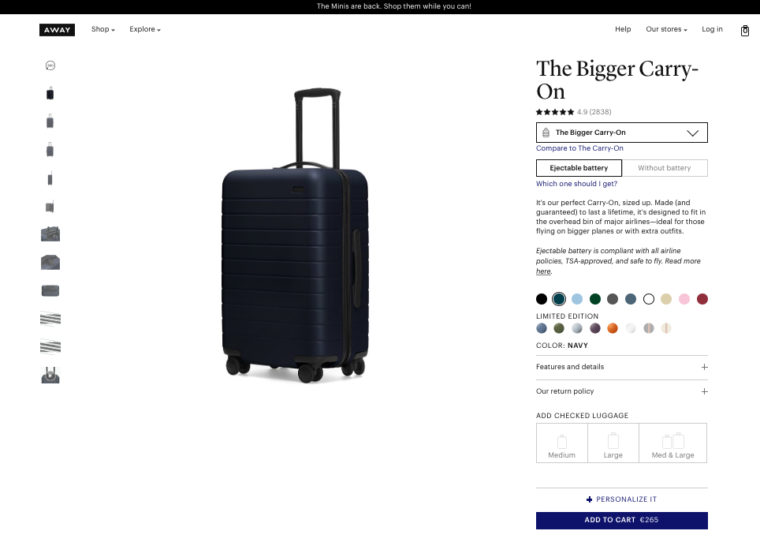
Away
What do we think about when we are buying suitcases? We think about the size of the suitcase and the uses of the suitcase and how it will fit our needs. Well with Away product page layout, you get all this information. On the right-hand side of the page, you get product reviews, which are very important, but also the description of the product and some personalization options for it. A very clear product page that explains exactly what the product is meant for.
Conclusion
The importance of having a good product page is big. It plays a role in promoting your product and making it more attractive to the customers. In this post, we have looked at some of the best product page layouts that have been used by large companies. You can incorporate some of these layouts into your business, and hopefully, you will see improvement in sales in no time.
6 Comments
Sam
2019-12-18 at 16:33Thanks for sharing!
Awesome article!
Read some tips about creating product page.
Harris
2020-06-29 at 09:03Nuce article! thnx!
Harris
2020-06-29 at 09:04That’s true! nice article
Bartonix
2021-05-03 at 23:46Very nice . Good job
word unscrambler
2022-08-29 at 06:47Nice article! thank!
gorilla tag
2023-11-08 at 09:57Amazing post.