Are you thinking about redesigning your website? You should take into consideration that once your page loads, people form an opinion in .05 seconds. There is no place for unnecessary elements and bugs there. However, there are some things to keep in mind when redesigning a website.
This article will explain what a website redesign is and what the advantages and disadvantages can be. We also describe the bugs that may occur during a redesigning process and how to optimize your website in that case. Of course, we go through how to use heatmap and session replay.
Do you want to know more about redesigning an e-commerce site and fixing bugs on your in general? Keep on reading.
Table of Contents
What is Website Redesign?
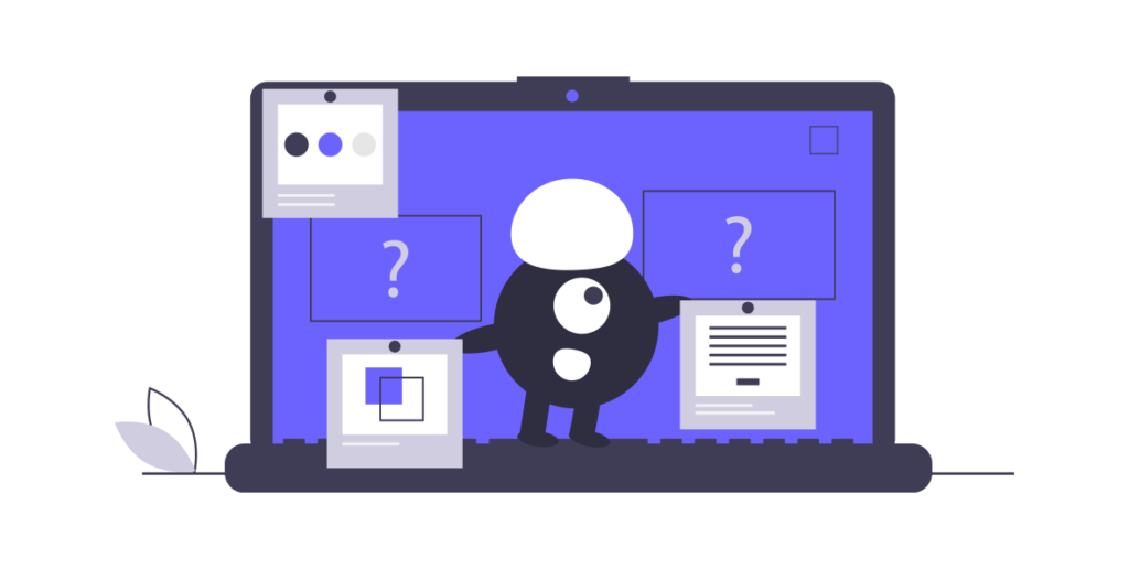
A website redesign is a comprehensive process that involves upgrading content, rejuvenating layouts, and optimizing navigation to increase conversions and improve site performance.
So can all the changes I make be considered a redesign? – You might ask. Well, the answer is no. There is a tremendous difference between updating and redesigning a website.
A redesign frequently entails considerable changes to a website’s coding and aesthetic presentation at the same time. On the contrary, a refresh occurs when the basic structure and functions of the website are substantially unchanged and only small modifications are made, like only changing colors or fonts.
Why Website Redesign is Necessary?
When you finally manage, through a lot of hard work, energy, and money, to get the design, contents, phrasing, colors, and visualizations that your target audience likes, it is hard to give it up and change it for something new and untried. A well-developed website can look really perfect for a while, bringing in visitors, generating leads, and increasing sales, and therefore conversion rates. However, we all know that there is no such thing as “perfect”, even in the online world.
Change, improvement, and development are necessary to keep a business alive.
Any business may benefit from having a responsive web design that is fresh and user-friendly. If you experience any of these, now is the time to start your website redesign:
- It appears to be out of date and old-fashioned.
- Does not accurately represent your corporate brand.
- On mobile devices, it looks unappealing, and your website is not responsive.
- It takes an excessive amount of time for pages to load.
- It is difficult to find what you are looking for, the navigation is not smooth.
- Has irrelevant and out-of-date content, among other things.
Web analytics is another less visible and more technical approach to validate your worries about whether or not it is time to redesign your website. Take a look at the following quantitative measurements:
- Low return visits
- High bounce rate
- Low average time spent on pages
- Technical performance data metrics, etc.
A redesign can have many benefits, but there can also be some drawbacks, but with a little care you can avoid all the negative effects and reap the benefits. Let’s see what these are.
Website Redesign Pros and Cons
Many services, corporations, enterprises, and website owners have discovered that website redesigning is a smart step that may help them grow their company. However, in addition to the many advantages, this can also have disadvantages. To avoid major negative effects, we have therefore compiled a list of the most important advantages and disadvantages that can occur as a result of a website redesign.
Website Redesign Pros
Smooth Navigation
When a website is redesigned well, navigation becomes smoother, and users can access all content more quickly. A website’s links and menus can be properly organized, making it more user-friendly by providing a better user experience.
Modern Appearance
With the continuous development and website redesign, you can ensure that your website is up to date with current trends, while retaining its own identity. When redesigning a website, pages are rebuilt, themes are updated and new designs and visuals are added. This makes it more enticing to visitors and will most likely result in increased consumer traffic. The message, visuals, colors, typography, and backgrounds are frequently changed during a redesign, which keeps the website fresh in the public view.
Increase in Search Engine Visibility and Rankings
The redesign not only develops the creative appearance of your website but also helps to improve its search engine visibility. The introduction of additional SEO tags, keywords, alt text, proper URLs to appropriate pages contributes to the scaling up of ranks even more.
Enhanced compatibility
Whereas most websites nowadays are compatible with the majority of platforms, devices, and browsers, redesigning frequently aids in the integration of the most up-to-date tools and technology.
Improvement of Site Speed
Redesigning websites typically reduces clutter and speeds up loading times. Site speed may be thought of as a sliding scale, with the quicker sites gaining the greatest benefits and every second count. For example, sites that load in less than two seconds have a 9 percent bounce rate, whereas pages that load in five seconds have a 38 percent bounce rate.
Keeping up with the competition
The e-commerce market is improving continuously and the competition is bigger than ever. If your website is more than a year old, it will be unable to compete in the current market with other professionally sophisticated and technology-based websites. Website redesigning will therefore enable you to update your website at any moment and to make it innovative by current market demands.
Website Redesign Cons
Loss of Loyalty
Habitual visitors, leads, and customers are often reluctant to change, even if these improvements are otherwise beneficial for both the website and the visitors. Some returning users may experience temporary frustration when using the website if it has undergone significant changes.
However, if the development and redesign have been efficient and of high quality, these negative feelings and fear of novelty will soon disappear, as the visitor can focus on the long-term benefits. It is, therefore, worthwhile to include some user experience improvements in these redesign developments.
Complicated Process
A generous redesign process is usually much more complex than creating a website from scratch. Moving on from what already exists makes it more challenging to change the entire design. Therefore, it is worth being prepared for the fact that the planned redesign will take more money, time, and effort than you originally thought. However, remember that it is necessary and essential to evolve and grow.
Negative Impact on SEO
Search engines like google generally appreciate it when we update our content. However, during a major redesign, you may make changes that negatively impact SEO and destroy your hard-won results. It is therefore worth avoiding the following fatal mistakes:
- Leaving the development environment crawlable.
- Changing image names at random on high-ranking pages.
- Delete pages or change their URLs without being redirected.
- After migrating to and from the development environment, not executing a full crawl.
- Failure to do a thorough function check on everything.
- After migrating to the live server, failing to reconfigure WordPress and plugins.
Bugs
Last but not least, a negative effect can be the occurrence of various bugs, which are mostly due to less sophisticated, elaborate details and shortcomings. The bugs that may occur during the redesign are described below.
5 Most Common Redesign Website Bugs

In a complete website redesign, there may be errors and bugs that occur due to a tight schedule, lack of resources, or other unexpected situations and coincidences. There are many ways to group these emerging bugs, these are design, functionality, spelling, compatibility, localization, performance, usability, security. We will show you the most common ones that, with a little care and foresight, you can prevent during your next redesign.
Clickability
As a visitor to a website, one of the most annoying things is when the website designer has completely different ideas about which elements should be clickable and which should not. An ambiguous design can completely destroy the user experience.
It is of paramount importance to reduce click uncertainty because today visitors want answers and results as soon as possible. There is a very limited chance that they will search for a clickable interface on your website if your CTAs are not clear.
Want to know how to make sure all the items you need are clickable? Stay tuned for the rest of this article.
Responsiveness
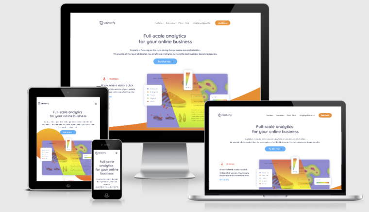
In redesign processes, there can often be problems with responsiveness if there are gaps in the planned web design or if it is not tested extensively enough. Responsive design is a web design that flexibly adapts to the screen size of different browsers in order to provide the user with an optimal experience on any browsing device, whether desktop, laptop, mobile, or tablet.
The responsive design provides the most comfortable and complete user experience for visitors browsing your website on any device. In this competitive online world, a bad UX can be deadly for your brand. That is why you should pay particular attention to responsiveness and an excellent user experience.
Compatibility
By compatibility we mean the browsers, it may be very similar to the previous responsiveness question, but it is still worth mentioning in a separate section. Why? While the issue of responsiveness is usually related to readability, appearance, and user experience, the issue of compatibility with a browser can even be at the code level.
Each browser is different and contains varying features that render your code in different ways. That is why, before you redesign your website, it is worth looking at what your target audience (visitors, leads, returning customers) are coming to your website from which browser and from which device. Only then should you consider and decide on the optimization you need to make. Do you want to know how to do that? Just keep on reading.
Loading
Nowadays, high-quality, eye-catching visualizations are hugely popular.
Videos on the main page, large images on the product pages. Visitors love it, loading speed less so.
The majority of ecommerce listing sites attempt to display multiple products on the screen at the same time. As a result, product photographs are typically quite small (which is why they’re known as thumbnail images). Nonetheless, the image plays an important role in assisting the user in making a decision about which product to choose. It often tells you a lot more than any words could.
Pictures are always loved, so it is definitely worth using them. But how do we do this without slowing down the loading speed?
WebP is the most efficient of all the web picture formats. When compared to JPEG, the file size is often 25-50 percent less while maintaining the same quality. It also supports alpha and transparency, making it a fantastic alternative to PNG for speedier picture loading. You should also compress your JavaScript and CSS files as a way to squeeze out any additional space.
Malfunctioning

In addition to the bugs described earlier, there are a number of other minor or major bugs that may occur during the redesign. You may see a 404 error if there is a problem with the website or if a page has been relocated or deleted. To avoid this, strive to automatically redirect visitors away from deleted pages.
When restructuring, updating, or completely redesigning a website, developers often use so-called no-index code to make the website in a semi-finished state invisible to search engines. The advantage of this is that hard-to-build SEO results are not negatively impacted by the ongoing changes. However, in some cases, once the redesign is complete, this tiny bit of code remains in the system and the page continues to be invisible to search engines. Unfortunately, the error is often discovered too late, so it is worth paying special attention to this.
In addition, functional errors such as malfunctioning links, buttons, and/or forms may occur. Preventing the problem or looking for a solution? Check out these solutions below.
How to Fix Bugs on Your Website
Fortunately, there are a number of excellent options if your website is experiencing these problems, or if you just suspect that bugs in the redesign process are behind the anomalous behavior, web analytics tools are your savior.
Website Heatmaps
Traditional web analytics tools use quantitative metrics to show the source of the traffic to a website, how long users spend on a particular interface, when they move on, etc. But one question remains unanswered: why? Why does a user decide to leave an otherwise full shopping cart before paying? These are the kinds of questions that qualitative, or qualitative analytical tools can answer.
Heatmaps are used to provide the website operator or owner with an aggregated picture of user behavior in a visualized way. The graphical representation of the data is based on a color-coding system that allows the representation of different values and their weights. The warm and cold color spectra express the areas perceived by users as valuable (warm) and less valuable (cold).
Now that the basic concept is clear, let’s look at what information each type of heatmap provides.
Click Heatmap
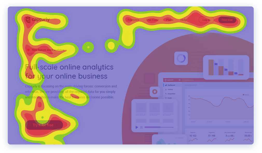
As the name of the tool suggests, click heatmap provides information about the exact location of clicks on a website, showing which areas of the site attract the most clicks and were on the site visitors expect to find clickable items.
By using it, you can find out what motivates your visitors and understand the process of what we might call the purchase decision.
Efficient and clear navigation is a cornerstone of websites. Navigation menus play a particularly important role in webshops. Does your navigation menu bar contain the right elements? You can optimize your website by looking at the click heatmap to see which menu bar elements are clicked on more frequently.
For example, if a button that is important for conversion is not attracting attention in the right way, test different options. Relocate the button or simply rename it to another term. Either way, seeing your site through your users’ eyes is essential to making these kinds of decisions. You may find that the button that gets the most clicks, according to the heatmap, is the one that is less relevant because it does not have a key role in conversions. In this case, a solution could be to move the menu item to an area that triggers fewer interactions.
Scroll Heatmap
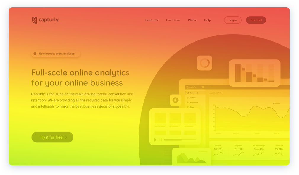
If you’re interested in how long your website visitors scroll down, this tool is for you! You can find out which sections are the most likely to leave your site without a visitor taking action of value to you. This will help you decide where to place your most valuable Call-to-Action buttons.
For example, a common problem is that users do not read through the content of your blog, which the scrolling heatmap provides useful information about. Place visual images in critical areas, such as human faces, to attract and retain attention.
The scroll heatmap shows which parts of the published content grab attention and which parts are rejected.
If you know the unwritten rules about content placement and compare this with your audience’s interactions, you can optimize the display of text accordingly. User testing has shown that optimally, website visitors scan the content they find by following a so-called F- and Z-pattern.
Statistics from the Nielsen Norman Group show that individual visitors spend 80% of their time on a website above the fold, compared to 20% below the fold. While these tests are conducted using so-called eye-tracking technology, it is worth noting that users focus their attention on the moment of click, where it is.
Segment Heatmap
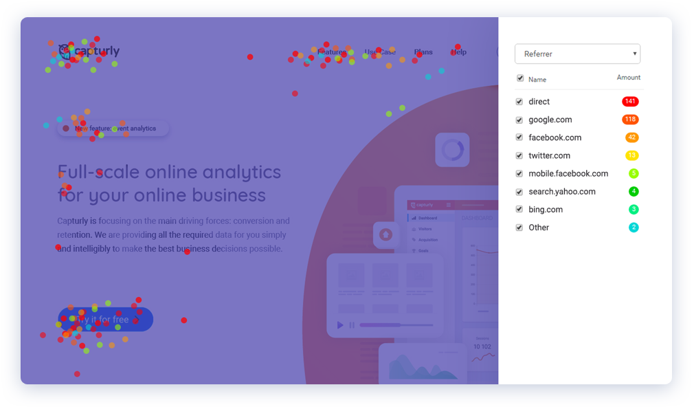
What if we want more in-depth information? How can this be represented visually? This is what the segment heatmap is for.
Based on the source of traffic, you can segment the audience coming to the site, who may be coming from direct traffic, search engines, social media sites, etc.
However, this heatmap not only collects information about the website but also about the device, browser, or even operating system the traffic is coming from. It is a great tool to ensure that your website is still compatible after the redesign, whether across different browsers or devices.
Session Replay
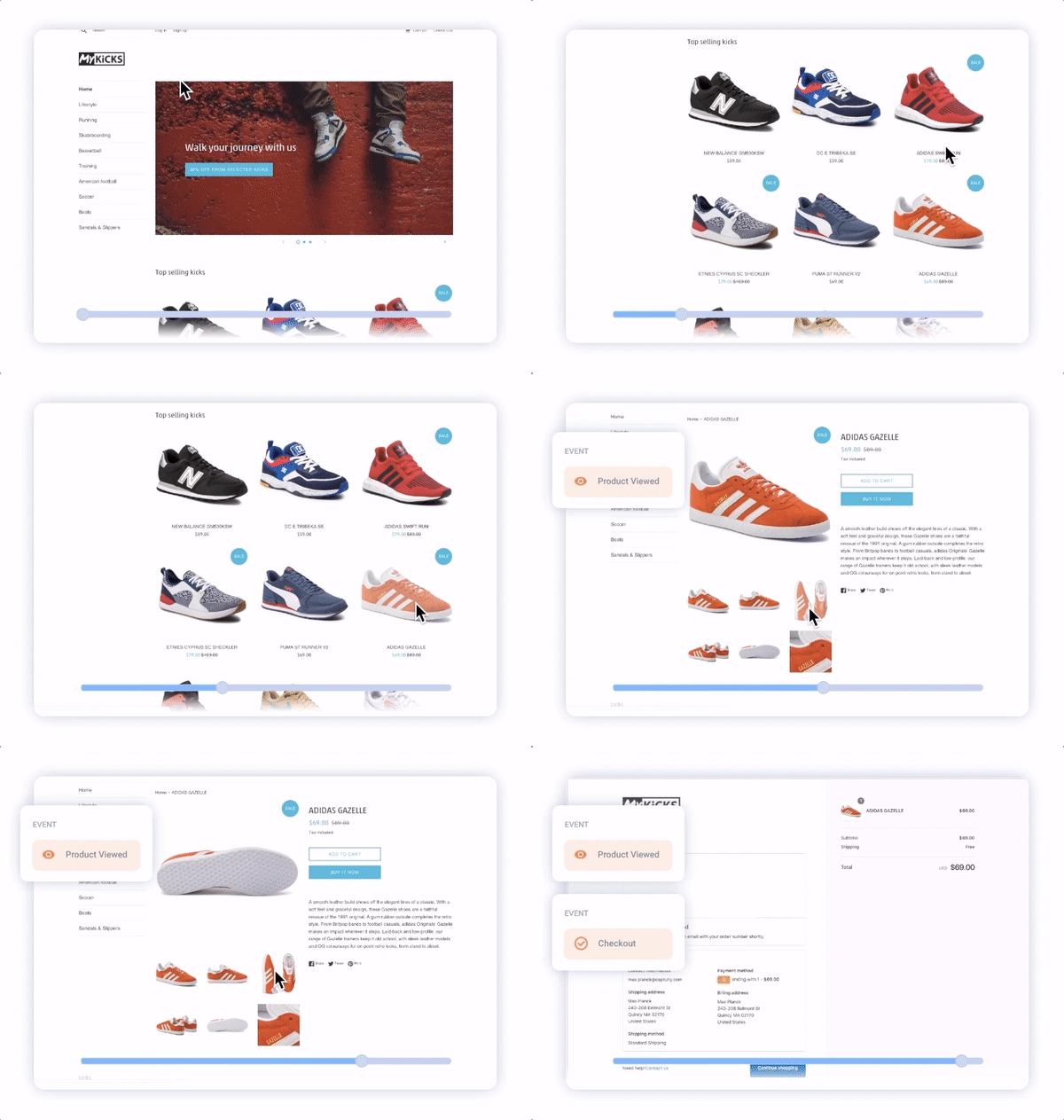
Session replay is a web analytics tool that allows you to see the specific mouse movements of your visitors on the website.
In essence, they are a form of a playback video where you are able to see exactly what mouse movements the user makes on the website. From the clicks to the specific moves, you are able to see the customer mouse movement on the website in real-time.
As we’ve said, session replays will give you the “why” behind the numbers. And if you run an e-commerce site, you definitely do not want the dead links and bugs to occur, especially on product pages or your cart.
Session recordings will give you valuable insights as to what your visitors are doing specifically on your website. But it is also a great tool for seeing where the user experience on the website needs improvement. With session replays, you can uncover some unpleasant truths about the website, and find more ways for how it can be fixed. It will help you identify and solve redesign bugs and problems, which will help you in the long run.
Wrapping up
A website redesign is a multi-step process that includes updating content, refreshing layouts, and improving navigation in order to boost conversions and enhance site performance. In addition to the many advantages, there can also be some drawbacks if you do not take care of or use the right tools. The most common bugs may be related to clickability, responsiveness, compatibility, loading, and other similar malfunctionings.
However, the good news is that a complex web analytics tool that offers heatmap analysis and session replay can also resolve minor and major errors. Try it yourself for free!
Don't forget, sharing is caring! :)

