Is your site having problems to convert visitors into customers? Have you ever asked yourself the question of why do your visitors rarely become your customers? In this article, we will take a look at why your conversion rate is low, what mistakes you might be making and how to remedy them.
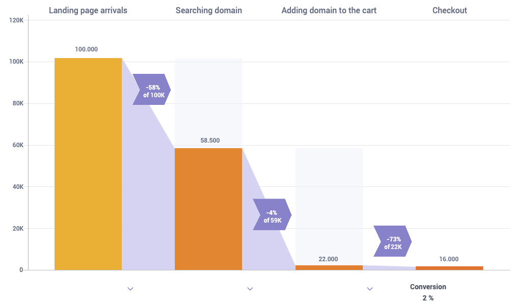
This is a problem even major online companies are dealing with. Usually, the vast majority of the visitors on your website are just passing by; it is quite rare and hard to get a new customer. About 80% of the site guests actually never become converted, and it is usual that less than 10% of the visitors are converted. Normally, a conversion rate from 2% to 5% is already a decent return, but you can even improve those numbers by fixing the problems in your CRO system.
Improving your conversion rate is very important for your business if you want it to grow. If you sit down and thoroughly analyze your website structure and the CRO implementations on it, you might find out that it has some flaws that are hindering the progression of your business online. You want to use the right CRO techniques and solutions in the first place, but if that is not working either, you have to look at them and determine what the problems are.
Let us take a look at 10 most common mistakes when it comes to conversion rate optimization and then we will take a look at how to solve them.
Table of Contents
1. YOUR SITE IS NOT UNIQUE

Your site may look great, you may have a great idea about the website and you have some good products in your store, but your conversion rate is still very low. Why is that, you may ask yourself?
Well, one of the biggest issues that many webpages have is that they have no unique selling point that would attract customers. This means that they don’t have that factor that they are easy to remember and that will give visitors an association with the website.
What you have to keep in mind is that there are hundreds, if not thousands of other websites that are very similar to yours and compete in the same field as yours. That is why you have to take measures to ensure that your site will stand out in the crowd. You need your customers to have an emotional appeal to your website.
Customers use their emotional capacity when shopping online; they prefer to use their emotional appeal to the brand rather than actually go by the factual information about it. How to solve this problem? You need to add more “soul” to your site. Use more colorful language, use stories and try to create a brand with a character.
2. YOUR WEBSITE IS TOO SLOW
This is one of those issues that tends to be disregarded when it comes to CRO. Scroll speed and short loading times are very important factors that may distinguish your site apart from the competitors. I am sure that any of us have had a bad experience with a slow website, and it leads to frustration and anger amongst the customers.
You don’t want that to happen on your site. Slow loading time is one of the biggest factors when it comes to bounce rates on your site. Even Google uses website speed as a factor for its ranking system. So not only you will lose customers, but also your site will lose ranking points for Google if it has slow loading speeds.
Often, customers will want to seal the purchase as quickly as possible or they might be in a hurry to do so. So, website speed will certainly help with that. This problem can be solved by consulting with your tech team, or if you want to do it yourself, there are some measures that you can take to reduce loading speeds. You can compress your images on your site so that they will load quicker, you can minimize the HTML file sizes and so on.
3. BAD DESIGN OF THE WEBSITE
The design is one of the most important factors to make your site more appealing. It is the first thing that visitors notice when they come to your site. It is also one of the main reasons for a high bounce rate. As a result, not many people will stay on your site and become your customers. You may not have enough quality graphic content on your site.
Another important aspect of bad design is that your website might be badly optimized for mobile devices – nobody likes a badly designed mobile app. Considering that people believe that apps make life easier, it’s important to focus on both the app and the site. Fortunately, similar rules apply to both. Are you ready to learn more? Nowadays; a lot of people use their phones to browse and purchase stuff online. That is why it is so important to have a good mobile app in place to enable that.
Tips to solve this problem: improve the design of your website, add some high-quality images that are relevant for the content, improve the mobile version of the website.
4. YOU HAVE A BAD LANDING PAGE
What is the first thing a user sees when they enter your website? The landing page. That’s why it is so important to have a good landing page. How can a bad landing page harm your conversion rate? To begin with, it might have too much information on it that is not arranged properly and your landing page is just a mess. You can solve this issue by refocusing the information on the landing page in such a way that the information given is clear and there is one clear idea presented on the landing page.
Also, the landing page might be out of date with bad design and also with bad content. You want to have good content on the landing page that will attract the users, so you may want to add more good content along with some videos and quality photos. Here are 7 landing page examples to start with.
5. THE CONTENT IS LACKING
Content marketing, in the words of Chris Brogan, can really “shake the tree.” Now when you hear the term “content marketing” you might think about blog posts. Here’s the thing: content is all over the place. Your main page, your pricing page, even the checkout page has content on it. Content marketing influences prospective customers with authority, liking and reciprocity, which has a great impact on the conversion rate. Often it is the content that attracts the users to your website. You want to have good, quality content, but not too much of it – that can create a distraction. You need well-written content with concise and clear selling points and ideas.
Another important factor when it comes to good content is that it is SEO friendly. That means that you want to have content that will help your site be found easier on Google. Include as many keywords as possible in your texts, have interesting texts that the users will want to read and that is interactive.
6. LESS IS MORE

Sometimes you want to include less information and have less content that is more appealing to the visitors. A lot of the users have very short attention spans and that is why you want to keep your key ideas short and succinct. Not many users actually scroll down all the way to the bottom of the website. As I mentioned before, website speed is always a game-changer so keep an eye on your performance. There are some tools that help you optimize your website in a technical way – upload speed, browser caching, image optimization, etc. – (eg. Google Page Speed Insights, GTmetrix ).
That is even more important on the landing page. If you are selling a product, you want to put only the most important information that will attract the visitors on the landing page.
7. YOU DO NOT APPEAR TRUSTWORTHY
What makes a customer appear trustworthy to the sellers? They should have their website up to date, they should add the contact information so that it is clearly visible, they should include the safety and security certificate badges and they should have active social media accounts. Either way, you need a proof of concept in your website design, as credibility helps you drive more conversions.
Those are all factors that will make you more trustworthy and will make the customers trust you. A lot of people nowadays are still skeptical about shopping online, and for good reasons. There are many frauds and many people have encountered instances of it. That is why many people will want a trustworthy seller.
8. YOU DON’T WANT TO DISCOUNT YOUR PRICES TOO MUCH TO INCREASE SALES
Appearing too “salesy” is a big no-no. Many online retailers make the mistake of lowering the prices for a short amount of time to attract as many customers as possible. But this tactic is only effective in the short term and will likely not lead to many long-term customers. Discounts are not bad, of course, but do not offer too many of them. It will also devalue your brand. If you take a piece of advice, know your audience before pushing forcing all kinds of discounts on them. Research, research, research!
9. YOU DON’T EXPERIMENT WITH THE STUFF THAT ALREADY WORKS

Now you might ask why would I want to do that? There is no point in experimenting with something that is already working. Well, it can actually be worth it, because you can still improve something that is already doing well to do even better. There may be untapped potential on your site and you don’t even realize it. Keep in mind that your website should always change to keep up with the new trends. This means, that the conversion funnel you’ve created last year probably won’t be as effective now.
10. YOUR FORMS ARE TOO COMPLEX
It can be frustrating for customers to fill in forms and they don’t want to spend a lot of time doing that. So, make sure your forms on your site are clear, easy to read and quick to fill. Forms are always a hard nut to crack. For starters, people really hate forms, however, this doesn’t mean that you have to avoid using them at all. In fact, forms are everywhere and are the nuts and bolts of any website out there. Tailor your forms the right way by avoiding conversion killer mistakes and you’re good to go.
Wrapping Up
Hopefully, you have a clearer idea of how you can improve the conversion rate on your website after reading this article. Now it is time to get to work and try some of these solutions out!
Don't forget, sharing is caring! :)


7 Comments
API Travel
2023-02-14 at 13:36Thanks for sharing very useful information good blog.
Lauren Rodriguez
2023-08-15 at 15:04I have read your blog on Common CRO mistakes to avoid. It was very interesting and helpful but I can add some extra points in your article. Here some extra points:
1.Testing without a roadmap.
2.Unorganized one-off testing.
3.Not having a clear understanding of KPIs in your CRO project.
4.Not tracking micro conversions.
These are some extra points to add to your article. Readers if you are confused about your web and App development , you can get a free consultation at Alakmalak technologies.Visit our site for more information.
slope
2023-10-26 at 10:17Perhaps you’re overlooking opportunities on your site. Never forget that your website has to evolve with the times. That implies your conversion funnel from last year is probably not going to be as successful this year.
fireboy and watergirl
2024-07-03 at 10:26What you shared has a lot of useful information, very useful to me, and good for the community in general. Please let us know what’s going on. special thanks!