Embarking on the journey to redesign your SaaS product can be exciting and challenging. In this guide, we’ll explore the process with insights, tips, and real-life examples to help you successfully update your interface.
Table of Contents
Understanding Redesign: What, When, and Why?
Redesigning your SaaS product goes beyond just changing its looks—it’s a strategic move into the future of satisfying users and staying relevant in the market. Let’s dive into why this step is crucial and discover the reasons that drive SaaS platforms to upgrade their interfaces. From fixing outdated looks to keeping up with the latest tech trends, this journey offers insights beyond a simple facelift, promising a standout SaaS experience.
What is a Redesign?
A redesign means strategically overhauling your SaaS product’s interface—its visuals, user experience, and overall functionality. It’s not just a makeover; it’s a careful process aimed at making users happier and meeting the changing needs of the market.
When is a Redesign Needed?
Signs that it’s time for a redesign include an outdated design, decreasing user interest, or technology advancements that your current interface doesn’t use. Regularly checking your product’s performance and listening to user feedback helps pinpoint the right time for a refresh.
Risks of Redesign
Redesigning isn’t without challenges. Possible risks include upset users, service disruptions, and a learning curve for current users. However, with careful planning and communication, these risks can be minimized.
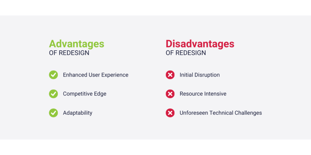
Advantages:
✅ Enhanced User Experience: A good redesign can make users much happier and more likely to stick around.
✅ Competitive Edge: Staying on top of design trends helps you beat your competitors.
✅ Adaptability: It’s a chance to add new features and technologies for better performance.
Disadvantages:
❌ Initial Disruption: Users might need time to get used to the changes, causing a temporary drop in engagement.
❌ Resource Intensive: Redesigns take time, effort, and money.
❌ Unforeseen Technical Challenges: These challenges could range from compatibility issues with existing systems to unexpected glitches that require additional time and resources to address.
💡 Thinking about a redesign? Consider your specific needs and balance the benefits against the possible challenges. Each product is unique, and its improvement journey is just as special.
Navigating Your SaaS Product Redesign: A Step-by-Step Guide
Great job on choosing to redesign your SaaS product! Now, let’s break down the redesign process into easy steps to make sure it’s a smooth and successful transition.
1. Define Your Objectives and Scope
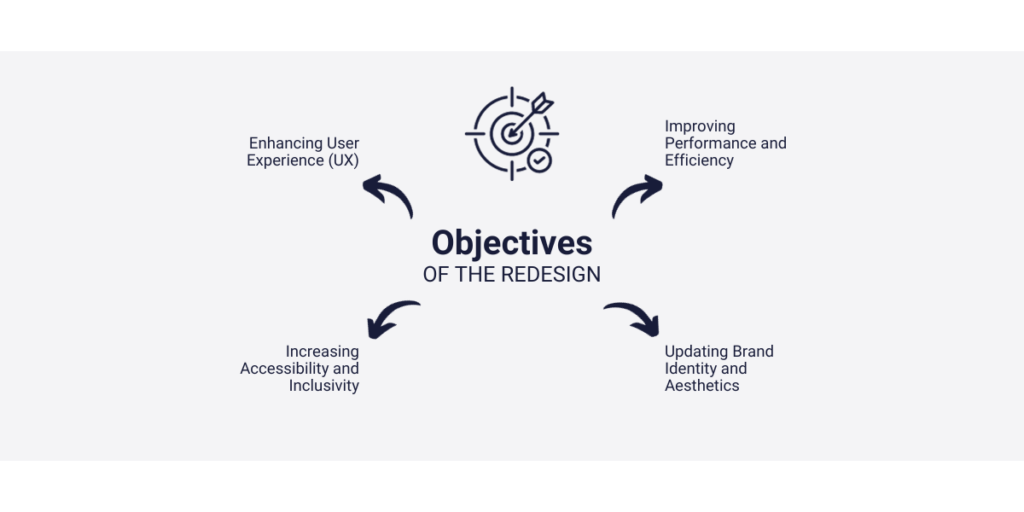
Starting a redesign without clear goals is like setting sail without a map. First, figure out what you want to achieve with the redesign—whether it’s a cool new look, better functions, or more user engagement. Once you’re clear on your goals, set the boundaries for your redesign to avoid going off course. This helps your team stay focused, use resources wisely, and make sure the redesign has a clear purpose.
💡 Grab your virtual pen and paper. Clearly state your redesign goals and set the boundaries for your project. A clear plan is the key to a successful redesign journey.
2. Conduct a Comprehensive Audit
Before diving into the redesign, take a good look at your current interface. Evaluate what’s good and what needs improvement. Ask yourself what users like and where the design falls short. This self-reflection is the foundation for making targeted improvements.
Listen to what users say through their feedback. Understand their experiences, preferences, and any problems they face. Test how users interact with your current interface to find out where things might be a bit tricky.
Use website analytics tools like Capturly as your helpers in this adventure. It’s like a detective’s magnifying glass, showing you how users behave on your platform. Capturly looks at things like page views and clicks, giving you a big picture of how users navigate your site. This helps identify problem areas and spots where you can make things even better.

💡 Put on your detective hat. Dive into user feedback, run usability tests, and let Capturly be your magnifying glass into the details of user behavior. The insights you gather will be your guide for a redesign that truly meets user needs.
3. Create User Personas
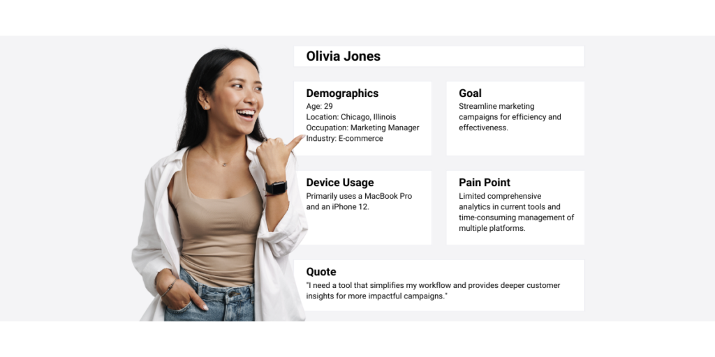
To make your SaaS product redesign user-friendly, start by creating detailed user personas. Think of them as colorful blueprints, each representing a group of people who might use your product.
Creating these personas means digging into who your users are—their demographics, behaviors, and preferences. What motivates them? What challenges do they face that your redesign can help with? By answering these questions, you make detailed profiles that show the essence of your user group.
User personas make data more relatable for your design team. As you go through the redesign, these personas become essential touchpoints, making sure every decision matches the diverse needs of your users.
💡 Get ready to be a virtual sculptor. Create detailed user personas to bring life to your data. The better you understand your users, the more effective and impactful your redesign will be.
4. Brainstorm and Ideate
Now that you know your goals and have your user personas, it’s time to get creative with your team. Bring together your design experts, developers, and anyone who loves thinking outside the box for an exciting brainstorming session. This is where amazing ideas come to life.
As you dive into this creative process, keep your goals and user personas in mind. Every idea should match your goals and the different needs of your users. In this collaborative space, don’t be afraid to suggest bold ideas and think outside the usual.
Remember, great ideas often come from mixing different perspectives. Encourage everyone to contribute, creating an environment where creativity has no limits. This brainstorming session is where your redesign takes off, not just meeting but going beyond expectations.
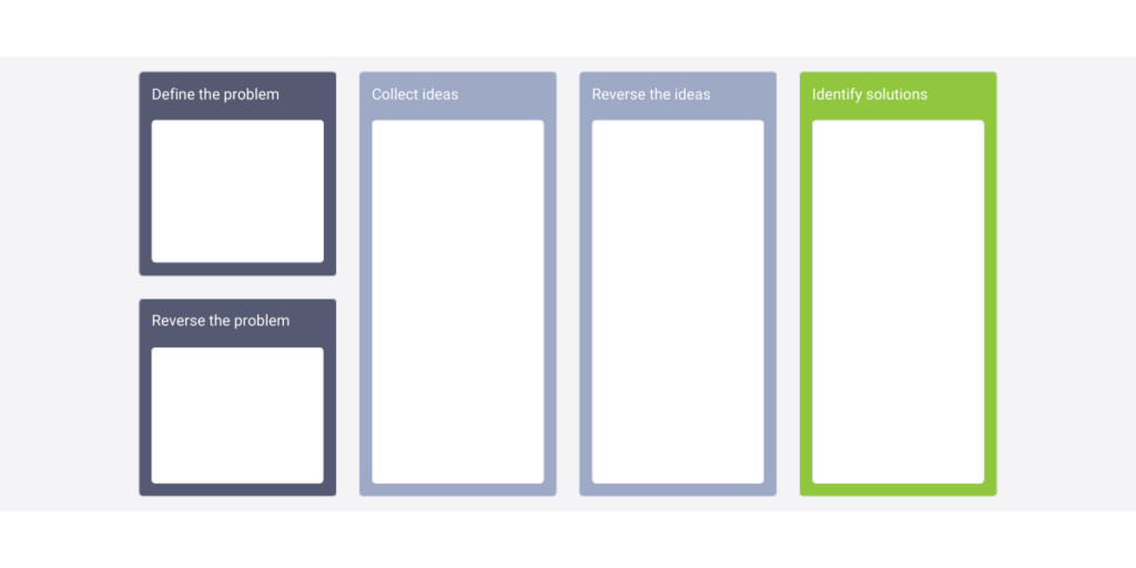
💡 Get ready to be creative. Gather your team, grab some whiteboards, and let the ideas flow. Being bold is the key – in this space of innovation, amazing things happen.
5. Wireframing and Prototyping
With a bunch of ideas, it’s time to give them shape. Welcome to the world of wireframing and prototyping, where your redesign vision turns into real plans. Tools like Sketch or Figma become your virtual architects, helping you create models that show how your ideas will work.
Wireframes are like the skeleton of your design, showing the basic structure. They’re the bones on which you’ll build your design. Prototypes take this to the next level, letting you see how users will interact with your design.
This step is a crucial bridge between thinking of ideas and making them real. By creating these visual plans, you not only refine your design ideas but also open the door for early feedback. Testing your plans with prototypes lets you make changes based on what real users think, making sure your redesign isn’t just good-looking but also easy to use.
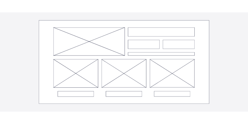
💡 Get your tools ready. Dive into wireframing and prototyping with Sketch or Figma. Watch your ideas come to life and be open to getting feedback early on – the foundation of a user-friendly redesign.
6. Gather Feedback and Iterate
The real power of your redesign is not just in your ideas but in how well they work for your users. Now it’s time to collect feedback and make improvements, where your prototypes take the spotlight in a dance with your audience.
Share your prototypes with a select group of users or people who have different opinions. Get feedback about how easy it is to use, how it looks, and the overall experience. This feedback becomes your guide through the process, making your designs better and better.
As you go through user comments, see it as a way to make things better, not as criticism. Every piece of input is like a tool refining the sculpture of your redesign. Through this teamwork, you create a product that doesn’t just meet but goes beyond what users expect.
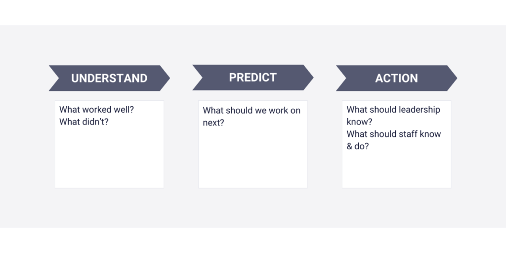
💡 Get your prototypes ready for the spotlight. Share them with a select group, and collect feedback like an expert conductor collecting notes. With each round of changes, your redesign becomes more polished, hitting all the right notes for user satisfaction.
7. Collaborate with Developers
In the complex dance of a redesign, working together with design and development teams is the choreography that turns ideas into a real product. Smooth communication sets the rhythm, making sure every design detail becomes a working feature.
Bridge the gap between how things look and how they work by creating a collaborative space. Encourage open communication so designers can explain their creative ideas and developers can share insights on what’s possible and efficient. This teamwork is where the magic happens, turning visual ideas into something users can use.
Consider using Agile methods to handle the back-and-forth nature of redesigning. Agile ways are flexible and adaptable, letting your teams quickly respond to changes. Regular meetings and continuous feedback become the heartbeat of a well-coordinated redesign project.
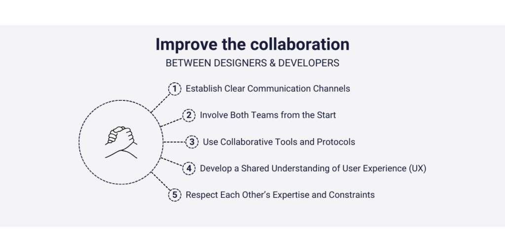
💡 Start the collaboration between design and development. Encourage open communication, try Agile methods, and let your teams work together seamlessly. The result? A redesign that not only looks great but works flawlessly.
8. Implement and Test Incrementally
Now that your redesign is ready to become a reality, let’s talk about making changes bit by bit. Instead of making all the changes at once and causing chaos, it’s like steering a ship with small, controlled updates.
Making changes step by step not only lowers the risk of big problems but also lets you test and make things better regularly. It’s like adjusting sails while sailing, making it easier to fix unexpected issues before they become big problems.
Testing is like having a careful guide during these small updates. Keep checking how the changes are affecting things, get feedback from users, and adjust your course. This way, your redesign stays flexible, changing as users’ needs and the digital world change.
💡 Imagine you’re a sailor adjusting your ship’s sails. Make small changes, test them, and make them better as you go. Redesigning little by little ensures a flexible course that meets users’ needs.
Success Stories: Real-Life SaaS Product Redesign Examples
Let’s look at some real-life examples of how companies improved their SaaS products. Learning from these stories can give us a good idea of how a Saas product redesign can make a big difference.
1. Slack: Streamlining Communication
Before Redesign
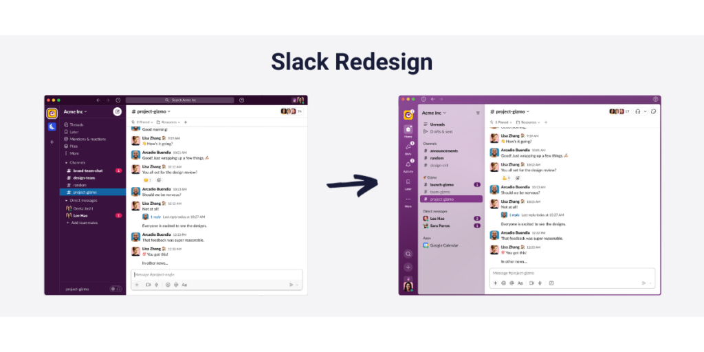
Slack, a tool for team collaboration, decided to change its look to make things easier. The old version had lots of features, but it was confusing for users because it looked complicated.
Redesign Strategy
Slack planned to clean up the look, make it easier to find things, and overall, make it more enjoyable to use. The new design focused on being simple while still keeping all the important functions.
Results
The redesign worked well – more people started using Slack, and they used it more often. People found it simpler to use, making communication smoother for everyone.
2. Mailchimp: Evolving with Market Trends
Before Redesign
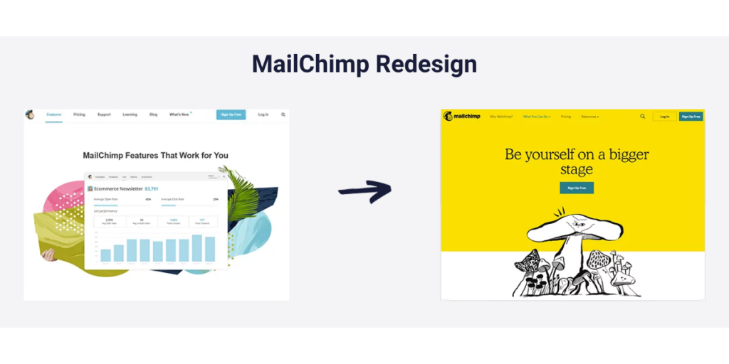
Mailchimp, a platform for email marketing, realized it needed to change with the times and make its interface easier for users.
Redesign Strategy
Mailchimp wanted to make the platform easier for users to understand while still keeping all its powerful features. The goal was to make the design look nice and be focused on what users need.
Results
People liked the new Mailchimp design! They said it was easier to use, and they enjoyed how it looked. The changes made things better for users.
3. Spotify: Enhancing User Engagement
Before Redesign
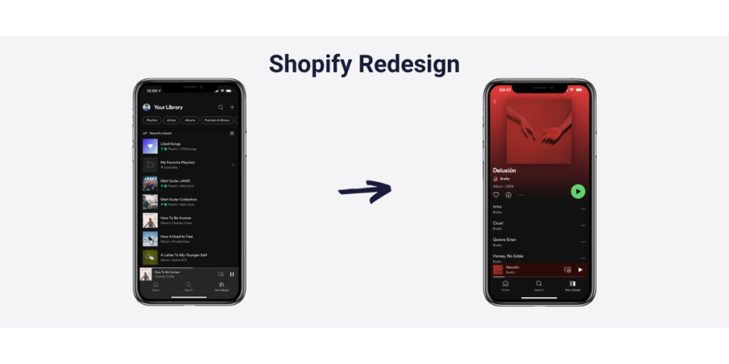
Spotify, a super popular music streaming service, wanted to fix some problems users were having. People were finding it hard to discover new music and move around playlists.
Redesign Strategy
Spotify decided to change things up. They brought in personalized playlists, made their recommendations better, and gave the whole system a friendlier setup. The idea was to keep users interested and give them a more customized music experience.
Results
The changes made users happy, and they spent more time listening to music. The personal touch made discovering new songs more fun and tailored to each user.
💡 These stories show how a good redesign can make a big difference. When you start your redesign journey, think about what your users need and what’s trendy in your industry. Keep an eye out for tips on using analytics tools like Capturly in your redesign process.
Capturly in Your Redesign Toolkit
As you gear up for your Saas product redesign adventure, having the right tools is super important. One tool that can make a big difference is Capturly – a cool analytics solution. Let’s see how Capturly can help you out at different stages of your redesign.
1. Web Analytics for Smart Choices
Capturly gives you detailed web analytics, showing how users behave, what they like, and what they don’t. Before you jump into your redesign, use Capturly to figure out how users use your platform now. Find out which parts are busy, what features are popular, and where there are problems.
💡 Check out Capturly’s web analytics to make smart choices. See where you can make things better and decide what features users love.
2. Error Tracking for a Smooth Experience
During your redesign, there might be some bumps in the road. Capturly’s error tracking helps you find and fix issues quickly. Keep an eye on error rates, understand how they affect users, and sort them out fast to keep things running smoothly.
💡 Use Capturly’s error tracking to catch and fix possible issues early in your redesign. This helps avoid problems for your users.
3. New Survey Feature for User Thoughts
Capturly’s new Survey feature lets you ask users for their thoughts right inside your app. Use surveys wisely to learn what users like, expect, and find tricky. This feedback is super helpful for making decisions during your redesign and making sure the final product is what users want.
💡 Ask your users using Capturly’s Survey feature. Get their thoughts to go with the numbers, so you understand how users feel.
Conclusion
Unlock the secrets of your Saas product redesign with this guide. From setting clear goals and checking everything thoroughly to creating user personas and making small changes, this guide gives you a step-by-step plan for a successful redesign. Real stories of success and using analytics tools like Capturly add important insights, making sure your journey to a new look is smart and all about users.

Don't forget, sharing is caring! :)

