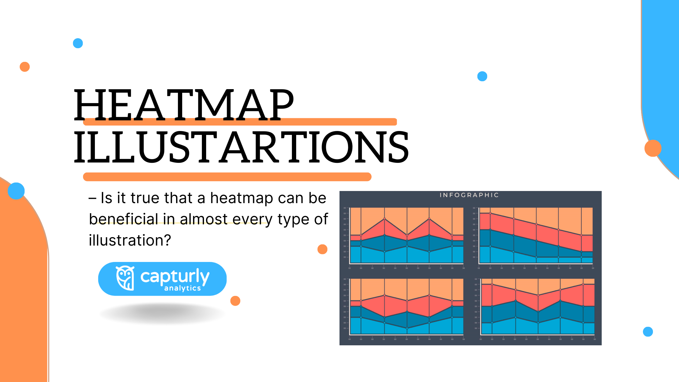
Heatmap is a very easy tool. It is an illustration tool where values are represented by colors. It can be useful for measuring website processes, although experts use it for biotechnology, sports, or to manage a crisis as well. In this article, I won’t introduce you to all the possible usage, or the history of the heatmaps. Instead, I will try to show you the different illustrations that experts use when they want to demonstrate something. Luckily, nowadays with apps, you can easily create your heatmap, if you are both brave enough and good at programming. However, there are numerous sites which can provide you with easy-to-use diagram creators to skip the programming part. Unfortunately, they are usually pay-to-use ones.
Back to the subject: heatmaps can be illustrated in numerous ways. Also, there are uncountable possible heatmap illustrations. Why? Because the definition of heatmap is quite wide. Some people even say that if you use colors in an illustration to distinguish values, we should call it a heatmap. So it’s unlikely that I will show you all the possible uses in this article, thus I would rather concentrate on interesting usages, which can attract your attention. I hope it will!
Table of Contents
Clustered heatmap
One of the hardest ones to describe. It is mostly used in biotechnology, although scientists use it in connection with other biological-related fields too. It is useful since it can display the relationship and distinguish different variables, sometimes more than two. For biotechnology-related people, this illustration is a good simplification, to examine for example two different proteins, or genes in a very fast and easy way.
Imagine a two-dimensional grid of cells, where each cell represents a specific value. That value contains a color code, which can show you the magnitude of the value. Like in almost every heatmap specific-illustration, the interpretation of the colors is the same: red means big values, blue smaller ones. There is one more important part of this odd heatmap: the labeled rows and columns are reordered in a very specific way. The more similar the two elements are, the nearer they go to each other. In this way, it’s easy to find patterns and relationships between elements, and with the added colors, you notice the relations every time you use this heatmap.

Source: https://btep.ccr.cancer.gov/
Density plot
A density plot is a data representation tool, which uses a line to describe the density of an object. This illustration is recommended, since just using histograms with squares or rectangles you can not introduce a continuous movement. Thus, almost nothing can be shown.
Although density plot is a great tool, we might ask ourselves ‘How is it exactly related to heatmaps?’ as heat and colors do not have a role in these illustrations. That’s true, however, there are a huge number of density plots where they also get a heatmap interpretation. In these situations, the heatmap is a great tool to add one more layer to a density plot.
Let’s see an example: There are two axes, horizontal and vertical. One tries to measure the upcoming data’s acceleration, the other the miles per gallon value. So far, it’s easy to show and present the data on a simple X-Y coordinate scale. However, and that’s where the story gets exciting, we add one more layer to this analysis. We are curious about the local density of each data too. So we use colors, and the result will be quite simple, even though we illustrated three different characteristics in one density plot. As of this, density plots and heatmaps meet with each other often if we try to present a very complicated comparison or data set. In these cases, via heatmap, we can pack them up in a more understandable way.

Source: https://jokergoo.github.io/ComplexHeatmap-reference/book/other-high-level-plots.html
The above written example and this illustration have no connection with each other.
Ternary plot
A ternary plot is a very unique representation of a heatmap, I bet you never saw one of these. It’s a three-sided tool, the word ‘ternary’ describes that. In other words, it is a triangle where each side has unique characteristics. There are some kinds of data where it is useful, as it can compare 3 different variables and then it can sum to one constant. Of course, the ternary plot is not always a heatmap. You can use this tool with just three different lines as well and where those lines cross each other inside the triangle, that’s where your result will take place. In this case, colors are unnecessary to use. Although, there are situations where it is not enough to just show the exact place of your result. Here, people are curious about the whole triangle, how the three variables affect each other in each place.
For example:
Imagine a three-sided plot. The variables are sand, silt, and clay, which are all shown by percentage. If there is 100% percent sand in the soil, it’s self-evident that the soil does not contain any other elements. In this example, the tool tries to show the composition of soil in a certain area. We want to show via this tool how the mixture of these three ingredients affects the quality of the soil. With just lines, we can easily show the best quality soil, however, we can not make deep connections from the three variables, as we just only see the best possible one. Luckily, the heatmap can solve our problem. With colors, we can explore in what proportion the combined three variables work well together. So, maybe a big percentage of sand can reduce the quality of the soil, as that part of the triangle is colored blue. I know, it’s a little complicated and there are just a few fields of life where it can be useful and thus rarely occurs. However, as you saw, this is a great way to magic a hard-to-understand, three-sided tool, into an easy-to-understand graphical representation.

Source: https://www.originlab.com/doc/Tutorials/TernaryContour
The above written example and this illustration have no connection with each other.
Bubble chart
A very popular tool, although rarely turns up with heatmaps. It represents 3D data the same as the ‘ternary plot’. However, it uses bubbles to distinguish one data from another. Usually, it appears in an X-Y curve, where there are connected values through each axis. The third separate value can be read out through the size of each bubble. So it also tries to mix three different variables and translate the overall score in a fun way. As of the fact that it is using a bubbling method, usually there is no need for the use of heatmaps. Here, there is no available data outside the bubbles. In other words, you can not mix the three different variables how you imagine, like for example in a ternary plot. Bubble charts show exact locations in the curve, where the results of the previous calculations have been got.
Also, there is one case where the bubble chart does contain a heatmap. It usually occurs when we want to add a fourth value, that’s what the colors can provide. It may create very complicated diagrams, however, sometimes this is your only chance to explain connections from a bunch of data.

3D surface plot
Another interesting usage, but a rarely used one. First, it seems a little hard to understand the whole mechanics behind it. Relax, it’s not your fault. 3D representations usually look a little bit weird at first, as it is unusual for our eyes. The more we read newspapers and normal books, the more our eyes get used to 2D diagrams. 3D-s are complicated to us for 2 separate reasons:
- Illustrators usually try to show their diagrams through 2D devices, like through a screen of a computer, or a book
- We haven’t got used to it yet
But, let’s go back to the 3D surface plot. Imagine firstly two inputs: x and y. They give our 2D function. Then there is a ‘z’ variable. It gives us our 3D function. ‘Z’ is the height of the ‘x’ and the ‘y’ coordinates. So now we have three different variables, but the ‘z’ depends on the other two variables. The whole system works great, but there is one little problem in connection with it: it looks a little messy. Just using lines it is very hard to make a difference between each data height, it can deceive our eyes. So, that is where the heatmap occurs. Each data gets colored in terms of its height (red usually means the highest points, blue the lowest). Now, we can distinguish the separate values and recognize what the illustrator would want to tell us.
It is useful for identifying patterns and trends in the data, so its importance is undoubtful.

Source: https://www.python-graph-gallery.com/3d/
Color coding on a matrix
This is an easy-to-understand heatmap appearance. Here, there are just two different variables. Color coding means that we associate a value between two numbers with a color.
For example, let’s take a very little matrix. We can get numbers between 0-10 and 10-20. 0 to 10 are the smaller ones, we associate them with the blue color and its shades. Also, we associate the range of the 10 to 20 numbers with the color ‘red’. Here, we can distinguish them from each other, also we can recognize which is the bigger one without reading the actual numbers. In this example, it makes no sense, as we can easily figure out the difference between one to another. However, over 7-digit numbers, we may make mistakes. Although, if we add color scales to it, we might avoid them. In most cases, that’s what we love about heatmaps. They don’t do anything big, just a little simplifying. However, in our fast tempo everyday life, little time saving also matters!
Experts in risk management also use that technique to recognize the possible threats the company may face! Later, their whole risk strategy will be built on this matrix end score.
An Interesting usage – The keyword heatmap
Last but not least, I tried to bring you a little different illustration, which is nearly never used, but an interesting one. This is like a heatmap for words and with the help of it, you can recognize the most used words or phrases. It can be useful, for example, when you write an article and you are curious about whether you used your keywords enough times. If you used, your keywords take place in front of red color.
To tell the truth, I think if you want to analyze the most used keywords, there are better options instead of using heatmaps.
Usually, we use heatmaps as a visualization tool, or we can use them to make qualitative research, although it doesn’t provide you with any quantitative opportunities. It means you can visualize the keywords with this method, but you must measure them first with another tool. That’s the main reason why it’s not a well-known tool for keyword optimization. Although a few people are more likely to memorize the difference of the colors than the difference between sizes of words. So if you want your data to appear in a fascinating way, or your mind is more likely to work with this solution, give it a try!

Conclusion
As you may have read the article, you might have noticed that a heatmap is not an unmissable thing when you want to create an illustration. For instance, density plots or ternary plots would be useful without the inside heatmap too. You can read out the scores from these illustrations since heatmap doesn’t influence the overall scores at all. It doesn’t change the numbers and the formulas. It just makes graphical changes. Yet, it ensures the understanding of the illustrations, or it gives us time-saving opportunities.
There are almost infinite possibilities to illustrate heatmaps. It is because most of the time you are not really illustrating the heatmap itself. Firstly, you would just make charts and dots and complete them with this color-represented tool.