
You have a charming-looking site that attracts hundreds of thousands of visitors, but you realize that you only have a few sales compared to that significant user flow. So what went wrong? Low conversion rate could be frustrating when everything feels under control but the numbers are not justifying it. That’s when UX comes into the picture.
UX (or user experience) is literally what it says – the searcher’s experience on your site. The way they feel on your website, how they interact with different elements on it (images, links, CTA-s, etc.), how easily they can navigate to their desired destination – these are some factors that could be considered as “user experience”. These points determine what impression you leave on a visitor about your brand, so when you feel that you don’t convert enough people to customers, you could start your investigation by asking some directive questions:
- Is my site’s design visually appealing?
- Do I need any reshape on my web?
- Is there anything that distracts visitors’ attention?
- Are CTA-s correctly placed/reaching their goal?
- Can searchers find their desired content easily?
- Does my site work flawlessly?
- Is there a problem in general, or just on one device?
- Is my site optimized for all browsers?
If you think this would require starting your website from scratch, don’t worry! Deploying a website analytics tool, you can tailor which part(s) of your site requires changes. There are two types of analytics tools you can use – quantitative and qualitative analytics.
Table of Contents
Quantitative analytics
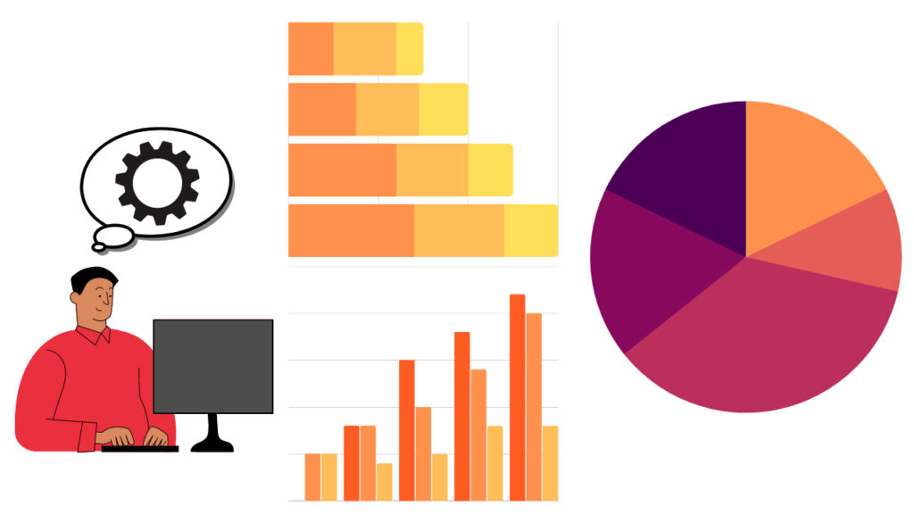
Quantitative analytics offers solutions to measurable, objective data. To answer questions that start like: “How much…?” , “How many..?” you should always turn to quantitative analytics. It could be very useful to e.g. give a better insight about the traffic on your website, how many visitors turn into actual buyers, bounce rates on certain pages, how much did they enjoy their time on your site or how many new or returning subscribers do you have.
As you can see, there are several ways to analyze your web’s performance. They can be represented in graphs, charts, or tables. Here are a few ways to make visitors’ actions measurable on your site:
- Traditional analytics tools – like Google Analytics to gather, analyze and report data
- Conversion funnel
- A/B testing
- Event analytics
- Surveys
- Reviews
Now let’s talk about qualitative analytics.
Qualitative analytics
If quantitative answers the “How much/manys” regarding your site, then qualitative direct you towards the whys and whats. Qualitative analytics give reasons behind visitors’ behaviors, emotions, and experiences – it can explain the different actions users do on your site.
Data could be just plain numbers, but qualitative tools can give meanings behind them. If you feel that the exit rate on certain pages is very high, your products don’t sell enough or you only have a few subscriptions, it could be a sign to get your site under qualitative analytics. Maybe something distracts your users while shopping or frustrates them on your site. There are 2 main tools to make the most out of user behavior examination:
- Session recordings
- Heatmaps
In the following part of this article, we are going to take a closer look at heatmaps.
Heatmaps
What are website heatmaps?
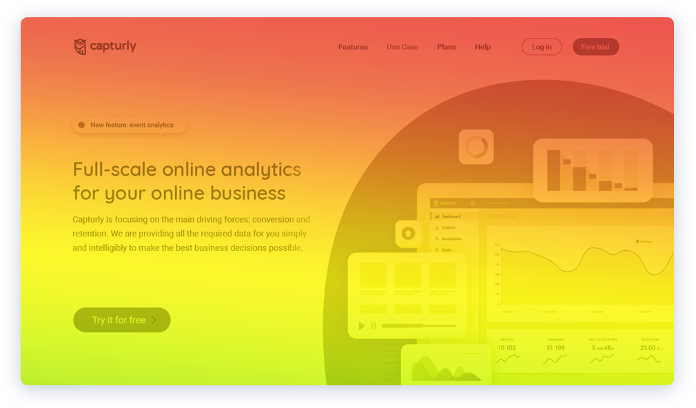
Website heatmap is a tool that visually represents how visitors interact on your website. Depending on how frequently searchers use different parts of your site, there is a cold-to-warm “temperature” scale to represent user activity hotspots (cold colors refer to the least used part of your site and warm colors indicate the most used ones). It’s like taking an X-ray of your site and see where the friction points are.
Heatmaps are quintessential when it comes to UX analysis. They can highlight the most popular regions of your pages and show if users browse your site as they are supposed to. There are 3 different ways you can examine what’s going on on your sites using heatmaps:
-
Scroll heatmaps
Scroll heatmaps show user engagement on your pages. They represent how far people scroll on each page. When you have a content-loaded site, you should think about doing a scroll heatmap analysis to check how long you can keep visitors’ attention.
Also, it is essential to inspect how different devices perform because there might be different user experiences on various devices, so maybe you will only need to redesign on a specified platform, but we will talk about that later.
-
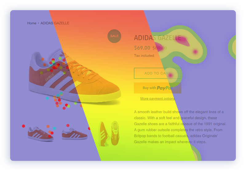
Click heatmaps
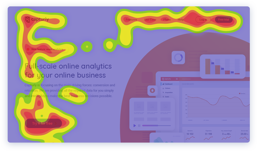
Click heatmaps display how people interact on your site. It highlights the hotspots of your web, meaning where visitors click the most, so it is very informative if you want to investigate if your CTA-s reach their main goal or if your links get the necessary clicks.
It can uncover unexpected clicks too because there might be some cases when visitors click on places they might expect to be something interactive, so you can optimize your site based on this information. More down below.
-
Segment heatmaps
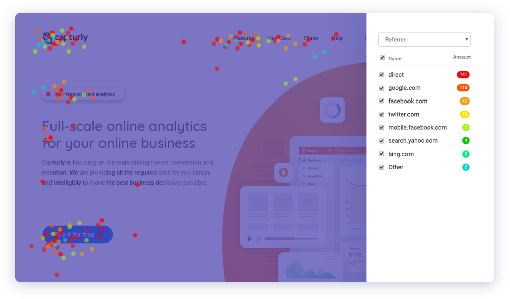
When you appear on different interfaces and wonder: “Where do most of my traffic come from?”, then you are looking for segment heatmaps. This tool can show you where people come to your site. It’s similar to a click heatmap, but the clicks additionally give a “web demographic” meaning to activities on your site.
Segment heatmap is a powerful tool for audience optimization. There are different ways you can take advantage of this equipment and I’m gonna share some tips & tricks with you in the following section.
Now that we had a little introduction about heatmaps, let me share with you:
5 tips on how to use heatmaps to improve UX
#1 (f)Hold up! – How far do customers actually scroll down on your page?
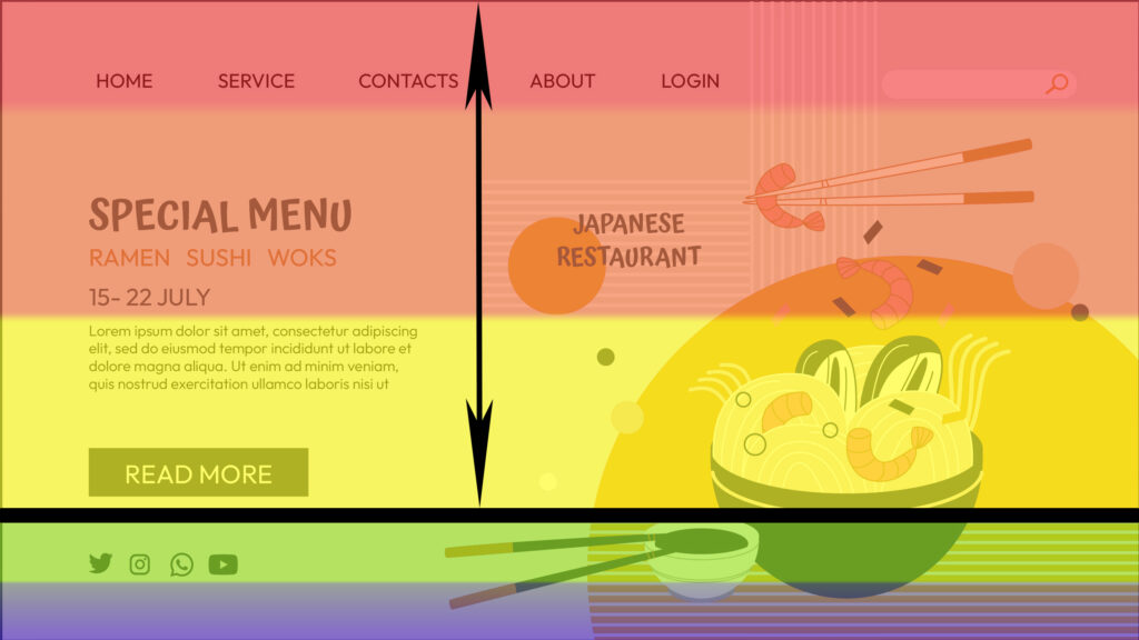
In our constantly accelerating world, we want to access everything as fast as possible. And when we land on a page and can’t find what we are looking for in a matter of seconds – let’s be honest! We move on and search somewhere else. The above-the-fold part of your page can determine the result of a user’s interaction – it’s their first impression of your content. That’s when scroll heatmaps can come to our aid!
You can check whether your important content gets the necessary attention it needs. If you see that most people don’t get below-the-fold and miss out on important context, you should consider either 2 things – if you want to still give things a better understanding, shorten the length of your posts, articles, etc. and focus on the most relevant pieces of information or pack your main content and CTA-s to above-the-fold.
Also if you find out in your analysis that there is a rough change from warm to cold colors on your site, it might be worth a closer look. Maybe there is a huge blank part on your page that makes your visitors leave early or a big gap between two different blocks. If you can fix these issues, you can gradually improve the UX on your site.
#2 The Hottest Topics – Discover your CTA-s efficiency
When you want to encourage your customers to do certain actions (like purchase your product, subscribe to your newsletter, or fill out a login form), you usually place well-visible CTA-s around your page. But how do you know that they are in the right place? Click heatmaps can be one way to find out!
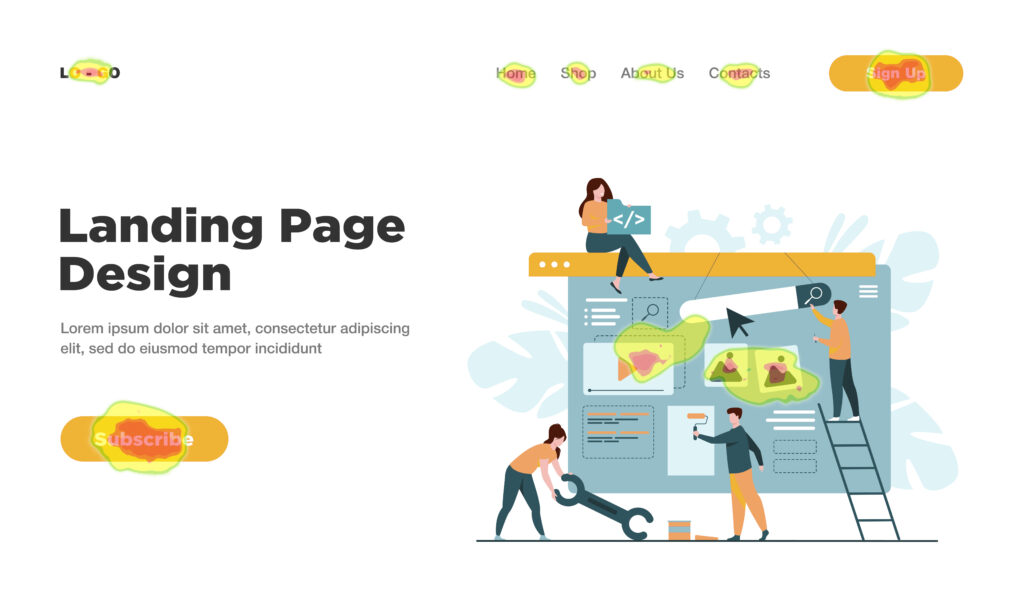
As mentioned earlier, click heatmap’s goal is to show what are the frequently interacted spots on your website. You can put each of your pages under a magnifying glass and see how the responsive parts of your website perform. This way you can detect whether your CTA-s get their primary goal or spot unexpected clicks. Sometimes users try to press on places that are not meant to be clickable. In these cases, you should consider putting a responsive object to these spots or making your site more clear.
Furthermore, I would suggest you double-check all the links that can be found on your site. Maybe some of your links are broken and don’t redirect to the desired destination which can leave visitors frustrated and leave your page immediately (and it can have a negative impact on your SEO). Keep it under control to satisfy your users!
#3 Passport, please! – Get the most out of your traffic
Searchers can get to your site in many ways – via ads, social media, browsing, etc. You have different marketing campaigns to reach more and more people – but do you really need all of them? Segment heatmaps may assist you in answering that question.
It visually represents the different traffic sources that arrive to your site. You can use it to determine which sites should need more advertising focus or which campaigns require a bigger push. Reveal where you gain the most attention and focus on it!
#4 Sometimes, size does matter… – Optimize to different devices
Not only your content should be outstanding and have a fascinating design, but you have to provide the same experience everywhere. You attract visitors from different interfaces – smartphones, tablets, different browsers from desktops – and you have to provide the same content everywhere. It’s not just about context, it’s also the appearance.

You can use different heatmaps to make the best out of every interface. Utilize click heatmaps to check if all your CTA-s behave the same way on each platform. Inspect their responsivity and see if there’s no conflict while using each button. Check how far people scroll on various devices by using a scroll heatmap – maybe customers scroll less further on mobile than on PC so you can immediately intervene in this problem by redesigning your landing page. Little things can make wonders!
#5 Analytics, unite! – Combine different analytics tools
Heatmaps have several advantages, but you can level things up. Combine them with other methods and tools and you can achieve even better results. Here are a few combinations that can help you understand your visitors better:
Heatmaps + Session Replay

If you want to have a better understanding of why people click on certain parts of your pages, session recording can give a better insight. It shows you the whole process of how a user interacts on your site – it records mouse movement, page redirects, and where they leave your site. If you want to figure out the reason behind unexpected clicks on your pages or how users behaved in certain situations, session replay can complement your heatmap analysis perfectly.
Heatmaps + A/B Testing
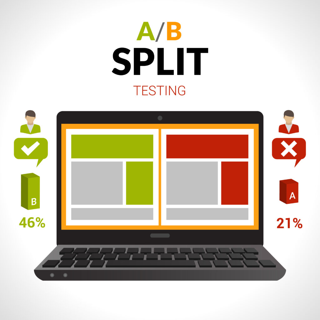
You may have a fascinating website, but you feel that it could do better. You have a different idea to take your site to the next level, but not sure how it would perform. Before you make radical changes, think about doing an A/B test. One way to use it is that you implement your new design and see how people like it. You can also make changes on your content and examine how it affects your traffic, and there are several other ways to use it. Combine this testing method with a click heatmap and you can see the effect of your new page. Make the most out of your ideas!
Heatmaps + Conversion Funnels
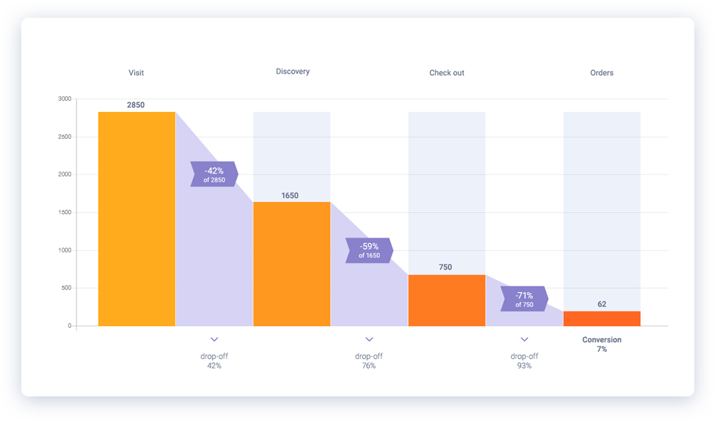
While analyzing your conversion funnel, you may have experienced that there’s huge traffic to your site but then you realize an inconvenient surprise – only a fragment of your visitors actually buy something on your site. So what can you do to understand why that happens? Combine heatmaps and conversion funnels for the perfect wombo-combo to solve that mystery!
You can check what’s going on in each of your conversion funnel’s steps by using heatmaps – investigate how users navigate on your site, detect clicks on unusual spots and apply clickable objects, links or CTA-s where people might expect something interactive. The easier for your visitors, the better for you!
Summarize
Coming to the end of this article, let’s check what we learned today:
- To get the best out of your website, UX is a quintessential factor to keep in mind.
- Quantitative and qualitative analytics are both useful to keep track of how your site performs.
- We dug deeper into one of the most popular and useful qualitative analytics tools – heatmaps. Heatmaps are very informative when it comes to user behavior analysis.
- Different heatmaps can bring different user pain points into the spotlight. Discover these frictions and optimize them to turn the tides.
- Don’t be afraid to combine different analytics tools with heatmaps – the more the better! Step to the next level to get even bigger success and reach your desired goals.
To kick off your web analytics adventures, you should give Capturly a try! This online analytics platform has a wide range of both quantitative and qualitative tools, like event analytics, conversion funnel, session replay, and heatmap too! You can try the service for absolutely free without giving your credit card information. Get to know the software and decide to upgrade later!
Have fun!