You may be wondering what you can get from an article like this. My goal is to give an in-depth look at the basics of wireframing from a more practical perspective.
In this article we’re going to answer the following basic questions:
– Who uses it?
– Why should you consider using them?
– How can you create awesome wireframes with or without software?
Let’s begin
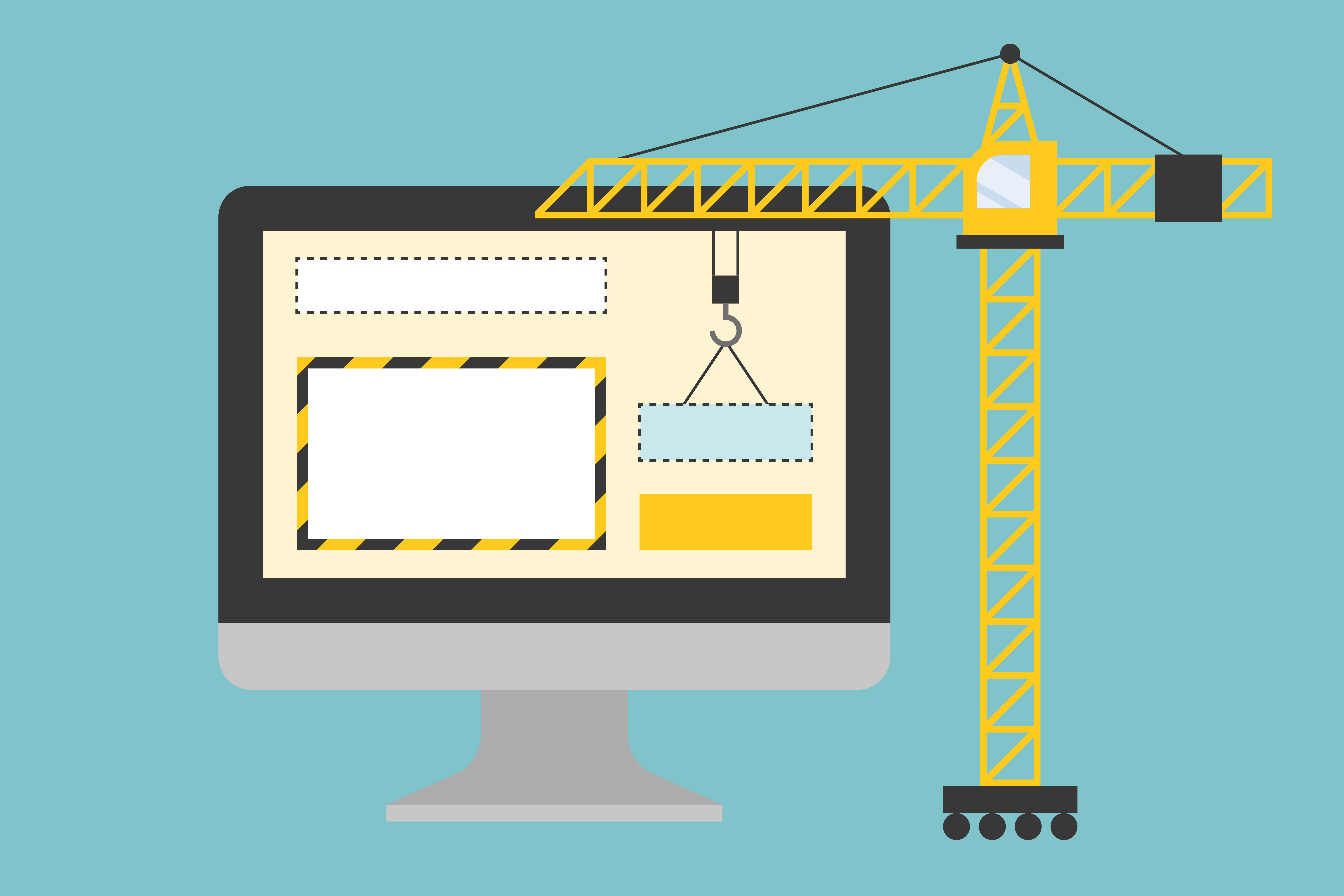
When it comes to wireframing, the easiest way to describe it is as the cornerstone of product design and development. Regardless of the project itself, you will work with this tool in the early stage of website/mobile application building. The goal here is that everyone who’s involved in the project has to be on the same side. This means not only designers product managers and engineers but everyone. If we look at a company that prefers agile development, we can see that wireframes are implemented in the early stage of product design and development phase. Yes, even a simple paper-based sketch can be considered as a wireframe, but we’ll discuss this in-depth as the article continues.
Sketch, Wireframe, Mockup
Okay, hold on. Aren’t mockups the same as wireframes?
Wrong.
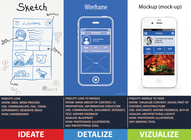
The wireframe is all about making mockups work. As it’s shown on the picture above, its fidelity ranges between low and middle. In the case of an app or a website, it can be navigation, the layout of buttons, boxes and other elements while a mockup is as close as possible to the end result. It sometimes changes the details you would ignore otherwise, like repositioning CTA-s can make a huge difference in conversions. Understanding how users really interact with your website can help you a lot to find the right place for your CTA.
Its purpose is to give an overview of the final product. You can use graphic software or dive into coding, it depends on you. If you try to show the end result in its glory with all the details, you’re doing a mockup. Going even further and taking functionality into the picture, we can talk about prototyping but that’s another topic. If you wish, you can read more about the differences here.
Who Uses Wireframes?
„In short, anyone involved in the product — in any capacity.”
Although designers, developers, and product managers typically create and use wireframes the most in their daily work, many people benefit from wireframes. These may include business analysts, information architects, interaction designers, user experience designers, graphic designers, programmers, and product managers.
Why Should Anyone Use Wireframes?
„Wireframes are the “blueprint for design.”
In other words, they have a role in connecting the information architecture with the visual design in order to represent an interface. This interface has five main purposes:
- To tell how the site or app comes together
- To tell how it will be usable
- To tell how the information will be organized and represented
- To tell how and what content it should hold
And last but not least
- To tell how these will interact with the user
So how can you create wireframes?
Earlier I’ve said designers, developers, and product managers make wireframes. But this doesn’t mean that it’s the same.
UX/Graphic Designers consider using wireframes when they wish to create graphic mockups, prototypes or a new UI overall. So for them, it’s a pre-work process. Another reason for using it is to simulate user flows. They create them after having a persona, a user journey, site map to work with; in other words, after putting together the discovery-related activities.
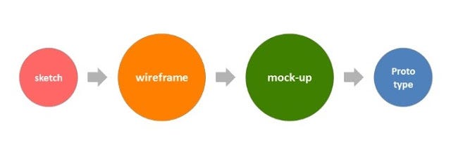
For the UX Designer, wireframes are like abandoned, empty houses waiting to be filled with life.
The designer decides what furniture goes where and how visitors can navigate through the house without any injury. In other words, user flows are basically series of interactions between the user and the interface in a way that ends up in a silky smooth result. Flowcharting, storyboarding and wireframing work hand in hand to achieve the goal.
Developers use wireframes to get a more tangible grasp of the site’s functionality.
It gives the developer a clear picture of the elements that they will need to code. it’s important to note, however, what kind of development process we are talking about. In the case of back-end development, wireframes can be low-fidelity the way a UX designer creates it. On the other hand, front-end development requires a high-fidelity wireframe.
Product managers require wireframes with more of an inspection purpose: to review and ensure that requirements and objectives are met through the design.
Copywriters can make use of wireframes also! For example, in order to provide the clients with the visualization of their copies or support the designers during the design process. It is also worth mentioning that wireframes not only provide a strong pillar but also speed up the workload.
Creating wireframes with zero investment:
Sketching/Paper Wireframing
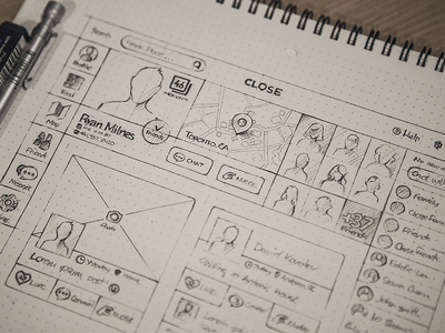
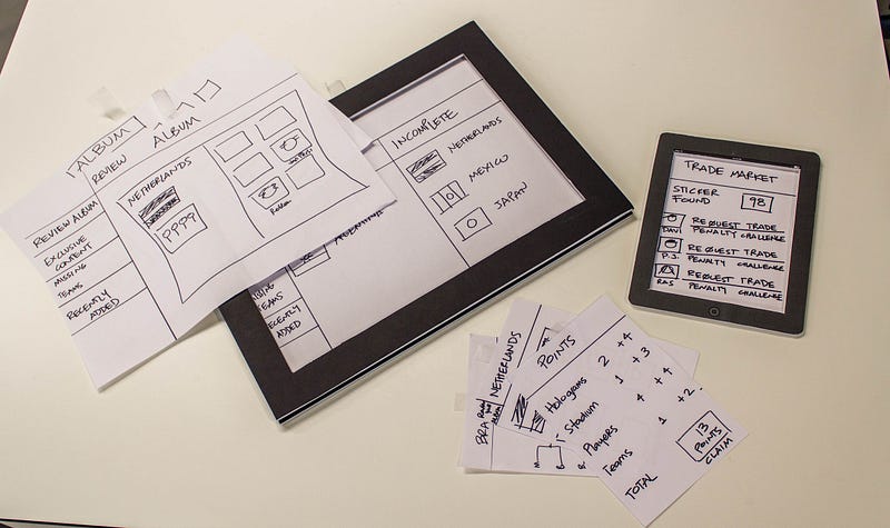
Pros:
- Speed: Just grab a pen and a piece of paper and that’s it, nothing fancy. Start drawing the product design at any level, the only limit is your imagination.
- Flexibility: You have the opportunity to swap between low-high fidelity concepts, so who knows, you might start with a sketch and end up with a prototype on your way.
- No distraction: You focus on that piece of paper in front of you. No colors, forms or pre-done styling (good for lazy people)
The following two are applied when you turn sketches into paper prototypes:
- Easy standardization: This comes from the flexible fidelity aspect. Since you’re creating multiple patterns with the same layout/cut-out, you can standardize your prototype with ease.
- Interactive and alive: They’re just as mobile as sketches, plus they are alive! Run around the office and show them to the colleagues, pin them on the wall.
Cons:
- Duplicating work: if you ruin something at the end of the process, redoing some parts can be pretty frustrating. You can undo some of the decisions by erasing or overlapping lines, probably resulting in a big ball of ink spaghetti. Also, you can’t “save” your work and have no access to templates. If you go one step further and wish to create a paper prototype, you have to put in that extra work making it, even more, time-consuming.
- Zero level of interactivity: Forget about animating things and you’re also out of luck if you want to link your sketches together. No advanced stuff here.
- Hard to update: After a couple of hundred papers sitting on your desk, you’re pretty much sitting there hopelessly when it comes to “updating” your work. Especially if multiple personnel work on the same project.
- Potential inconsistency: unless you’re experienced enough or talented in drawing, you have to be very careful during the process to avoid inconsistency.
Black & Whiteboarding

Pros: (see sketching)
- Large scale: If you wish to turn your whole office wall into a giant whiteboard, no one is stopping you. The screen-size is nor your only choice here. Speaking of scale, you have the opportunity to inspect and think from a distance, from multiple feet away, even while walking around.
- Transparency: Besides looking cool, a building with offices, hallways filled with whiteboards where people can work together on projects makes the whole company feel alive and transparent.
Cons: (see sketching)
- Lack of mobility: If you have a larger board you’re pretty much locked in space. Especially if it’s mounted on the wall. If it’s on a stand, you may still look stupid running around the hallway with a big “canvas” showing off your masterpiece.
- Low details: You can’t go really into the details unless you have very sharp markers that can draw thin lines, shapes (worth to note this will lose its perk from a distance)
Stenciling
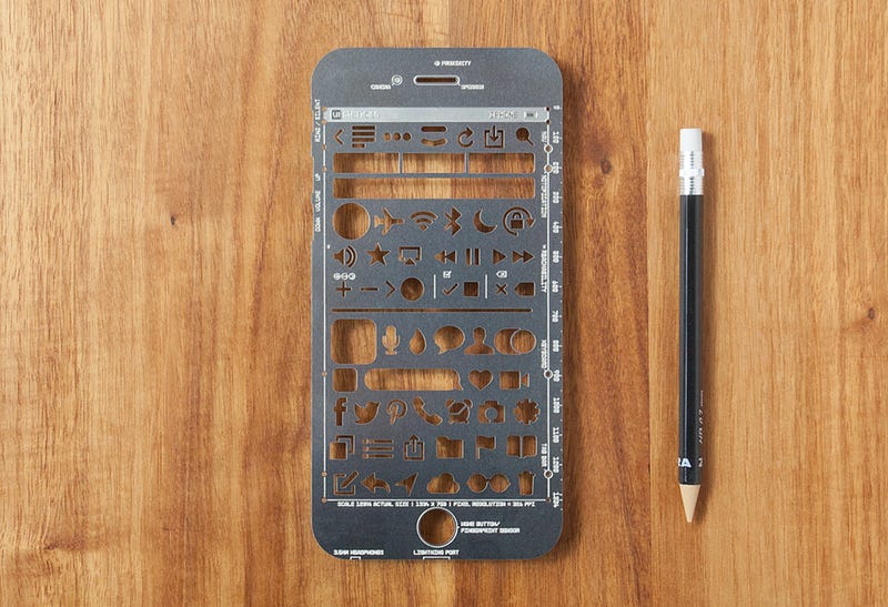
My favorite type of non-digital wireframe creators. It’s basically sketching but with a twist. Do you remember when I told you that one of the cons of sketching is the lack of templates? Well, stencilling fixes this in a simple yet elegant way. You can find a ton of templates online you can print out, some of them come bundled. Or you can decide to make your own. With the implementation of templates, you’ll make sure that you can plan with consistency and instead of focusing on details such as duplicating buttons and other UI elements in the same shape/size, you can focus on the project itself.
Now for the digital armory:
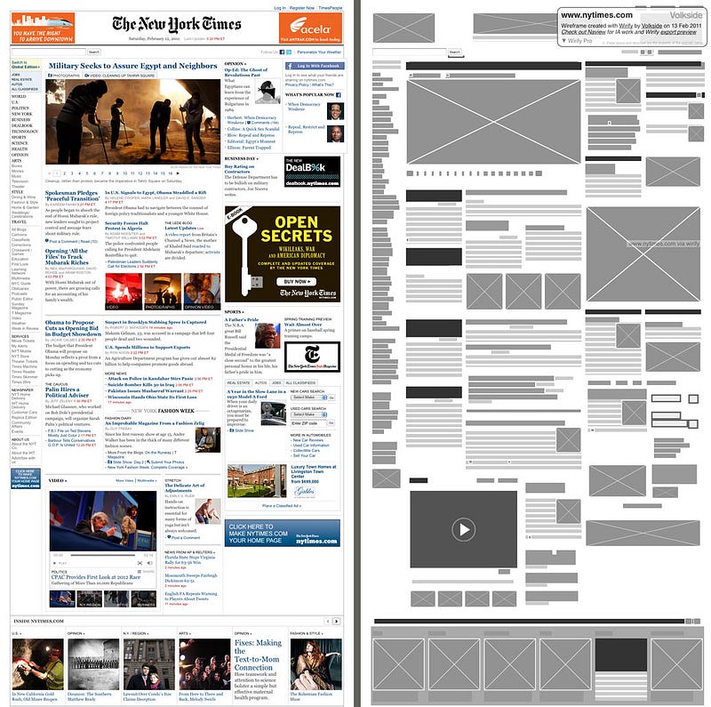
When I first started creating wireframes I was overwhelmed by the software available out there. It’s really hard to tell which one is better than the others and worth spending your hard earned money on. To be honest, I still don’t know what to say, other than what work for me the best. Firstly I would point out a tool I often use called Wirify. It’s not really something you create with wireframes, but the idea behind it is brilliant. Pick a website you like and get it naked to the bones. Let’s have a look at the NY Times, for example.
Or CNN.
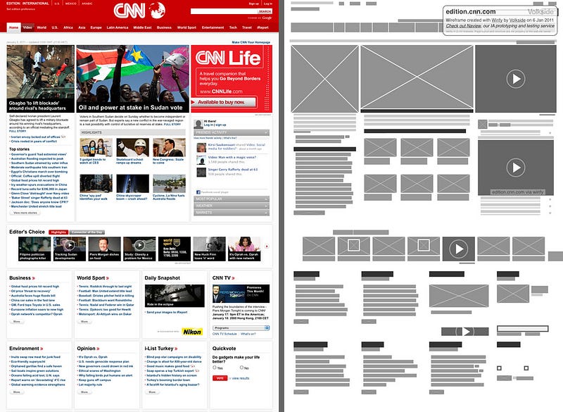
So in case you run out of ideas, well now you can inspect a site that actually functions. Pretty neat right?!
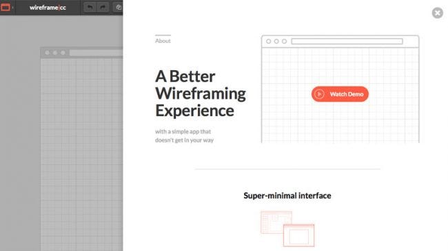
It’s one of the best online tools out there when it comes to designing quickly.
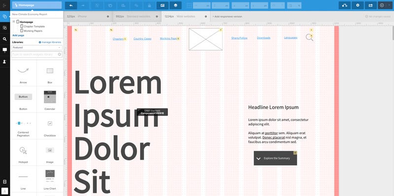
If you wish to dive deeper into the ocean of software and not afraid of learning, I also recommend UXPin. It was developed by UX designers for UX designers. It has a nice drag and drop style and a library filled with great features. On top of that, it has Photoshop support. The things I dislike about it are the price and although the support for mobile is somewhat okay, it’s lacking in gestures.
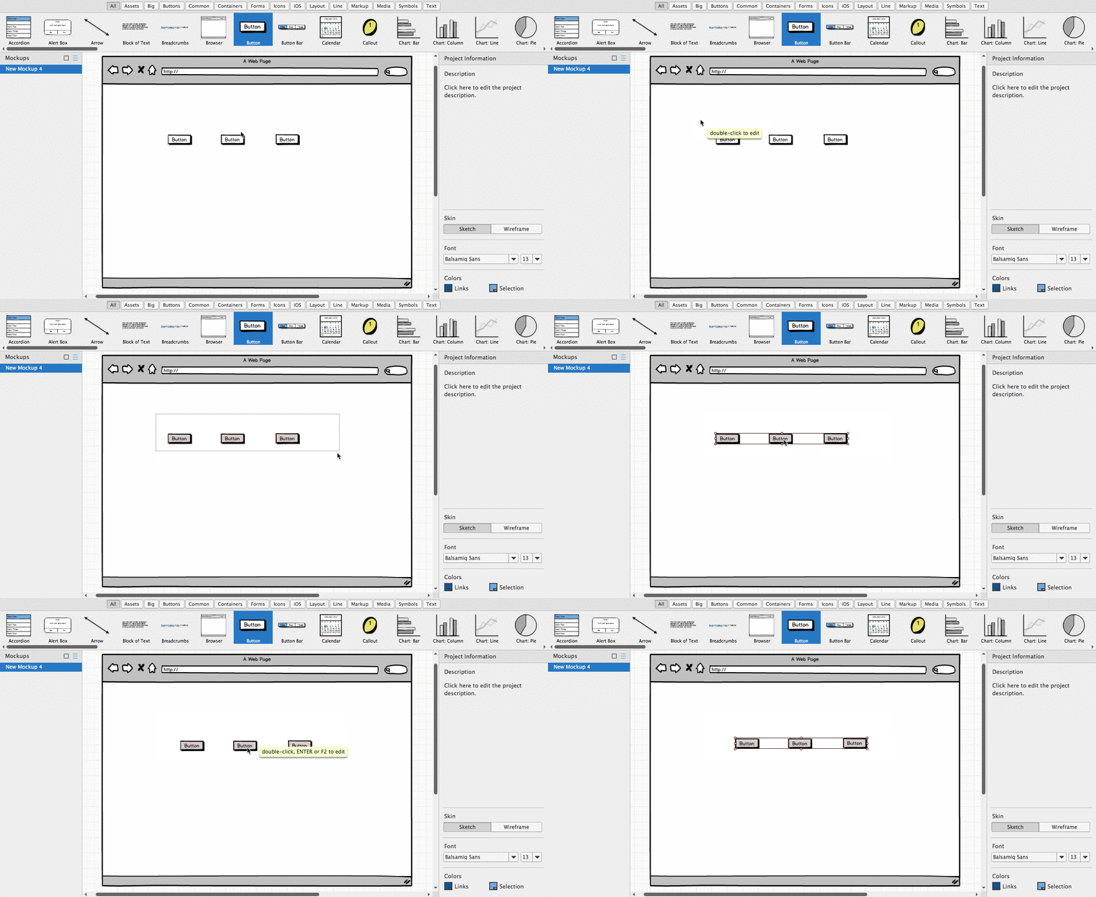
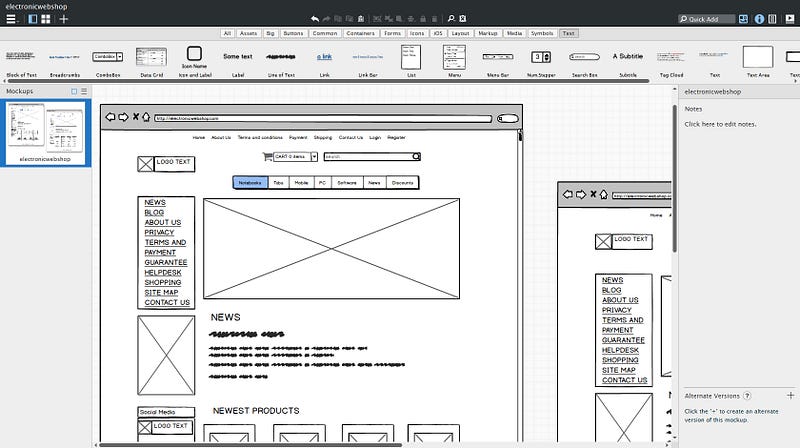
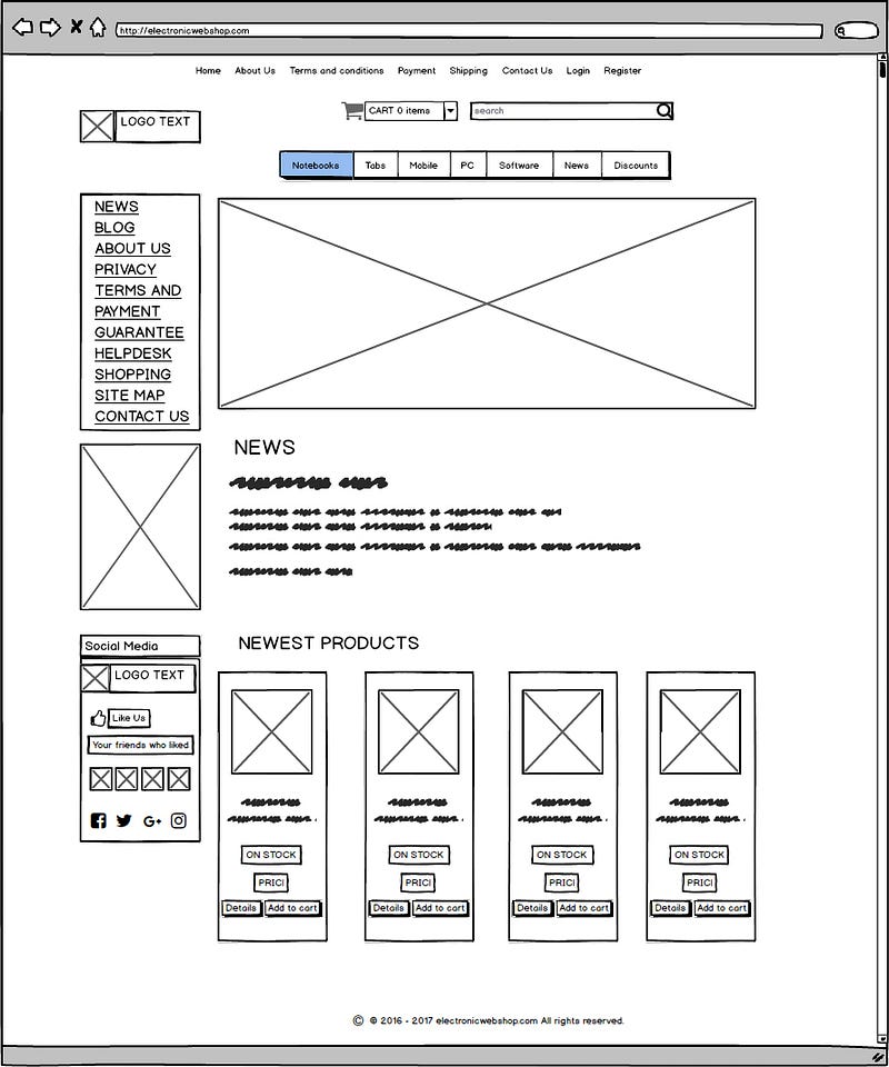
My all time favourite when it comes to building static wireframes! It’s not only fast to learn but also super convenient to use. It also offers the same drag and drop style editing as UXPin. I highly recommend it to anyone who has just started building wireframes or plans to do so in the future. You can create professional, marketable wireframes. It’s available on both Mac and Windows. Here’s an example of a project I’m currently working on. It’s a webshop still in development for electronic and household goods.
Conclusion
There are common misconceptions when it comes to wireframes. The wireframe is all about making the project work focus the attention on functionality. This way is a low-mid level of fidelity. You can create wireframes and use them, whether you’re a UX designer or not. However, if your goal is to create them to improve user experience, focus on a constant user flow.
There are different ways to create wireframes, for example, you can go the traditional paper and pen way, or try dedicated software. Personally, I like to start from a Stenciling and work myself up to digital, using software like Balsamiciq or UXpin. If you are out of ideas, you can always inspect sites for cool wireframes with a tool like Wirify.
Don't forget, sharing is caring! :)

6 Comments
Rainer
2019-09-01 at 18:22Great article, thank you very much. It really clarifies the use of wireframes.
Robert
2019-09-03 at 14:33Thank you Rainer, glad you liked it! 🙂
My Ascension Portal
2023-01-17 at 10:43I am still searching for some proper solution Same issue still no fix to this.
https://www.my-ascension.net/
stumble guys 2
2023-02-01 at 10:10I am overjoyed to have, at long last, come across this website. Really thought-provoking articles and activities; many thanks for taking the time to put these together. Please continue to share additional content in the form of a blog. This website is now bookmarked in my browser so that I can continue to keep in touch with you.
How To Build A Hydroponic Greenhouse In Your Backyard
2023-06-21 at 02:46Wireframes are important for focusing on functionality and creating a blueprint for digital projects. They have a low to mid-level fidelity and can be used by UX designers or anyone interested in improving user experience. While wireframes primarily serve the purpose of outlining functionality, they can also help identify and address usability issues.
blog News
2023-12-30 at 19:05Wireframes ux presented a lot of nice information I really benefited a lot and this design is teaching me new things now