Creating a high-converting landing page is key to your online success, especially in digital marketing. Think of your landing page as a welcoming gateway. It’s like your virtual storefront where potential customers get their first glimpse of what you offer.
A high-converting landing page really stands out, especially when compared to other signup methods. It boasts an impressive 160% higher conversion rate! Unlike pop-up windows that might irritate some users or sign-up forms buried on different pages, your landing page is the first thing visitors see. It’s where their journey with you begins.
This guide will show you how to craft a high-converting landing page. It’s not just about grabbing attention; it’s about turning visitors into valuable leads or customers. We’re excited to share the secrets of successful landing pages. With our best practices, tips, and the latest trends, you’ll boost your conversion rates and generate more leads for your business.
Table of Contents
What is a high-converting landing page?
Let’s talk about a high-converting landing page. It’s a special web page with one big goal. Unlike your homepage which does many things, a landing page guides visitors to one specific action – we call this a “conversion.”
For your high-converting landing page, whether it’s getting people to sign up for a newsletter, buy something, or download an ebook, it’s super important. It helps build your brand’s trust and authority. This page is where you really engage and persuade your target audience.
A high-converting landing page can really boost your marketing’s return on investment (ROI). It means more conversions for every dollar you spend. This is a key measure to see how well your efforts are doing.
Types of landing pages
For your high-converting landing page, remember each type has its own purpose. It all depends on your marketing campaign’s goals. Maybe you’re collecting leads, helping customers decide, or closing a sale. The right landing page can make a big difference in reaching your goals. Let’s look at different landing pages, each made for specific campaign objectives:
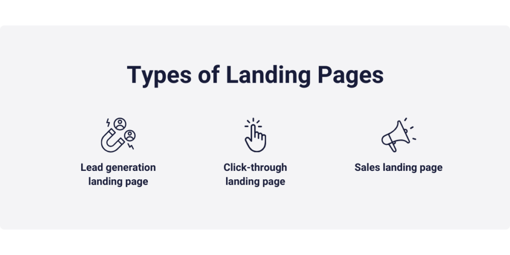
Lead generation landing page
A high-converting landing page is designed to gather important info from visitors. In return for something valuable like an e-book, webinar, or newsletter, you ask for their contact details. For instance, if you’re giving away a free e-book on digital marketing, you’d use this type of page to get the visitor’s name and email.
Click-through landing page
Click-through landing pages are key in getting potential customers interested. They give visitors all the info they need, preparing them for the big decision. These pages are all about getting folks to click through to your main product or service page. Like, if you have an e-commerce site, you’d use this kind of high-converting landing page to show off product benefits before guiding visitors to buy something in your online store.
Sales landing page
Sales landing pages are all about closing the deal. They aim to persuade you to buy something. Take an online store’s product page as an example. This kind of high-converting landing page highlights product details and benefits. It also has convincing calls to action, like “Buy Now” or “Add to Cart.”
Benefits of effective landing pages
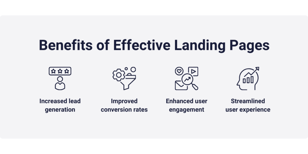
Why should you put time and effort into creating effective landing pages? Well, the benefits are huge! They can really boost your digital marketing ROI. Think of a high-converting landing page as a key player in your online success.
Increased lead generation
Lead generation is super important for many businesses. That’s where high-converting landing pages come in. They’re powerful tools for getting visitor information, and helping you build a great contact list. By using lead capture forms, subscription prompts, or special content offers, these pages encourage visitors to share their details for something valuable. This creates a pool of potential customers interested in what you offer. You can nurture and convert them, forming the core of your customer base.
Improved conversion rates
Did you know that, according to Wordstream, most websites have a conversion rate of about 2.35%? But, if your landing page is tuned for a specific goal, it’s more likely to turn visitors into customers or leads. A high-converting landing page is not just any web page; it’s a carefully built machine for conversions.
Its focused design and catchy content make it more likely that visitors will do what you want, boosting your conversion rates. A higher conversion rate means you’re getting more bang for your buck in your marketing efforts.
Keep in mind, though, what counts as a “good” conversion rate can really differ. It depends on things like your industry, who your audience is, and what action you want your visitors to take. Some areas, like e-commerce, often see higher conversion rates than, say, informational blogs.
Even though average conversion rates change across industries, a well-crafted landing page can beat these averages. This ensures you’re getting the best results from your digital marketing work.
Enhanced user engagement
Landing pages are like special doors to what you offer. They’re carefully made to get visitors to interact in a specific way. By matching the content and design with the page’s goal, you can really grab your audience’s attention and lead them through a unique experience.
For example, if you’re showing off new software, a high-converting landing page can highlight its cool features and perks, tempting users to dive deeper. This not only leads to more conversions but also helps people understand your product or service better. This builds trust and confidence in your brand.
Streamlined user experience
Building a high-converting landing page is all about giving a smooth and easy user experience. It guides visitors in a clear, logical way, making sure they easily find what they need. The simplicity and clarity of these pages make it a breeze for users to get around, understand your message, and most importantly, do what you’re hoping they’ll do.
Let’s say you have an e-commerce business launching a new product. By focusing your marketing on a landing page made just for this product, you can really grab potential customers’ attention. These pages give all the product info, show user reviews, and lead visitors through an easy buying process. This builds brand loyalty and trust. Plus, you can use analytics and A/B testing to see how users interact and keep improving the page for the best results.
In short, effective landing pages are great for everyone. You hit your marketing targets while giving potential customers a smooth and friendly experience.
10 steps to build a successful landing page that converts
Creating a high-converting landing page is all about the right mix of strategy, design, and content. Let’s dive into the key steps to make a landing page that really works. We’ll use real examples to make it easy to understand and do.
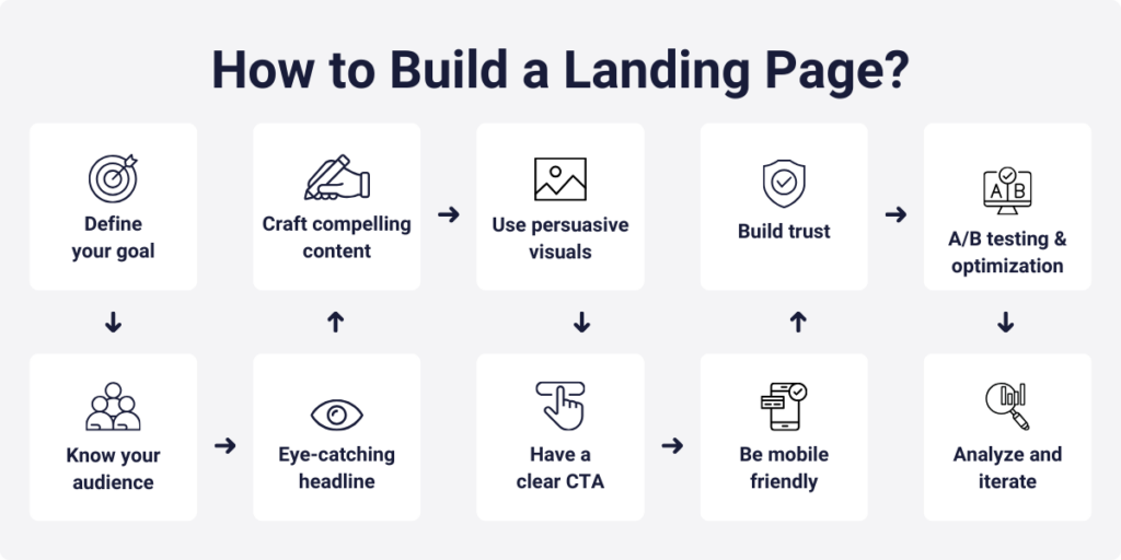
1. Define your goal
Every great landing page starts with a clear goal. What do you want to achieve? Maybe it’s getting email leads, promoting a product, or getting people to sign up for an event. Your goal shapes the design and content of your page. For example, if you’re an online store with a summer sale, your goal is to boost sales with discounted products. Your page should clearly show this.
2. Know your audience
Knowing who you’re talking to is key. Figure out who your ideal visitors are, their problems, and how what you offer solves these problems. Suppose you’re a fitness coach with an online program. Your audience might be fitness fans wanting to shape up. Your landing page should then focus on how your program helps them reach their fitness goals.
3. Craft an attention-grabbing headline
Your headline is the first thing people see. Make it catchy, short, and focused on your goal. If you’re a software company with a productivity app, a headline like “Double Your Work Efficiency with Our Innovative App” tells the value straight away.
4. Develop compelling content
The content on your landing page should be clear, to the point, and convincing. Use bullet points, short paragraphs, and visuals to get your message across. For instance, if you’re crowdfunding for an eco-friendly product, create content that highlights its green features, benefits, and why it’s important for a greener future.
5. Use persuasive visuals
Pictures and videos make your landing page pop. Choose high-quality visuals that match your message. For example, if you’re selling a tropical vacation package, include bright images of the destination, smiling travelers, and fancy hotels. Here’s how you can create a high-converting landing page with WordPress.
6. Have a clear call to action (CTA)
Your call to action is key. It’s the link between what your page says and what you want to happen. It guides, motivates, and makes the path to action clear. It’s super important for meeting your goals. So, if you want people to sign up for a digital marketing webinar, your CTA could be as simple as “Reserve Your Spot Now.”
7. Build trust
People shopping online are smart and careful. They don’t just trust any company or website they see. To win over these cautious visitors, you need to build trust. Add things like customer testimonials, case studies, certifications, or security badges. If you’re offering a course in financial planning, show success stories from past students who got better with money.
8. Make sure it works on mobile
Most people use the internet on their phones, so your landing page must work well on mobile devices. Test your page on different devices to make sure everyone has a great experience.
9. A/B testing and optimization
Even after your landing page is up and running, there’s more to do. A/B testing helps you see which version of your page works best. You make two similar landing pages with one small change, like a different headline or button color. Show these to visitors randomly, and track which one does better.
Using the data, you find out which version gets you closer to your goal. Then, use the better version as your new standard. Keep testing and tweaking to make your high-converting landing page even better.
For instance, an e-commerce site might test different images to see which ones get more sales.
10. Analyze and iterate
Keep an eye on how your landing page is doing with tools like Google Analytics, Adobe Analytics, and Hotjar. Look at things like conversion rates, bounce rates, and how users behave. Use this info to keep improving your page.
To give your page an extra boost, try using tools like Capturly. It has features to help you track and better your landing pages. If you’re using WordPress, you can add Capturly with a plugin, making it easy to watch and enhance your landing pages.

Best practices in creating high-converting landing pages in 2024
Landing pages have really evolved. Today, making a high-converting landing page is not just about looking good. It’s about staying on top of the latest trends. By following these best practices, you’ll keep your landing pages not just current, but leading the pack in the fast-paced world of digital marketing.
1. Mobile-first design
With most web traffic coming from mobile devices, it’s crucial to focus on mobile-first design. Your landing pages need to look and work great on any screen size. In 2023, over 60% of web traffic was mobile, says Statista.
💡 Take Airbnb’s mobile landing page, for example. It’s super user-friendly and works well on various devices, meeting the needs of their wide range of users.
2. Speed and performance
How fast your page loads is super important. It’s often the first thing visitors notice about your site. Slow-loading pages can turn people off, making them leave before seeing what you offer.
Fast-loading pages, however, make for a smooth, responsive visit. They keep visitors interested, encourage them to check out your content, and help them do what you want them to do. Make sure your pages load quickly to keep visitors from leaving.
Google’s Core Web Vitals are a big deal for search rankings in 2023. Google says 53% of mobile site visits get dropped if pages take over three seconds to load.
💡 Airbnb nails it again with its quick loading times. Their focus on speed really makes them stand out.
3. Personalization
People now expect websites to know what they like. They don’t want to waste time on stuff that doesn’t matter to them. They want info and suggestions that fit their needs, interests, and what they usually do online. Personalization helps cut down on too much information and makes online browsing faster and better.
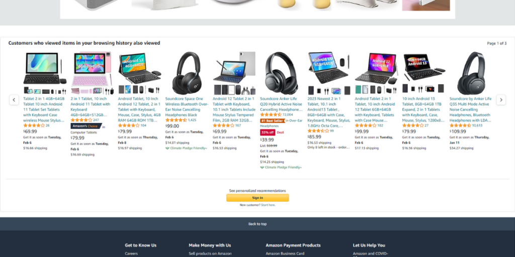
Did you know personalized content can boost sales by 20%? Try to make your high-converting landing page content fit where your visitors come from, or what they like and need.
💡 Amazon is awesome at this. Their pages suggest products based on what you’ve looked at or bought before. By tailoring content to your likes, Amazon gets more people to buy stuff.
4. Video content
Unbounce says videos on landing pages can up conversions by 80% or more. Videos are a strong tool. They get your message across quickly and effectively. You can tell an engaging story, share key info, and show why your product or service is great, all in a short time. Videos can also make people feel something that just words can’t. With pictures, music, and talking, you can connect with your audience on a deeper level, which can really influence their choices.
💡 Take Airbnb’s ‘Experience Airbnb’ campaign. Their amazing videos showed the cool experiences you could have traveling. By taking potential customers to their dream places through video, Airbnb really bumped up their conversion rates.
5. Clear and compelling headlines
According to Content Marketing Institute, 80% of people will read your headline, but only 20% will read the rest of your content. Your landing page’s headline is its first impression so craft powerful headlines that guide visitors toward the desired action.
💡 The Tesla website consistently features compelling headlines. Their Model 3 landing page, for instance, combines a powerful headline with visuals that evoke a sense of luxury and sustainability. The clarity and impact of the headline help guide visitors toward the desired action.
6. Social proof
Trust is paramount for conversions. At least 91% of people regularly or occasionally read online reviews. Use social proof elements like user ratings, case studies, or statistics.
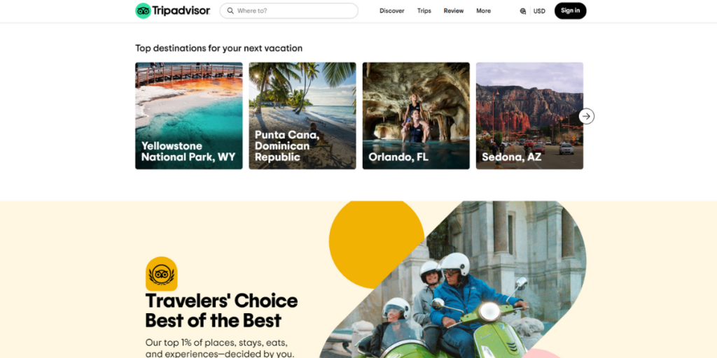
💡 TripAdvisor, the travel website, excels in providing social proof. Their landing pages feature real traveler reviews and ratings, helping users make informed decisions and building trust in the platform’s recommendations.
7. A/B testing
A/B testing remains a best practice in 2023. According to HubSpot, it can lead to a 5-10% increase in conversions on average.
💡 Optimizely, a leading experimentation platform, practices what they preach. They continuously experiment with various landing page elements to enhance user experience and optimize conversions. A/B testing ensures that their landing pages are always at their peak performance.
8. Minimalistic design
Minimalism in design is getting popular. Simple landing pages make it easier for users to focus on the content and what you want them to do. Plus, they load faster because they’re lighter in file size and code. Quick access to content is key these days.
Get rid of stuff that might distract visitors from your main goal. Take away menus and links that could pull them away from the page.
💡 Apple’s website is a perfect example of minimalism. Their product pages are clean and focused. They keep it simple, guiding users to the product info and the ‘Buy’ button.
9. Scannable content
Did you know people usually just skim online content? That’s why having scannable content is a must. It makes your page 47% easier to read, according to Nielsen Norman Group.
💡 Slack’s high-converting landing page is a perfect example. It uses short headlines, bullet points, and visuals, so visitors quickly get what Slack offers.
10. Progressive web apps (PWAs)
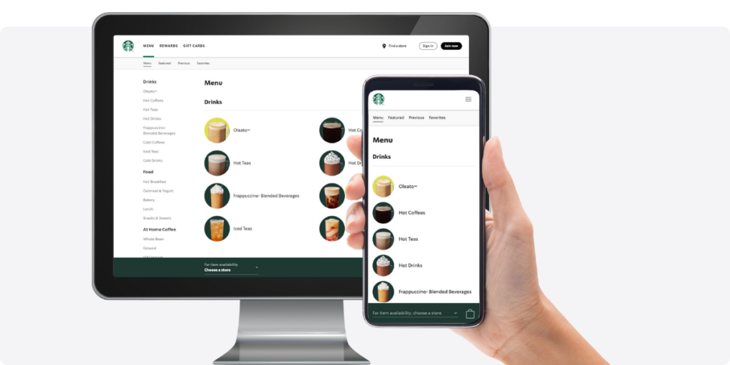
PWAs are like web apps but feel more like regular apps. Google Developers say they can boost conversion rates by up to 52%. They’re responsive, work offline, and have other cool app features, but are as easy to use as web apps. This makes them awesome for businesses wanting a smooth experience on different devices.
💡 Starbucks uses PWAs really well. Their PWA lets customers order, pay, and earn rewards just like in an app. This makes things easier for customers and helps Starbucks get more sales.
11. Accessibility
Accessibility isn’t just a trend, it’s super important and often required by law. It means making your content and site work for everyone, including people with disabilities. This includes things like text for images and videos, making sure you can use the site with a keyboard, captions for videos, and making sure screen readers can read your site.
💡 Apple is a leader in accessibility. They make sure all their stuff, including landing pages, can be used by anyone. By making your landing pages accessible, you avoid legal issues, reach more people, and show your brand cares about everyone.
12. Chatbots and AI-powered assistance
Statista says 67% of people have used a chatbot for help in the last year. Chatbots and AI help keep users interested by giving fast, personalized answers anytime. They’re great for quick replies and pointing users to the right info.
They can also do routine stuff like setting up appointments or tracking orders. This lets humans focus on more complicated stuff and helps users get the help they need.
💡 Zillow uses chatbots to help people find homes. They give instant support, keeping visitors on the site and helping them find what they need.
Conclusion
In conclusion, creating high-converting landing pages is an indispensable skill for any digital marketer. The benefits are clear: increased lead generation, improved conversion rates, enhanced user engagement, and an overall better user experience. With the steps and best practices outlined in this article, you now have the knowledge and tools to build landing pages that consistently deliver results.
Building high-converting landing pages is an ongoing process that requires continuous testing and refinement. Remember, your landing page is your digital storefront, and it’s worth investing the time and effort to ensure it converts visitors into valuable leads and customers.
So, are you ready to start building landing pages that convert and take your digital marketing campaigns to the next level? With the right strategies, tools, and a commitment to optimization, you can drive your online marketing success to new heights and achieve your business objectives. Don’t hesitate – get started on your journey to building landing pages that convert today!

Don't forget, sharing is caring! :)

![How to Build High-Converting Landing Pages in 2024 [Real example]](https://capturly.com/blog/wp-content/uploads/2024/01/How-to-Build-High-Converting-Landing-Pages-in-2024-Real-example-1.png)
3 Comments
fnaf
2024-01-08 at 02:44This is a strong start to the table of contents for an article on building high-converting landing pages in 2024.
little runmo
2024-01-18 at 10:35Therefore, adding social proof to your landing pages is an excellent way to enhance conversion rates. This could be in the form of a testimonial, review, or even a simple display of a brand’s popularity on social media.
Fnaf
2024-04-09 at 11:10It is gratifying to peruse blogs that acknowledge the significance of offering complimentary, superior resources.