Every problem is a little different from another. If you ask experts, each of them would say different solutions, but it’s not because they would try to fool you. Since they just analyze the whole process differently. The least I can advise you is to read this more than once, and always try to highlight parts that can bring a solution to your upcoming problems. Make experiments and shape my tips for your benefit. Trust me, it will lead to success!
Table of Contents
1. What are UX and UI exactly?
Understanding the exact meaning and the difference between the two abbreviated words, UX and UI it’s not an easy task at all, so I suggest starting with that. Since, if you are not familiar with these expressions, you never know the real meaning of this article and your conversion funnel may fall to its own death.
UX means user experience, which is responsible for the joy of your users.
- How satisfied are they?
- How do they react to your updates?
- How do they express themselves when they are angry?
Those questions are a key factor to answer and measure, month by month, sometimes day by day to know your visitors a little bit. When an average user/consumer tries something, their brain reacts to those new effects somehow. If we try to work with our user’s experience and of course we want to, since that’s the purpose of starting a business from the beginning, we have to be sure that those reactions must be shared with us. Neither the user nor the company wins anything if they don’t cooperate with each other. User’s experience ensures that cooperation.
User Interface as known as UI has a little different meaning than that. It’s restricted to the visual elements, pages or screens where the user can communicate with the company. This is like a system where the user lands, or what he touches when he wants to buy a product, or a service in the online world. It’s part of UX, but that means a little more, so we usually separate them.
Taking care of your customers is a very complex and hard job, sometimes it’s almost impossible to concentrate on all the aspects. Although there are some rules of both the User Experience and the User Interface which you must obey since it can influence the costs, the consequences, and even more: Your company’s future!
In this article I give you a few different ideas on how to use both of them correctly!
2.1 Simple screen layouts
Minimizing costs is not always easy, the statement which claims “The more price the better it is” is usually true. But not always. This first piece of advice is a very good example of that. Mostly making a good website means you have to buy a good editor, which sometimes costs more than 100 dollars per month. Although you can trick the system with free-to-use programs, it’s not really worth it since those are very complex for a starter. Often, it’s not too easy to navigate yourself in it, because your tools are unsorted, and you can’t determine what functions are not free-to-use, as it’s not so clear at the beginning. Luckily, most of the time the main problem is tinier than you think.
Let’s see an example: You don’t understand why the conversion rate is so little when it’s crystal clear that your competitors are getting well. You tried to analyze the conversion funnel, and you realized that after the first step, your bounce rate is really high. You are very desperately searching for the key, and in the end, you realize that it was in front of you the whole time. The lookalike of your website. If you sell products mostly to men, it’s unlikely that a purple background on a website could win their attention.
It was just a very simple example. But have you ever thought about how influential part of a good website is the screen layout itself? I heard stories about a company, which was keen to find new customers online, and after a lot of failed, unsuccessful updates, they almost gave up. Luckily at the very last minute they found out the main problem: their payment flow was a mess. It just covered 1/3 of the website screen, and there were a lot of other distracting elements. After they solved those mistakes their conversion rate went up by 400%, nowadays they have overtaken a lot of their older rivals.
So my first advice is as easy as it seems: do not overthink your problems! Try to focus on the simple solutions. Most of the time, it’s enough to go back on track.
2.2 Introducing the Fitts’ Law
Have you thought about why the space bar is the biggest part of our keyboard yet? Or why the ‘turn on’ buttons are usually tinier than the ‘turn off’ buttons in big household appliances?
It all came from a simple exploration, which was developed by Paul Fitts in 1954. It’s a simple formula that includes a mathematical description. The law predicts that the time required to rapidly move to a target area is a function of the ratio between the distance to the target and the width of the target (Wikipedia). How can we use this law in reality in connection with user experience? Luckily it’s very easy, let me show you:
Most of the time your users click to the largest buttons. They don’t like the little ones, since they do not read them as well. When your mouse is far away from a little call-to-action button, it takes so much energy to reach that, and also it increases the amount of time you spend doing it. Our brain doesn’t like that. Although if you use bigger call-to-action buttons which are near from your cursor, you increase the chance that a user finds it interesting and clicks on it. So, in a simplified way: put your most influential call-to-action button at a very comfortable place, and increase it to that point, where it is still visually pleasing.
But you have to know about two different rules, which restrict this whole idea a little. First, like every aspect of life, there are limitations. You can increase the size of your call-to-action buttons, but not to infinity. You have to take care of the lookalike of your site as well and you mustn’t oversize your buttons if it affects its beauty. Moreover, large call-to-action buttons can easily slow your entire website, so I advise you to use them, but not in all cases.
Secondly, it’s also important to determine the average place of the landing cursor. Heatmaps help you to achieve it, since this graphical representation shows you the given data on a color scale. Seems easy, but do not forget, it can be a different number for each user, so it can take a long time. However, that is a very important part of the whole process, as you may know, without monitoring the average value, you don’t see the bigger picture about your users habits and you can not determine where should you exactly put your large call-to-action buttons. If you keep these two rules in your mind, but also use Fitts’ law regularly, you probably make an improvement in the first 1/2 part of your conversion funnel.
2.3 Customer journey map – your main friend
Looking after your customers’ experience is one of the key factors which will depend on how great your company’s future will be. I have known some researches where researchers were curious about how important this whole process is exactly. When they evaluated the results, they were in a shocking mood. Basically, 80% of customers now consider their experience with a company to be as important as its products. Also, 91% of customers agree that a positive customer experience makes them more likely to purchase again. It is so surprising since these percentages are almost the opposite of what people experienced in the twentieth century. When our ancestors wanted something, they cared less about the brick-and-mortar shop itself. Back in the day, it took more time to go to another shop, so for example, they couldn’t compare the prices either. They just wanted a quality product that could satisfy their demands. Nowadays, the situation is not that simple. There are more products on the market than ever before, moreover there are numerous sites, where you can order the chosen products easily, instead of driving miles to reach one shop to another. If there are choices, the customer will sort from the possibilities. There are five stages in the digital customer journey. It means you have 5 unique chances where you can attract the attention of your products, your company, or your site.
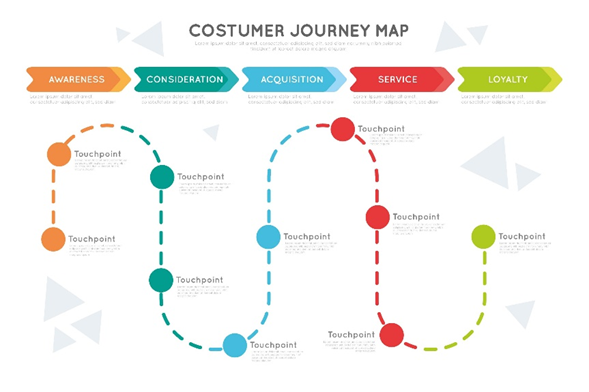
Does are:
- awareness
- consideration
- purchase
- experience
- loyalty
Do not miss one of them! But how can it even be possible to look after every part of it? A customer journey map may help you go through this barrier.
The customer journey map is a tool to visualize the experience of interacting with your brand from the customer’s point of view. Basically, it contrasts your and your customer’s thoughts. Your main task here is to face your thoughts and your customers’ opinions. Then sort them, to create pairs and unmatched parts. You don’t have to worry about the pairs; it means not just you, your customers love those parts of your company as well. The unmatched elements are the main problem. Your clients don’t like those. No matter how important those elements are for you, you must leave them out. In case you want happy customers.
2.4 Simplification—Sometimes less is more
A website is usually one of the brightest stars of a company. It can message to the world how fascinating the whole firm is, therefore people tend to spend more time making a site than they should. Don’t get me wrong, I do not say that it’s always a time-wasting process to improve your site, but most of the time a simple and clear one can generate much more visitors than a complex one. Moreover, a simple site can load up faster for any of your customers no matter how bad their internet connection is, so no one will complain about the huge load times and you rarely lose customers at the first few parts of your conversion funnel.
Complaining is also very common if they cannot find a place to write down all of their problems. So a help desk is essential to be created, where one of the employees is available for the given questions at least 8 hours a day. It will also simplify your time management, moreover, if a problem may occur, your customers will inform you at the very first minute. Just think about it, instead of spending enormous money to find out your latest bugs, your customers will share with you for free. Implementing this idea does not just mean that you don’t need to make forms every day if you are curious about your client’s opinions. You can also easily build a happy atmosphere around your company which surely gives a boost, and generates better user experience.
Also, you have to be aware of the fact that the customers arrive at your site to buy something, instead of looking around at your newly created features in connection with your site. There are at least two easy questions, which you must answer before implementing a new idea:
· Will it boost the conversion rate of the website?
· Will it influence and increase the user experience?
If at least the answer was ‘yes’ to ½ of the questions, give it a try. If not, do not waste your precious time doing it. Instead, let’s focus on other problems, which your customer’s journey map advises you!
2.5 Ask for help before something goes wrong
People are usually more likely to give help instead of getting it. It hurts our ego so much. Especially mine. I don’t like it either. But if there is one little thing that you must learn from this article, it must be this: if you do not know or understand something, ask professionals! They will help you, and it takes just a couple of minutes. In the short term, it can be more expensive than figuring it out yourself, although you save a lot of time, which you may use to develop other parts of your site. Professionals know how the conversion funnels are working, they know how to find the exact place of a mistake. They have been collecting experience for a very long time and they are happy to share it with you. Also, there are a lot of applications and products which help you to analyze problems faster and easier. Here you can both ask professionals and use their product, so at the same time of fixing problems you might learn something too.

Nobody will think you are less smart if you call for help. It’s like a good attribute which quite a few people have. Use it!
Conclusion
To overall my list I realized that the main parts of our problems occur because we are perfectionists. We love overthinking anything which is possible, and avoid simple solutions such as creating a simple website, our ask professionals.
There are three key part how you can achieve the goal, which I mentioned in the title of this article:
- Simplify everything
- Understand your customers behaviors and feelings
- Give them everything what they want
That’s the easiest way to minimize costs and maximize user experience!
I hope you find my article both interesting and instructive. I think with the help of this, you can reduce costs and increase the power of user experience. The article contained a lot of examples, some of them happened with my friends and colleagues, which has ensured the easier understanding of the article and also it has given context to my writing. I hope you find it informative!
4 Comments
APIs Travel
2023-03-13 at 08:04Amazing blog and valuable information. Thanks for putting so much effort in writing this Blog.
Data Science Course
2023-03-17 at 06:06I believe user experience is the most vital factor
Airline Reservation System
2023-03-21 at 11:10Great post. I write and manage two blogs by myself and I know the efforts it takes to write such an elaborate one.
Brigade Xanadu
2023-03-23 at 13:56Nice article! Thanks for sharing this informative post. Keep posting!