Creating a real estate website is “not a country for an old man”! The dynamic improvement this industry has faced – especially in the online scene – in the last couple of years was stunning.
Compare an old real estate website to a new one: the difference is huge, in almost every aspect. This is not a coincidence. Even in the COVID era, the total revenues from real estate transactions increased. Increased, but some parts of real estate got out of the offline world and switched to the online scene. In today’s world, it is unimaginable to reach success with your real estate business, without having a website.
But not just a website, because you want to create a better, more time-resistant website than your competitors’ websites. Well, we have some good news! It is your chance! In this article, we will share 18 (!) effective features that all lead you to a better real estate website than your competitors have! Do you want to stay on the top, or become the best real estate website in your region? Read this article out!
Table of Contents
Effective features real estate websites should include
As we mentioned, we sorted out 18 interesting features that have already dominated or will dominate the online appearance of real estate businesses. However, we not only wanted to share with you these tips. We wanted to give a more understandable structure to our article.
That’s why we created 4 topics, or brackets to which the tips belong. These brackets show the certain issue, which the given features can help you deal with. These are:
- Features that enhance the user experience
- Effective features to be more reliable
- Technical opportunities
- Features to grow your audience
Of course, not all features can be separated into one single group. However, all have one specific area that they most partly belong to. Thus, we only mention a feature in one group.

Features that enhance the user experience
Implementing these features most likely enhance your real estate websites’ user experience. Introduce some of these features, if you have a great number of new visitors, but are lacking in convincing the remaining buyers. Or when the visitors always remain visitors, and can’t be converted into buyers.
1. Highlight the best properties
When visitors get directed to your site or intentionally click on your website on Google, it is not completely sure that they will buy something from you. In fact, most of the time they won’t buy anything.
In terms of conversion rate, the real estate industry has one of the lowest: on average 1% of the visitors get converted in the end! That means that for every 100 visitors, there’s just one who actually buys something from you, fills out a form, or subscribes to your newsletter. However, highlighting the best properties on your landing page can help you avoid reaching an even worse percentage number. In fact, it can even grow this number between 3-5%!
Highlighting the best offers is not a new marketing idea. Showing your best gems may fascinate the potential buyers, and convince them about your sites’ credibility.
Let’s see an example of Rightmove.co:
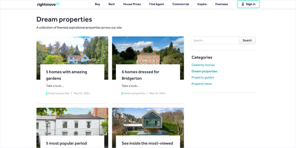
Who has the money to buy this castle? Probably 0.001% of the USA’s population. But if the business puts these into the spotlight, potential buyers more rather go through the funnel.
2. Fascinate the users with virtual tours
Virtual tours are something that is not a general feature across the market. A virtual tool is a video simulation or a panoramic view of an existing place available on the internet. The creation and the fast development of virtual tools are connected to the continuous closing by national governments between 2020 and 2022. However, after the descending effects of the virus, virtual tools are still a real deal.
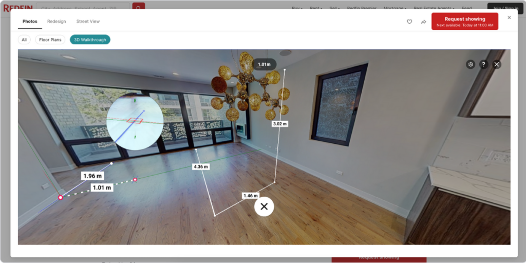
Why? Because it both fascinates the users and makes them clear about their decisions. Static photos have some important disadvantages: there are always black holes that the visitors can’t check. A photo may be taken at one side of the room, but that’s not enough! The following question always gets stuck in our head: what if they want to make us fool?
Well, virtual tours help you be more calm with a 360° of watching capability. Also, this brand-new function can enhance excitement among the buyers which leads to better conversion rates.
3. Create blog contents
Blog content is not for one-time users. However, in terms of a real estate site, it’s a false interpretation that you only need to focus on one-time buyers. The biggest real estate websites take part in renting, selling, recommending mortgages, or finding real estate agents.
These roles all require buyers to open the site more frequently than opening it every 10 years. Studies show that acquiring new customers is 5 to 25 times more expensive than convincing the existing ones. So it’s critical to have some features to keep the existing ones close to you. One way is to publish blog content from time to time.
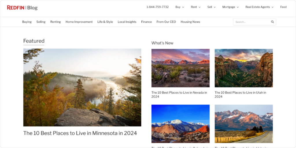
Why? Because developing trust with your customers is essential in this industry! And with blog content, where you can demonstrate your team’s expertise and professionalism it is easily achievable.
Think it out: would you rather trust a real estate website that has no record of its knowledge, or another that continuously publishes blog content about new trends, best strategies, or educational stories? Well, most of us will choose the second without a question!
4. Make your pics beautiful
A simple feature, yet very relevant today. Not just a luxury real estate website design needs to work with perfect pics, but the one that sells normal houses as well. Pics are the greatest friends of a real estate website since they can demonstrate the value of the sold product. If the pictures are lower quality, it’s harder to connect them with higher price tags.
Let’s see a home on Apartments.com:
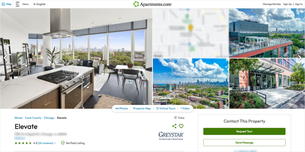
If you can’t photoshoot this home with a great camera, or can’t post it on your site in high quality, it would say a lot about your site’s professionalism.
5. Use your CTAs consciously
Yes, when there are 8 steps from reaching out to the landing page to buying the actual house, you will have a high drop-off rate. Although, sometimes you simply can not decrease the number of steps, CTA-s are a great way to push your customers where they want to go.
CTA, or Call-To-Action is a prompt on a website designed to take an immediate response from the customers, guiding them toward a specific action.
Let me show you the power of this feature, with the help of the most popular real estate website, Zillow.com:
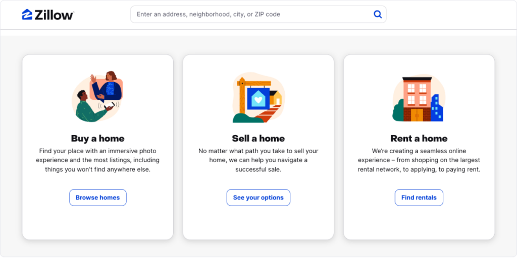
If you scroll a little bit down on Zillow’s landing page, you can see three different options, with three different CTA-s. The thing is: from the menu bar it seems a little bit tricky to choose the right option based on the customer’s preferences. However, clicking on the right CTA immediately navigates the customer to the preferred place.
With the help of that, customers are more likely to end the shopping procedure.
By the way, with Capturly Analytics, our online data analytics tool, you can check each CTA’s success, by just analyzing click heatmaps.
6. Highlight contact information
Although imported real estate businesses into the online space were a huge success, some parts are still connected to the offline world. We want to look around in the house with our eyes and meet with the salesperson, or the landlord. That’s why potential buyers and renters need contact information!
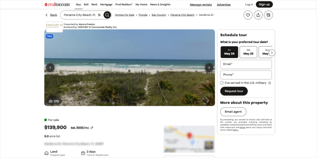
Yet, sometimes it takes so much time to find that. Highlight your (or if you enable other sellers on your site those as well) contact information on a general place! It not only avoids the visitors’ complete frustration but increases your website’s user experience, which definitely leads you to more loyal customers and better real estate customer retention!
7. Include a map function
A map function may feel like a very specific feature, but it can enhance the user experience of many customers. What does this mean in this specific case? It means that when the potential buyer sets the area where the potential buyer wants to search for the deals, a map shows up containing all the possible options.
This is Zillow’s version:
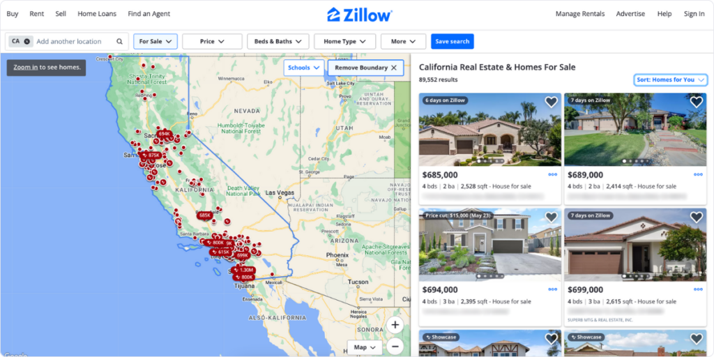
Here, you can even more zoom into the picture, and click into the designated house. When the potential buyer clicks on the red dot, the advertisement pops up! With this function, visitors can more easily deep dive into the deals, which increases their user experience. This function also increases the chance of a possible event, called “the purchase”!
Effective features to be more reliable
These features most likely improve your website’s reliability. Do you feel like your customers don’t think your site is credible enough? This is your chance to improve on that!
8. Give information about the neighborhood
Have you heard of people who tried to settle in a specific neighborhood, but failed?
Well, there can be several reasons for that:
- high crime rates
- too much noise
- lack of green areas
- lack of public transport
And there are way more other factors. Even if you found a great deal, you can’t be sure whether the price included these negative factors, or it was simply a great catch. “It’s better to be afraid than scared” – many countries use this expression in their own language, and its meaning becomes clear in these situations!
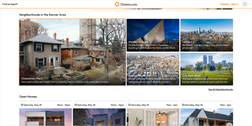
It makes the buyer so much more relaxed if this information is highlighted alongside the chosen house or apartment. It makes your site so much more reliable: “Well, this site doesn’t want to hide the negative parts” – many potential buyers may feel like this!
9. Display reviews
Reviews are also a great way to demonstrate more credibility from your website. According to Pwerreviews’s research, 9 out of 10 consumers consider reviews when making a purchase decision. Also, 93% of the buyers say that this content impacts whether they buy, or don’t buy the product.
We can take some consequences from this research: if social proof is not part of our website, we are going to lose many potential clients!
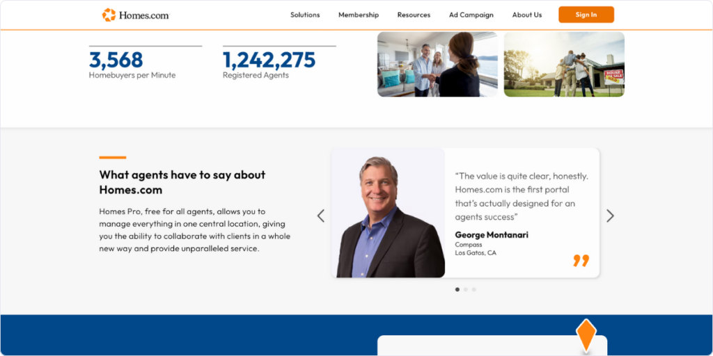
To achieve this you need two important steps beforehand:
- Have reviews on some specific sites – although some sites work with fake comments, we don’t recommend them as it’s easy to distinguish both from each other. It can even create negative effects.
- Integrate those reviews to your site – most likely need a tool that helps you do that correctly
And voila! Your business is even more reliable than it was minutes ago!
10. Display your colleagues like regular people
Most people have a general disinterest in real estate. Why does this industry actually exist? Why are there so many real estate agents around the world?
Some people even think that real estate agents are unreliable, have a lack of knowledge in the given industry, but hurry all the time. Maybe that’s true in some cases, but generally, it isn’t true. Real estate agents are not the devils in disguise, but helpful people who care for the seller first, and then the agreed commission rates.
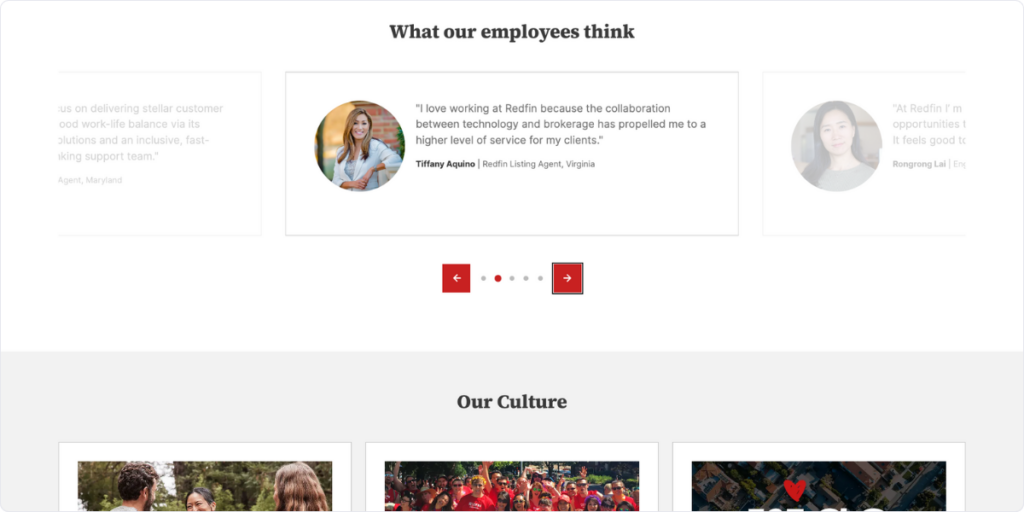
How can you reach that? Well, one way is to demonstrate your colleagues on your website in a friendly way. It’s better to throw the suit away and take a picture while they do something funny, or during their free time. Illustrate them as humans, and write individual introductions under all of their pics. Emphasize their personality, so potential customers can choose from people with different characteristics.
11. Protect data
Data protection is more important than ever in the online world. And it’s not only because the EU makes stricter and stricter laws about data protection, or that the biggest social media companies go to court once a week because of selling their users’ data.
We have started to understand how online presence works, and how easy it is to tell everything about our work, hobby, or the products that we buy every day. Data started to be a product, nowadays visitors no longer believe that something is free. “If it’s free you are the product” – all of us know this expression.
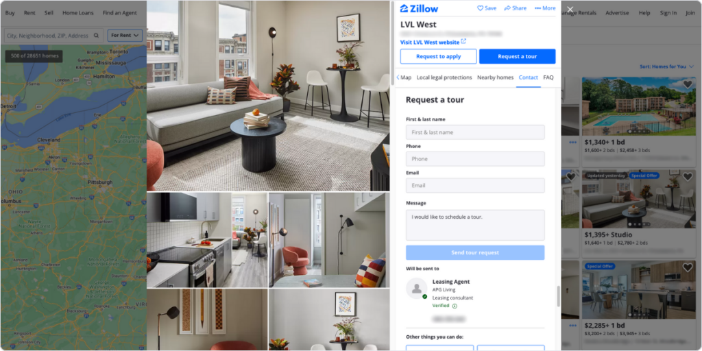
In the case of a real estate website, you probably need to hold a lot of personal information about your buyers. Credit card information, locational information, passwords, and email addresses. This data should never get into the hands of others.
Luckily, you have some good options for not only hiding personal information from data thefts but also from colleagues who unnecessarily take a look at this data sometimes. One of the best ways to do that is via data masking. Data masking is the process of hiding data by modifying its original letters and numbers. Because of this, even if your role is only to establish a connection between the seller and the buyer (they sign the documents on your site), they can be sure that you can’t get access to this critical information.
12. About Us page, the key to persuasion
As we have already discussed, a real estate website needs to ensure the potential buyer that their money is in good hands. They are for the buyers, and not the buyers are for delivering the company to its peak. But you can’t work on enhancing their trust in your landing page.
That’s why the About Us page can be the key to delivering this information. In this specific sub-page, you can share information about the working mechanism of the business, just as:
- The company’s vision
- Cultures and values
- The business model
- Directors and coworkers
Well, Rightmove’s “about” page is all about answering these questions. Moreover, you can also download all the documents connected to corporate governance, and information about their investors, and stakeholders. On top of that, there is a financial calendar function, where you can take a look at what’s coming in the near future.
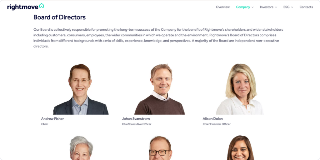
These acts definitely help to be more reliable in the customers’ minds. If something has relevance in this industry, this factor is definitely one of those.
Technical opportunities
In the technical opportunities section, we tried to sort out those features that can be connected to other positive attributes, just as more reliability, or understanding of the visitors better. However, implementing these features is nothing without a great knowledge of mainly in terms of programming. Although these opportunities are hard to implement if you don’t have enough resources, the effect can be even bigger than in the case of any other group.
13. Create an identifiable domain name
If you search for AI.com do you know where you will land? On Google Geminis site! Businesses spend huge resources on finding the best domains for their business.
But, why is that so important?
If a domain name is easily memorable, includes keywords on your specific industry, or has a “.com” ending, you can expect more organic searches than most of your competitors.
Let’s see the difference between Apartments.com, and Redfin.com, two very well-known USA-based real estate companies. We should agree that in terms of the better domain name, Apartments.com is the winner. Their name is in full harmony with their potential buyers’ keywords, or especially one, the word: “apartment”.
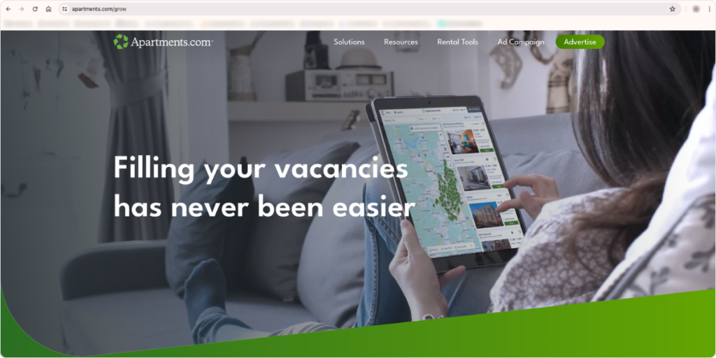
Currently, half of Apartments.com’s traffic comes from organic search, while that’s just 37% in the case of Redfin.com (Similarwebs’ data). Even if we couldn’t neglect some other factors in this equation, the power of an identifiable domain name is not just a fictional story.
However, you need to start thinking about the perfect domain name even before you launch your website. Also, you need to check expired, or almost expired domain names from time to time to find a gem, unless you don’t want to pay too much.
14. Develop an advanced filtering option
When people are looking for new homes they have expectations. Flat/house, buy/rent, or the maximum price that they theoretically pay.
Do they want to go through all the options? No, they are only interested in those that pass their requirements. That’s why implementing an advanced filtering option is not a possibility, it is an obligation.
An advanced filtering option must contain:
- A price range function
- A home-type function
- A Types of building filtering option
- A Square meter filtering option
And there are some optional opportunities to add, like: property status, parking spots, or year-built filtering options.
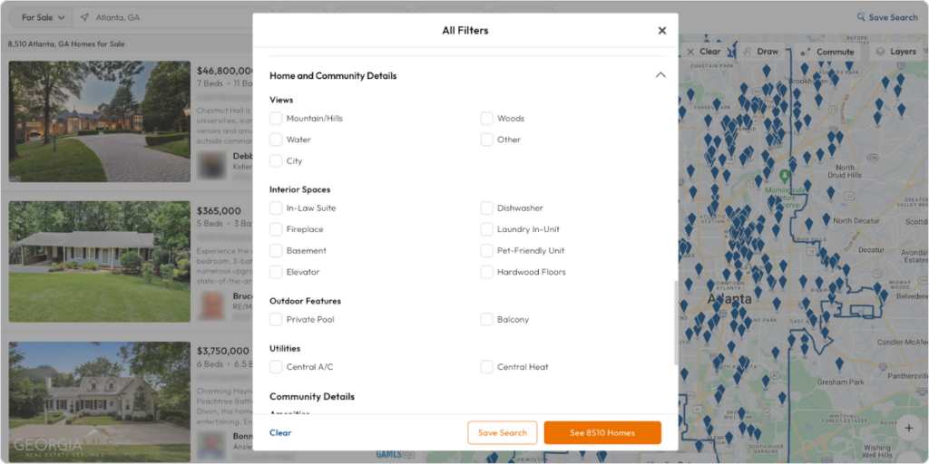
That’s one of the most effective features of all, but requires a lot of testing, and a lot of well-written programming codes. However, if you implement it correctly, you will extremely increase your site’s user experience, which leads your business to more time on your site by visitors. If you want to increase your real-estate website’s conversion rate, use this tip!
Capturly Analytics, our data analytics tool also implemented advanced filtering options to its tool, which became one of the main strength, and advantage amongst the competitors. So, this feature starts to be a standard in many industries.
15. Provide multiple languages
Of course, this tip depends on the country, and the region your business works. However, most of the time you should not stick with only one specific language.
For example, even in the European Union, only 51% of the citizens can speak in English according to a European survey. That’s even lower in other non-EU countries of this continent, and we still have not moved to Asia, where the situation is more complicated. First, you need to discover the potential language barriers of your target audiences, and if there are, you need to find a solution.
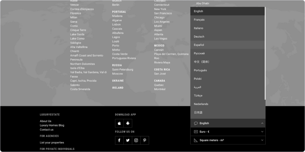
A multiple language option may require some translator inside the business, but if you calculate right, the benefits will be higher than the cost. You can grow your audience more, and discover new potential buyers on implementing this feature.
16. Use a responsive design!
Mobile users are more than ever. Research shows that mobile users were responsible for 66% of the global traffic, while desktop users accounted for only 33%. So two-thirds of the world’s population rather use their mobile phones when browsing the internet.
Even if in terms of purchases the ratio is not that mobile-oriented. Mobiles still lead in that aspect also. However, while desktop screen resolutions rarely mismatch, phones are another topic. 360X800, 390X844, 413X896 – These types of resolutions only cover a little bit more than 20% of the mobile industry.
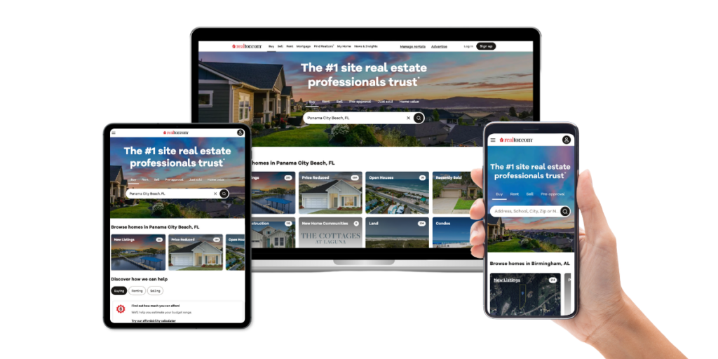
The summary is: you can’t optimize your site to all of them; unless you use a responsive design. “Responsive Web design is the approach that suggests that design and development should respond to the user’s behavior and environment based on screen size, platform, and orientation.”
So screen resolutions won’t matter, all of the visitors see the same. There are many software solutions for this specific problem, with a budget price. Although you may need to overwrite some of the codes, if you have a routine for this activity, tailoring a responsive design to your site should not cause any issues.
Features to grow your audience
These effective features all exist to grow your website’s audience. As sometimes it is not enough to promote your corporation to your well-known buyers, you need to travel to unknown waters. That being said, let’s see some real estate customer acquisition strategies!
17. Focus on renting as well
In the USA 65.8% of the population lives in a house on their own, while 34.2% rent a house according to some statistics. However, renting is getting more and more popular. While the prices of buying a house are constantly increasing in America, and Europe, the wages do not always follow the growing expenses. That’s why younger generations can’t afford to buy their own home, and renting is their one and only option.
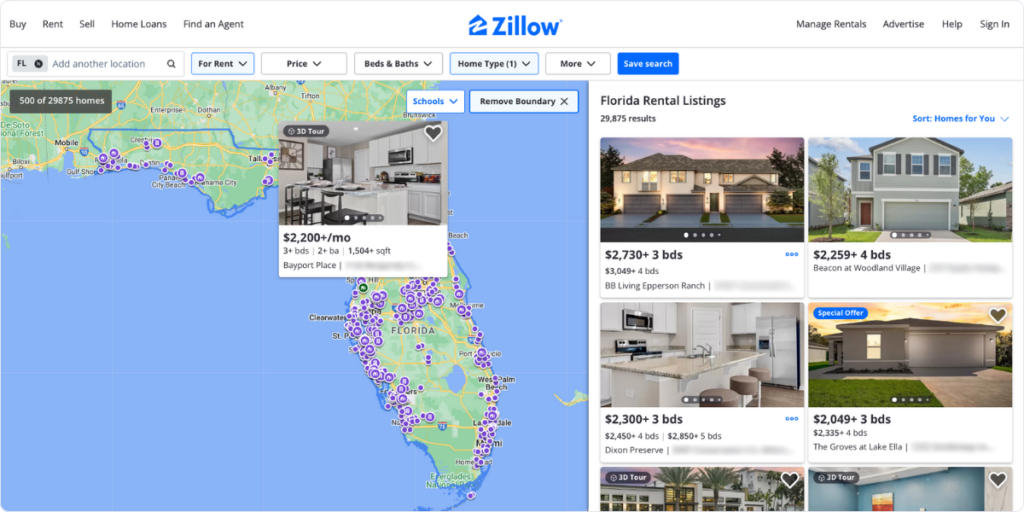
That’s why – if you want to grow your audience – you need to focus on renting as well. This is a big market full of new opportunities. The option of “renting” appears in all 5 market-leader American real estate websites. Thus, they fitted brand new options to their website, mostly for the comfort of renters. These are a pet-friendly home option, or checking the availability.
18. Add a home valuation calculator
You can open your website’s gate to another segment. Like, most of the time people not only want to buy houses, but some of them want to sell them as well.
However, the selling process starts with a hard task, and solving it usually requires professional help. Do you know the value of your house? Most of the time, no! Even if you remember the cost of building it up or the price that you bought years ago, these are completely irrelevant things by the time you sell it.
The demand, the continuously changing prices of construction products, and the current price sensitivity all influence the current price. And we haven’t spoken about one of the main factors: the current state of the house!
Well, an online tool can’t help you estimate your house’s current status, but can predict the possible price by analyzing the last sold houses near your area. This is what Redfins do! You only need to type your address, and the program lists all of the currently advertised homes near your area and the final price of the sold ones.
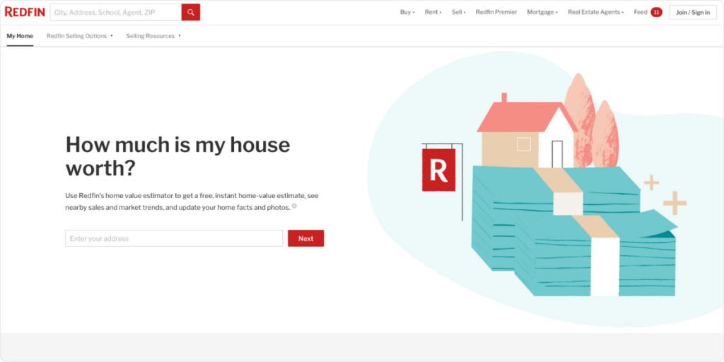
Even if this calculator can’t give you an in-depth answer to your question, here is the real deal: after the research was made completely free, the tool recommends choosing a real estate agent who personally analyzes the house’s current state and the possible price. This strategy not only pulls new members to a real estate community but leads the company to more money.
But first, get to know your visitors
If you know your visitors’ better they will be more likely to enjoy the time spent on your site. And the more they like it, and their user experience gets better and better, they will choose your site again and again. Well, we have already mentioned features about user experience, and the ways how you can enhance their buyers’ loyalty.
However, without understanding them, and knowing what they really want, all your tries can lead to failure. To ensure that you are going in the right direction, you must know your visitors’ better!
1. Measure your success
Let’s say you implemented one of these features. In what ways can you track success? Sold quantity, or maybe comparing two months’ revenues?
Well, these may be the effects in the long term, but for a short time period, these can’t track anything. However, by using data analytics software you can track the average time spent on your site, conversion funnels bounce rates, and the number of sessions. These can all give you a more clear picture of your success than the first metrics.
So, our first advice is to choose a data analytics tool and add that to your website. If you want to get a complete experience but do not want to spend half of your profit on data analytics software, we encourage you to take a look at our tool: Capturly Analytics.

Capturly’s capabilities not only cover the general data analytics features: heatmaps, session recording software, or a conversion funnel analysis. Capturly also offers a brand-new “custom event” function! As the name stands for itself, this gives you the opportunity to set custom events and measure their performances inside the “acquisition” menu bar.
Let’s say you made a blog page, and you placed a CTA on your webpage that directs the customers to your articles. With the “custom event” function, you can analyze how many individual visitors clicked on the call-to-action, therefore you can evaluate the success of your new feature.
On top of that, you can also filter session recordings, and make funnels from the given data.
2. Gather data with surveys!
There are some aspects you can’t be aware of unless you don’t ask your customers about it. Let’s take, for example, NPS (Net Promoter Score)! This metric is used to track how likely your customers recommend your website to their friends and relatives.
It is crucial information as if they don’t recommend you, their user experience was not satisfactory. Therefore, they not only persuade fewer people to use your site, but they will also pick another website for themselves as well.
On Capturly Analytics, you have the chance to deliver in-email surveys to your existing customers to track information about them and make them speak about their opinions. In-email has some advantages over in-site surveys. In addition to that, more existing customers will deliver these questionnaires back, and you get more data to evaluate the results.
Capturly also helps with the evaluation process, as the tool offers charts about the percentage of satisfied, and dissatisfied users, and calculates average scores.
Conclusion
In this article, we chose 18 of the most effective features of a real estate website to look for in the near future. Some of us may already be implemented on your site, but you still have a couple of other options to choose from. Do not forget: the real estate industry has radically improved in the online world in the last couple of years. If you want to stay on track, a brand-new vision is needed, with many more new features, and most importantly: the willingness to learn and improve!
There are several reasons for that:
– Some of these features have already been implemented by industry leaders
– The statistic shows its success
– Industrial customer or seller trends show its efficiency
Some may require a whole new concept, some only require minor updates. Technical opportunities usually require more hard work, but the reward is better.
Effectiveness can be analyzed from both the visitors and the business’s point of view. When there are more visitors, or the remaining visitors have better user experience, and the business doesn’t spend too much resources on creating a new feature; we can categorize that as an effective one.
Some of these features will become industrial standards in the next few years. So, even if small real estate agencies don’t have to implement all at once, they have to opt for introducing more.
Some of the common mistakes include:
– Ignoring testing
– Ignoring user feedback
– Overloading the website with features
– Slow performance
Don't forget, sharing is caring! :)

