![How to design effective forms to increase conversion rates? [Guide]](https://capturly.com/blog/wp-content/uploads/2024/04/How-to-design-effective-forms-to-increase-conversion-rates-Guide.png)
Welcome to Capturly’s blog, where we’re about to uncover the secrets of effective form design. Imagine navigating a website and encountering a form that feels like a never-ending maze. Frustrating, right? Well, fear not, because we’re here to revolutionize the way you approach form design.
In today’s digital age, where attention spans are fleeting and competition is fierce, the design of your effective forms can make or break your conversion rates. But don’t worry, we’ve got you covered. From reducing friction and optimizing user flow to leveraging cutting-edge tools like Capturly for advanced tracking and optimization, we’ll equip you with the knowledge and tools you need to succeed.
So whether you’re a small business owner, nonprofit organization, or blogger, get ready to revolutionize your forms and supercharge your conversion rates.
Let’s dive in and unlock the secrets of effective form design together!
Table of Contents
How effective form design affects conversion rates?
Did you know that the way online forms are designed can have a big impact on whether people complete them or not? Check out these cool statistics that show just how important form design can be for getting people to take action on a website:
- 38% of people stop engaging with a website if it looks unattractive: Yep, almost 4 out of every 10 people will leave a website if they don’t like how it looks. That’s a lot of potential customers lost just because the design wasn’t appealing enough!
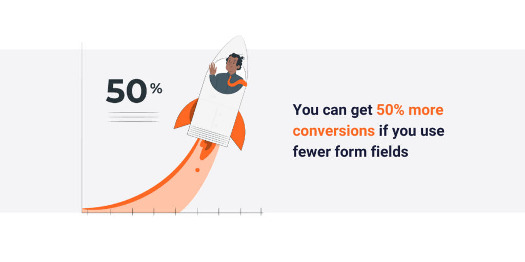
- 50% more conversions with fewer form fields: It’s true! When websites ask for less information on their forms, like reducing from four fields to three, they can get 50% more people to complete them. Less really is more when it comes to form fields!
- 81% of users give up on forms halfway through: Can you believe that? More than 8 out of every 10 people give up on filling out a form before they finish it. That’s a lot of missed opportunities for businesses to connect with potential customers.
- 94% of first impressions are based on design: When someone visits a website for the first time, a whopping 94% of what they think about it is based on how it looks. That’s why it’s so important for forms to be visually appealing and easy to use.
- Conversion rates drop 20% for every second of delay: Time is money, as they say. For every second that a website takes to load, the chance of someone completing a form drops by 20%. That’s a big drop in conversions just because the website is slow!
These statistics show just how much of an impact form design can have on whether people complete forms or not. By making effective forms look good, asking for less information, and making sure they load quickly, businesses can increase their chances of getting people to take action on their websites.
At Capturly, we understand the power of data-driven insights. Our heatmap feature provides visual representations of user interactions, allowing you to identify hotspots and optimize form placement for maximum impact. Additionally, our session recording with advanced masking ensures privacy compliance while offering valuable insights into user behavior.
What are the characteristics of a good form?
Before diving into specific tips, let’s outline the key characteristics of a well-designed form. Ever stopped to think about what makes a form go from “meh” to “wow”? Get ready to discover the secret sauce behind top-notch forms.
Whether you’re a student, an entrepreneur, or simply curious about web design, understanding these characteristics will unlock the door to creating effective forms that users can’t resist.
So, buckle up, and let’s embark on a journey into the fascinating world of form design!
Simplicity is key
Imagine you’re filling out a form online. If it’s short and sweet, asking only for the most important information, chances are you’ll breeze through it without hesitation. But if it’s long and asks for a bunch of stuff you don’t want to share, you might just give up halfway through. That’s why keeping forms simple is so important. Businesses that design effective forms with fewer fields are like friendly tour guides, guiding users through the process with ease and making it more likely they’ll reach the finish line.
Clarity is crucial
Have you ever been faced with a form that looks like a jumble of words and boxes? It’s like trying to solve a puzzle without knowing the rules! Clear instructions and labels are like road signs on a map—they tell you exactly where to go and what to do. Without them, users can get lost or frustrated, and might even abandon the form altogether. That’s why forms must be crystal clear, with easy-to-understand labels and guidance at every step of the way.
Accessibility matters
Think about all the different ways people interact with websites. Some use keyboards, some use screen readers, and some use voice commands. But did you know that over a billion people worldwide have some form of disability? That’s a huge number of people who rely on accessible forms to navigate the digital world. By designing effective forms with accessibility in mind—like using clear, readable fonts and providing alternatives for visual content—businesses can ensure that everyone, regardless of their abilities, can use them without barriers.
Mobile optimization is a must
How often do you use your phone to browse the internet? Probably a lot, right? Well, you’re not alone! With more and more people using smartphones to go online, forms need to work well on mobile devices. Imagine trying to fill out a form on your phone, but the buttons are too small to tap or the layout is all wonky. Not fun, huh? That’s why forms need to be optimized for mobile, with buttons and fields that are easy to tap and a layout that looks great on any screen size. After all, over 50% of web traffic comes from mobile devices, so it’s a big deal!
By prioritizing simplicity, clarity, accessibility, and mobile optimization, businesses can create forms that not only look good but also get results. So the next time you’re designing a form, remember these key characteristics and watch as your conversion rates soar!
At Capturly, we prioritize user experience. Our JavaScript error tracking feature detects and reports errors in real time, ensuring seamless form submission for every user.
10 tips for designing effective forms
Are you ready to level up your form design game? Get ready to dive into 10 actionable tips that will help you create effective forms that not only look great but also drive results. Whether you’re a business owner, a student, or just someone who wants to learn more about web design, these tips are for you.
Let’s jump in and unlock the secrets to designing effective forms that get people to take action!
1. Prioritize essential information
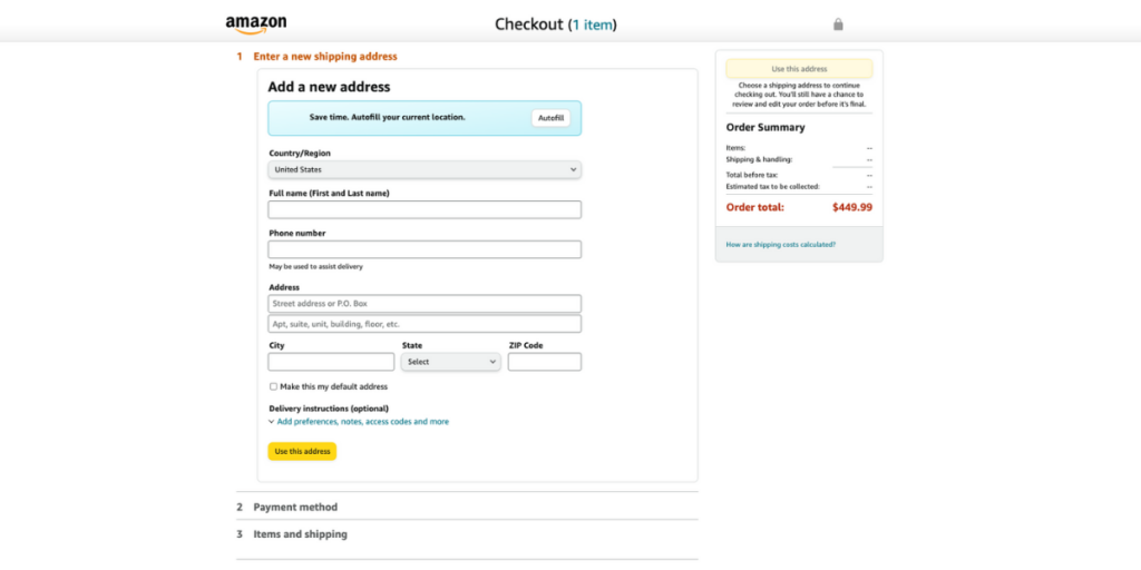
Many successful brands understand the importance of minimizing form fields to reduce friction and improve completion rates. For instance, e-commerce giant Amazon’s checkout process is famously streamlined, requiring only essential information such as shipping address, payment method, and contact details. By prioritizing essential information, Amazon ensures a seamless user experience, leading to higher conversion rates.
2. Use smart field validation
Real-time validation is a game-changer in enhancing the user experience by guiding users and preventing errors before submission. Take the example of online banking platforms like Chase or Wells Fargo. When users enter their login credentials, these platforms use real-time validation to check for correct formatting and instantly flag any errors, such as incorrect passwords or missing fields, helping users rectify mistakes before proceeding.
3. Employ clear call-to-action (CTA) buttons
Clear and compelling CTAs are crucial for prompting user action. Airbnb, for instance, strategically places vibrant and descriptive CTAs throughout its website and app to encourage bookings. Whether it’s “Book Now,” “Check Availability,” or “Contact Host,” Airbnb’s CTAs are prominent, descriptive, and visually appealing, driving users toward conversion.
4. Utilize progress indicators
Multi-step forms can be intimidating, but progress indicators help users navigate through the process with confidence. TurboTax, a tax preparation software, employs progress bars to guide users through each step of filing their taxes. By providing a visual representation of progress, TurboTax keeps users informed and engaged, reducing drop-off rates and increasing completion rates.

5. Optimize form field placement
The logical arrangement of form fields is key to enhancing usability and minimizing cognitive load. LinkedIn’s registration form is a prime example of optimal form field placement. By organizing fields logically and grouping related information, LinkedIn ensures a seamless user experience, making it easy for users to complete their profiles and join the platform.
6. Provide inline help text
Contextual help text or tooltips can significantly improve effective form comprehension without overwhelming users. Grammarly, a writing assistance tool, offers inline help text to clarify the purpose of each field in its registration form. By providing brief explanations or examples next to form fields, Grammarly assists users in completing the form accurately and efficiently.
7. Minimize distractions
Removing unnecessary elements and distractions from the form page is essential for maintaining focus on the conversion goal. Slack, a collaboration platform, employs a clean and minimalist design for its signup page. By eliminating extraneous information and focusing solely on the signup process, Slack reduces cognitive load and increases conversion rates.
8. Enable autofill functionality
Autofill functionality enhances user convenience by expediting form completion. Google’s autofill feature, integrated into Chrome browser and various Google services, automatically populates common fields such as name, email, and address based on users’ saved information. This seamless autofill experience saves users time and effort, leading to higher form completion rates.
9. Opt for single column layouts
Organizing form fields in a single-column layout improves readability and ease of completion, especially on mobile devices. Mailchimp, an email marketing platform, adopts a single-column layout for its signup form. By presenting fields vertically in a clean and uncluttered format, Mailchimp ensures a user-friendly experience across devices, resulting in higher conversion rates.
10. Test and iterate
Continuous testing and iteration are vital for refining form designs and optimizing conversion rates. SurveyMonkey, an online survey platform, leverages its survey feature to gather feedback on form designs and user experience. By regularly collecting insights from users and iterating based on feedback, SurveyMonkey continuously improves its form designs to better meet user needs and maximize conversions.
Summary
But our adventure doesn’t end here. Armed with the insights gained from real-life examples and practical tips, you’re now ready to tackle the challenges of form design head-on. Whether you’re a business owner, marketer, or simply someone passionate about user experience, you have the power to transform your forms into powerful conversion tools.
So go ahead, put your newfound knowledge to the test, and watch as your forms become streamlined, intuitive, and conversion-optimized. And remember, Capturly is here to support you every step of the way. With features like heatmap tracking, session recording, and JavaScript error tracking, you’ll have all the tools you need to fine-tune your forms and maximize your website’s potential.
So what are you waiting for? It’s time to elevate your conversion game and take your website to new heights. With effective form design as your secret weapon, the possibilities are endless. Ready to make your mark? Let’s make it happen together!