Regardless of your market, an important key to the success of your site, and any business, is the conversion rate: the percentage of visitors who buy or become subscribers and users. It’s common knowledge that you will not be able to do business if your visitors do not turn into customers and do not sell anything. The number of visitors to the site is an important factor, but when site visits are not converted into revenue that is important to your business, a large number of visitors will mean nothing.
Conversions do not happen by themselves.
It is necessary to follow the numbers, change, and improve. Increasing your conversion rate, no matter what you do, increases your income. Conversions are also one of the best ways to measure the effects of your paid advertising.
They show you how good your marketing is in “converting” visitors into customers, i.e., in making people do what you want and what your goal is because you have shown them that it is useful for themselves.
Increasing the conversion rate, in this case, shows how good your marketing plan is.
Getting a conversion means finding out what visitors are looking for when they come to your site or blog, and then giving it to them! In this article, we will talk about what the conversion rate is and how it is calculated, why it is important what its elements are, and what are the best practices and tools for improving it.
Table of Contents
What is the conversion rate and how is it calculated?
The conversion rate, more broadly defined, is the percentage of site visitors who took action – the one you wanted to take. What will be the conversion (desired action) depends on your business goals. For example, if you sell products and services through the site, then your main goal is for the site visitor to make a purchase. However, since product sales and service subscriptions are considered macro conversions, There are also smaller ones, the so-called pre-purchase micro-conversions, such as subscribing to an email list, tracking on social media, watching a video of your product, and more.
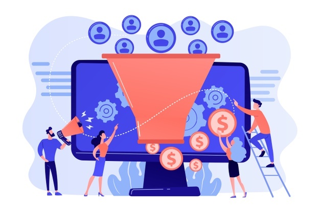
Through micro-conversions, users communicate and get to know your brand.
The most commonly used conversion types include:
- making a purchase
- download e-books, and mobile applications
- subscribe to the newsletter
- application for trial use of a service
- adding products to the cart
- registration on the site
- participation in online chat
- joining a business
- filling in the contact form
- webinar application
- course
Calculating your conversion rate is easy, as long as you know what the conversion rate is for your site. You need to divide the number of conversions you made on the site in a given period by the total number of visitors to the site or landing page, then multiply by 100.
The great thing about the conversion rate is that you can use it in different ways and be as specific as you want to keep track of whether your goals are being met. About this, you can track, for example, the following types of conversion rates:
- Site-specific conversion rate (which page receives the most conversions)
- The conversion rate of a particular channel from which your visitors come (visits from Facebook, Google Ads)
- Total conversion rate (of the total number of site visitors)
- Campaign conversion rate (how your ads work and what needs to change)
- The conversion rate of certain keywords
- The conversion rate of each ad separately, etc.
What does it mean to improve (optimize) the conversion rate?
Conversion Rate Optimization (CRO) is a process that aims to increase the percentage of site visitors who take desired actions in any way (become customers, fill out an opt-in form, etc.). To improve conversion, you need to know what works for your audience and what doesn’t, as well as understand how they navigate the site, what actions they take, and what prevents them from meeting your goals.
You need to offer something that they cannot refuse and that fits their expectations, problems, and desires. If the visitor doesn’t convert the first time, that’s fine.
If you have quality content with visual elements, a great offer, and a convincing call to action (CTA), it will remain in the memory of the visitor, who may come back later and make a conversion.
Why is it important to improve (optimize) the conversion rate?
Your business can grow in two ways: to increase the number of visitors to the site with the desire to increase sales, or to improve the conversion rate by converting current visitors into customers.
If you stick to increasing the conversion rate, it will be a more effective strategy because, with it, you will, in the long run, make sales continuously. Also, improving the conversion rate will save you the money you would invest to reach new visitors, which will also make your ROI positive.
Higher conversion rate = Better ROI
Conversion optimization applies to all traffic sources, whether it’s email lists, social networks, or paid advertising because that’s the only way to make sure you’re getting targeted visits that interest your offer.

If there are no users and customers who like your product, then it all comes down to wasting resources and time.
Some of the key benefits of improving your conversion rate include:
- you don’t pay for ads to get new visitors, you use existing ones
- you make more money, which you can direct to other business segments
- build a relationship of trust with your audience
- you retain users and customers, with the possibility of repeat purchases
- better understand the needs of your customers and users
- build your brand and authority
What do I need before improving my conversion rate?
For improving your conversion rate to work, it’s important to know what you’re improving, where, and when. Therefore, this information is the foundation for a successful CRO process.
Website analysis and how visitors behave on the site are the two main things that will help you decide which changes will improve your conversion rate.
For example, if you want to track the completion of the opt-in form on the site, you will need to track what percentage of visitors fill out the form. Limit this tracking to a certain period, so based on the obtained data, define your goal that should bring you a change in the next period.
Since you will not assume anything, because you will not waste time, you can apply two methods: a quantitative and qualitative analysis. Quantitative analysis should provide you with numerical data on how visitors behave on your site. Rely on Google Analytics for this information. Within your account, you can set a goal based on which to track conversions.
Number analysis is especially useful when you have a site with a lot of content because it will help you direct your actions exactly where you need them. The information that will give you answers about engaging visitors are:
- where they came from and where they clicked on the link to your site (from Google, other sites, directly)
- whether they are old or new visitors
- which page do they first come to when they come to your site
- who are your visitors (gender, age, interests, demographics)
- what content they mostly deal with and spend time on
- how many of them downloaded the free offer on the site
- which browsers they use and on which devices
- where they leave the site and what conversion they did not achieve
All of this information should help you know what you need to change and set goals for the pages that are most visited and engage your visitors because that way you will achieve visible improvements.
According to a study by Econsultancy, the areas in which entrepreneurs, improve the conversion rate, most often introduced changes and tests: website, landing pages, paid ads, mobile applications, and more.
What are the steps to improve my site’s conversion rate?
Use different calls to action (CTA)
Call to Action (CTA) is one of the most important basic elements in improving conversions. An invitation to action is a way to tell the visitor exactly what they need to do to achieve their goal.
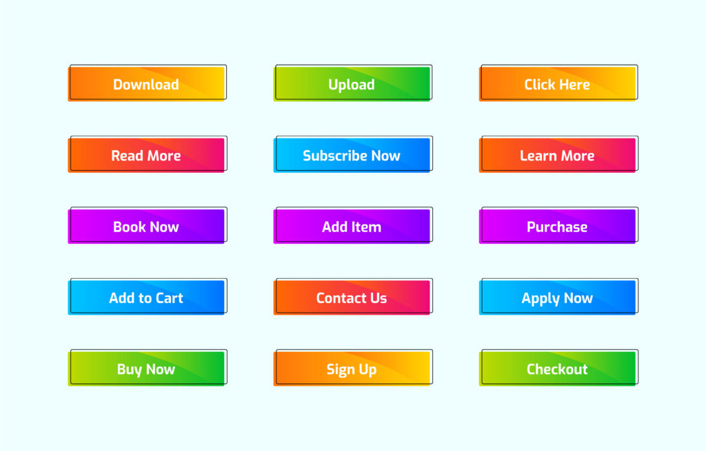
The call for action usually appears on most pages on the site, which means that it is an integral part of the trip of every potential buyer. The call for action should contain a value, be easy to understand and be convincing. Placing a CTA above the break can speed up the process and be a good solution for anyone interested and not have time to search the site.
In addition, long blog posts, a sidebar on the site, the end of the page, and emails are good places to set up a CTA. The language you use is very important. Using first-person words can activate dialogue in the visitor’s mind. For example: “I’m ready to improve my conversion rate.”
You can also add a sense of urgency, such as “Don’t waste any more time on non-converting visitors.” When you create a CTA that starts with YES, it has a positive effect in psychological terms. Use active language instead of generic because it will improve engagement. For example, you can use “View service details” instead of “Read more,” “Send my message” instead of just “Send,” put “View our products” instead of “Product categories” and so on.
The functioning of conversion is not a science. We all convert and become customers every day, we are all those visitors. Try different calls to action. Not only in terms of position on the site, but change the text and the design of the button.
Optimize your Opt-in form
Opt-in forms are a pillar of collecting data on visitors and customers and are therefore the main tool for improving conversions. Use the Opt-in form to search for data to help you improve conversions. Short forms with a couple of fields are more attractive to fill.
The form should have a precise title that will tell visitors what they will receive in exchange for contact information.
Use Landing Pages
A well-designed landing page is essential because it will make the process of researching and shopping through your site much easier. Landing pages help increase conversion rates and it would be great to have more of these pages for each audience segment, for each product or service you offer.
To create a successful landing page, you need to know why people visit your site, and how it benefits and helps them. The text on the page should be in short sections, concise and convincing enough for visitors to take action. In addition to content, style, appearance, and functionality are very important. Change the elements on the page, images, text, and CTA button, and monitor the effects of these changes. You will not immediately know what works best for you.
Make it clear what they get from your product or service, don’t just promote their features. When a visitor comes to the landing page, the call to action should direct him to what the next step is. If they come to the site through an ad, it must fulfill everything you promised in the ad (call to action) and allows the visitor to complete the action, whether to download something, buy or sign up for an email list.
Offer convincing and clear value
In terms of value, it is important to provide enough information to convince the buyer and the visitor. According to IDC research company, 50% of sales are lost due to inadequate information.
Therefore, if you want to sell your products and services, give as much information about them as possible in the form of product reviews, images, videos, sales, and landing pages.
In practice, 80% of users do not read everything, but the other 20% read everything. Your target group is exactly those 20%! The value of your offer makes it different from your competitors, something unique about the product, service, and company. That is the main reason why they buy from you.
The value includes all the benefits that will make customers’ lives better, and the solutions they get for their problems after they buy your product or service. The value should be highlighted on the site and have a sense of urgency.
We’re not saying it’s not good to write about product features (that’s fine on some parts of the site and landing pages), but when it comes to improving conversions, it’s best to point out the benefits.
For example, when offering your e-book, explain what the reader will get and how the book will help them. You can list chapters and subheadings. When they choose a product in your online store and put it in the basket, you can then offer other similar products. People buy from you because they love and like what they see!
Adapt website for smartphones
Most sites with a modern design are automatically adapted to mobile devices. This means that your visitors will have to fill in the data on the small screen, read the text and use the action buttons.
For all specific needs, your site must be mobile-friendly and functional, especially when it comes to online shopping. Make mobile purchases as fast as possible, as well as pay by credit card and PayPal. Avoid long filling forms.
Use quality images, in moderation
In most cases, using relevant, high-quality images can increase your site’s conversions. The image captures the attention of visitors and breaks the text. If there are too many of them, they will probably distract visitors.
When it comes to the page where you present your product, the rule is that there are a maximum of five photos of the product. If you want to increase conversions, use real photos of your products and services. Most phones take great photos, and you also have tools for photo editing and image optimization.
Increase the loading speed of the site
Conversion time greatly affects conversions. If your site loads slowly, visitors will probably just leave. Even if it’s just one second more, it can reduce conversions by up to 7%. When you test your site with Google’s tool, you’ll also get tips on what’s wrong and how to fix it.
Conclusion
Set your goal and determine your desired conversion. You can also have more types of conversions, which will help you attract more different visitors and customers. Use landing pages and optimize them for visitors as well as your site.
Use analysis to identify what works and what doesn’t. The conversion rate won’t get higher overnight, but if you want it to keep growing, don’t stop experimenting. Try new features, colors, and layouts. Not every combination of elements will work for every brand.
Your site will “turn” visitors into customers if you have something valuable and attractive to offer, simply and honestly, which will remove all dilemmas and risks in the minds of visitors.
Don't forget, sharing is caring! :)

