If you own an online store, you have probably dealt with conversion rate by now. In this article, we will see how you can optimize your checkout page for getting better conversion rates.
There is one important fact you should know before we dive in: there is no magic formula when it comes to optimizing your conversion rate. Every website is different. In fact, every visitor behaves differently on a website. So, there isn’t a general rule that surely works for everyone.
But any of the ideas present in this article can be a good method to increase your conversion rate. If you want to improve this number, just go on, and try these out!
Now, let’s quickly refresh what conversion rate really means, so you can understand today’s subject even better:
What is Conversion Rate?
Actually, it is pretty simple. Conversion rate is basically the percentage of people who visit a webpage and also convert. Let’s take an example:
If you have 100 people who visit your online shop, and 15 of them decide to buy an item, then you have a conversion rate of 15%. It’s that simple.
In this case, every single visitor, who actually lands on the checkout page and buys the item they’ve put in the bag counts as a conversion. If you look at the chart below you can see what I meant above when I wrote: “there is no magic formula”. This number can depend on many factors, such as the industry you’re doing business in, demographics, etc. According to Statista, US citizens left 40% of the shopping carts abandoned filled with clothing, while this value was only 4% in the case of food products in the year 2018. You don’t have influence over these, however, you can still do a lot in order to reduce the abandonment rate on your checkout page.
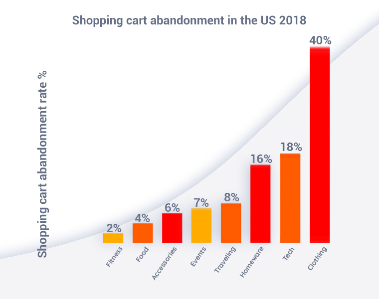
Source: Statista
Improving the conversion rate means persuading more people to complete their purchase. One thing you know for sure: You don’t want them to leave, especially not on the checkout page. So why don’t you ask yourself: Why do people leave a purchase hanging?
There could be multiple reasons for this, just to name a few:
- they can’t work out the costs themselves – being able to complete the checkout fast gives you a huge competitive edge
- new fees might pop up on the page that they were not expecting – when they finally made the decision, you show them some hidden fees, that’s a big no-no
- the need for an account to finish the checkout – especially applies to the food industry, let them complete an order, then offer the benefits of registration
- the checkout process is complex, thus raising trust concerns – a complex checkout process is a fancy word for “something’s fishy”
But how can you optimize the checkout page, so more people will complete their purchases, and thus increasing your conversion rate? Let’s see!
How to Optimize the Checkout Page?
In this section, I will show you multiple steps that you can take to improve the checkout page on your store’s website. Keep in mind, this process takes time and patience. The first thing you must do is to study your current checkout page stats. This is where you begin the optimization. Why?
Well, to be able to improve the checkout process, you must first know where the problem lies, right? This is why your website metrics are so important. You must know at which point your visitors jump out of the checkout process and how long they stay on this page. This way, you can direct your efforts in the proper direction, without wasting your resources.
So, let’s see what practices you can put in place to optimize the checkout page:
To map your customer’s journey you’ll need to set up a conversion funnel. A conversion funnel is a simple yet effective tool in your marketing toolbox. On one end you have your visitors entering the funnel, and on the other end a paying customer comes out. For the purpose of this article, let’s break down the audience into four levels:
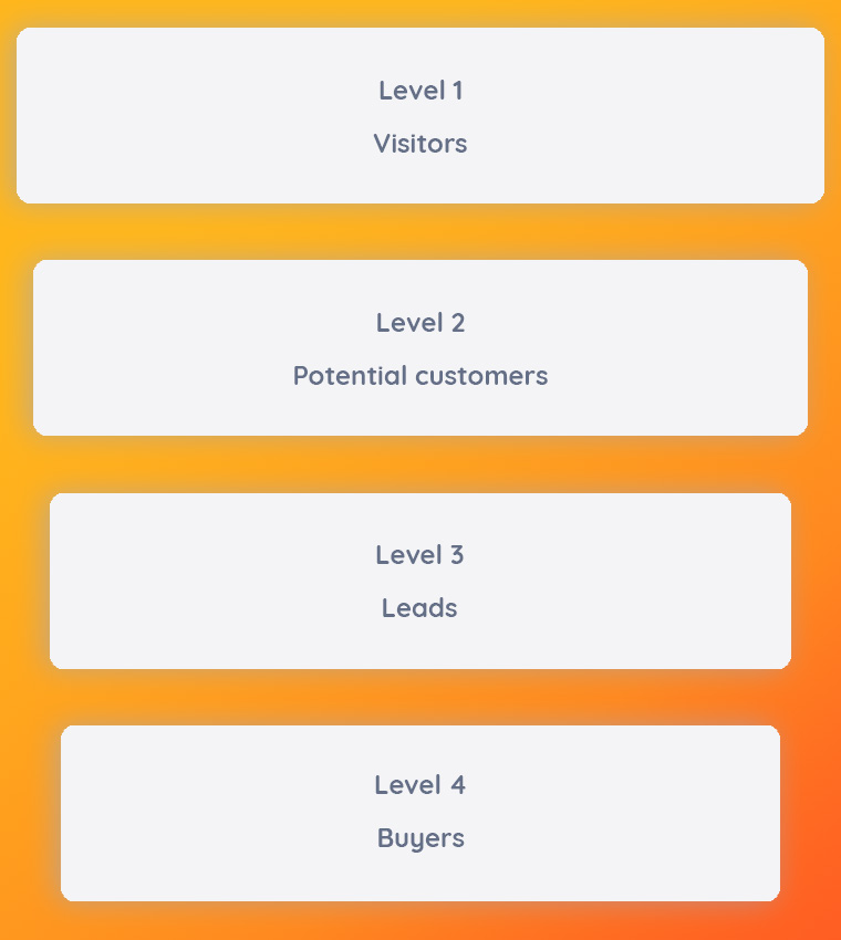
- Visitors -They represent the very first stage of your conversion funnel, therefore their number is significantly higher than the others on the list. They never met your products/services before. They might have heard about you somewhere, however, cannot relate to you from their own experience. Your goal here is to build a brand identity instead of trying to convince them to purchase immediately.
Conversion goal idea: Apply an event to those pages where you wish them to proceed to. If some of them visit those, will proceed to the next stage.
- Potential customers – At the second stage, you’ll start losing visitors, however, if you play it smart those who remain are your potential customers. They already show some level of interest. At their stage, you can apply light pressure in order to “hook” them, promotional offers such as up-selling or down-selling, downloadable content, etc. Your goal is still far away from making them open their wallets, as it’s still too early for that.
Conversion goal idea: A subscription to a monthly newsletter, product video views, clicks on more information.
- Leads – They have collected enough information and are confident enough to give it a go. Don’t be surprised at this point if you have less than a third of the visitors. On rare occasions, a visitor can skip the second level and move towards this part of the funnel, however, this is likely due to the influence of others. A strong word of mouth is and will always be the best form of advertisement! At Level 3 you have one more thing that can make – or break – your dream conversion rate, and that is hype. The motivation is at its peak, people start to put products in their carts or signing up for trials, pre-purchases, etc. However, don’t think you are set for life, as this is like the wild west where anything can happen anytime. If you are familiar with the term: shopping cart abandonment, you have probably experienced hell.
Conversion goal idea: Track the trial signups, pre-order CTAs, and the checkout page itself using events. Monitor your final checkout page like never before. If you see significant dips in your conversion funnel, try to think as your leads do. There’s so much you can do than just plain guesswork. For instance, you can review those sessions using click heatmaps or scroll heatmaps, and even session replay features are available at your disposal.
- Buyers – Congratulations you made it!
- Diamonds – But there are only four stages. It’s true that you have actual buyers, but this doesn’t mean you can lay back and relax. What you should do instead is some fine-tuning on your final conversion rate. This is a good time to start collecting feedback. Those who are willing to share their after purchase experience with you are your most valuable customers. If they take their time and fill out forms for you – even though people actually hate forms – will most likely be the number promoters of your website. Therefore you should learn to “keep them well”. A coupon code, an affiliate marketing program, special events are great ways to keep them hooked. Your elementary interest is to spoil them.
If you wish to get a deeper understanding of the conversion funnel, and the conversion rate optimization process, I recommend you reading this conversion rate optimization 101 articles.
Also here’s a SlideShare version on the topic:
Some of the best tools to help you in this stage are the following ones:
- SimilarWeb: helps you learn about your competitors and tweak your checkout page to meet your goals.
- Woopra: stores all the stats regarding your user’s behavior.
- UserTesting: helps you test the site and see how clients will behave on it.
- MouseFlow: similar to Woopra, it stores all kinds of user statistics and helps you learn why your users leave the site.
1. Put yourself in your potential buyer’s place
When they search for a product online and decide to buy it, they expect the respective website to be quick, responsive, and effective. This user experience is what many businesses fail to deliver.
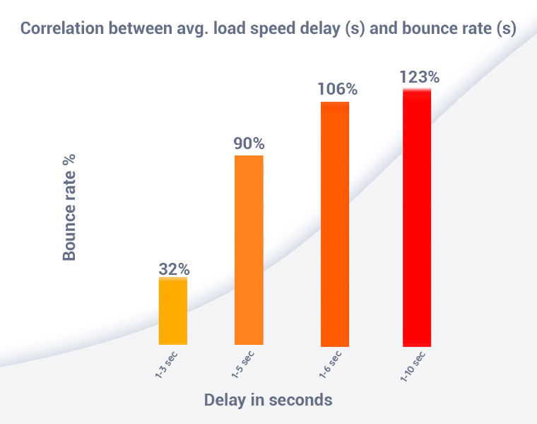
If visitors leave your site right at checkout, something could be wrong with the efficiency and speed of the whole purchasing process. Just consider that most people expect a page to load in at most 3 seconds. Any additional second of delay has a significant impact on the bounce rate and therefore on your conversion rate.
The checkout page makes no difference. Make some changes in the layout and back-end code, if it takes too long for the purchase to complete. If you don’t know how just hire a web developer who can do it for you.
Also, consider the complexity of the checkout process too. Are you asking for too many details, that might not even be necessary to complete the purchase? If so, just remove the unnecessary queries that annoy your customers.
Give the customer the freedom to choose a payment method that suits his needs. You could also give him multiple choices to find an efficient and cheap shipping method.
2. Efficient customer service improves conversion and retention
The second aspect you should consider is also tied to your user’s behavior. When a customer wants to buy an item from you, he/she could have questions about the process. And since that’s the case, they also want quick answers.
Most people don’t like to call the company for any minor or major questions they have. So, if they don’t find the answer to a question (how the item will be shipped for instance), it’s very likely that they will move on to another shop.
This, however, can be easily dealt with. Add a FAQ Section to the checkout page. Include all the questions that a potential buyer could have regarding the checkout process. And don’t include links that lead to a new page. Just make the whole section work right on the checkout page.
Another way to handle this is to add a live chat option to the page. If any question surfaces on the customer’s end, they can easily ask it using the chat. But if you decide to add this feature, make sure somebody is always available to answer your customers.
3. Conduct surveys

I know I mentioned above that people hate forms. You might think that this is inefficient. Actually, even huge corporations like Taco Bell, Ford use surveys as a method to improve customer satisfaction and conversion rates. You could come up with a specific survey that asks your customers about the checkout process.
But make sure you only include a few questions; the ones that are most important. For example, you could ask them what is it that they would want to be improved about the checkout process. Considering the answers, you can make the necessary changes to the page.
When building a survey keep the following in mind:
- always explain the purpose of the survey in a short, informative way
- highlight the anonymity (can’t stress this enough)
- explain to your customers that the information they provide is secured and will be only used for the sake of the survey only (to improve customer satisfaction)
- make it flow, avoid out of context, eyebrow-raising questions
- demographic questions belong to the end
- avoid yes/no questions, as they won’t give you much information use scales and multiple-choice instead
- avoid open-text inputs, users hate these and they hold almost no statistical value
Here are some decent survey questions:
- How satisfied are you with your purchase? (scale 1-5 or 1-10)
- How well does the product help you achieve your goals?
- How did you find our website? (multiple-choice with an else field)
- How satisfied are you with the customer service? (scale 1-5 or 1-10)
- What would you like to improve regarding our website? (speed, navigation, prices, etc.) (multiple choice 1-5 or 1-10)
Demographics:
This is always a tough nut to crack, however, these questions are extremely valuable when it comes to building customer personas.
- What is your age?
- How do you identify your gender? (radio buttons: male, female, other)
- What is your employment status?
- Where do you live? (region, city, zip code, you can decide the level of detail)
- What is your monthly income approximately? (this is a super sensitive yet extremely valuable question so it’s really up to you if you decide to use it)
4. The Checkout Page’s Layout
The next step is explicitly about the page itself. A checkout page usually consists of a big “Pay” button and all the details that a customer must know for finishing the purchase. Also, there are blank fields present here where a user enters the required information. How can you improve this, to get you better conversion rates?
For example, you could place the “Pay” button both on the top and bottom of the page, so your visitor has an easier time finishing the order. Another good idea is to add the ability to manage the cart on the checkout page. For instance, you can let the customer add or delete items already on the cart. Regarding the text fields, you can optimize these to remember any information a returning client introduced previously. You can also make the billing address the same as the shipping address unless the customer chooses otherwise.
To make the checkout page and the whole website more appealing, many shop owners like to display trust seals on this page. There are thousands of online buyers who don’t trust an online shop from the beginning. And that is totally understandable.
But if you display some of the trust seals your shop has earned over time, you can let your customer know that you’re an honest store that cares about its customers. They will know that you’ll deliver the order in the shortest time possible.
5. Develop a Responsive Checkout Page
The last step you must do regarding your checkout page is to optimize it for different devices. This step is a must, no matter what type of store you own. More and more people shop for items on their smartphones or tablets. Keep in mind that ideally, you should aim for a fully responsive experience.
Here are some must-know responsiveness stats that have an influence on conversion rates:
- 55% of consumers have bought something online after discovering it on social media. This is a great motivator to tag your products on Instagram.
- Users who have a negative experience in your mobile store are 62% less likely to purchase from you in the future.
- 90% of consumers say they use multiple devices to complete everyday tasks, while 40% say they use their mobile device to conduct research prior to making a purchase.
And the number is rising by the minute. So, you can’t afford to not optimize your checkout page for mobile users. How is this achieved?
The idea is to make the page look and work well on smaller screens, not just desktops or laptops. This is done by tweaking the source code of the site, to make it responsive. But if you use WordPress as the base platform of your website, this will automatically take care of the responsiveness for you. The whole website, not just the checkout page, will look and feel great on all types of devices. Considering how many people shop online using mobile devices, this step will greatly improve your conversion rates.
Wrapping up
Every online shop has to constantly work on optimizing its conversion rate to get more profit. I told you about 5 different optimization practices that can help you in this regard. Keep in mind that not all of them need to be put into practice in your specific case. To optimize the checkout page, just apply the ones that work for you.
5 Comments
Swati patel
2021-02-26 at 11:05Very informative blog. Thanks for sharing.
Raju
2022-06-06 at 08:39such a nice blog
Brochures are perfect for promoting and providing essential information about the business. A clean, professional, and high-impact designed brochure sets you apart from your competition and reinforces the value your company offers. Ideal Design makes brochures Design different. Unique designs and strategic objectives turn prospective leads into clients or customers.
Advertising Agency Ahmedabad
2023-03-13 at 10:23I have optimised my website’s checkout page.
very informative article. Thanks for sharing.
Tranquil Technologies
2024-01-27 at 07:22Thanks for sharing this blog