In this section, you’ll learn about how you should read and analyze heatmaps to make the most of them. Luckily, they are easy-to-use and easy-to-understand!
What does a heatmap tell me?
A heatmap tells you which is the most and least engaging part of your website. After considering the results of a heatmap analytics, you can rearrange the elements on your website to make it more user-friendly.
The most appealing spots are marked with ‘hot’ colors. It means that the main percentage of users have done some interactions there. These spots are the most valuable ones on your website, which is why you should put modules there to emphasize them.
The least attractive places are displayed with ‘cold’ colors on a heatmap. For some reason, these spots do not catch the attention of the users the way ‘hot’ ones do. Because of that, avoid putting any important information there, rather save them for design elements or rarely used modules.
How do I read a heatmap?
Reading a heatmap is an easy job since everything is marked with colors. The ‘hotter’ the color is, the more attractive that spot is, based on the number and density of the clicks. Usually red, orange and yellow are considered to be ‘hot’ colors. Most of the users interacted with the ‘hot’ areas in some way. Visitors are more likely to read the information that is located there, hence ‘hot’ spots are good for placing call-to-action, too.
‘Cold’ colors mean that these spots did not catch the eyes of most users. ‘Cold’ colors are mostly green, purple, and blue. Since these spots are not as attractive as the ‘hot’ ones, don’t place any essential data there. Plan some design elements instead, that fit these spots to fill the blank spaces.
How to analyze heatmap data?
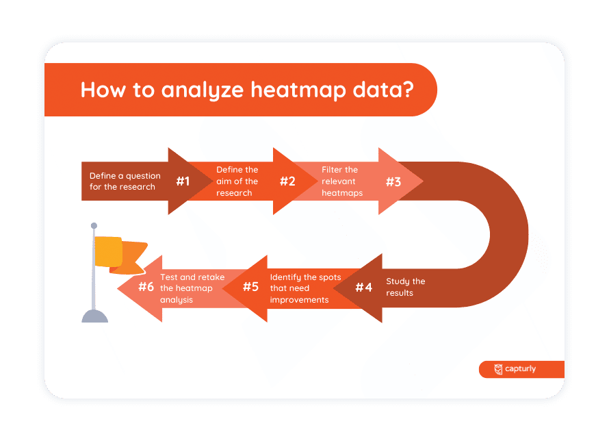
While analyzing heatmap data, the most important question is whether users click on key elements on your website or not. But there are some steps to follow during the analysis. Let’s read them below.

STEP 1 Define a question for the research.
For example, if you recently changed the design of your website, you could study whether users find the key elements the same way they did before.
STEP 2 Define the aim of the research.
Following up on the previous example, after a change in design the aim may be to analyze the results of this development.
STEP 3 Filter the relevant heatmaps.
Capturly uses a filter that makes it easier to find the pages you’d like to analyze.
STEP 4 Study the results.
Ask for help from different divisions of your company. An IT developer, a sales assistant, and a marketing manager can interpret the results differently.
STEP 5 Find the good and bad performing points in need of correction.
For example, there can be a call-to-action that gets enough clicks because of its content, but it would be more easily noticed if it had another color or text size.
STEP 5 Try to find a solution for the ‘cold’ spots and then retake the heatmap analysis.
It can happen that after the correction those spots don’t bring the expected results. In this case, try to rethink the arrangement of your website and substitute that content with less emphasized items.
It’s really important to retake the heatmap analysis from time to time since user behavior can change. To meet users’ needs it’s key to monitor their habits and develop your website according to their needs.
Discover user behavior on your website with our comprehensive tool that combines click, scroll, and segment website heatmaps!
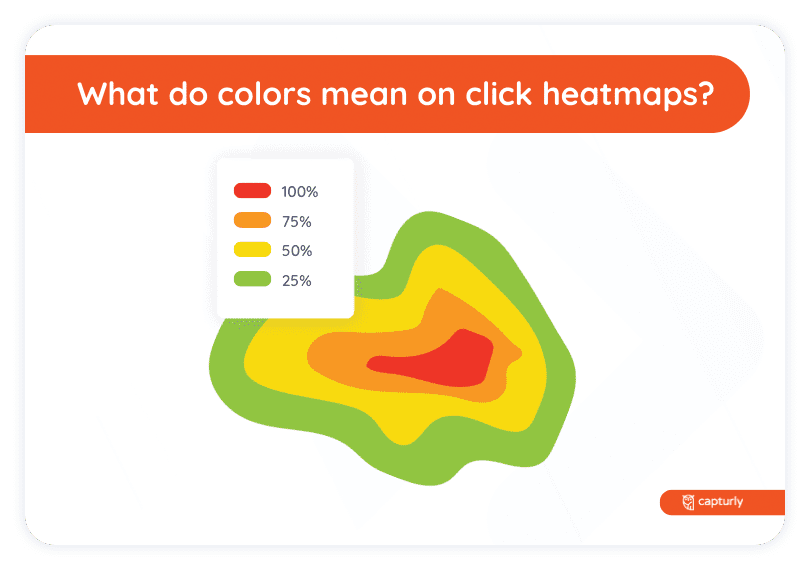
What do colors mean on click heatmaps?
On click heatmaps, colors basically mean the number of clicks on each spot. The ‘hotter’ the color is, the more attractive that spot is. Red, orange and yellow are considered to be ‘hot’ colors. The attractiveness is based on the number of clicks on that spot. If colors turn into ‘cold’ like green, blue or purple, it shows that those spots are less attractive. In other words, users didn’t click on them as frequently as on ‘hot’ spots.

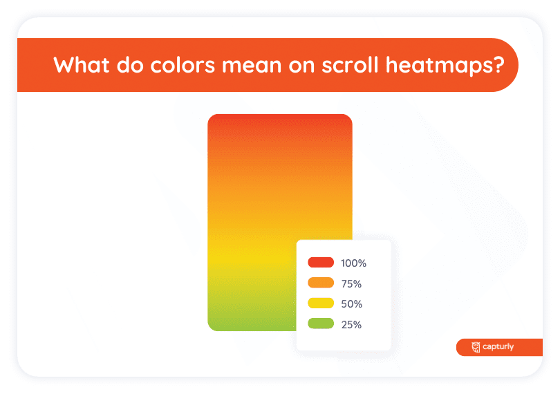
What do colors mean on scroll heatmaps?
On scroll heatmaps, colors represent the number of users that scrolled to that part of the website. The ‘hotter’ the color is, the bigger part of users scrolled down to see that content. Red, orange and yellow are considered to be ‘hot’ colors. If the scroll heatmap starts to display ‘cold’ colors, it means that the majority of users abandoned the website before scrolling down to that part of it. ‘Cold’ colors are green, blue, and purple.

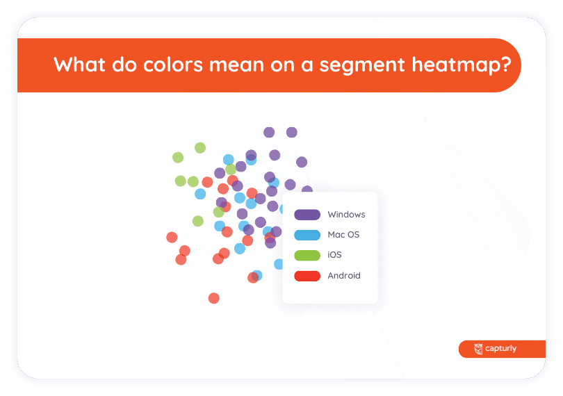
What do colors mean on a segment heatmap?
On segment heatmaps, different colors represent different segments of users. The aim of segment heatmaps is being able to filter data. Filters are based on the referrer sites that connect users to your website. On a segment heatmap, you can see different colored dots. Each segment of users has a color. Same colored dots are denser if that segment interacts more with that spot, which makes it easier to focus on a target group.
