Have you ever realized that different fonts trigger different emotions? We even would say that correctly chosen font will help not only to build your brand identity but also to ease the reading process. This, in turn, is very important if you work on brochure, magazine, ebook or on UX of your website and blog. Then why do not you take all the advantages of it?
Table of Contents
What is Typography?
Typography is something bigger than just picking the right font type. The typeface, font type, font size, color, line length and spacing, alignment – all of them matter in typography. It is crucial to choose elements of the typography wisely, especially knowing that people receive 95% of information through text. You should be able to grab their attention and send your message. Always make sure that your text is comfortable to read because it has a significant impact on people’s perception of your brand. If someone has to spend extra minutes to understand what is written, he or she will most likely to skip that content together with your aimed message. In order, That is why you should know how to effectively shape your written information through typography elements.
Choosing typeface & font
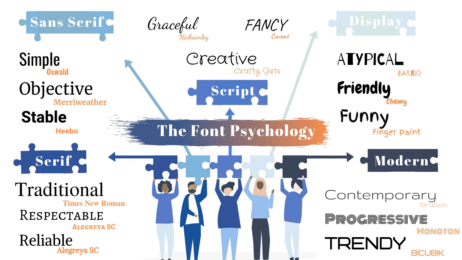
First of all, it is important to note that a typeface and a font are not the same things. Actually, one specific style of a typeface is called a font. For instance, Arial is a font under the Sans-serif typeface. Each typeface and font type convey different emotions and signal about different brand personalities. You can choose fonts between Serif, Sans Serif, Modern, Script, and Display typefaces in regards to your brand personality.
Moreover, create a contrast by using mismatched fonts. Do not be afraid of pairing Serif and Sans Serif because this way you can make text clear and equally distinguishable. However, make sure that you use no more than 3 different fonts that are not too similar.
Thirdly, check for glyphs before you pick a font. Make sure that the chosen font has all the characters you’ll need. Especially, it’s important to consider when you write the content in a language that has special letters.
Last but not least, be consistent in your design by applying the same design to all content. Make a list of fonts that will be used for different elements of the text. That includes choosing a font for the headlines, the sub-headlines, the body texts and functional design like buttons.
Choosing font color & size
After choosing a perfect font type for your brand, it is time to pay attention to the color and the size of written text. It is well-known that different colors influence people’s perception and decision-making processes differently. But how can font size affect readers?
You may think that choosing small fonts will result in compression of your text and this way people see as much text as possible at once. Especially, when you have lots of content and a high need to share it through small screens. However, we recommend you to use a bigger font size. Yes, even for mobile readers. Because larger font sizes are easily recognizable, and therefore help people to divide the content into small parts. This is particularly essential considering the “F” reading pattern among people which determines if they want to stop just scanning and read carefully. We suggest you check this font size guideline that can help you to decide which font size to choose.
Choosing a line length
Making a decision on a line length and its spacing is as important as selecting the right font type and size. It is not recommended to use a short line length since it can lead to the reader’s frequent eye movement which is very disturbing. It is not recommended to make a line of a text too long either because then it will be harder to focus on it. Of course, a line length can vary with respect to screen sizes. In general, 50-75 characters and 30-40 characters per line are the optimum numbers for desktop and mobile devices, respectively.
Visual Hierarchy
It is important to note that the human brain likes to organize the elements of the content according to the similarity, continuity, closure, and proximity. That means they don’t read the pages word by word, instead, they filter the relevant words and sentences. Generally saying people scan the text instead of reading.
But how can you put it into practice? The answer is a visual hierarchy! By using different font sizes and types you can create visual hierarchies that lead the reader’s attention through the content the way you want. You can apply different font styles for the headline and another for the body to distinguish them, or you can use larger font sizes for the headlines and make it bold. Additionally, you can highlight the important parts of the text so that readers can focus on the most important part of the content.
Wrapping up
Day by day the importance of the typography is increasing together with the content flow. Knowing how to provide readable and legible content will help you to communicate with people and influence their decision-making process. Therefore, we recommend paying attention to how your content is written and start being an expert in typography.