Table of Contents
UX Guide
The best thing about web design is that you always have a little extra to add to your website in order to enrich your user experience.
UX Planning
UX planning is a process that has three main phases:
Phase I. – The research phase:
I like to call it a tutorial scenario since at this point the only goal is to learn as much as possible about potential users and competition.
Phase II. – The design phase:
This phase provides a framework, defines the core functionality of the website.
Phase III. – The validation phase:
Here you check how well the design of the second phase matches the expectations of the target group.
What Makes a Good UX?
1. Exceptional navigation
Excellent navigation is one of the most important aspects of website usability. Simple HTML or JavaScript menus tend to work better and are essential building blocks for platform and browser-independent UX design. It is equally important to ensure the smooth flow of navigation. It is good practice to limit the number of menu items as much as possible. A drop-down menu or a single sub-menu may work better on a website, for many sections and pages.
The progress of DHTML and JavaScript libraries, such as React, jQuery, has revealed many new opportunities for creating innovative navigation systems.

It is worth noting that navigation is more than just menus stacked together. Here are a few more points to consider:
- supporting effective search functionality – a typical UX convention might be when we search at the very beginning of the page
- provide several ways to discover content – categorization and the use of filters are indispensable for websites that provide more information than usual
- information-rich footer section
Bad navigation on your website can cause frustration in your visitors and lead to a high exit rate or even bounce rate.
88% of online shoppers say they wouldn’t return to a website after having a bad user experience.
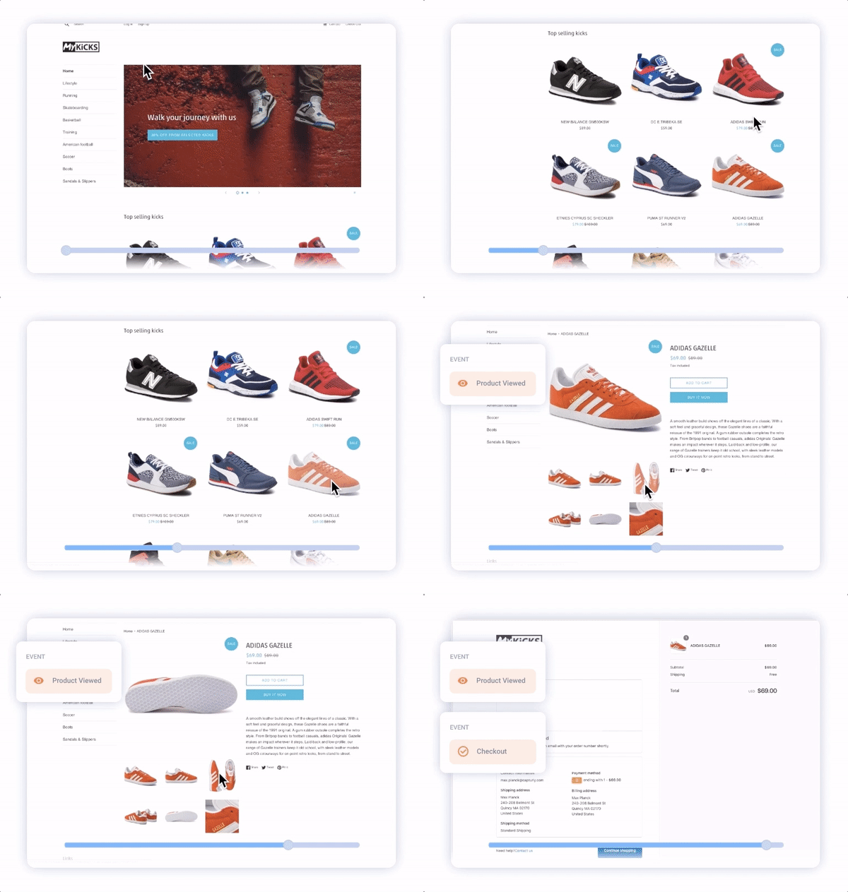
To avoid that, there are great web analytics tools to discover and analyze navigation issues, they are called session recording. Session replays enable you to track every visitor engagement on your website. With the help of session recording, you are able to analyze every mouse movement on your website. Which means that you can optimize your navigation to be as smooth as possible with real user-data. It is a quick, safe tool that supports all devices and screen sizes, logged-in pages, and dynamic pages.

2. Responsivity
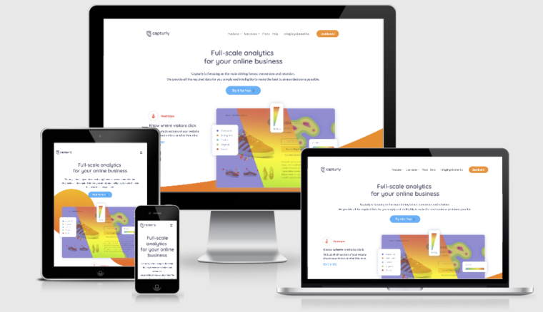
A responsive website adjusts the content to the browser interface. If you open a responsive page on a desktop computer and then change the browser size, the content will dynamically rearrange, scale itself. In the case of mobile interfaces, this happens automatically. In order for users to benefit from a seamless experience, careful planning of the content of the website is required.
The screen resolution continues to grow on the “typical” displays. Today, the average web session is at a resolution of at least 1024 x 768 pixels. However, you need to make sure that what looks acceptable in this setting, it is also decent when it comes to other solutions.

Screen resolution is a factor that needs to be adopted when designing your website. It’s a very good tactic to figure out your visitors’ preferences, experience the most commonly used screen resolution, and see how visitors behave on your website.
There are web analytics tools that draw click heatmaps or scroll heatmaps in addition to quantitative data and create snapshots in the form of session recordings of your site. It’s similar to like having your own tester team, the only difference is that you get feedback from visitors firsthand. UX design is a data-demanding process, so analytics and a good UX walk hand-in-hand.

Browser compatibility is easy to ignore. Often even the websites of the most well-known companies neglect this problem. This undoubtedly has a negative impact on the usability of the webpage, which can especially be felt on mobile devices.
Although modern browsers have evolved and become more efficient, there are still inconsistencies on websites interpreted by different browsers. It is important to ensure that your site appears and behaves consistently with popular browsers, such as Chrome, Firefox, Safari, and Opera. Such simple things distinguish the professionally designed website from the rest.
3. Website localization
Website localization is the process of tailoring your website to a target audience based on their native language or cultural background. It’s a complex process that requires a lot of research and understanding regarding the coding and culture of your users. You might be saying to yourself, “Do I need to localize my website?”
According to CSA Research, 40% of internet users will not buy products from websites that are not in their native language. Many studies show that users interact more on a website that caters to their language or region. And so, when you’re creating a website, maybe you should consider looking into website localization services that will help your website cater to a more diverse audience without compromising your vision.
4. Efficient error handling
It doesn’t matter how hard you try to plan ahead, even if you think of a thousand variables, there will always be one that you didn’t count on. What exactly does this mean? It’s impossible to prepare in advance for every situation arising from the continuous development of the online world.
Thus, there can be no such thing as a perfect product/web design. What has been good practice for the last couple of years it is not guaranteed to stand up to today’s standards and vice-versa.
You can’t measure everything in advance so you have to test! That’s why good troubleshooting and description of on-screen messages are very important for creating a pleasant UX.
The correct handling of errors at the code level with the help of component testing ensures that the website is robust and error-free. Displaying the correct error message improves user experience and overall usability.
5. Valid marking and clean code

A website that meets modern web design practices and standards is often more powerful and reliable. This also ensures that the webpage loads faster and is more consistent between browsers and devices. By ensuring that the code is clean, it is easier to identify and troubleshoot any problems.
6. Contrasts

Choosing the right contrast for your website and its content is one of the most important design principles that you should never overlook. You can use contrast in many ways.
A popular example could be when using a darker font on a brighter background or the other way around.
The lack of contrast, on the other hand, makes it very difficult for visitors to consume the content. Therefore in the case of the visually impaired applying the proper amount of contrast is a must. In addition to readability, contrast used along with shadows helps to create a hierarchy by making the elements pop out. The connection between the two is well known in photography.
7. User-friendly forms

Visitors expressly hate forms. The importance of forms, however, is unquestionable when it comes to websites. Without them, registration would be impossible and in addition, they provide valuable leads to the business.
50% of marketers state that onsite forms are their primary source of leads.
In order to get the most out of web design, it is important to build forms that are easy to use and are accessible to everyone.
When designing the user experience, keep these important aspects of “serving” forms in mind:
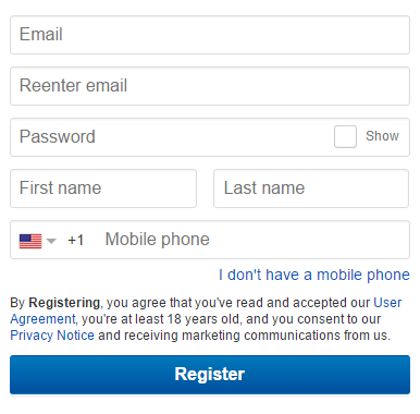
Label arrangement – when compared to the input fields, a label can be placed above the field, inside the input field itself to the left or to the right of the input field. The registration form of Amazon and eBay is a perfect illustration of the common layout of labels. For example, if our goal is to save space on a given surface, instead of reducing the white-space between the input fields of the form (thereby creating a sense of congestion), we can place the labels in the fields themselves.

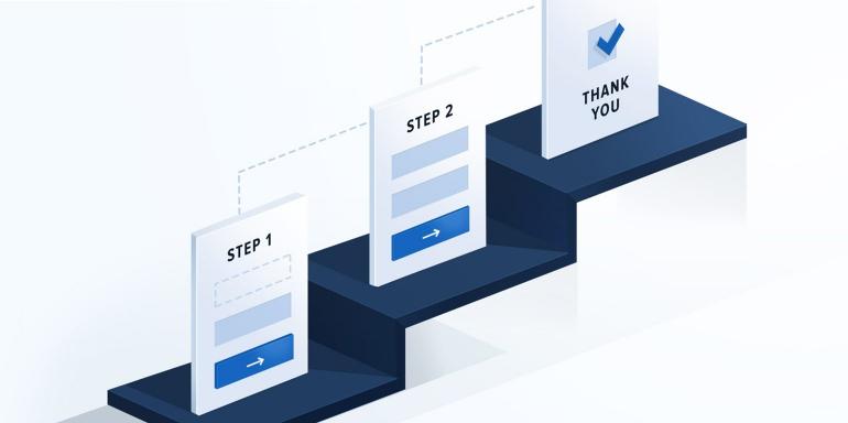
Multi-step process – it could be ideal to present a form in this format if you want to give the user immediate feedback on the process in which they are currently participating. Great for presenting a way of a shopping process.

White space – it is customary to think of white space as some kind of “negative”, unused space, but this is a misconception! White-space segments the form and makes it transparent.
8. Visual hierarchy in web design

Remember, when it comes to usability and user experience optimization, the goal is to encourage visitors to perform the desired action, but in a way that is natural and enjoyable. The web designer can guide the visitor’s view in a predefined way by determining the position, color, and size of each item. In a nutshell, the visitor first sees what the web designer wants to show. The white space referred to in the previous paragraph, ie the white medium plays a significant role not only in the case of shapes but is also a fundamental element of the hierarchy. Visual hierarchy is closely related to the principle of simplicity. It offers the organization of website elements in a way that visitors are first oriented towards the most important parts.
9. Credibility

75% of visitors judge a website’s credibility only on its aesthetics.
Yes, that’s a big number.
In order to provide the best possible user experience on a website, credibility is a key pillar of long-term success. In practice, this means to spare the visitor from the unpleasant experience of having to browse dozens of pages just to make sure your product or service is valuable. The footer section is perfect for informing the visitor about the people and contacts behind the website. Credibility is equally important on pricing pages. There are many ways to represent prices in a comprehensive way.
If your prices can be viewed from the beginning and you let the user make a price comparison – that he’ll do anyway one way or another – you have already taken a big step towards gaining your trust.
Testimonials are also very strong incentives, as what could be more convincing than another user who has experienced your product or service?
10. User Experience based on user expectations

What is website UX?
A good UX builds on user groups and personas. An important aspect is exploring the user’s expectations and pain-points. The user experience so designed allows us to tailor content and experience to the specific needs of the user.
According to a study by Janrain & Harris Interactive, over 70% of online consumers are negatively affected when faced with promotional content on a particular website, especially if it does not affect their interests. The most important element of websites that provide a user experience that fits well with expectations is that they can typically adapt to the interests and needs of users without having to do anything to the users.
How do you know what a user wants?
You can choose from several methods depending on the amount of time, human and financial resources you can allocate for the purpose. What’s really important is that you can do this kind of research yourself:
- User Interviews –
Not only they reveal the real problems of the users, but you’ll also have first-hand information about your users’ expectations towards your website. - Competitor Analysis –
If you notice that your website is not converting properly, chances are that your competitors have already faced this problem. What is the structure of their side? What feedback do you get from users? - Questionnaire –
What’re the preferred devices of your visitors? What do they want to accomplish while visiting your website, ie. they want to get informed, or have specific purchasing intentions? How smooth is the overall user experience flow? Is there something that might disturb them causing drops in the conversion rates? - Session replay and heatmap software –
The qualitative analytical methods mentioned previously are excellent for exploring the motives of the users and the pain factors for them on your website.
Wrapping up:
What is website UX? What is a good UX? What makes a good website? Well in this article you can find answers for all your questions.
User needs are constantly changing and you need to adapt to them. What has proven to be good practice for a few years now may be outdated, and which did not exist, maybe necessary today. One of the pillars of compliance in web design is the creation of a website that meets the expectations of users. Many factors define this concept, such as responsiveness, credibility, navigability, and the overall quality of the website code. Creating an effective web design is a long process. If you want to ensure a positive user experience on your site, make sure that the experience is personalized. This is the only way you can establish long-term relationships with your customers and skyrocket your conversion rates.
Don't forget, sharing is caring! :)


5 Comments
kajal singh
2021-06-21 at 06:58Hi there, thank you for sharing such a great piece of content with us. It is really an informative and amazing post.
mohammad
2022-06-11 at 12:17This is a great information
Sophia Brown
2023-05-12 at 14:49I have read your blog and it consist of very interesting and useful information. Your information can add good information to readers that can help knowing if their website consist of Good design or not. I have some of other points that can also help them to identify if their website design is good or not. Check out them:
1. White space
2. How good is Calls to Action (CTAs)
3. Is your Feedback mechanisms easy?
4. Consistency
5. How Innovative is your website?
These are the some of the point that can also help you identifying if your website as good design or not. It is very necessary to have latest design for website other you will be left behind in the market. To get the latest website design and if you have budget problem then you get it from Alakmalak Technologies at very affordable rates.