
It’s time to leave 2022 behind and focus on what’s coming next. Your eCommerce business should be no exception. Building or revamping a good eCommerce website requires an understanding of what’s trending in web design and how to influence user behavior and address your customers’ needs.
In this article, we’ll explore 8 eCommerce web design trends for 2023 that, besides being eye-catching, will help to grow your revenue and business.
Table of Contents
What is web design?
If you’re new to eCommerce, let’s start by defining what web design is. It refers to the process of planning and building websites on the internet, how they look and how they work for users.
The difference between web design and graphic design is that the first must have user experience in mind, which means considering how users interact with the website. Both should reflect what you’ve stated in your branding strategy regarding visual identity.
Why is web design important for eCommerce businesses?
Web design is relevant in terms of usability and accessibility. Still, for an eCommerce business, effective web design is also essential to increase conversion rates, eventually leading to increased sales.
Good web design benefits go beyond transactional goals. Browsing and exploring a useful and responsive eCommerce website will create an overall good experience and, over time, will help to build long-term customer relationships.
What is responsive web design?
Responsive web design means a website is designed to automatically adapt to various screen sizes, whether a desktop, smartphone, tablet, or laptop device.
By using responsive design when building an eCommerce site, customers will get immediate access to the correct version of a site, so their experience is simple and fast. Moreover, images, copy, and other elements are scaled appropriately to fit each device, helping to reach broader audiences.
According to Hubspot, 93% of users leave a website if it doesn’t display correctly on their device, so why take the risk?
What are the main components of eCommerce web design?
Before getting into the web design process, let’s go over its main elements:
- Layout – the arrangement of visual elements such as images, texts, graphics, and shapes.
- Color palette and typography – a specific color scheme and set of fonts that match your business’ branding.
- Navigation – how users find what they’re looking for—similar to a map or directory to guide the online experience in the best way possible.
- Content – the core of the user experience. Copy and images should include essential information.
What are eCommerce website design Best Practices?
Now that we’ve gone through the basics of web design, how can you ensure that your website works properly? Here are some key principles that contribute to good eCommerce site design and questions to answer to confirm that your eCommerce site design is functional.
- Simplicity – Just keep it clean. Simple web design is crucial to perform well in selling your products. Focus on the actions that a user needs to take to make a purchase.
- Consistency – The overall look and feel should be cohesive. Does the eCommerce site have uniformity across its product pages?
- Navigability – This means that the design is user-friendly and intuitive. Is it responsive and accessible for all kinds of users? Is it well-organized so users can easily find what they are looking for?
- Up-to-date content – This is pretty straightforward; it means keeping your products, images, pricing, descriptions, and policies updated. For example, is the content on your homepage relevant for this time of year?
- Accessibility – Web accessibility means anyone can use your site – or shop, for that matter. Visual and written content must be understandable for everyone, regardless of their disabilities or limitations.
8 eCommerce design trends and website design Inspiration
There are numerous ways to design a website, but some features work better for eCommerce. Remember that the main goal is to increase sales and keep customers interested and excited about your products.
Take a look at these eCommerce website trends that you should consider in your design if you’re building a new site or revamping it.
1. Simple and Clean
Straight lines, neutral colors, and desaturated product pictures using natural lighting are key elements to keep a clean look and feel over your eCommerce site.
Also, short copy using sans serif fonts is a typical element of websites that keep it simple and distraction-free.
What are the benefits?
Besides creating a well-balanced look, by building a clean layout, users focus directly on items and their descriptions; navigation becomes easier since website menus display clearly.
How can you implement this trend in your web design?
Good old “less is more” is your motto to get it right with this design trend. Start by removing distracting elements such as animated images, pop-ups that don’t make sense through the browsing journey, and graphic assets that you’ve previously added to decorate.
Which brands are embracing simple and clean web design?
- Example 1: Muji
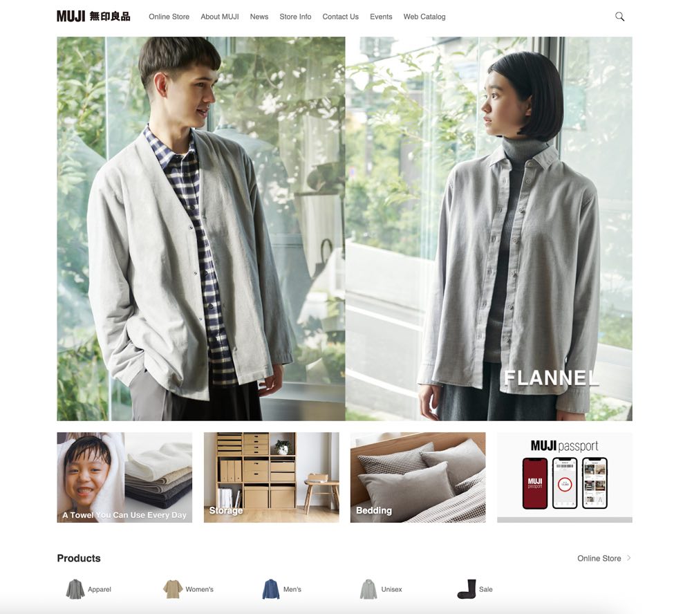
Source: Muji
Japan-based brand Muji pays homage to the classic Japanese style. Its core principles rely on quality materials, simple processes, and minimal packaging, which is reflected in the brand’s online shopping experience: what you see is what you get.
You won’t find flashy discount text or over-the-top editorial photoshoots on the Muji website.
- Example 2: Lunya
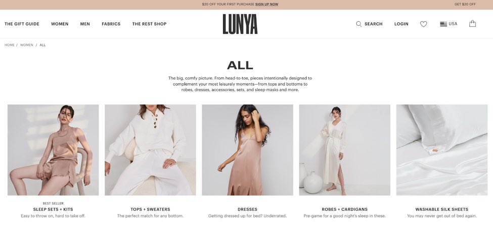
Source: Lunya
The brand’s statement is to focus on rest and helping women achieve their “dreamstate.” Hence, it’s logical that Lunya’s website is committed to a neutral color palette that inspires comfort, calm, and relaxation.
Product pages include images of all product variations that users can add to the cart using a “Quick add” button that grants users a fast checkout, so the experience is also straightforward.
- Example 3: Brooklyn Candle Studio
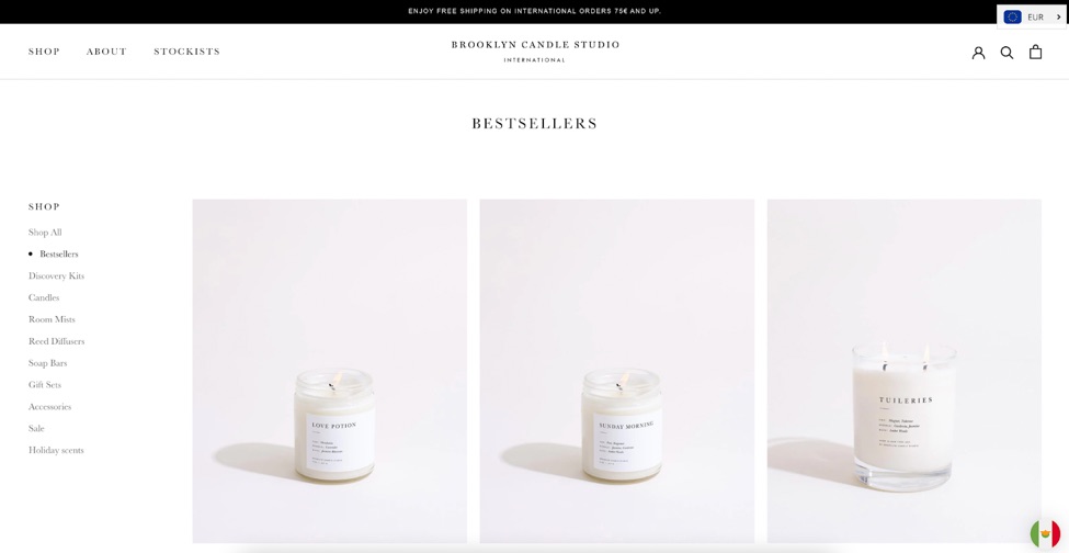
Source: Brooklyn Candle Studio
The “full sensory experience” and artful minimal packaging of the Brooklyn Candle Studio translate to an online experience with items and collections featuring short copy, classic sans-serif font, and white background product pictures.
Since this studio is interested in selling internationally through wholesale buyers, the experience adapts for both US and EU users. It displays a pop-up to calculate duties and taxes applicable to each potential buyer’s location.
2. Real-life, unedited images
Given that web design relies on solid creative imagery, this trend also means a positive outcome for eCommerce businesses in terms of engagement and brand loyalty.
Non-detectable editing allows brands to keep it real and balance style with authenticity, which is much valued, especially among younger consumers.
What are the benefits?
Real-life pictures reinforce the message of inclusion and self-acceptance, and brands benefit from this by offering an authentic experience for customers. Organic imagery and user-generated content (UGC) help drive social proof for a brand’s products and boost overall engagement.
How do you get the look?
The trend has been building over the last few years. It started to gain popularity during the lockdown when large-scale photoshoots weren’t possible. Many brands – particularly beauty and lifestyle brands that work closely with influencers – have embraced no-edit images.
Which brands are embracing unedited images?
- Example 1: The Inkey List
Using unedited photos and showcasing UGC is an excellent move for a skincare brand that claims that knowledge powers better decisions.
The Inkey List states that “skincare is a journey, and we are in it together,” and young customers are here for it; the brand has over 400K followers and 10 million likes on TikTok.
- Example 2: Tree Hut
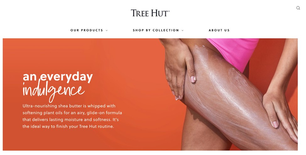
This online store website design is all about tropical vibes and healthy skin rituals to make customers “feel good from head to toe.”
Since Tree Hut claims to be committed to making self-care accessible for everyone, product pictures include unedited photos and handwritten fonts.
Another detail to make the website seem more down-to-earth is the all-lowercase copy for menus and product categories, which reads as an honest and unedited approach.
- Example 3: Aerie
For a business built on inclusion and diversity, Aerie continues to deliver a powerful message that celebrates all body types and empowers people to stay active regardless of their physique.
The AEO’s sub-brand website promotes activewear design for “real comfort,” which is reflected in each item, copy, and graphics focusing on what customers love doing in real-life scenarios.
3. XL fonts and graphics
Oversized images and fonts provide great structure for product-design-focused eCommerce sites. Hero images should communicate a strong brand identity.
What are the benefits?
Large, unusual, and bold visuals are great for catching users’ attention by creating a crafty, artistic feel.
How do you get the look?
Make your products the star of the show. Users visit your website to get a closer look at what they’re purchasing, so high-quality and zoom-in images are essential.
Oversized typography is a great way to create eye-catching visuals without cluttering your site.
Which brands are embracing XL fonts and graphics?
- Example 1: Bodum
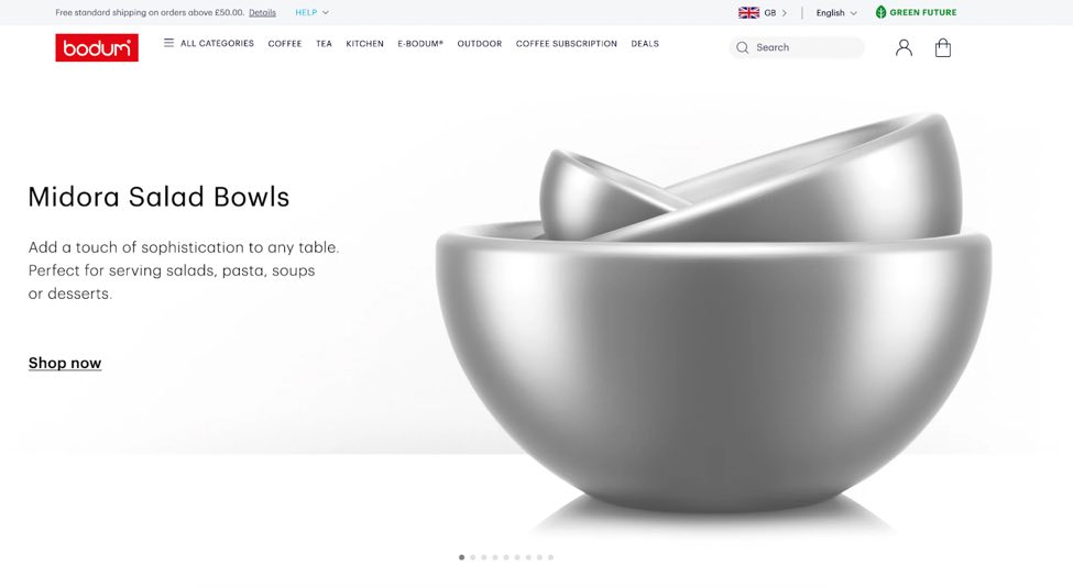
Source: Bodum
Danish company Bodum’s motto is that “good design doesn’t have to be expensive,” and its eCommerce site portrays that beautifully and simply.
Bodum presents its products, such as coffee makers, tumblers, and mugs, like art pieces in a museum.
- Example 2: Bose
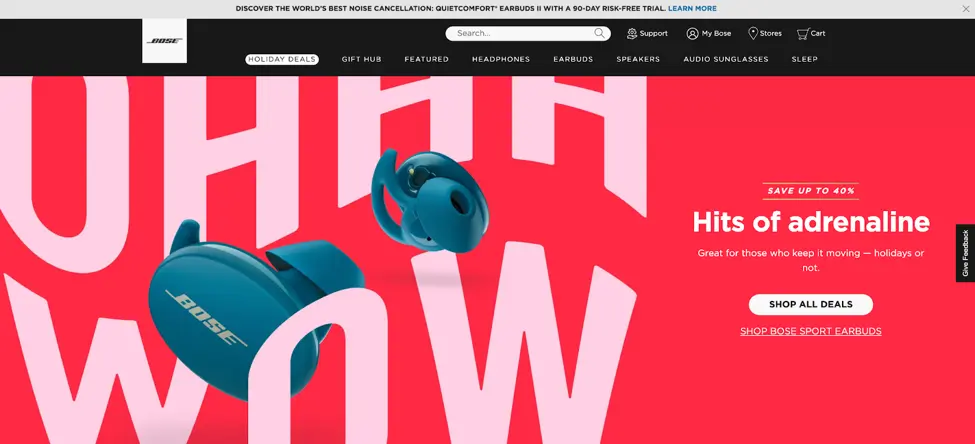
Source: Bose
American audio equipment brand Bose has a stunning eCommerce site design. The oversized text resembles sound waves, making it look like the fonts are moving across the screen.
Besides its large graphics, this website’s call-to-action buttons are also featured front and center.
To encourage sales during the holiday season, each item shows a “Drop a hint” button that allows users to email a recipient, telling them they’re interested in a specific product.
- Example 3: Samsung
Electronics company Samsung offers a wide variety of products. The website displays products in full detail and provides an augmented reality experience that allows customers to try them before they buy.
4. Nostalgic Design
This blast from the past is about connecting with users through their nostalgic memories.
A trend that’s dominated fashion and graphic design over the last few years, web designers are now mixing retro fonts, textures, and colors from various eras – such as the 60s, 70s, 80s, and 90s – to create a nostalgic aesthetic.
What are the benefits?
Nostalgic design works like a magnet for customers’ yearning for an old-school aesthetic and products that recreate.
How do you get the look?
Retro fonts and graphics are at the heart of this design trend. Think bright hues and floral patterns from the 60s, psychedelic fonts from the 70s, neon from the 80s, or 8-bit graphics from the 90s.
Which brands are embracing nostalgia design?
- Example 1: Bando
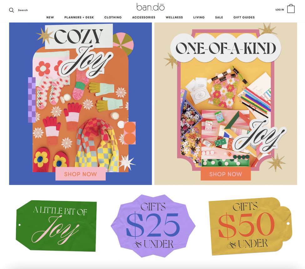
Source: Ban.do
Exploding with the 60s and 70s patterns, fonts, and details, Bando is anything but boring.
While other websites use minimal UI to highlight their products, this brand does the exact opposite without neglecting the user experience.
- Example 2: Center Stage
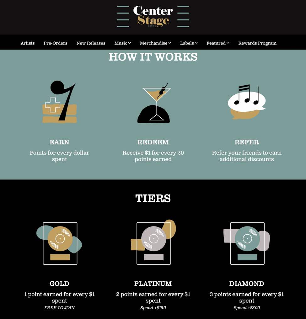
An eCommerce site built especially for nostalgia and vinyl enthusiasts, Center Stage and its labels aims to achieve a retro feel.
It features graphics such as classic martini glasses and an atomic age-inspired design that combines organic shapes with sleek lines.
- Example 3: Reebok
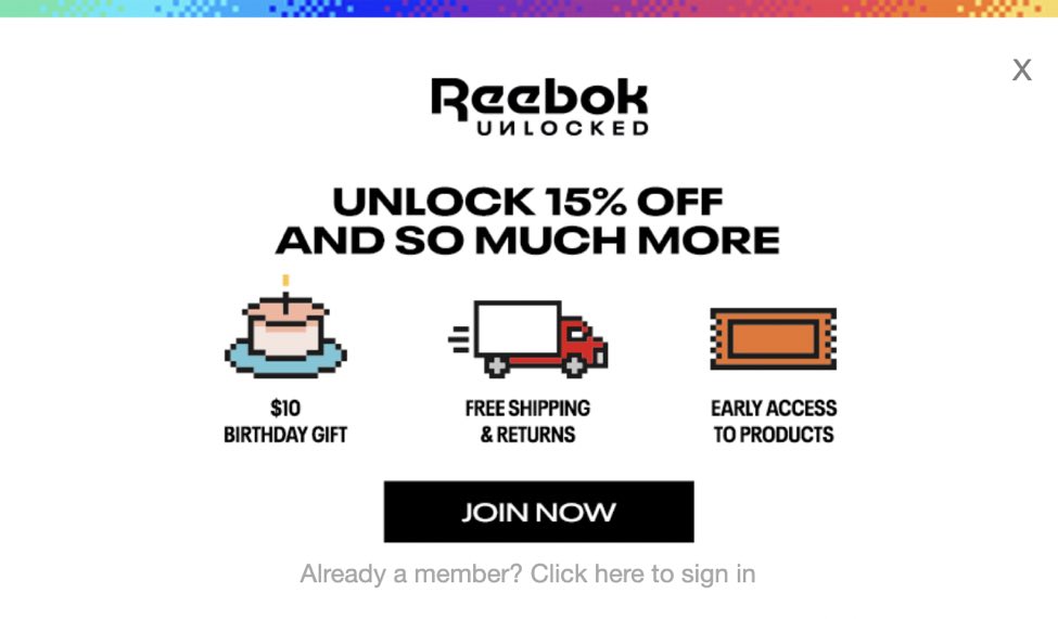
Source: Reebok
While this brand is not necessarily nostalgic, the website’s nostalgic-inspired pop-up immediately catches users’ attention by browsing its product pages. The retro animation features 8-bit sneakers and icons that ask visitors to join Reebook’s loyalty program, which allows customers to earn points for every online or in-store purchase.
5. Y2K Aesthetic
The 2000s are back in style. Bright and pastel colors, gradients, glitter, and 3D fonts are coming back across many popular eCommerce sites.
The iconic Y2K trend was fueled mainly by the fashion industry, quickly skyrocketing to popularity across social media platforms like Instagram and TikTok.
What are the benefits?
This nostalgic aesthetic works for web design because it gives viewers a sense of comfort and meaning.
If your brand targets Millennials and Gen Zers, 00’s design is a significant trend to catch their attention.
How do you get the look?
The Y2K aesthetic comprises all things plastic, sparkly, and metallic. Pastel and holographic color palettes, rainbow and sunset gradients, and hot, pastel, or baby pink are all colors reminiscent of the noughties.
GIFs are also a great way to play on the Y2K aesthetic. Did you know that the file extension is thirty-something years old? The same age as older millennials!
Which brands are embracing Y2K design?
- Example 1: KimChi Chic
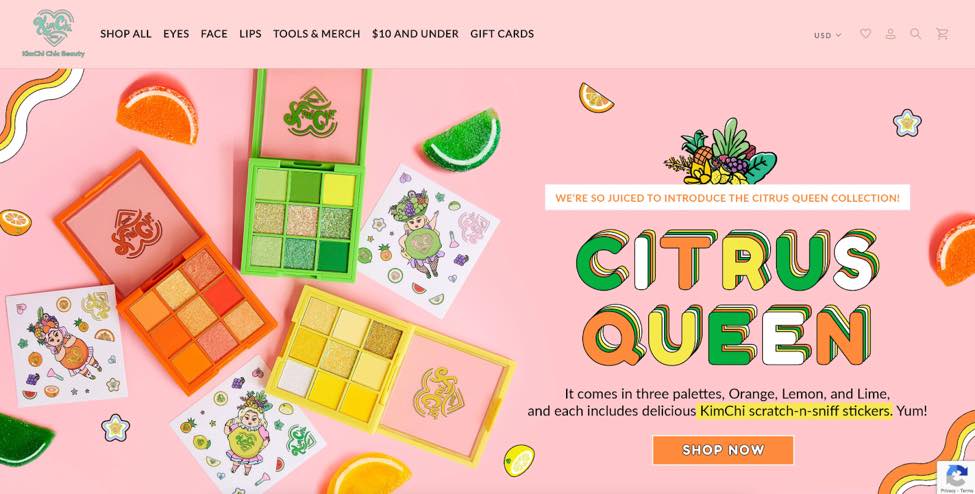
This beauty brand, created by Korean-American drag queen Kim Chi, takes inspiration from the Y2K style and makes its own across its website and socials. The hero section features a rainbow of citrus, while their other product pages explode with gradients and bubble gum colors.
- Example 2: Bliss
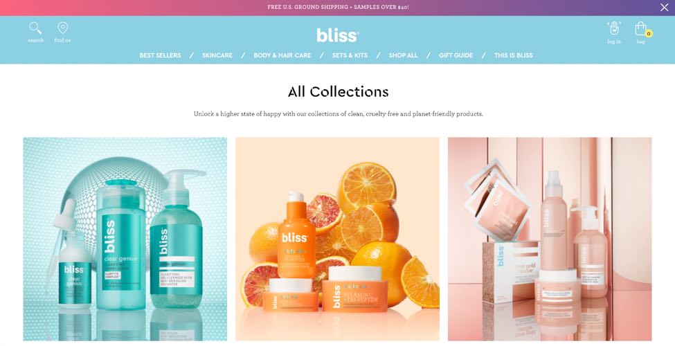
The American self-care brand Bliss perfectly aligns its web design with the Y2K aesthetic. Its product pages are simple yet colorful, ranging from baby pink to lemon yellow to baby blue.
6. Collage Art
Digital collage incorporates shapes, patterns, mixed media, and various colors layered on top of each other. tt. This creates a hand-made effect, replicating the look of an old-school collage, often using newspapers, magazines, paper, and fabrics.
What are the benefits?
This design trend is perfect for creative brands – such as lifestyle, fashion, or home decor – as it emulates an artistic, crafty vibe.
Collage allows you to display a wide range of imagery within one graphic. The busier, the better – collage reflects a laid-back, creative brand personality.
How do you get the look?
Take some of your favorite graphic elements – such as photos, fonts, and illustrations– and assemble them creatively as a graphic for your homepage. Remember that collage doesn’t have to be perfect; instead, try to be creative and try different arrangements.
Which brands are embracing collage?
- Example 1: Jungalow
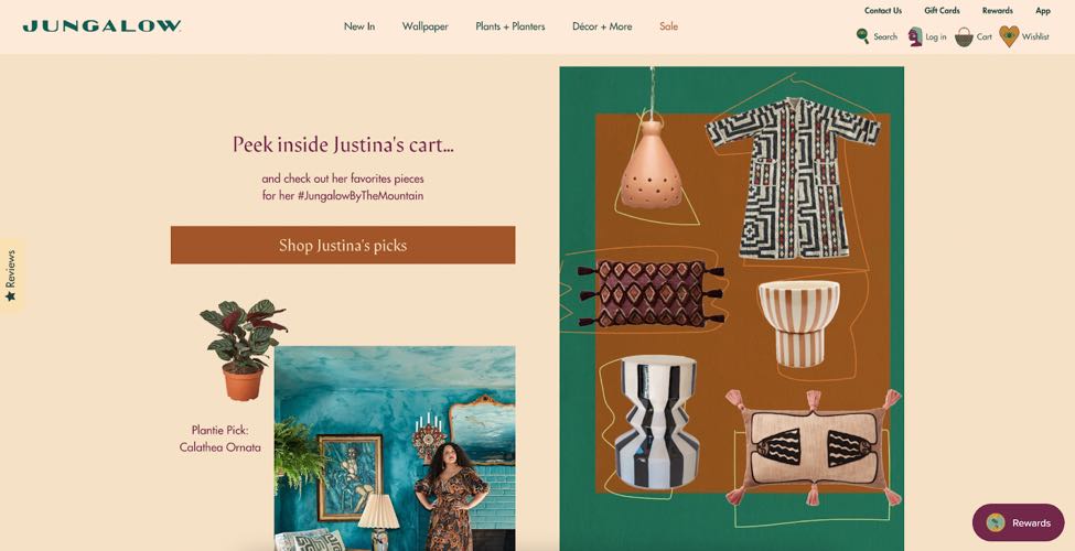
For this bohemian brand, collage works quite well. Displaying products like clippings from a magazine gives an artsy vibe.
- Example 2: Tokyo Treat
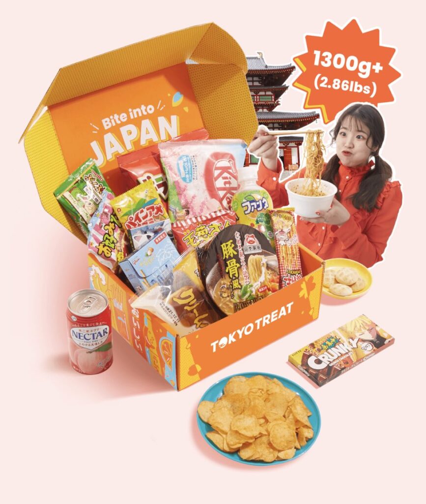
This online subscription service delivers Japanese snack boxes worldwide. Just like their product, Tokyo Treat’s eCommerce website gives party vibes party all year round. Every visual element is fun to watch, and anime-inspired collages present what’s inside each box.
- Example 3: Dr. Martens
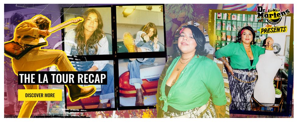
Famous footwear and clothing brand Doc Martens remains true to its style and brand identity.
This eCommerce website includes plenty of edgy collages– from lo-res digital pictures to scratched and scribbled photos and black and white stills– to create an urban, grunge aesthetic.
7. White Space
This minimalist design trend focuses on delivering a flawless user experience. The goal is to declutter a website’s design and make the navigation as smooth and straightforward as possible.
What are the benefits?
White space works wonderfully in terms of responsiveness. User interfaces that prioritize negative space load faster and are easier to optimize for different devices.
How do you get the look?
The goal is simple: keep what you need. No more. Avoid adding unnecessary information or graphics to make it look a certain way. Remember that this is about arranging your products most efficiently and straightforwardly as possible.
Which brands are embracing white space?
- Example 1: Cavallini
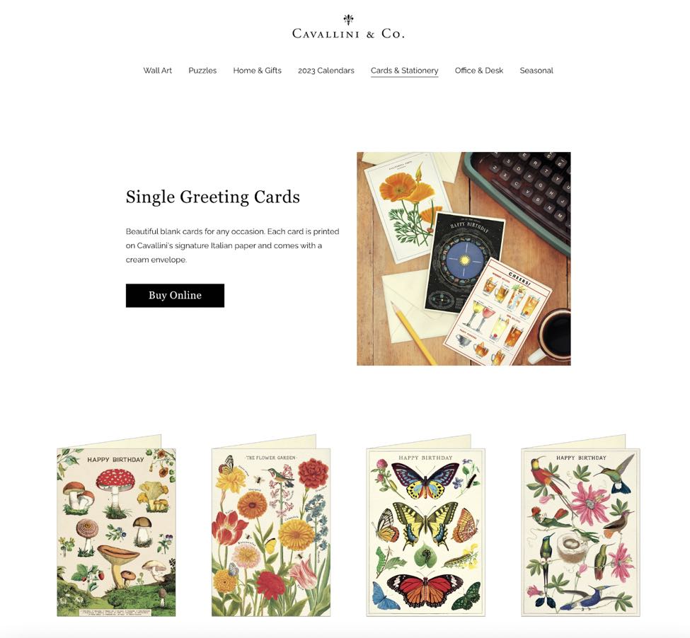
Beautiful paper, wall art, and office supplies are the focal point of this eCommerce website. Cavallini specializes in gift and stationery products that look elegant however you use them.
In this case, negative space works as a white wall that drives attention to each item.
- Example 2: MoMA Store
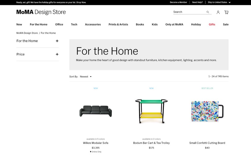
Source: MoMA Store
This web design is like walking around a museum. There are no unnecessary elements, and the exquisitely curated items on display allow users to take a moment to ponder and appreciate each product before purchasing.
- Example 3: TASCHEN
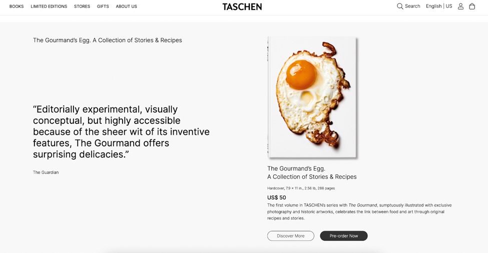
Source: Taschen
For cultural archeologists and founders of Taschen, the key is to be inclusive, independent, and inspiring. Their books are world-renowned and beautifully designed, which comes across clearly on their website.
The white space is distraction-free for users, driving their attention straight to the featured book covers.
8. Hero Video
First impressions count – it only takes 50 milliseconds for users to form an opinion about a website. So, using a video for your hero section can be a clever move.
Many luxury and fashion brands use video to advertise numerous products, moods, and settings instantly.
What are the benefits?
Using a video for your eCommerce website’s first impression encourages users to dive deeper into the site. Remember, this is the first chance to communicate your unique selling point.
How do you get the look?
Create your video with user experience in mind. A beautiful video is one thing, but your products must be the hero. Make sure to include clear CTA buttons that send users right to your products.
Which brands are using video?
- Example 1: Marc Jacobs

Source: Marc Jacobs
Featuring their products and brand identity in one place, Marc Jacobs has done an impeccable job with this hero video.
Example 2: Pull & Bear
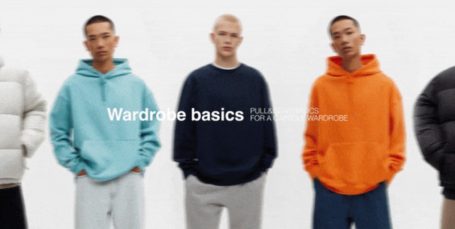
Source: Pull and Bear
This is the perfect example of why video is so compelling. Above, we look at nice products within two seconds, giving Pull & Bear’s products maximum exposure in a short time.
To Wrap Up
These trends will help your eCommerce business increase sales, reach new audiences, and improve relationships with existing customers.
Whether you’re building a new eCommerce website or revamping an old one, continually iterate your design and keep exploring, experimenting, and looking for inspiration.
9 Comments
Travel APIs
2023-03-03 at 05:41Thank you for sharing such an important topic with us.
ImminentSoftwares
2023-04-11 at 12:41Very interesting, please share more.
Rajan kumar
2023-04-11 at 14:05thanks for writing a nice article
Website Development Packages
2023-04-28 at 11:29It’s important for your online store to follow suit. Knowing what’s current in web design, how to affect user behavior, and how to meet the wants of your customers are essential to creating or improving a successful eCommerce website. That’s a terrific post you found, and it makes me wonder whether there are more places we can find similar useful details.
Criação de site
2023-05-07 at 17:58Thank you for sharing this informative article on the upcoming eCommerce web design trends for 2023. As the online business landscape continues to evolve rapidly, it’s crucial for eCommerce businesses to stay ahead of the curve and be aware of the latest design trends that can help them grow revenue and improve user experience. The article provides valuable insights into 8 key trends that businesses should consider when building or revamping their eCommerce websites in 2023. I appreciate the opportunity to learn more about these trends and how they can be used to address customers’ needs and influence user behavior.
digital marketing for apartments
2023-06-03 at 06:26Post explores the emerging web design trends specifically for e-commerce websites in 2023. The article discusses topics like minimalist design, immersive experiences, personalized content, and mobile optimization. It provides insights into how businesses can stay current with design trends to enhance the user experience and increase conversions.
web design fort myers fl
2023-06-14 at 07:38An engaging blog post that highlights emerging web design trends for e-commerce websites in 2023. The article discusses the importance of user experience, mobile responsiveness, minimalist design, micro-interactions, personalized shopping experiences, and social proof. It provides examples and practical tips for implementing these trends effectively. The blog post encourages readers to share their thoughts and opinions in the comments section, promoting further discussion and idea sharing among e-commerce professionals.
denver seo consultants
2023-07-01 at 07:35If a company wants to stay competitive in the digital market, they should read your blog post about the latest trends in e-commerce site design for 2023. Due to the dynamic nature of web design, keeping abreast of changing aesthetic preferences and user expectations is essential. Key developments including immersive experiences, mobile optimization, and customizable interfaces are highlighted in your paper. Businesses may improve customer engagement, boost conversions, and deliver world-class e-commerce experiences by embracing these trends.
Offshore Digital Marketing Agency
2023-08-23 at 19:49Keep doing and keep sharing